Statement of intent
For this project I am going to focus on texture and and different types of textures to resolve my pictures and define them more, I am going to research different types of textures for example fruits, leaves etc. To show the work that I have built, I will focus my images on these textures. I found this quite easy to use as the tools are easy to follow, for my final images I will choose my best one and describe my use of textures.
For my initial research I will start by looking into texture photographers, such as Roe Ethridge, Imogen Cunningham and Marc Anderson, I chose Roe Ethridge because his work is unusual and rare and he does it so well, and his use of textures are unbelievably beautiful and uncommon, I chose Imogen Cunningham because her work is elegant and beautiful no matter what her use of texture is, and all of her work has a sharp focus rendition of simple objects. I have also chosen Marc Anderson because his use of textures are also simple but he somehow makes them interesting to look at because of the sharpness in the photos.
When I chose this theme my initial thoughts were of natural textures such as food for example fruits, and some other natural textures such as leaves and trees and grass. After thinking about the project title I thought about all the way I could combine and contrast the different textures and I could also do studio shots as well as using the natural outdoors for my natural textures so that it could look more essential. The images I would like to take are close ups with a telescopic lens and textures around my house because that is a natural environment
To show progression through my work I will start by photographing simple pieces of textures such as fruits and plants and then bring them into school for a more natural definition, I prefer natural resources because they are quite beautiful to look at and man made is something that everyone does.
I would like to experiment with a wide range of within my work. I have a manual Canon camera which I will take a lot of my pictures on, but I would also like to test with my own mobile phone camera and possibly a telescopic lens to see the effects and changes. I will try to push myself with Photoshop to edit my photographs with the black and white filter.
I have a few months to produce my website of work towards the production of my final piece. I have aimed to complete my initial research within the 3 week and start photographing by the 4th week in order to give me the time I need to show my work in the editing site, when I have completed the project I will select my best photographs and show them in my final gallery.
As my project progresses I will use annotations throughout my web-page labeling my ideas and development clearly. I will mainly seek advice from my teacher and my peers on how to make my work better, as I’m always aiming to push myself higher. I will also watch tutorials and demonstrations and find my own as well to help me develop my skills and knowledge of Photoshop and Photopea . After the creation of my final portfolio I will write a final evaluation on the project as a whole, reflecting on what went well and what I would do differently or change given the time.
Research
Photography research for Imogen Cunningham
Context
IMOGEN CUNNINGHAM
(AMERICAN, 1883 - 1976 )
I have researched information for Imogen Cunningham
'Imogen Cunningham occupies a singular position in the history of American art of the twentieth century. For over half the history of photography, she explored- with innovation and a new perspective- all the major traditions associated with the medium as fine art. She has been most widely acclaimed for the photographs made during the 1920s and 1930s, particularly close-up images of plants and nudes. She also made portraits which are now considered classics in photography, including images of Alfred Stieglitz, Spencer Tracy, and Martha Graham. She was a founding member of the West Coast-based Group f.64, which championed an un-manipulated, direct approach with the camera, or “straight” photography. Her photographs are represented in major collections and museums around the world. The Weston Gallery represents the Imogen Cunningham Trust and have vintage, modern as well as posthumous prints available. Please contact us for acquisitions.'
This is where i went to find the information
https://www.westongallery.com/original-works-by/imogen-cunningham
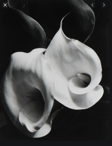
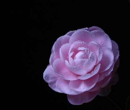
Composition
The light coming in from the right hand side of the photograph focuses on the petals, highlighting their whiteness against the black background, which gives a monochrome kind of effect on the image and makes the image look very dramatic.
I can see that Cunningham has used the Rule of Thirds, with the center of the flower on the left hand side sitting on the sweet spot. The flowers also take up two thirds of the image, with the leaves in the top third, this makes the flowers the main object you look at and stand out against the dark backdrop. because the flower sits on the bottom left of the image.The contrast between the black and white brings out the form and shape of the flower and makes the flowers look sophisticated and elegant. The image has been taken inside the studio, using lighting and a tripod to hold the camera steady. Imogen Cunningham does this to create a dramatic effect on the flower, without making it look boring .The image uses leading lines as part of the compositional technique to draw attention to the flower, we can see these curving lines in the outline of the petals and leaves, which draws your focus into the center of the flowers. Imogen Cunningham has cropped the image tightly so you can see the flower close-up,it is very close to the picture plane. Your eye is drawn to the flower because it is in the foreground and the background is black and dull so the flower stands out.The image also looks Photoshopped because of how pigmented the white petal is, you can also see some shadows of the flower in the background which makes the image more authentic and talented. However, when this photograph was taken, it would have been captured on film and there were no computers and so the striking contrast would have been manipulated in the darkroom. I like how she uses the shadows to develop her work into something inspirational. I might try and use some of these techniques in my own work.
I can see that Cunningham has used the Rule of Thirds, with the center of the flower on the left hand side sitting on the sweet spot. The flowers also take up two thirds of the image, with the leaves in the top third, this makes the flowers the main object you look at and stand out against the dark backdrop. because the flower sits on the bottom left of the image.The contrast between the black and white brings out the form and shape of the flower and makes the flowers look sophisticated and elegant. The image has been taken inside the studio, using lighting and a tripod to hold the camera steady. Imogen Cunningham does this to create a dramatic effect on the flower, without making it look boring .The image uses leading lines as part of the compositional technique to draw attention to the flower, we can see these curving lines in the outline of the petals and leaves, which draws your focus into the center of the flowers. Imogen Cunningham has cropped the image tightly so you can see the flower close-up,it is very close to the picture plane. Your eye is drawn to the flower because it is in the foreground and the background is black and dull so the flower stands out.The image also looks Photoshopped because of how pigmented the white petal is, you can also see some shadows of the flower in the background which makes the image more authentic and talented. However, when this photograph was taken, it would have been captured on film and there were no computers and so the striking contrast would have been manipulated in the darkroom. I like how she uses the shadows to develop her work into something inspirational. I might try and use some of these techniques in my own work.
Connection
I have decided to use Imogen Cunningham because she is a female and in the photography world there aren't that many that are well known for no reason and her work should be more discovered because of how amazing it is.
Another reason to why I chose her is because of her amazing use of the black and white filter and how she uses natural textures such as plants and flowers, not many people use that and she is talented to do so. Her work is simple but still eye catching which is unique and not often done. I am going to use her work to inspire my own photography by using natural textures and a range of black and white filters because its alluring.
Another reason to why I chose her is because of her amazing use of the black and white filter and how she uses natural textures such as plants and flowers, not many people use that and she is talented to do so. Her work is simple but still eye catching which is unique and not often done. I am going to use her work to inspire my own photography by using natural textures and a range of black and white filters because its alluring.
Comment
In my opinion I really like Imogen Cunningham's work because of how amazing her photographs are, I've really enjoyed looking at her work because her work is beautifully unique and not boring, most people find her work dull but I find her simplicity amazing and beautiful.
Research
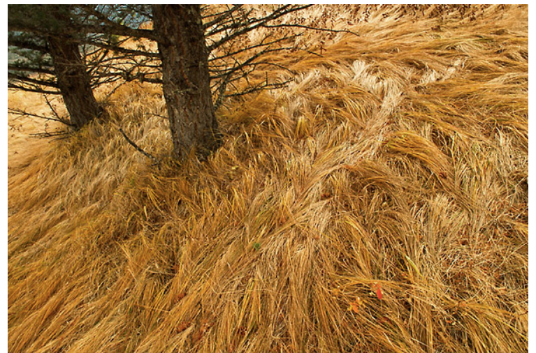
Composition
In this image I can see that the cameraman who took this image used the rule of thirds to help the viewer draw eye to the main object, which is the two trees. In my opinion I think that the trees stand out because of this effect, and that is what the cameraman wanted for the trees to stand out. Although the trees stand out the most I've also drawn attention to the bronze like grass which tells me that the photographer took this picture in autumn time. In this image is see a foreground and a middle ground and a distance. In the front I see the bronze grass, in the middle I see the 2 trees and in the distance I see a fraction off the blue sky. The way the photographer took this picture makes the landscape look like its falling which creates the effect of drama without editing. When I look at this image I see that the photographer set this picture in a natural sunset to create the effect that this picture is natural. They wanted to set this image in a natural sunset because of how the sun reflects on the grass, if it was set in another white balance the picture wouldn't have the golden effect. I also think the photographer set the ISO on 200 or 300 because of how bright the image is. I also think the aperture is quite deep because of how clear the background of the image is.
Connections
This is connected to my work because we are learning how to do rule of thirds, and this image is a great example of the rule of thirds. This image is also connected to my work because it's in a natural setting and we are learning how to take good images in a natural light, we are also learning how to use a natural light setting and this image is also a good example of that.
Comment
In my opinion I think this image is a great example of a natural image because the image makes you draw attention to the tree but it also makes you draw attention to the gold grass which makes you aware that this picture was taken in autumn time.
Context
I cant say much about the context because I don't know the background of this image.
Researching for Roe Ethridge
Context
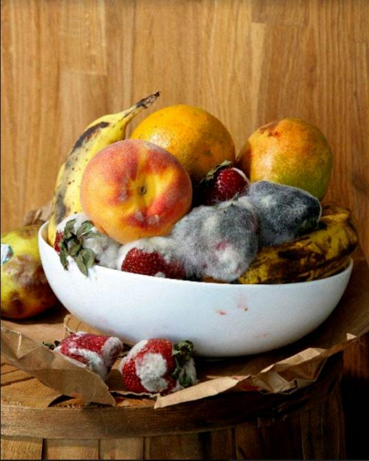
From my research
“Roe Ethridge (American, born 1969) takes equally from his work as a commercial photographer, and artist. Blurring the lines that separate the two, Ethridge creates images that are simultaneously generic and intimate, often treading between humor and cynicism. Functioning in tandem, these motivations coalesce into an ongoing investigation into the mechanics of photographs, and their ability to both retreat into the personal, and expand to relay collective experiences. In 2016, the Contemporary A"
“Roe Ethridge (American, born 1969) takes equally from his work as a commercial photographer, and artist. Blurring the lines that separate the two, Ethridge creates images that are simultaneously generic and intimate, often treading between humor and cynicism. Functioning in tandem, these motivations coalesce into an ongoing investigation into the mechanics of photographs, and their ability to both retreat into the personal, and expand to relay collective experiences. In 2016, the Contemporary A"
Composition
The lighting on the image is natural making the moldy fruit on the image stand out and look very clear, I can also tell by looking at the image that the light setting is natural because you can still see the original color of the image. The photograph is fairly new because I can tell it was taken on an advanced piece of technology due to the clear capture of the mold and the beautiful lighting effect. The photograph thrives with color and since it doesn't look edited it keeps it natural and makes it look realistic. However some may argue that the image is edited because of how vibrant the image and how it looks too realistic and the mold looks too fluffy. Clearly the image is very sharp and clear and this is because the camera is on a larger aperture setting. The image also looks like it was taken on a tripod because the camera is capturing the fruit pot level to the lens
Connections
This work connects to mine because the Rotting fruit shows more texture. For my texture project I have also taken pictures of fruit but not as unique and strange as this one. This picture that Roe Ethridge has taken is eye catching because of it's difference, which is what I am learning to do. I can tell by the photo that this is taken in a natural light, which is what I am also trying to do.
Comment
In my opinion I find his work unique and fascinating because it's not something you see everyday and unlike other works it's eye catching and makes you want to look more into the photo. I really like his work because it inspires me to do what he does.
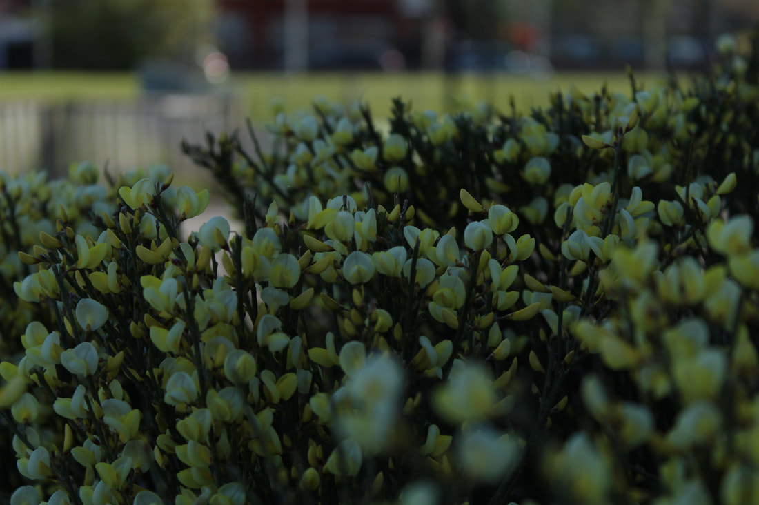
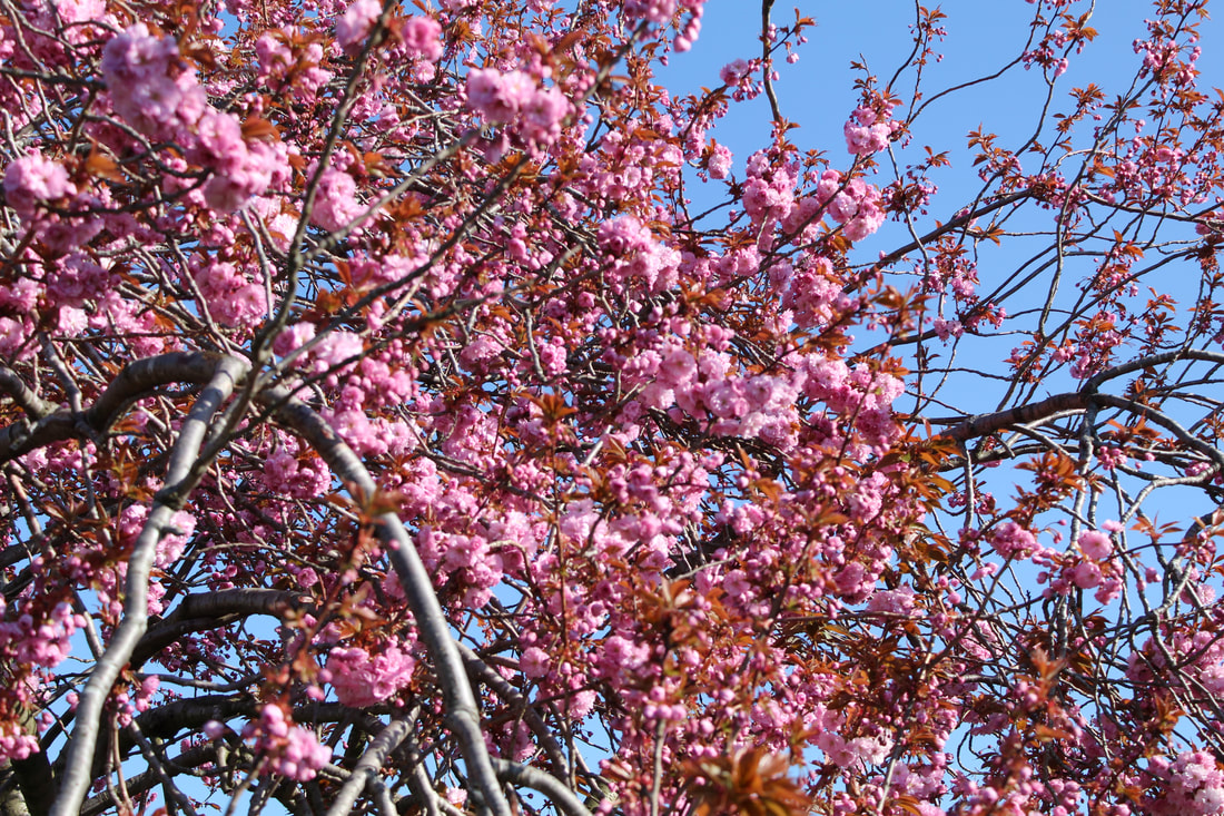
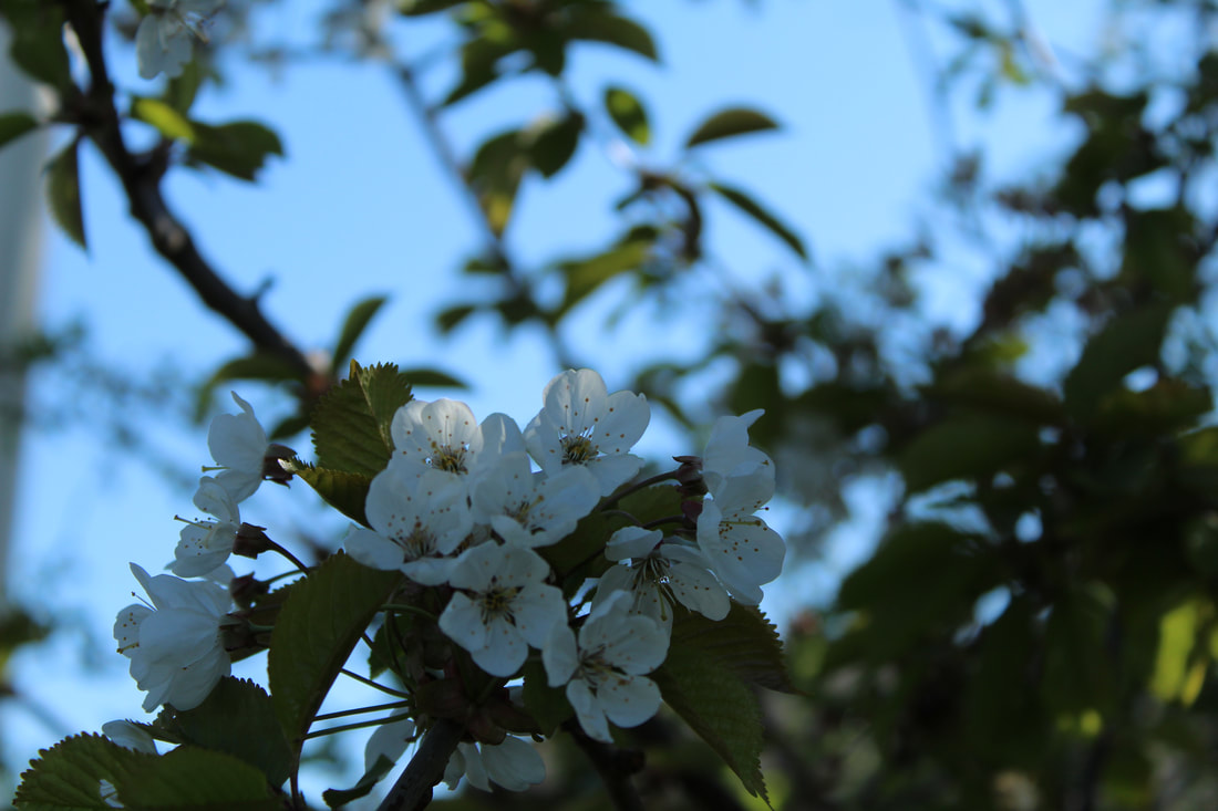
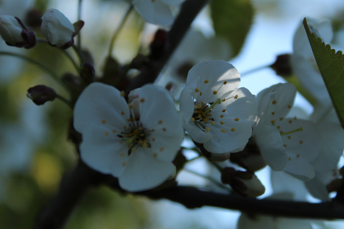
Natural texture mood board
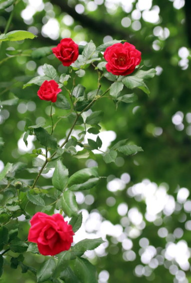
I have chosen to do flowers because personally to me they make everything look beautiful and more vivid which is what I would like my website to look like because It creates a more personal and professional atmosphere. Nature has always fascinated me especially colourful flowers, since colourful flowers make the image look more attractive which is the vibe I want to create. Taking pictures of flowers also allows you to see my perspective of them(unique, different and alive), they also brighten up the photo without even having to brighten it up myself. They also connote to spring, warmth,life and rebirth which is something a lot of people want to see, which can make my website more and more attractive.
Man made texture mood board
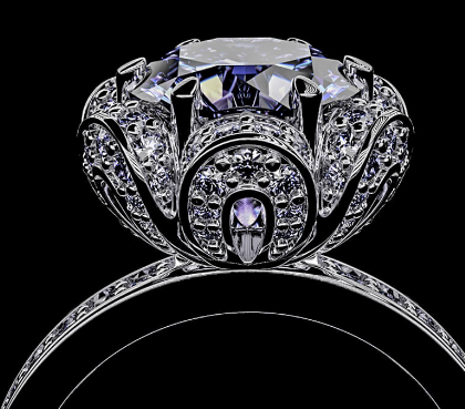
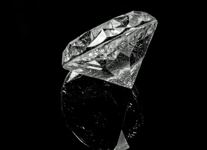
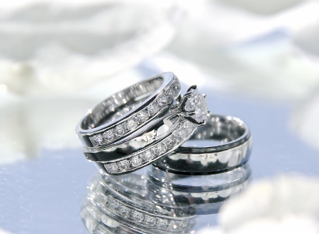
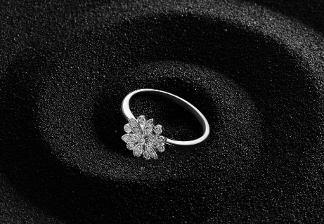
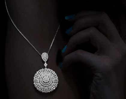
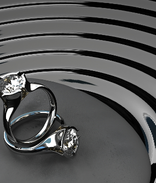
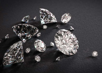
I have chosen to do jewellery because again they are something nice to look at which make your website look more attractive and professional, jewellery also has a shine which can reflect onto the camera which can make the images look beautiful and nice to look at.
Mind Map
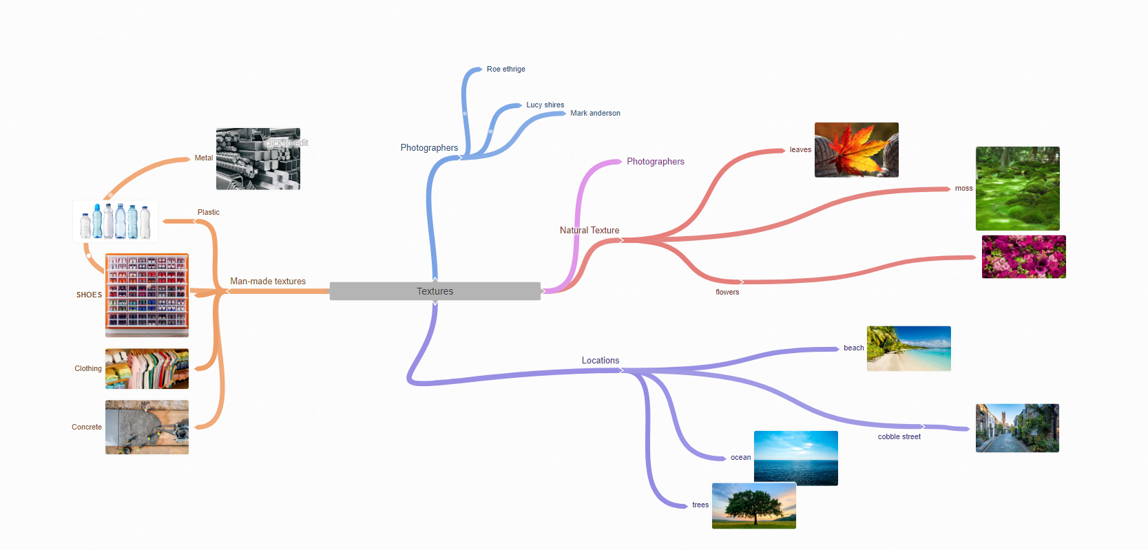
Natural Textures
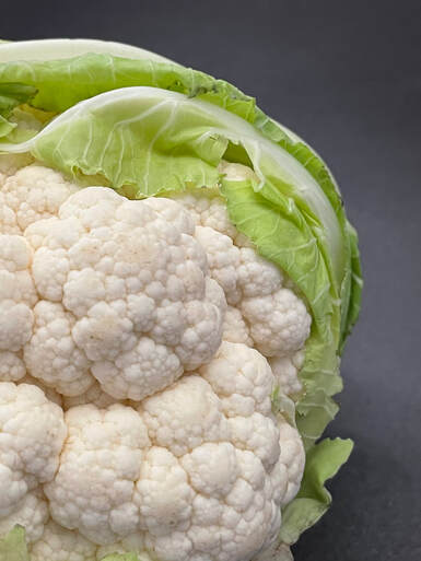
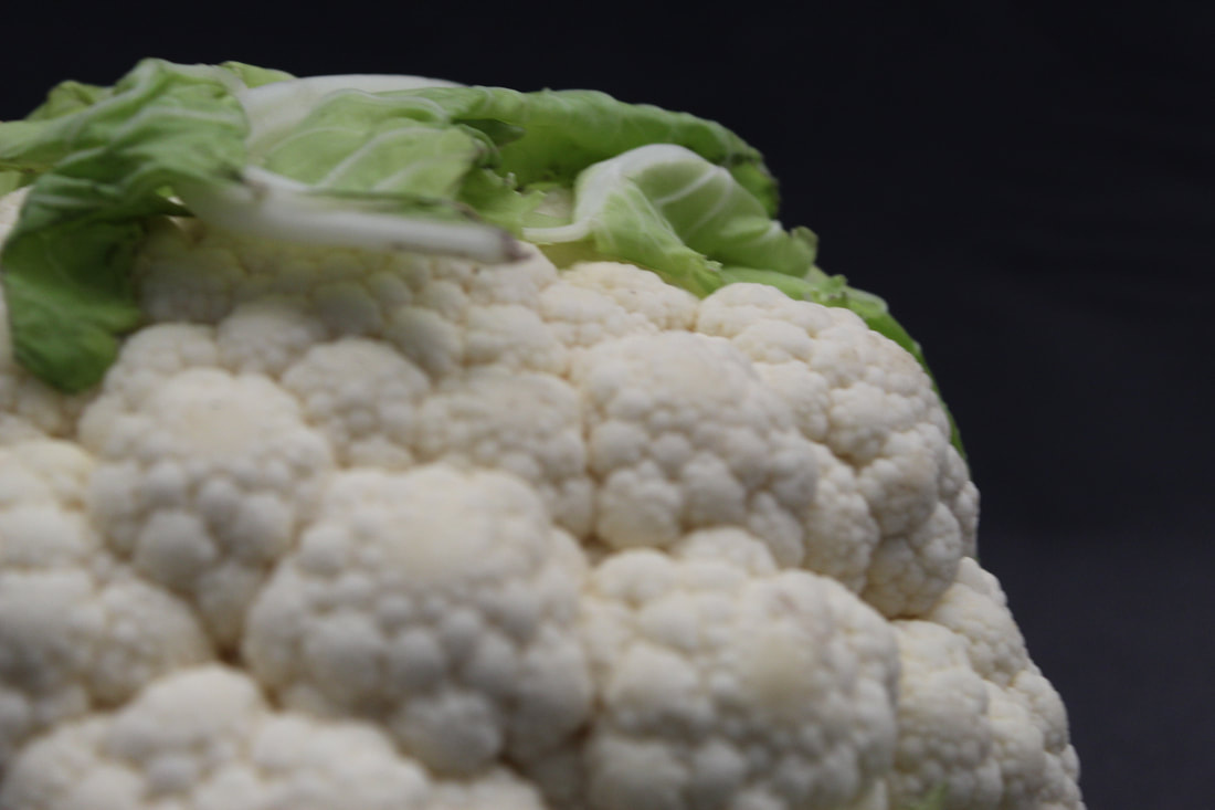
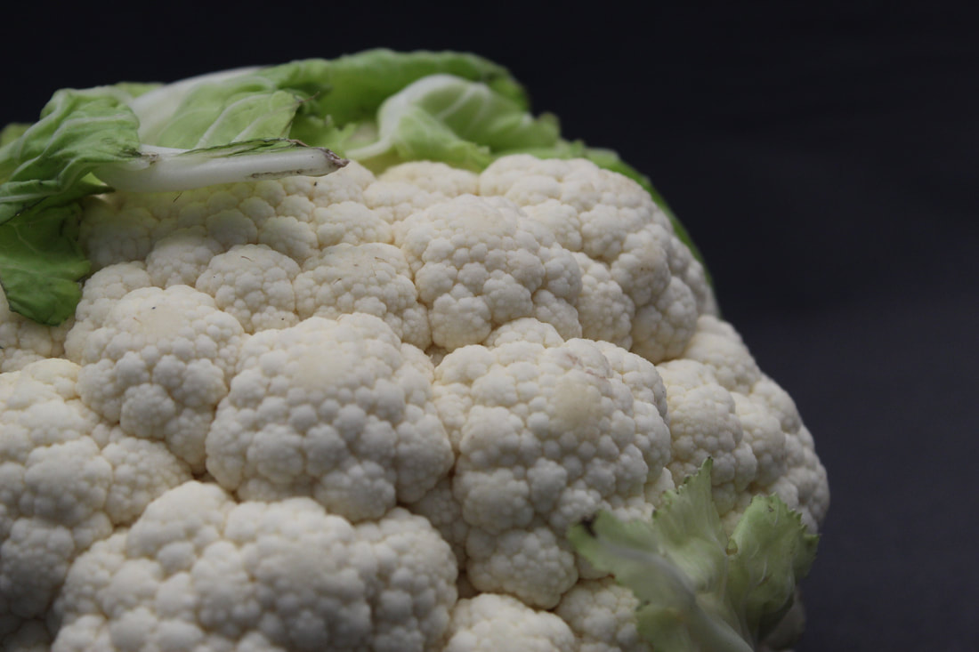
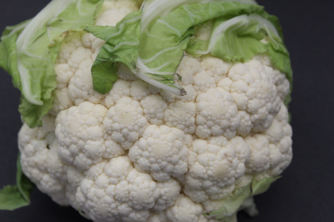
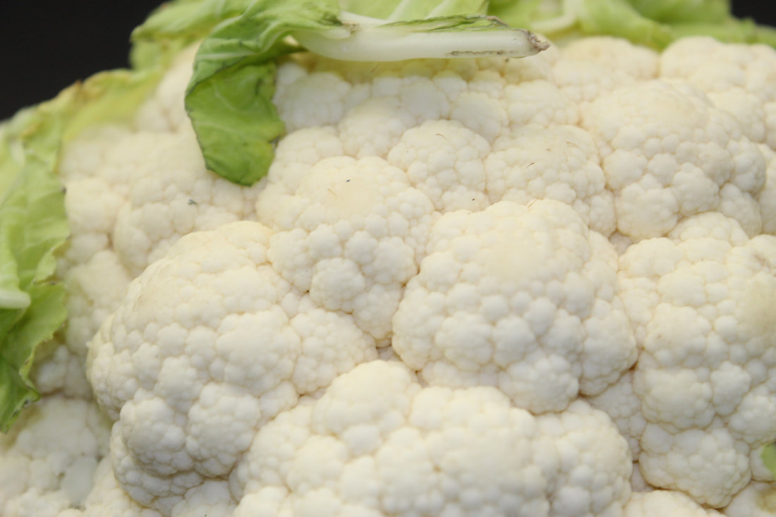
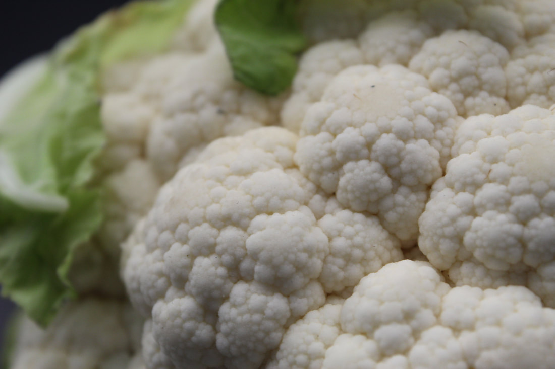
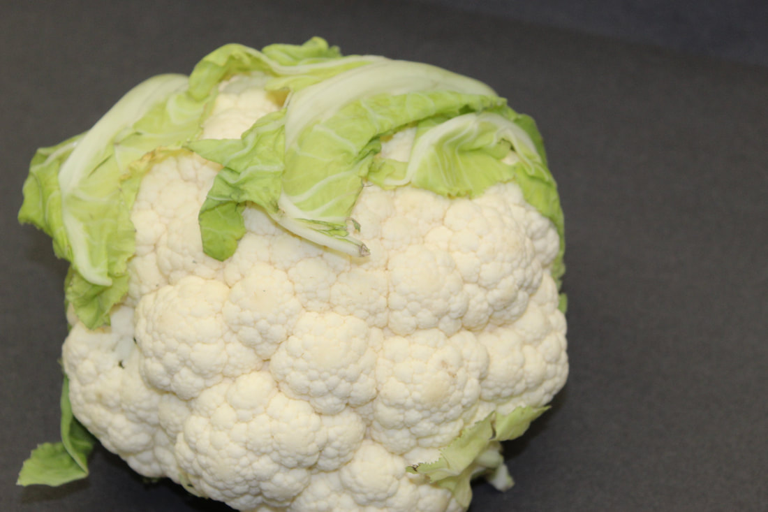
Cauliflower
|
|
|
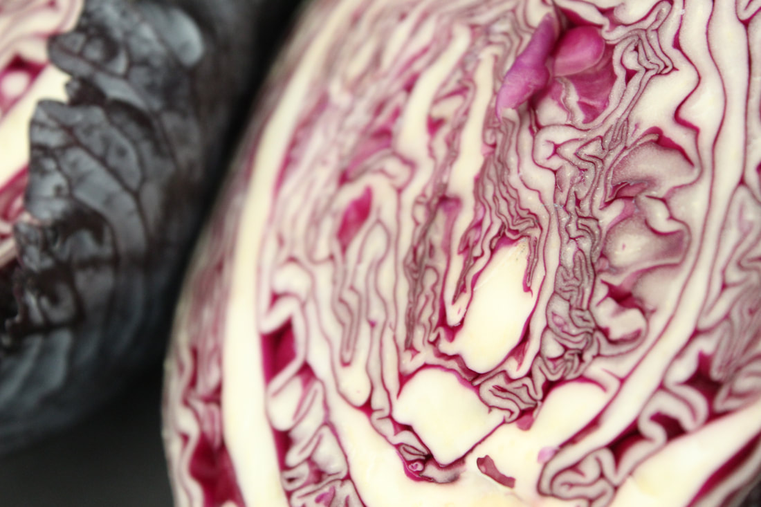
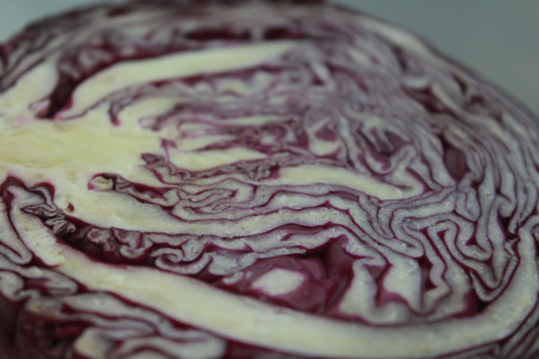
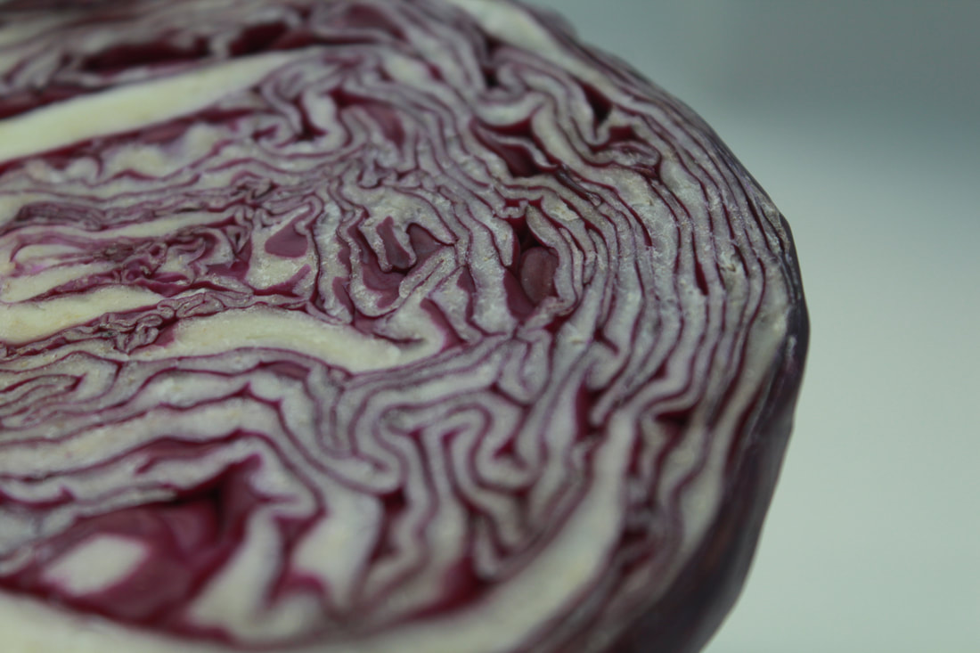
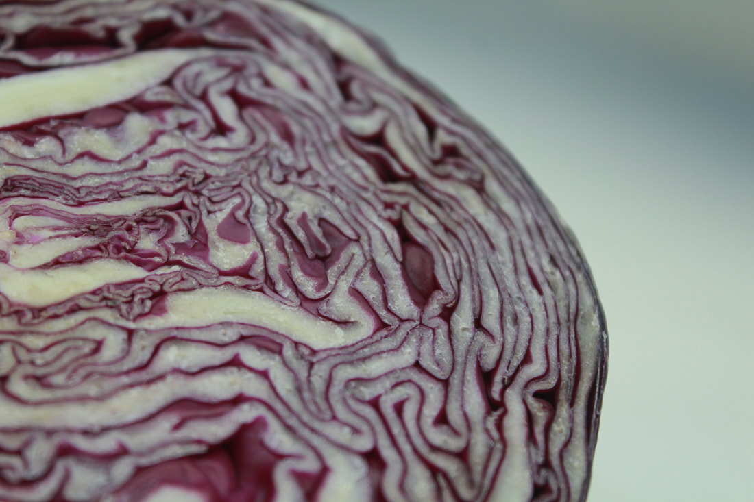
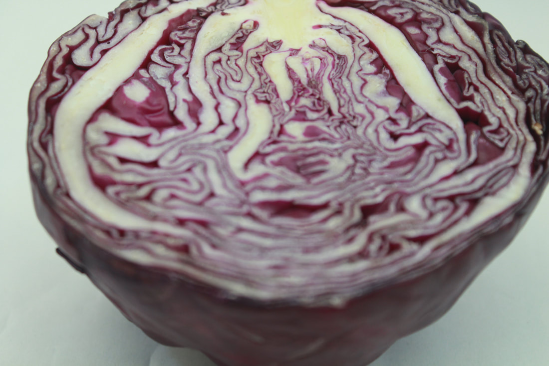
Purple Cabbage
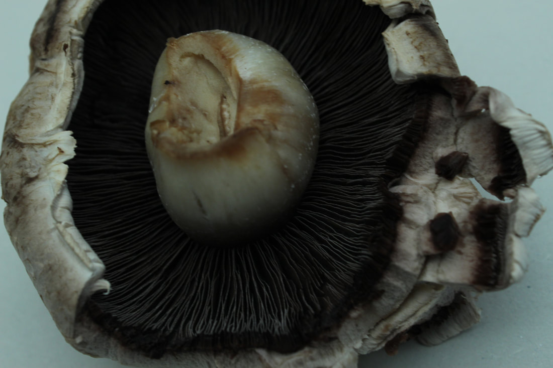
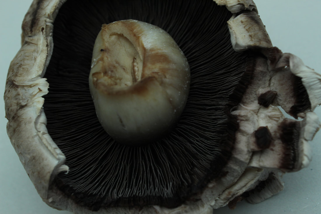
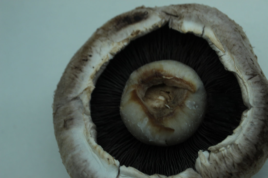
Mushrooms
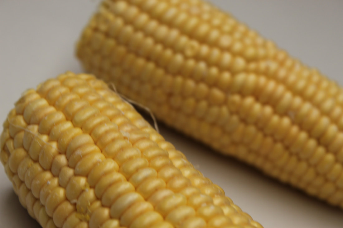
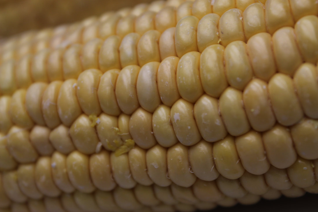
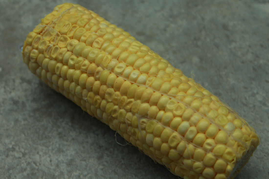
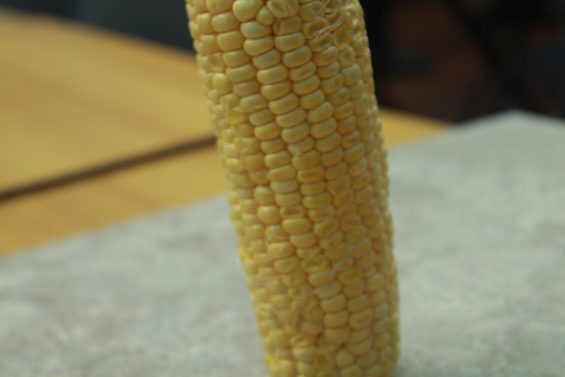
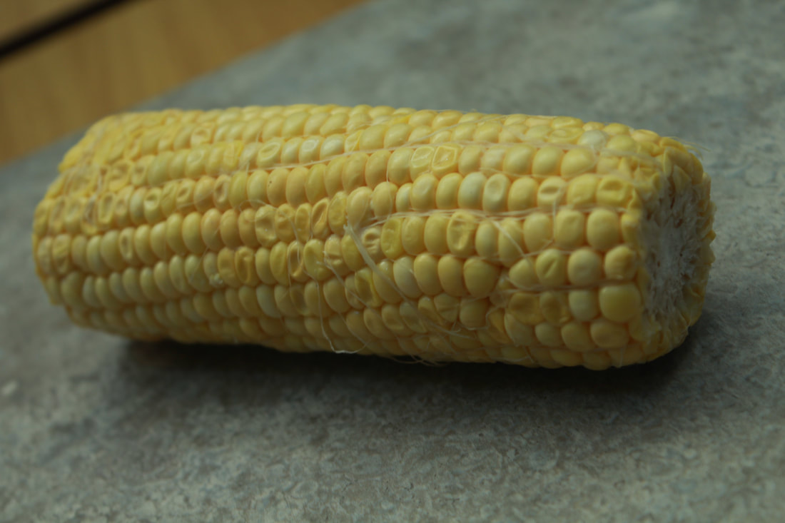
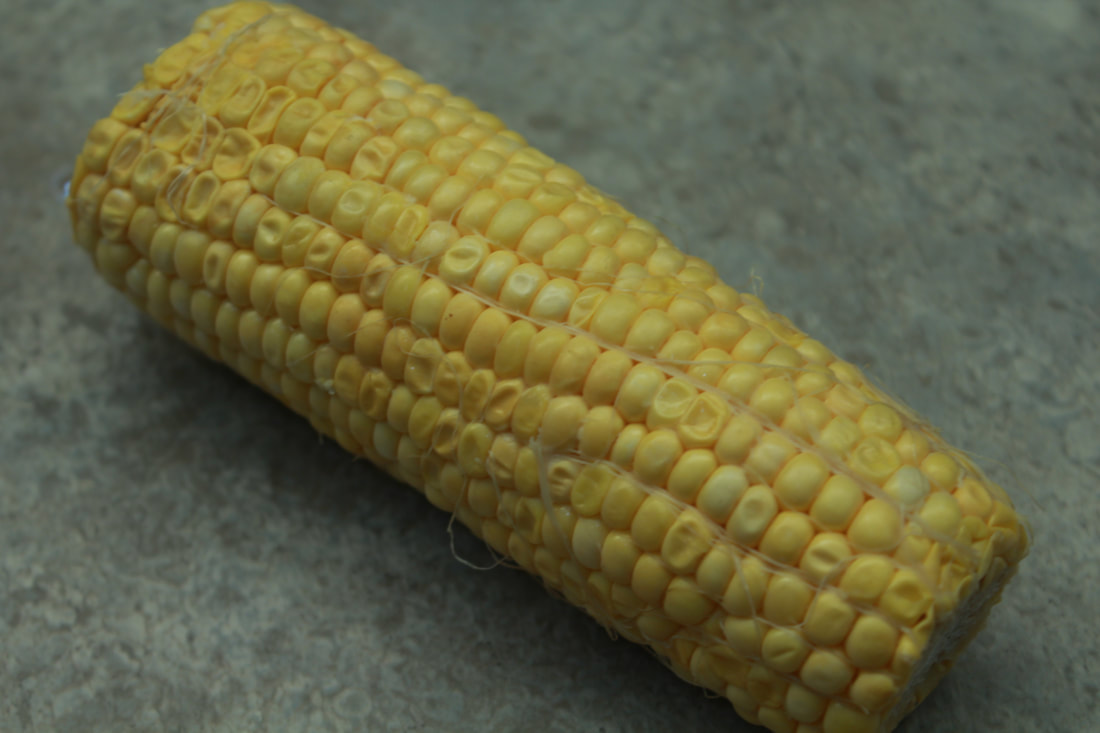
Corn
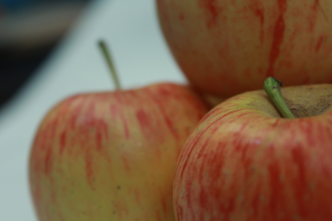
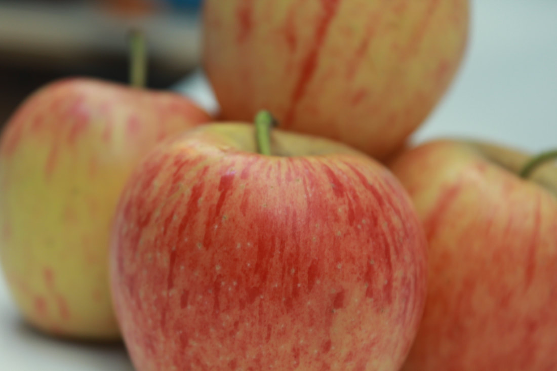
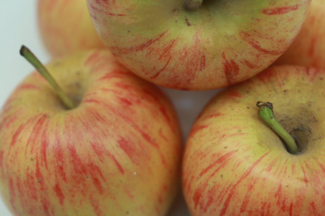
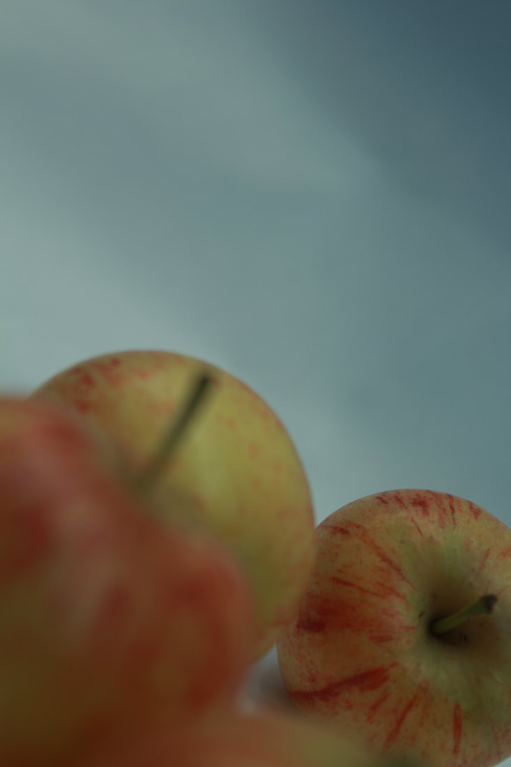
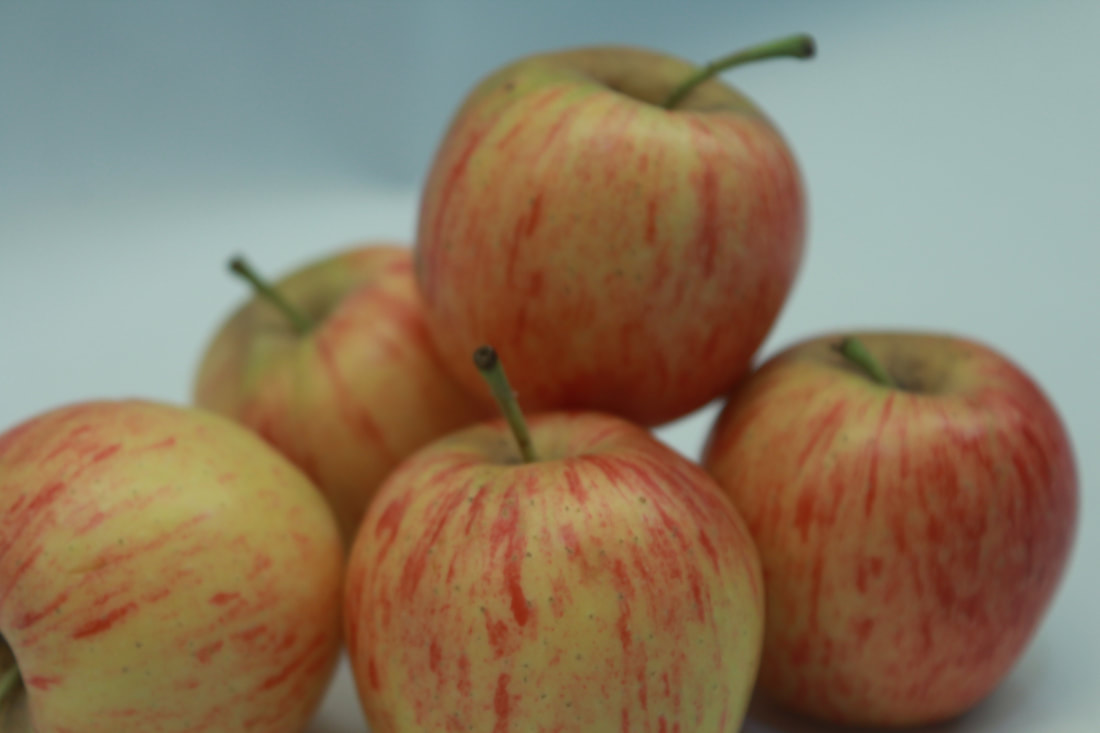
Apples

My best and worst images
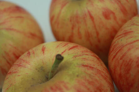
This image is my best image because I used the rule of thirds because when you look at the image, your eyes go straight to the bottom left because everything else it unfocused behind it.
|
This image is my worst image because it's blurry, meaning you can't see anything, it also looks unprofessional
|
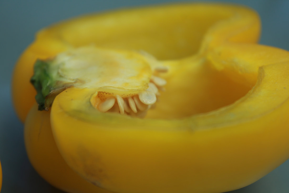
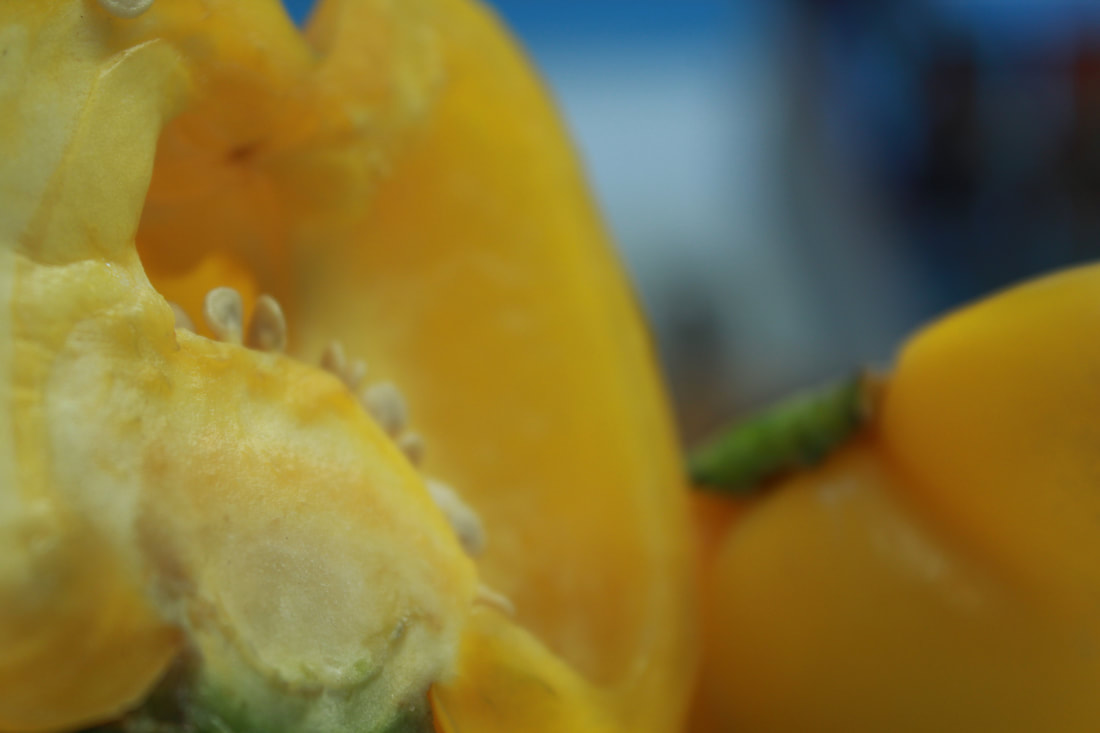
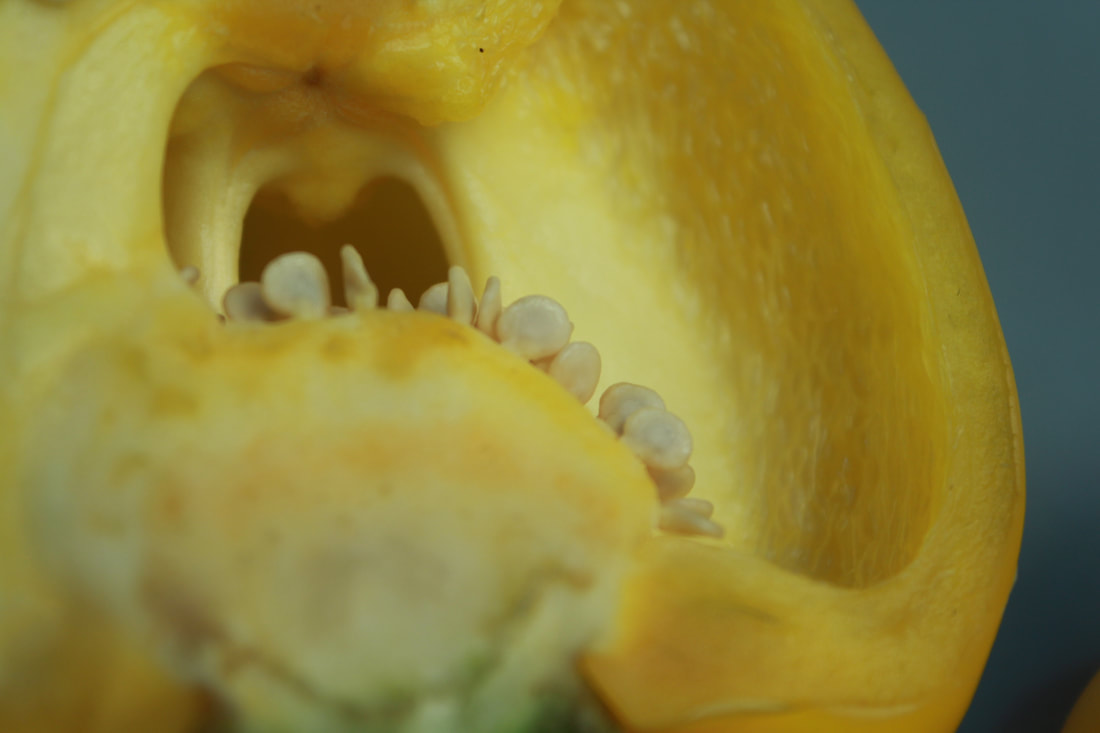
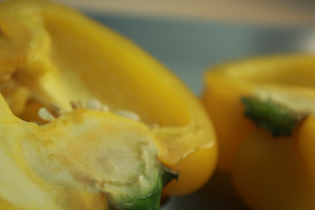
Peppers
My best and worst images
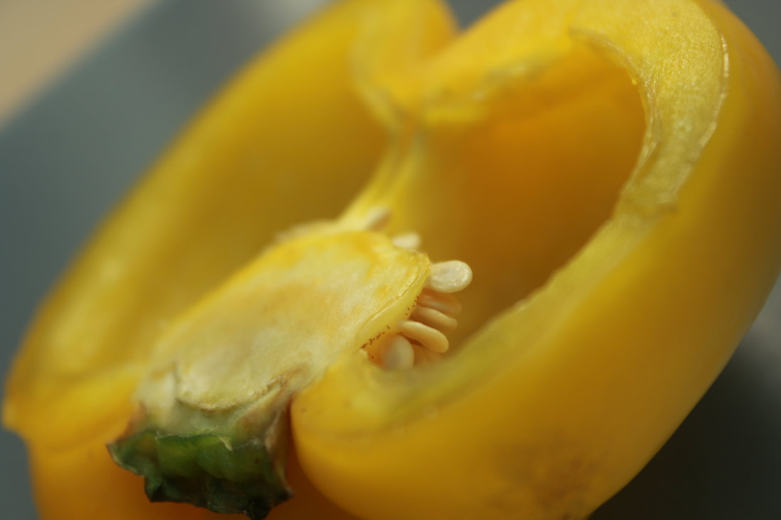
This image is my best image because of my use of rules of thirds and you eyes zone into the middle of the image, the main focus of the image, I also used a natural light to define the pepper more
|
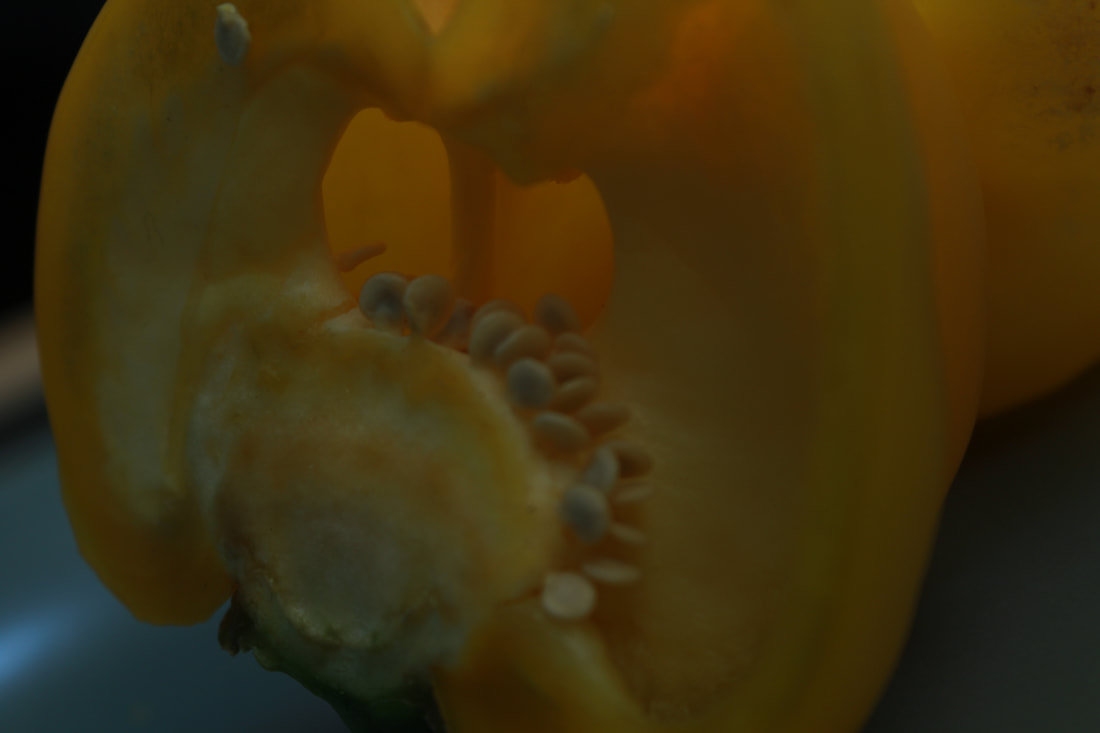
This image is my worst image because it's dark and you can barely see anything. The position of the pepper is also not appealing.
|
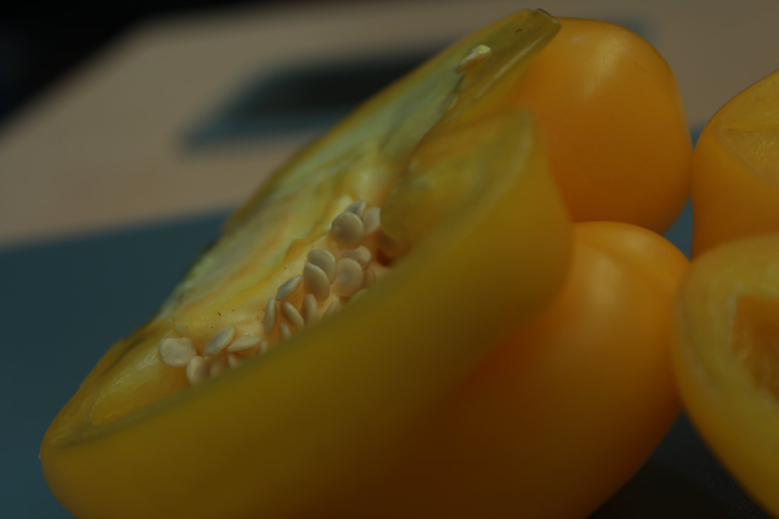
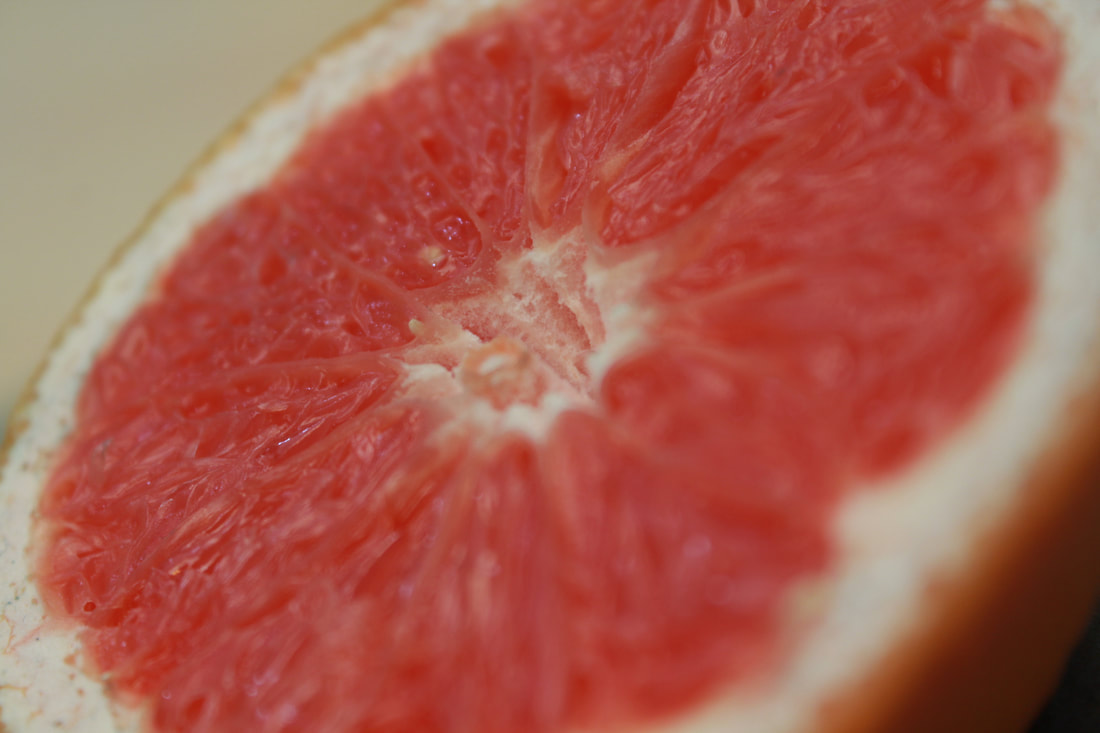
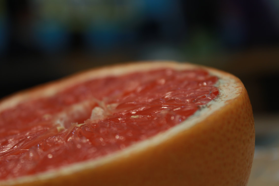
Grapefruit
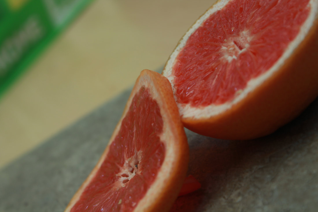
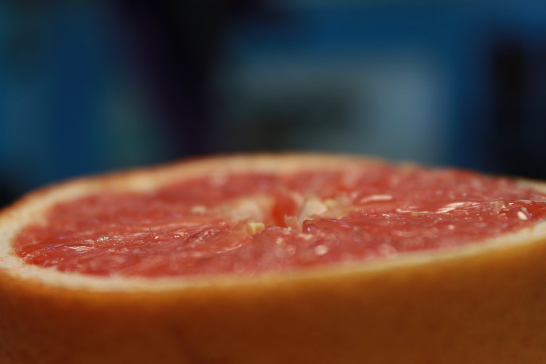
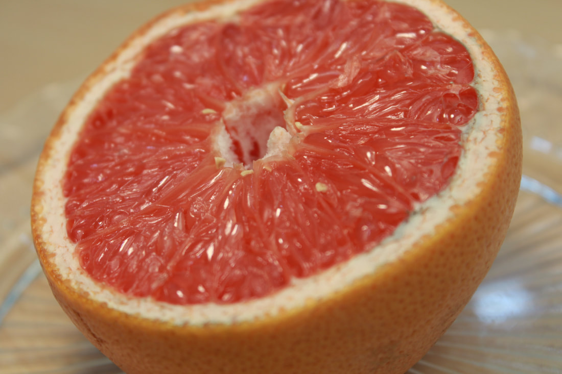
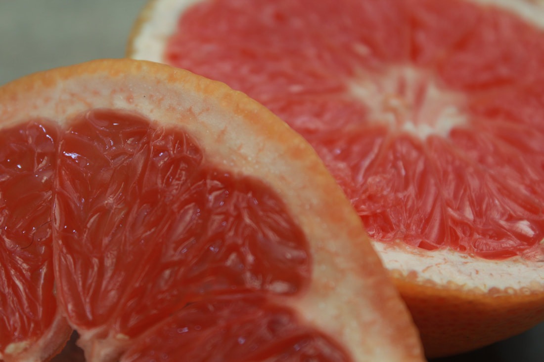
My best and worst images
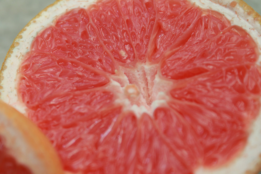
This image is my best image because it's very clear in the center and purposefully blurry on the outside so that you can pay full attention to the center of the image, I used a natural light on this image, so that you can see the what the object looks like.
|
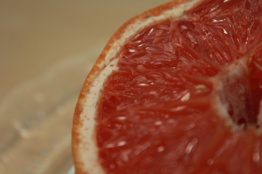
This image is my worst image because the light filter I used didn't fit well with the image, I don't remember, what I used but it's really off putting and makes the image tacky, other than that I used rule of thirds so your eyes draw to the top, middle of the image, which is clear.
|
Nature
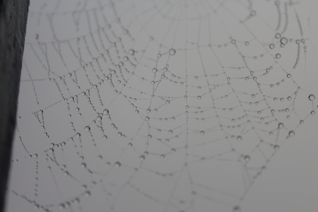
Spider webs
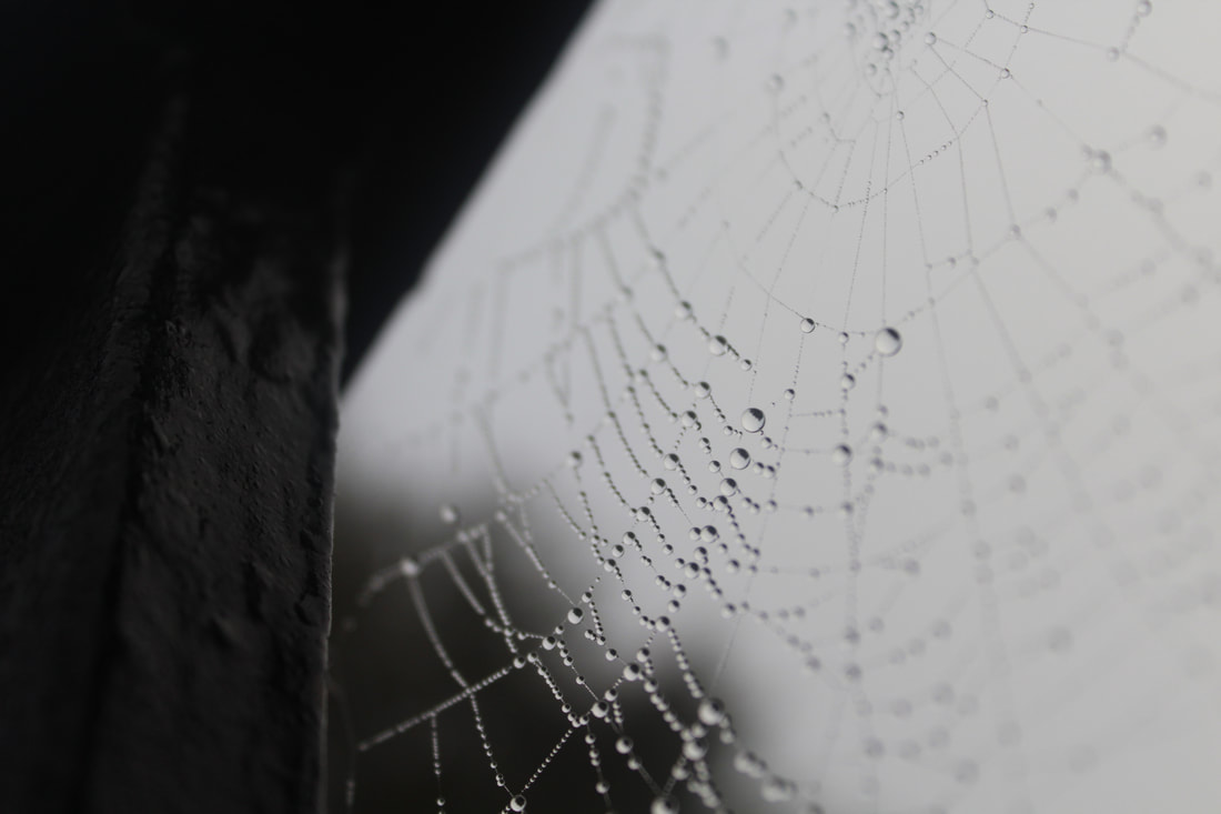
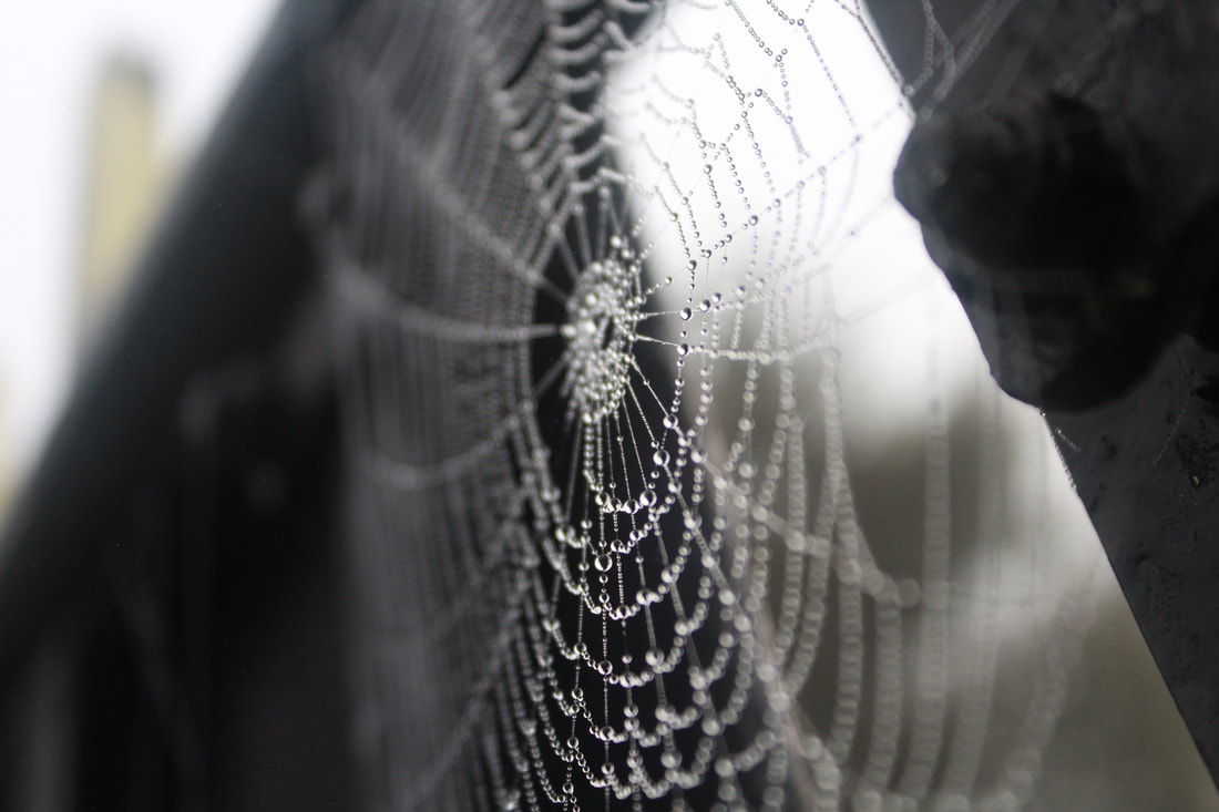
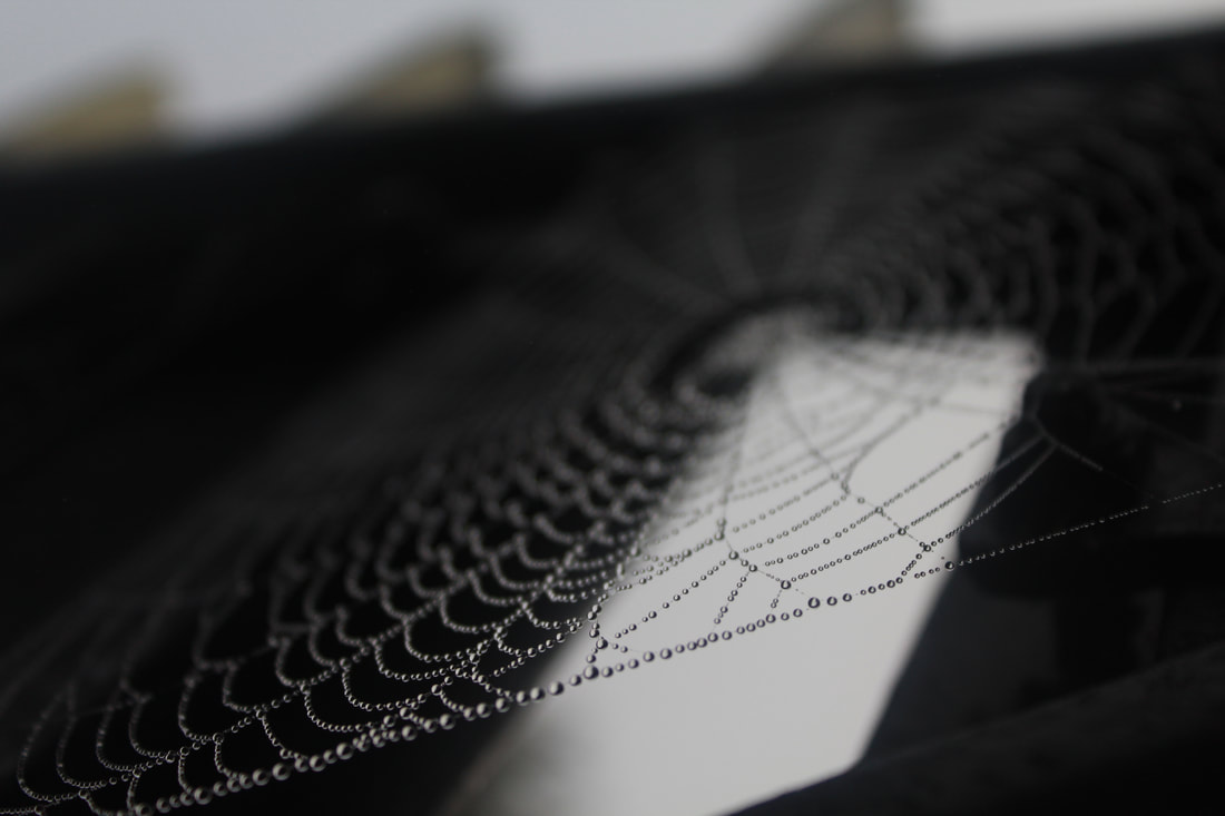
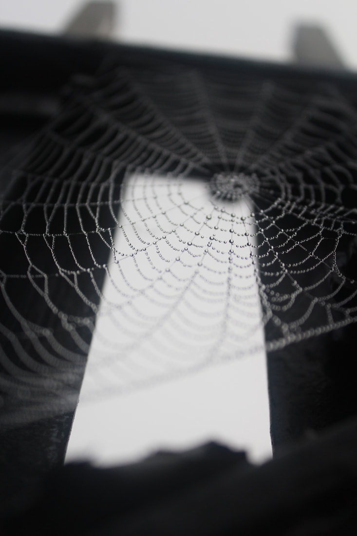
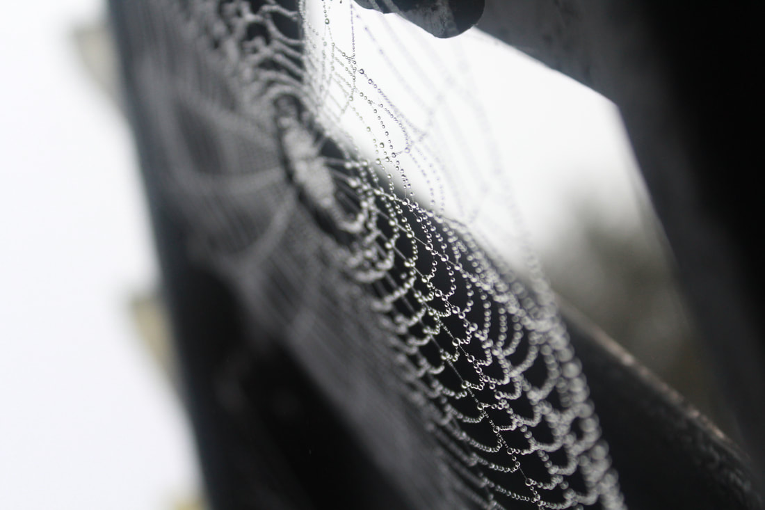
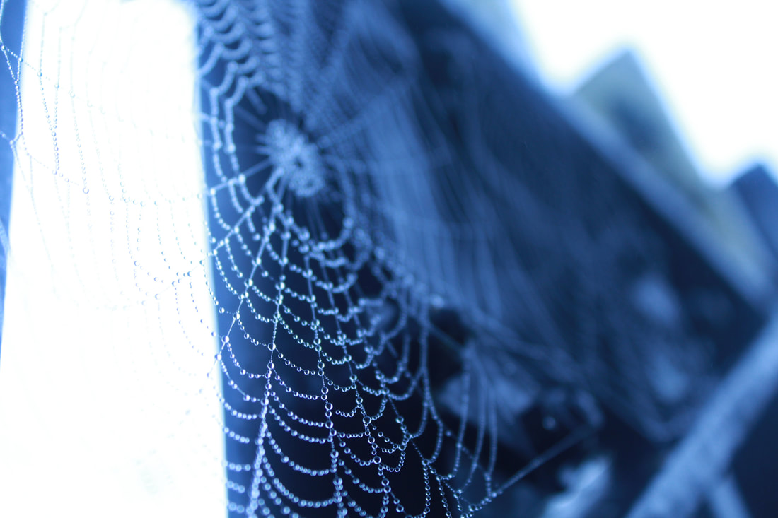
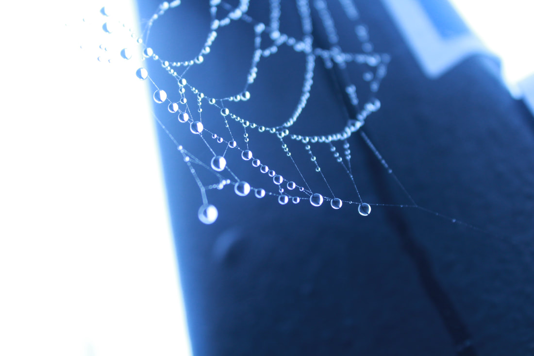
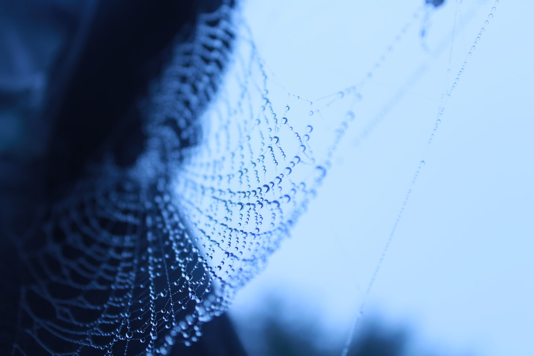
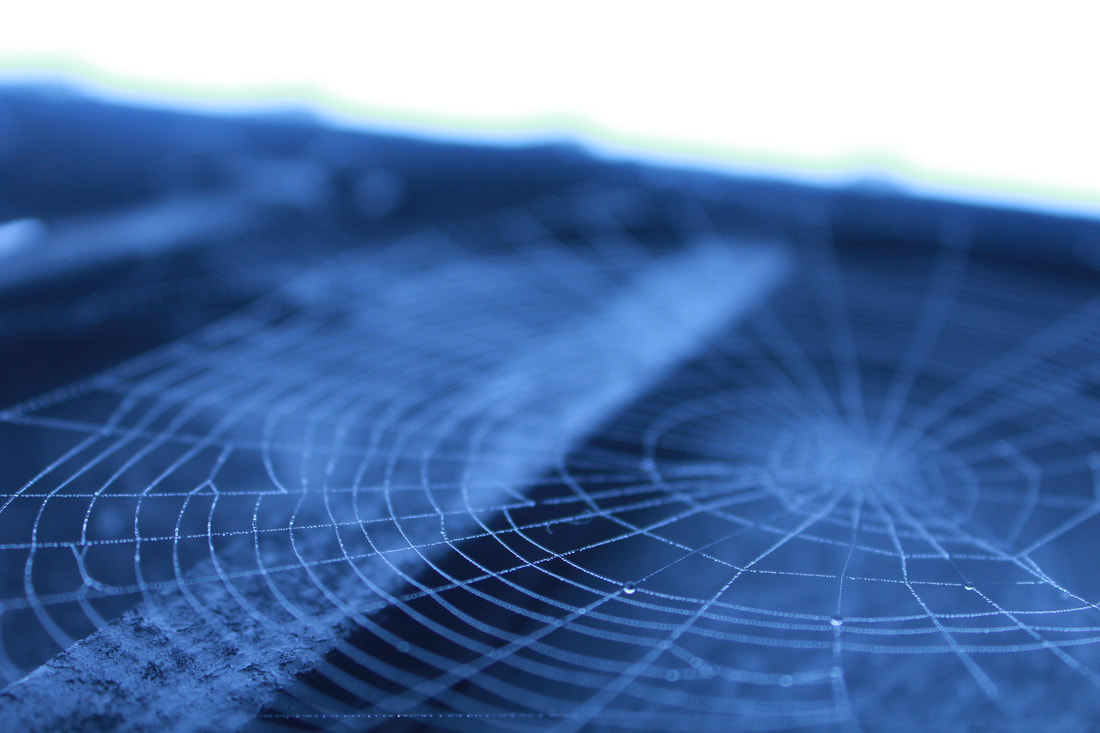
My best and worst images
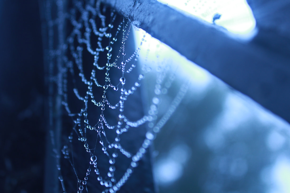
This image is my best image because I used the rule of thirds, the image makes you draw eyes to the bottom right of the image because of how clear it is, and how the image only focuses on the droplets on the cobweb, the image isn't dull because of my use of the tungsten light which gives it the blue effect.
|
This image is my worst image because it has no qualities, the picture is dull and you can barely see the the spiderweb, I didn't use a light setting which is the reason to why the picture is so dull and low
|
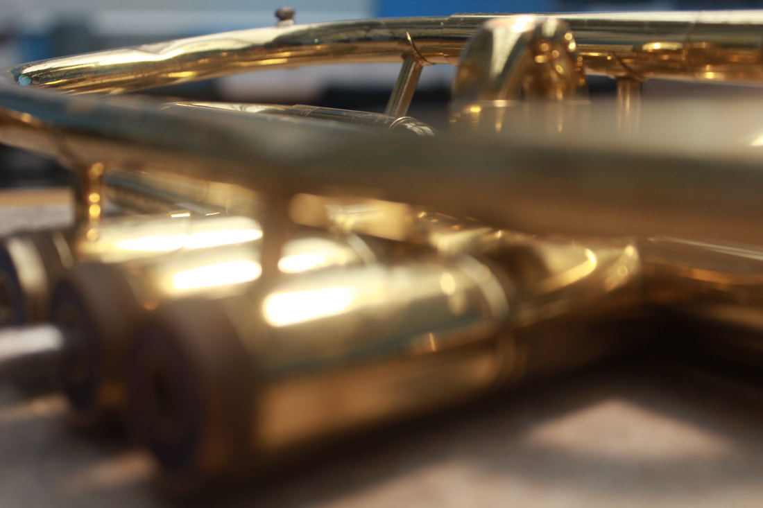
Man Made Textures
Trambone
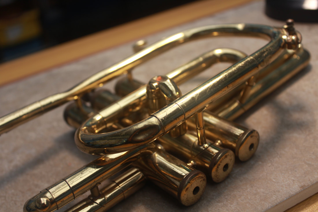
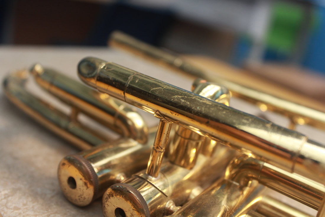
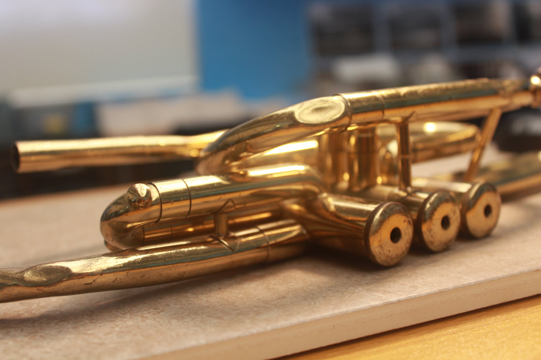
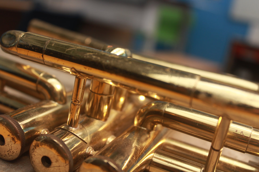
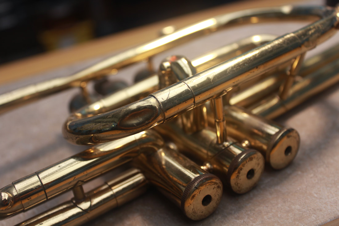
My best and worst images
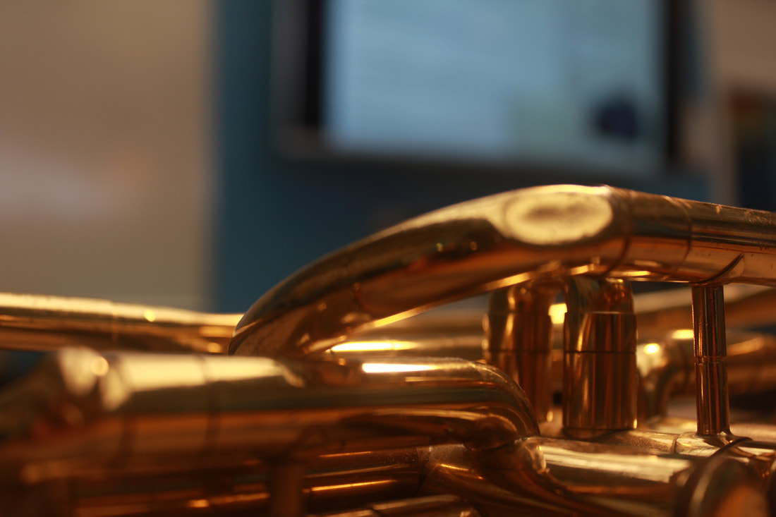
My best image, I picked this image as my best image because of the focus, the image really focuses on the main object of the image, I also class this as my best image because of my choice in light setting, I can just tell by looking at the image that this is set on fluorescent light because the image has a lot of warmth. This image is also my best image because of the field depth, the image has a blurry background which means that the field depth is really small meaning the depth settings is at f5
|
My worst image, this is image is my worst image because the image is blurry at the wrong spot, you can's exactly see the main object of the image which is distracting making your eyes wonder off from the image.
|
Metal Tree
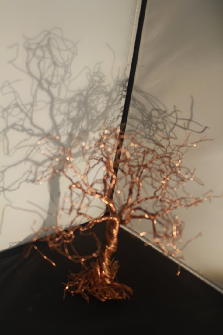
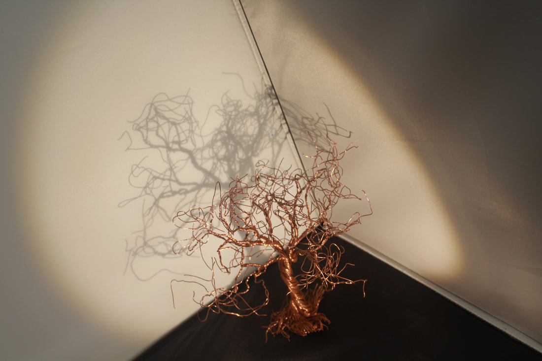
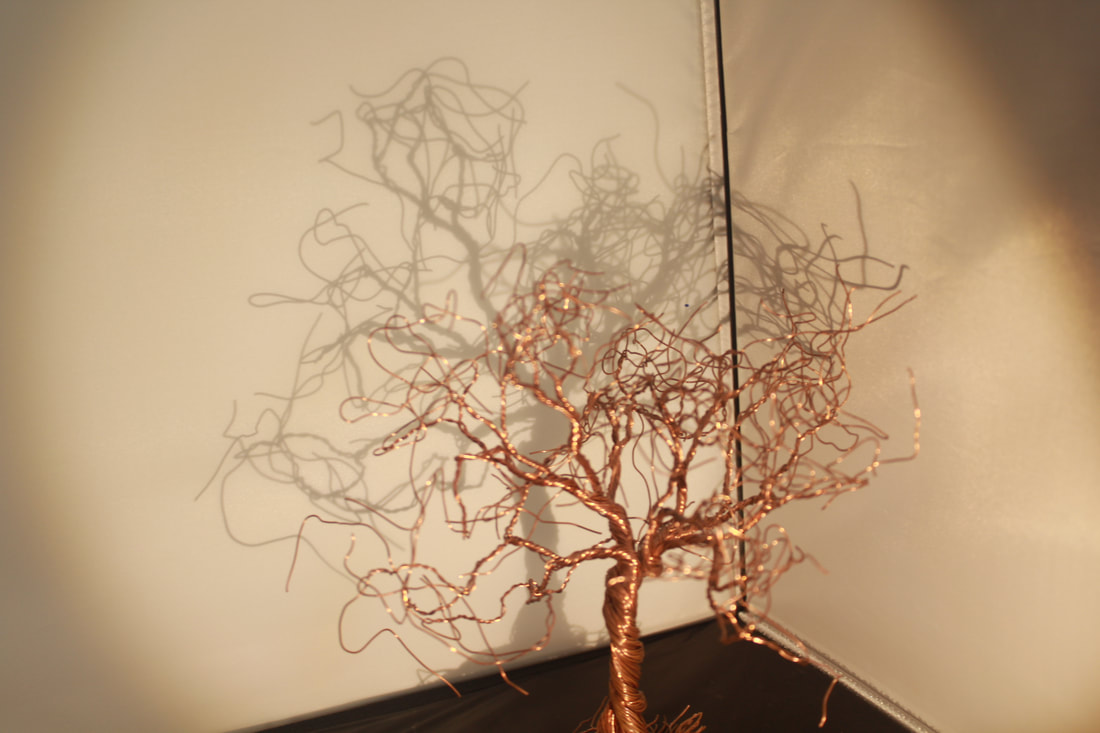
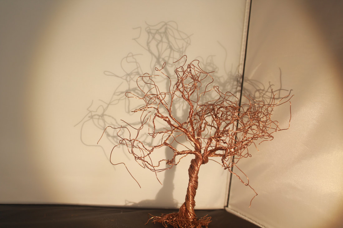
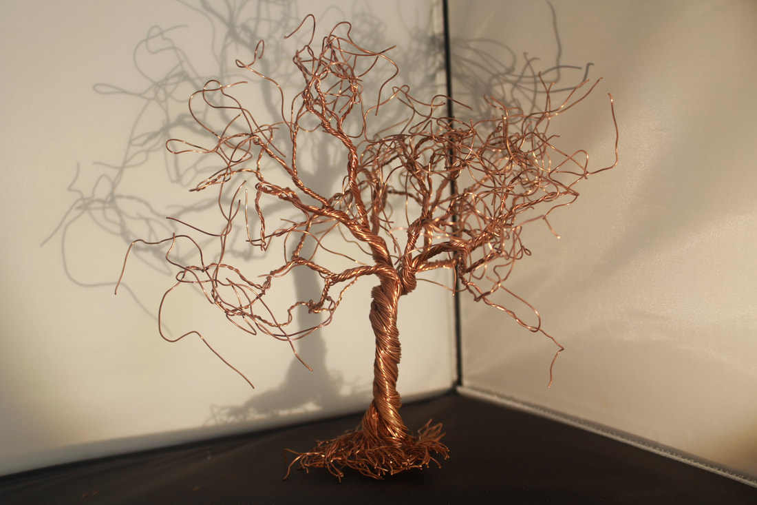
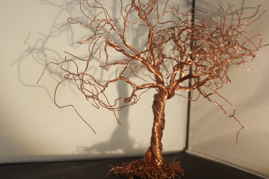
My best and worst images
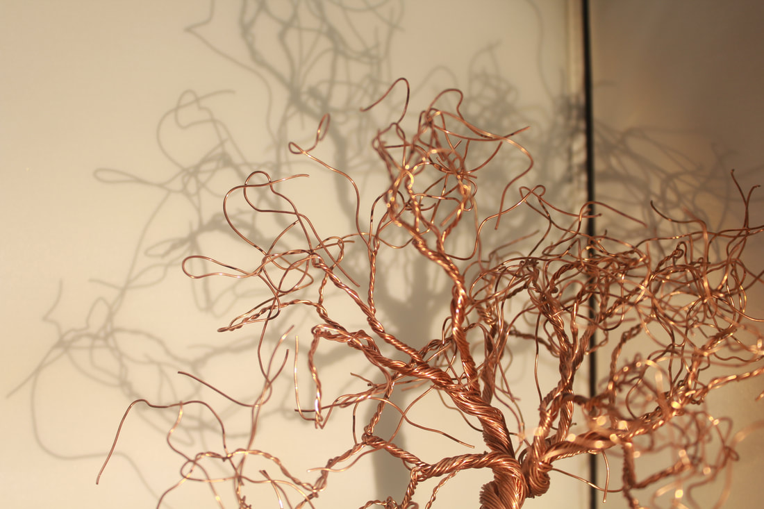
My best image because I used the rule of thirds, the image makes your eye draw to the middle of the image. I can also tell that this image is set on fluroesent light because the image has a lot of warmth which makes it look very soft and smooth, the image doesn't go blurry instead you are able to see the shadow coming off the metal tree making the image look ten times better.
|
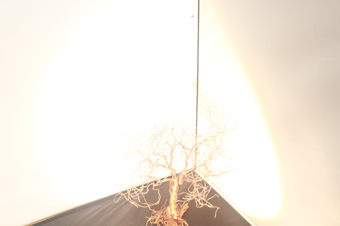
My worst image, I chose this image as my worst image because you are not able to see the main object of the image which is the tree and you can only see light making you wonder off the image because the image has nothing interesting about it.
|
Screws
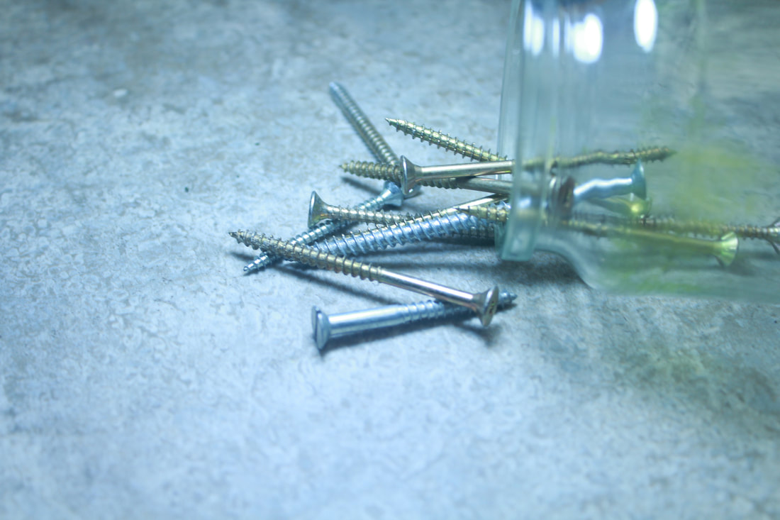
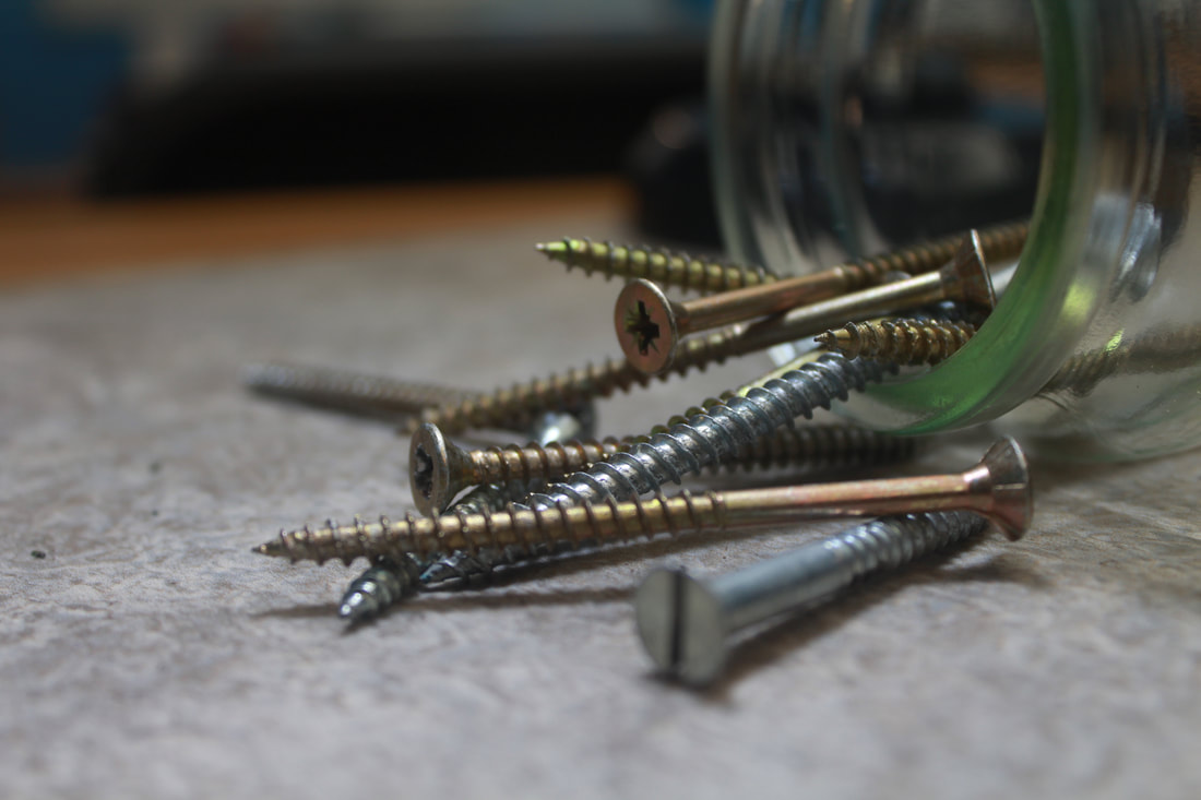
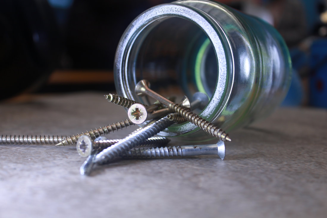

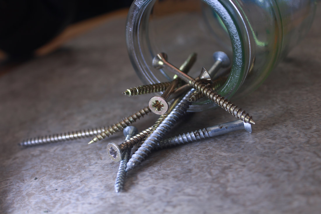
My best and worst images
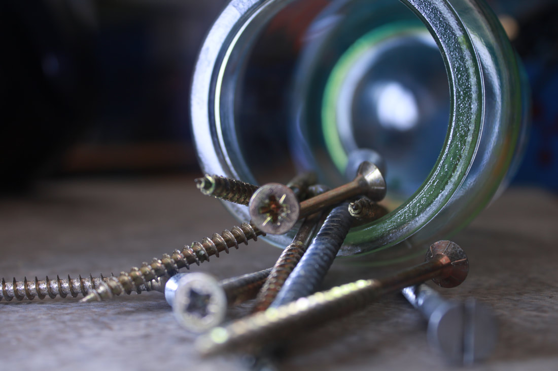
My best image, I chose this image as my best image because of the focus, the image is very clear on the main object of the image. I can just see from the image that I used tungsten light because the image has a blue tone on it. I also find this image good because of the depth of field, the image turns blurry very fast making you just focus on the main aspect of the image.
|
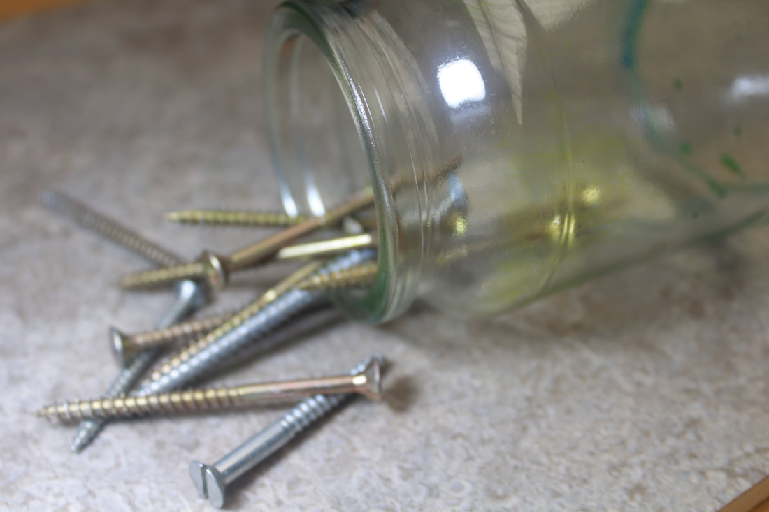
My worst image, I chose this image as my worst because it's very dull, the image has no lighting effect on it making it look very boring, the image is also shot at a very unappealing angle making you focus on the wrong thing in the image.
|
Shoot 4: Monday
Silver beads
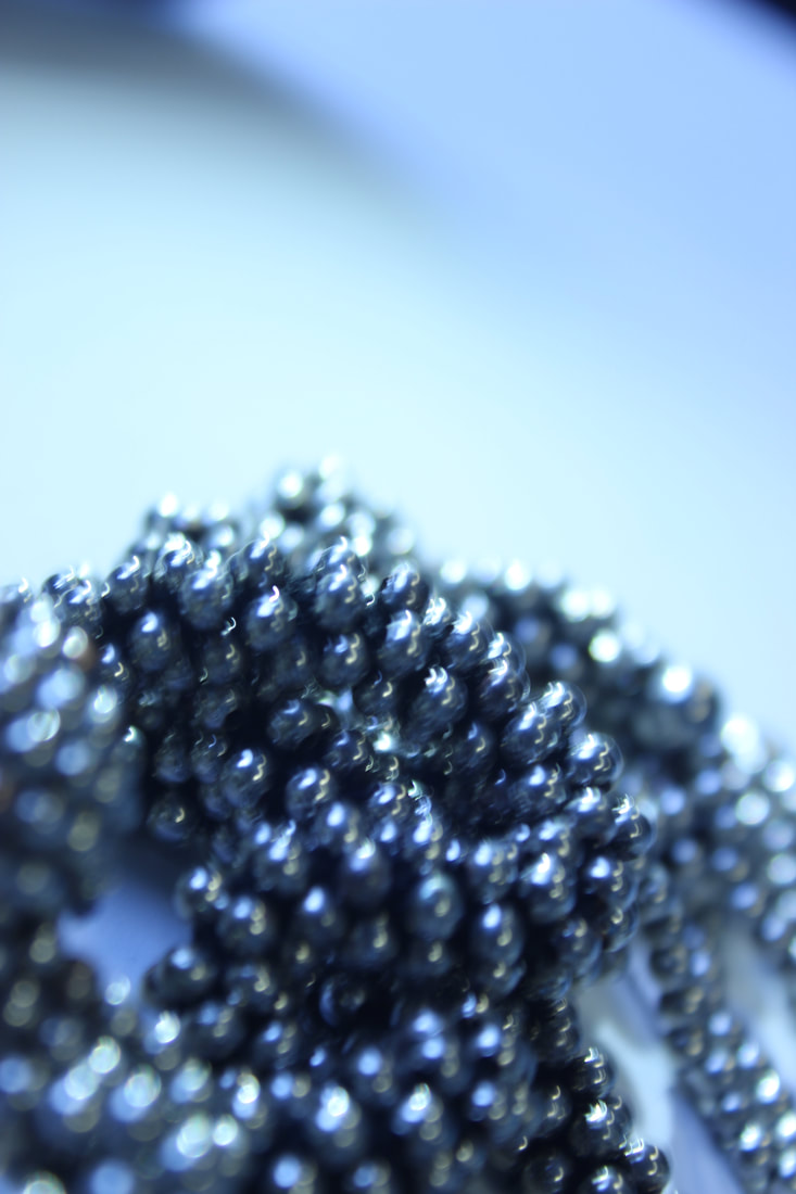
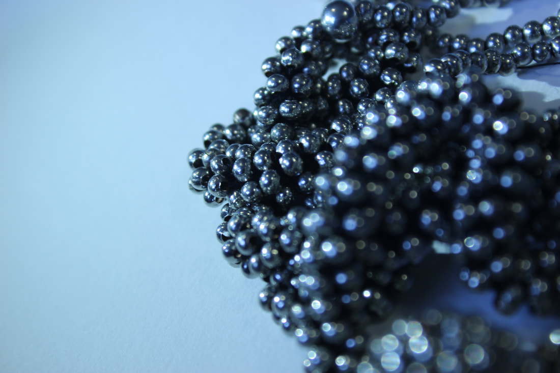
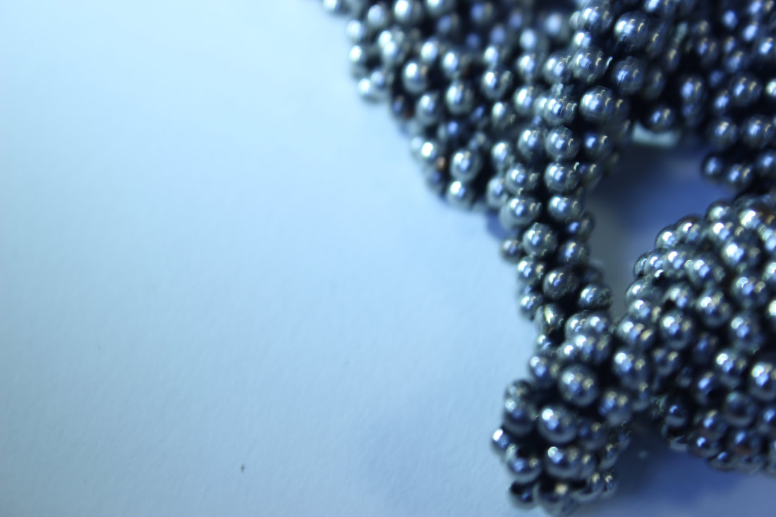
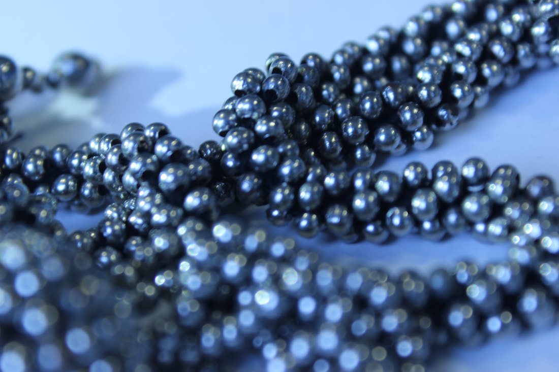
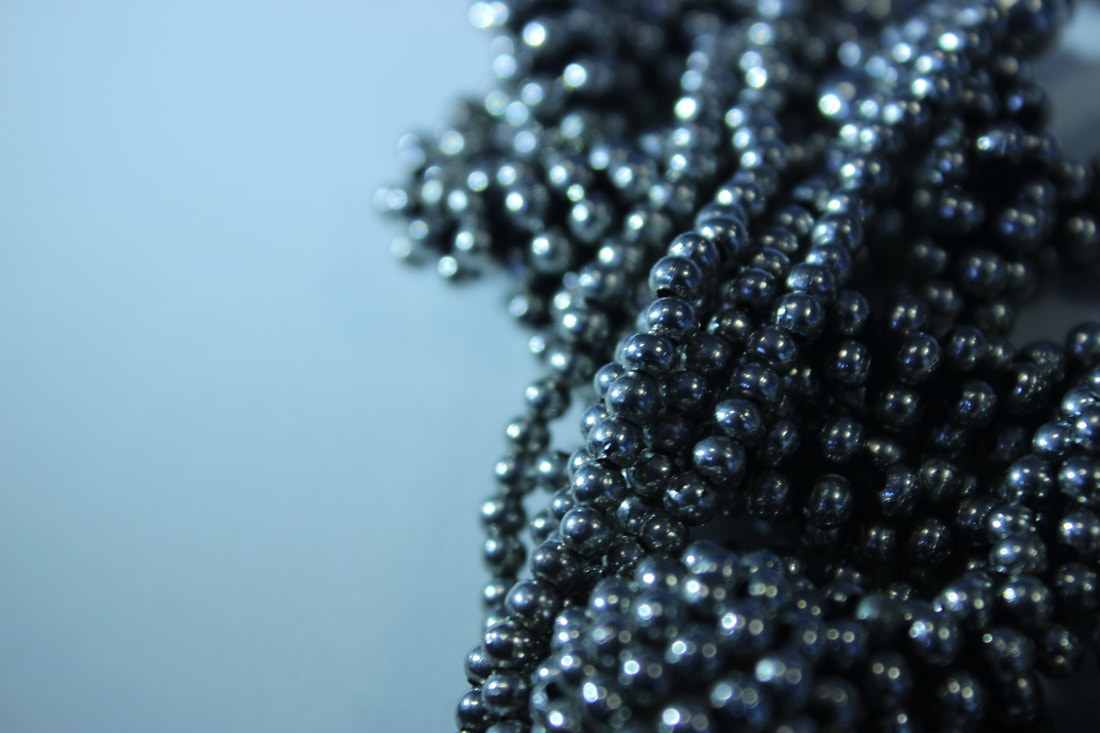
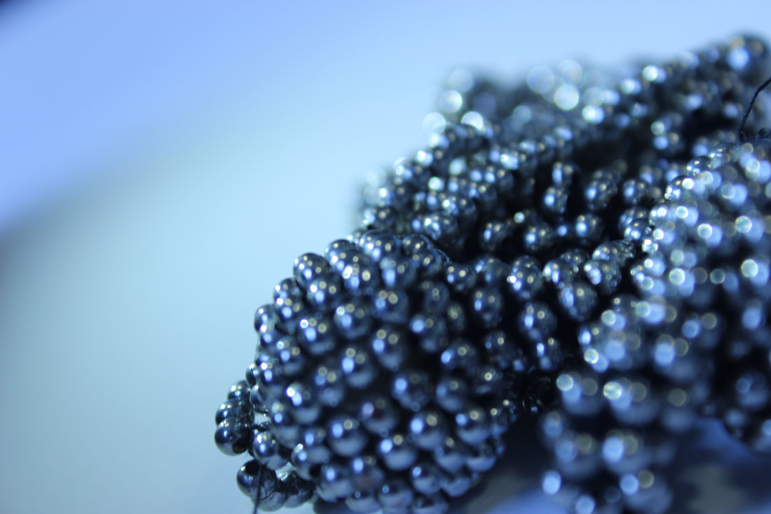
My best and worst images
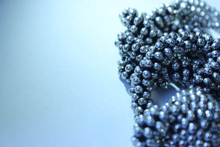
This is my best image because of my choice of angle, the main object of the image is at the rights side and the camera really focuses on that and it quickly goes blurry when it goes off the beads
|
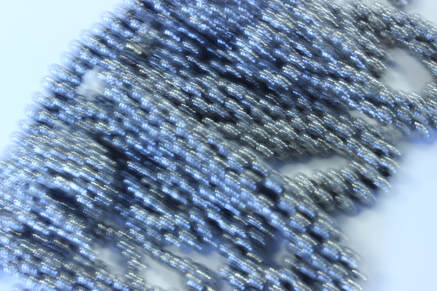
This is my worst image it's blurry and you can barely see anything. Unlike the other image it doesn't have rule of thirds or an f stop or any effect properties which makes this image look poorely taken.
|
Jewel Box
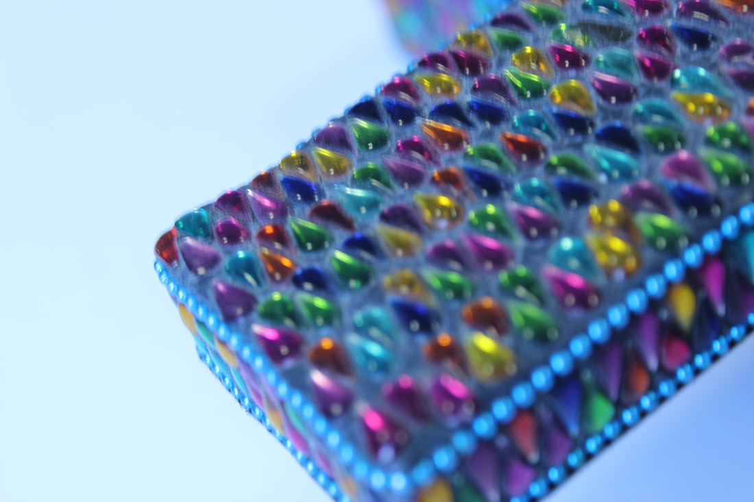
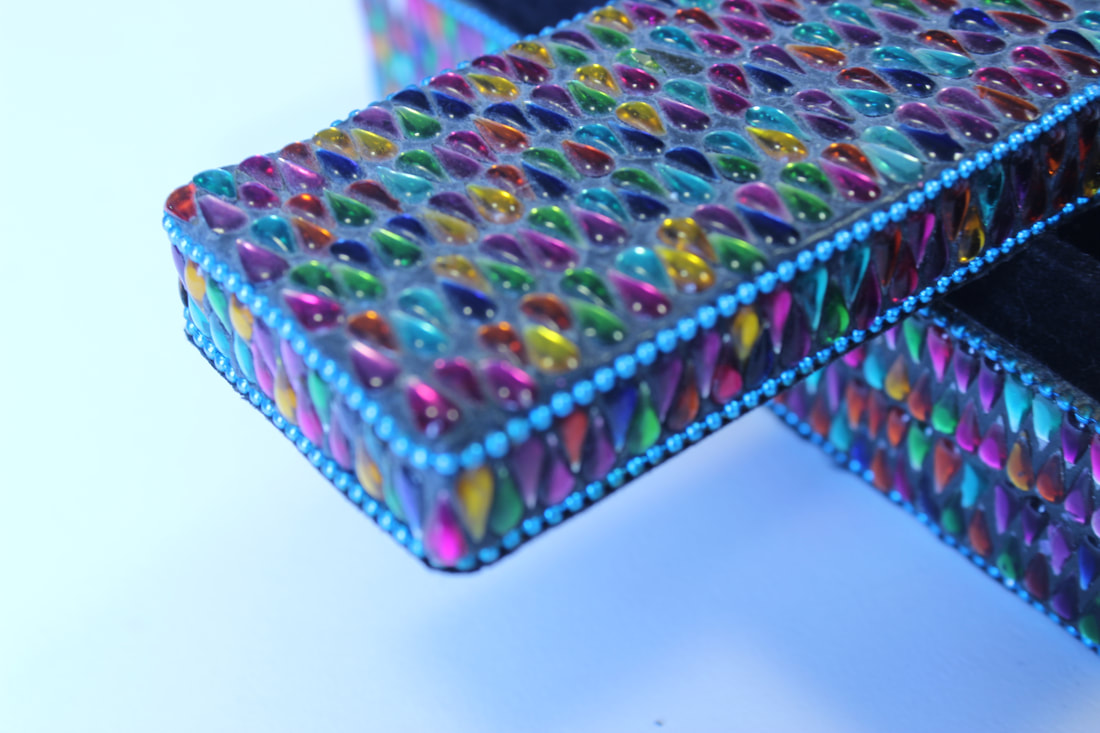
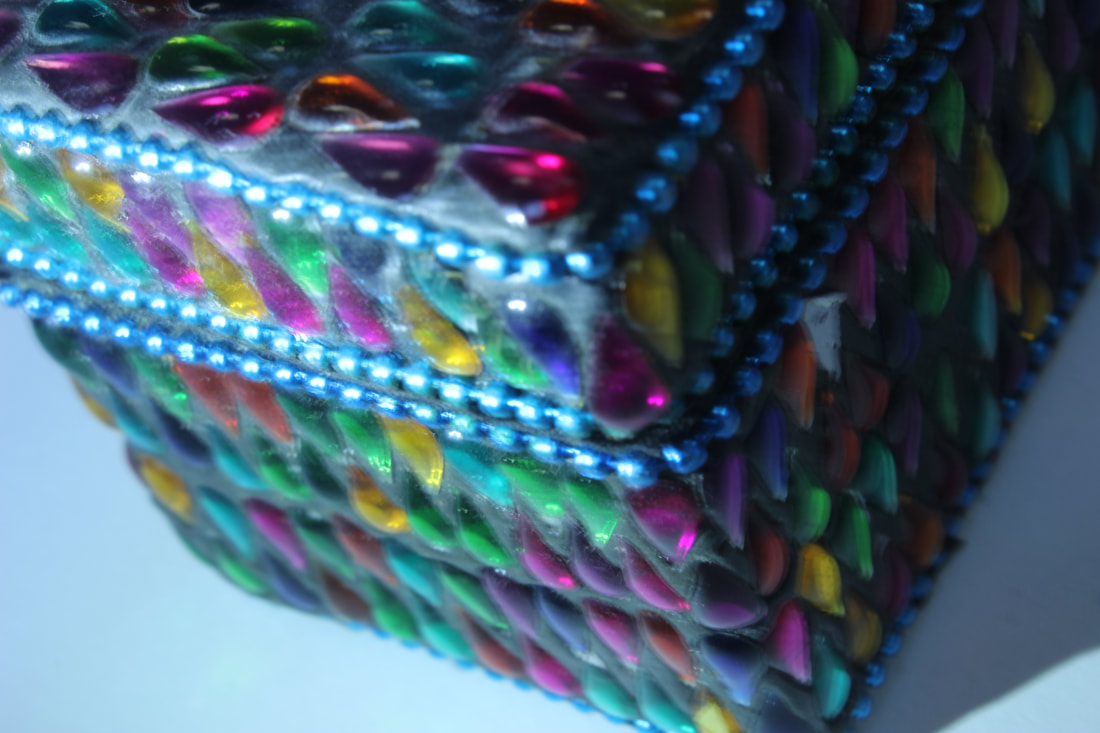
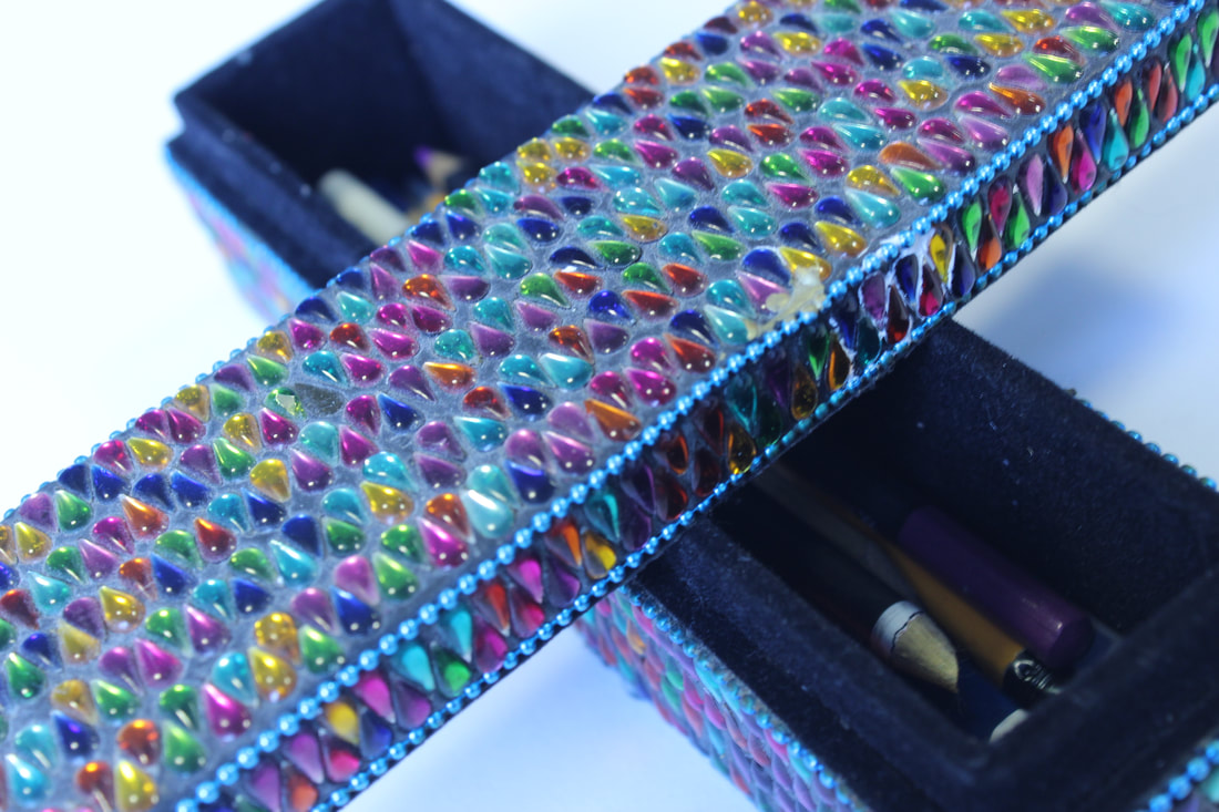
My best and worst images
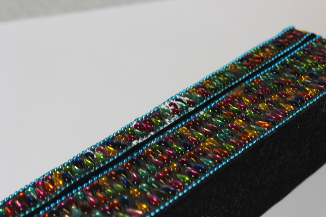
This image is my best image because the image almost covers the screen allowing your eyes to scan through every property. I didn't use a lighting effect on this image but the image is still very clear.
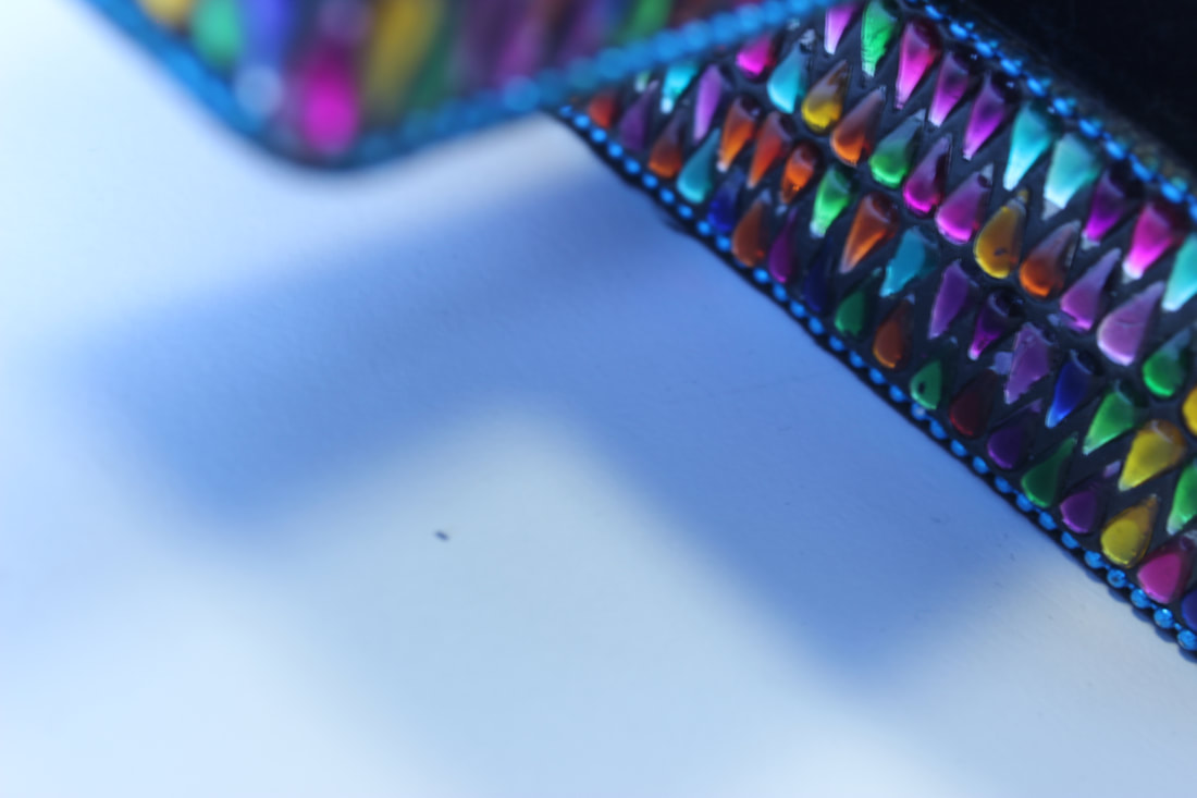
|
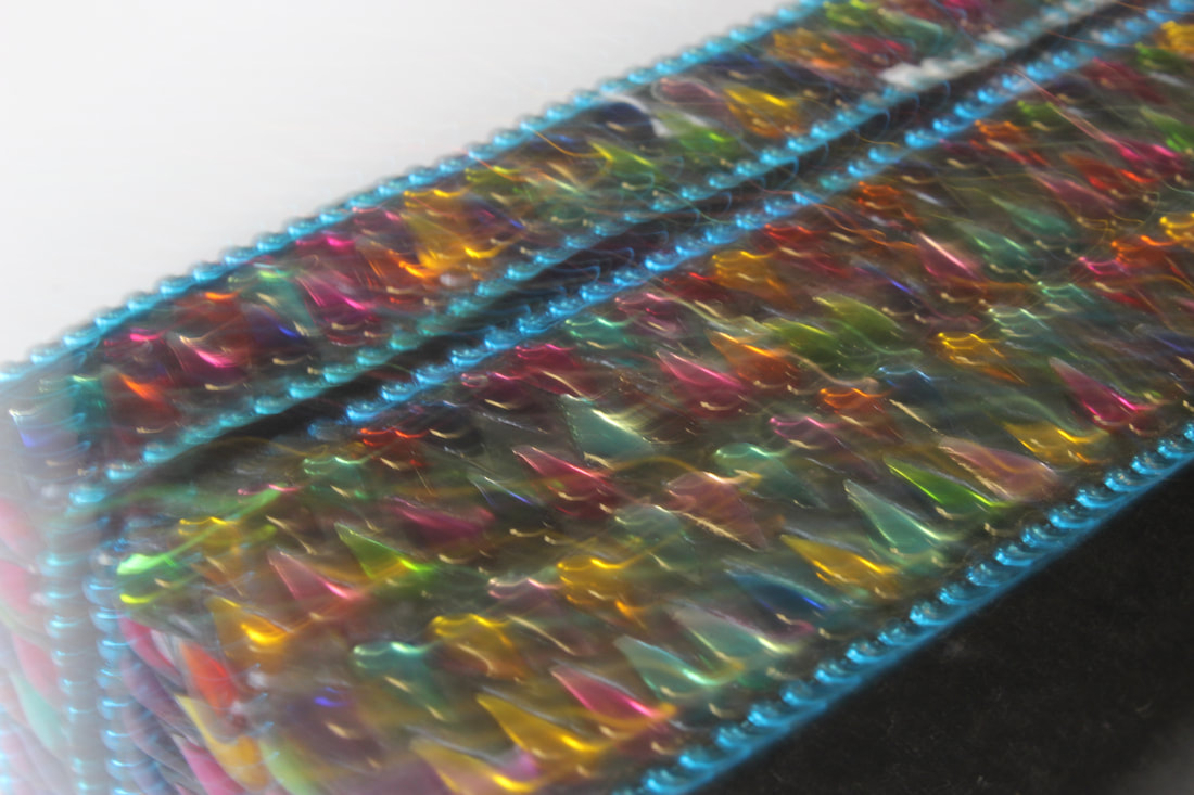
This image is my worst image because the image is very blurry and you can't see any properties of the image. There also isn't good lighting which makes the image look bleak and sloppy. This image isn't professional and unappealing.
|
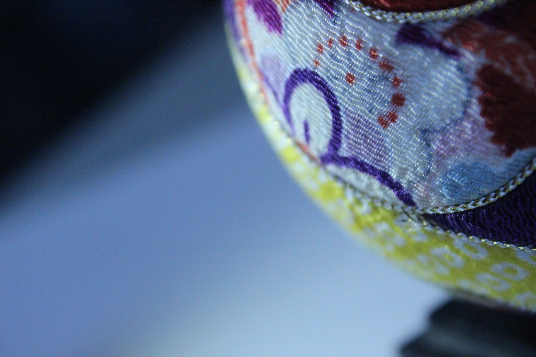
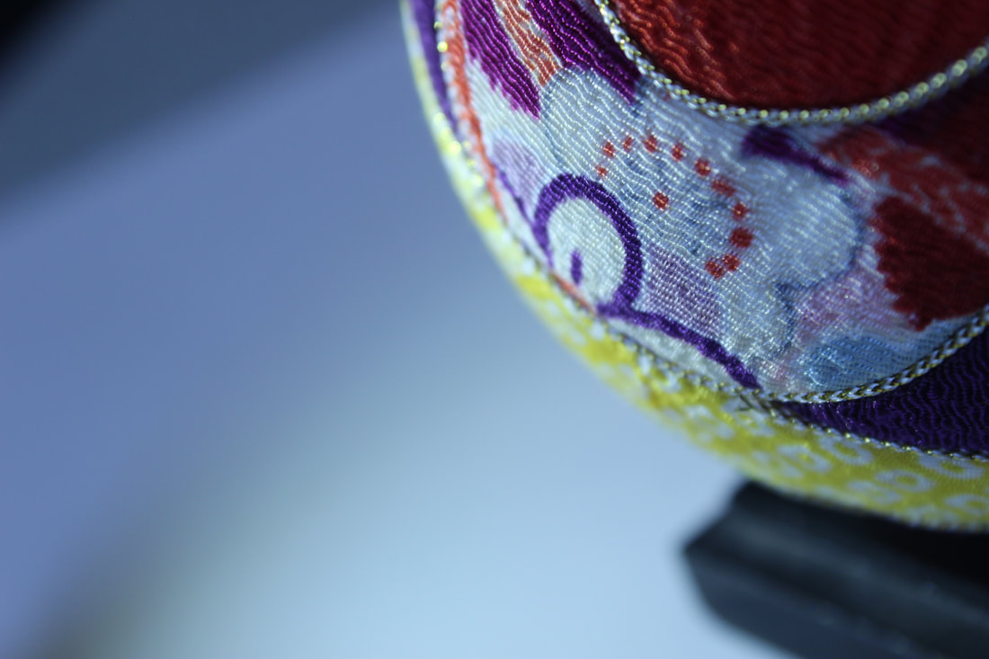
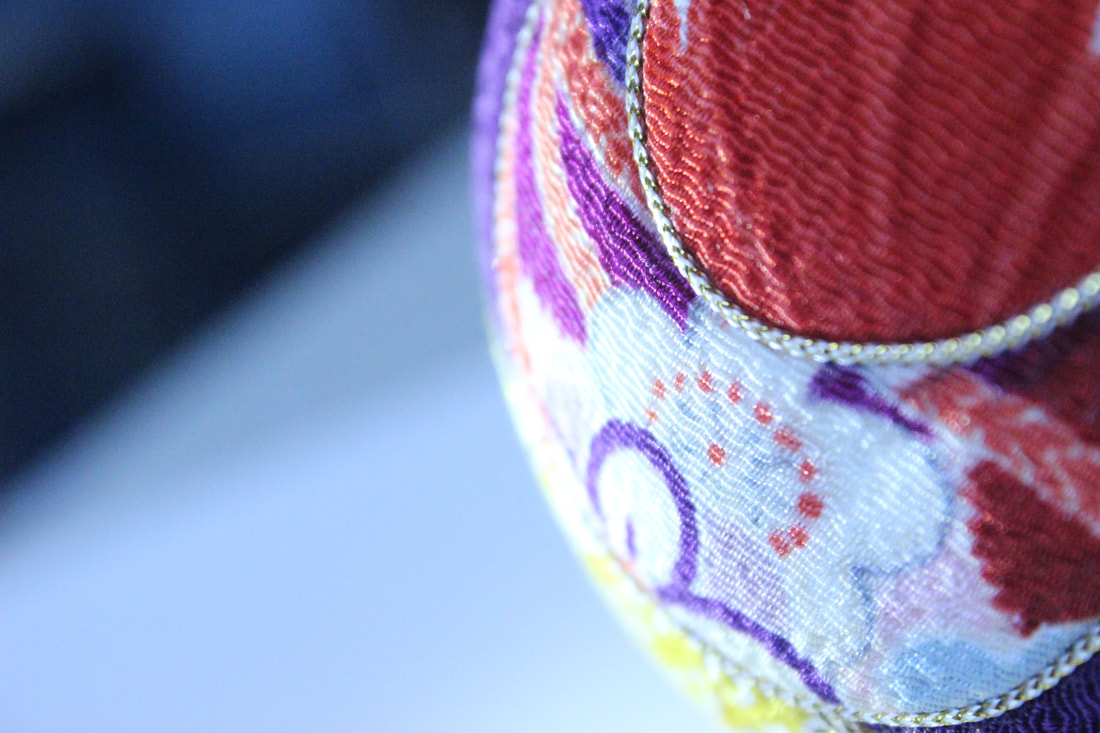
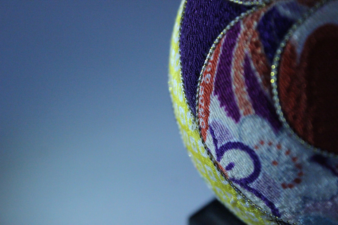
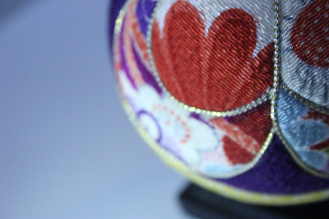
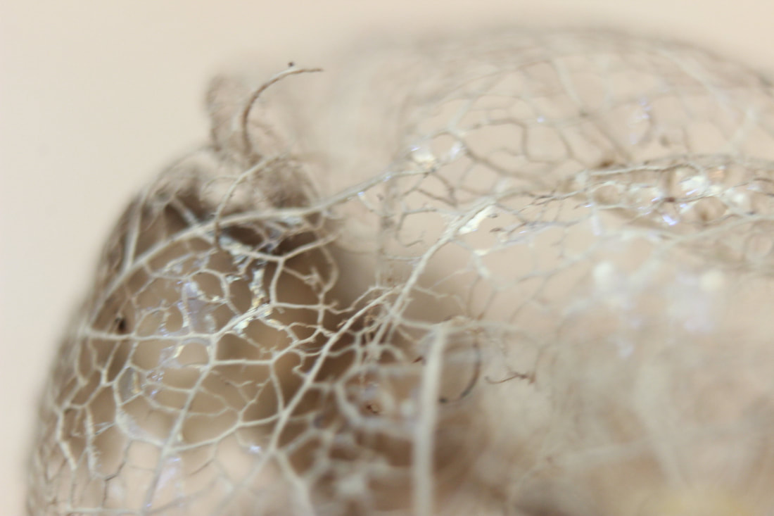
Fabric ball
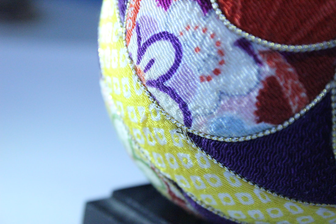
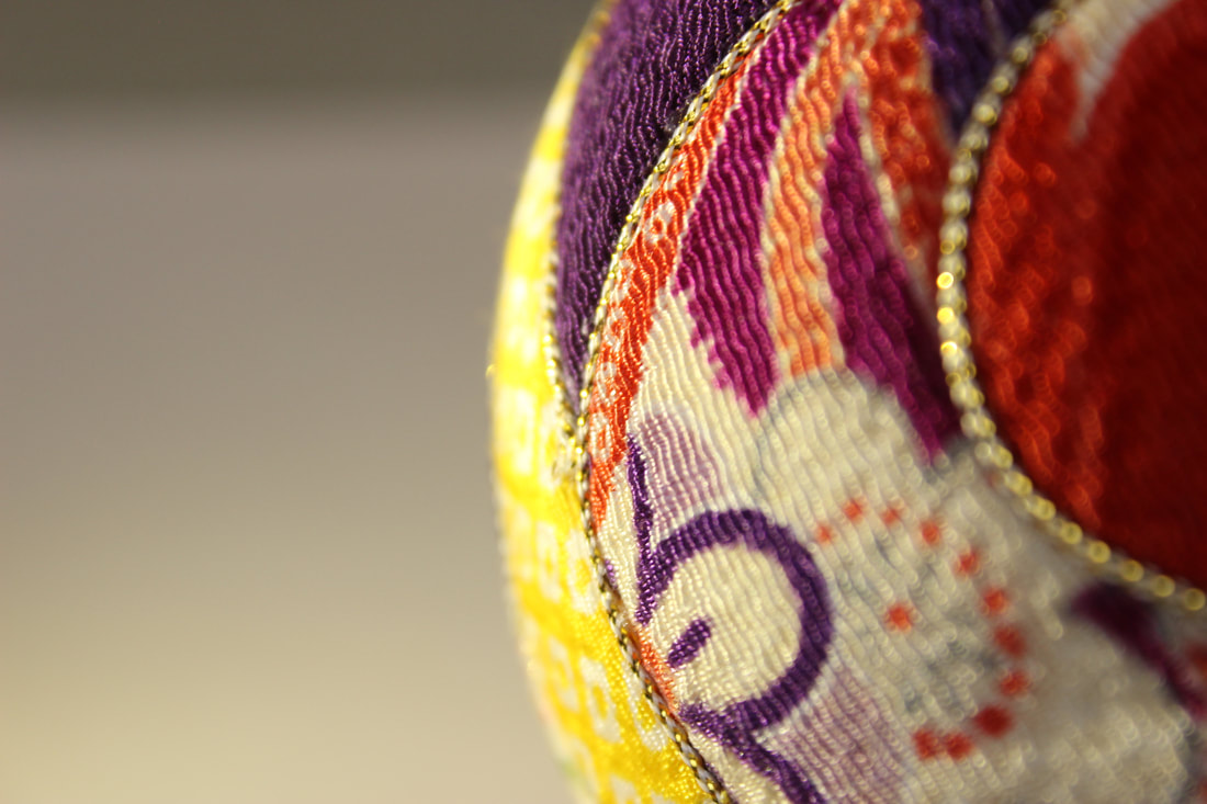
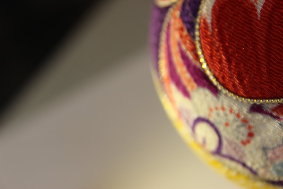
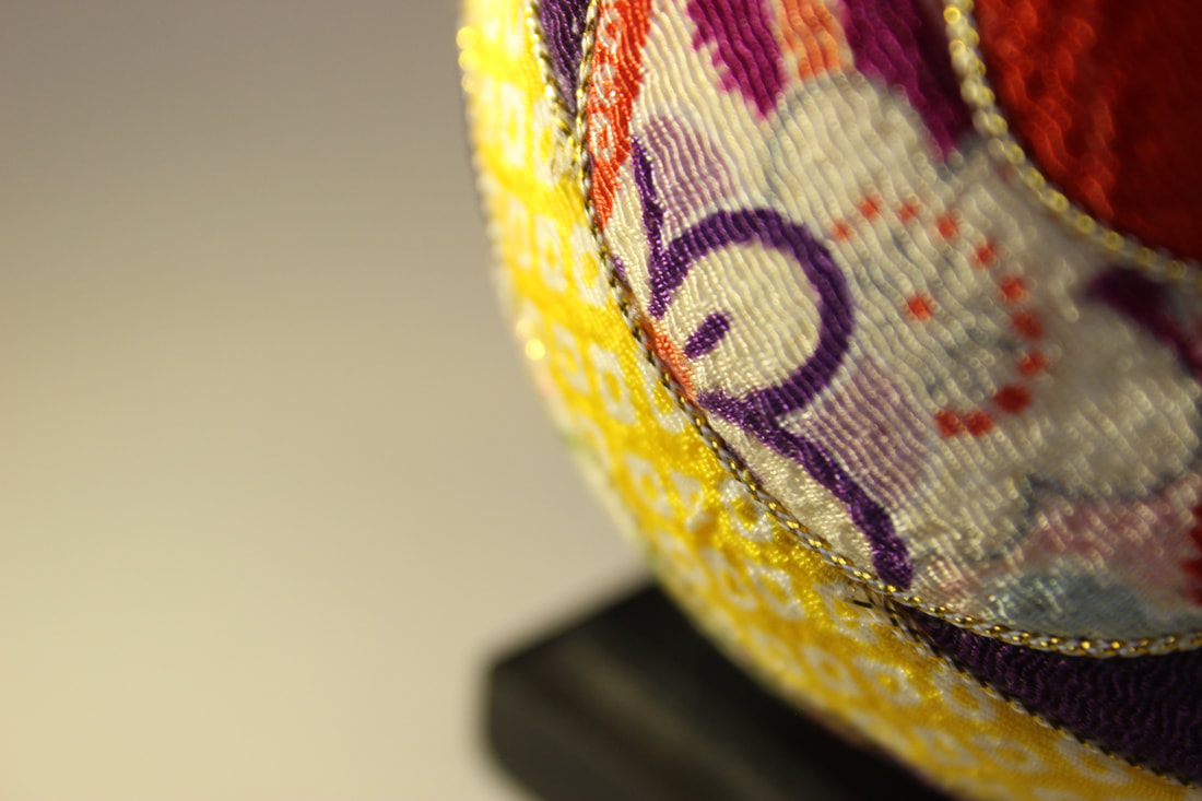
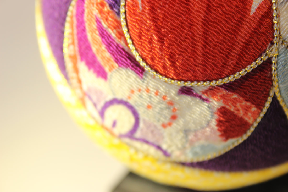
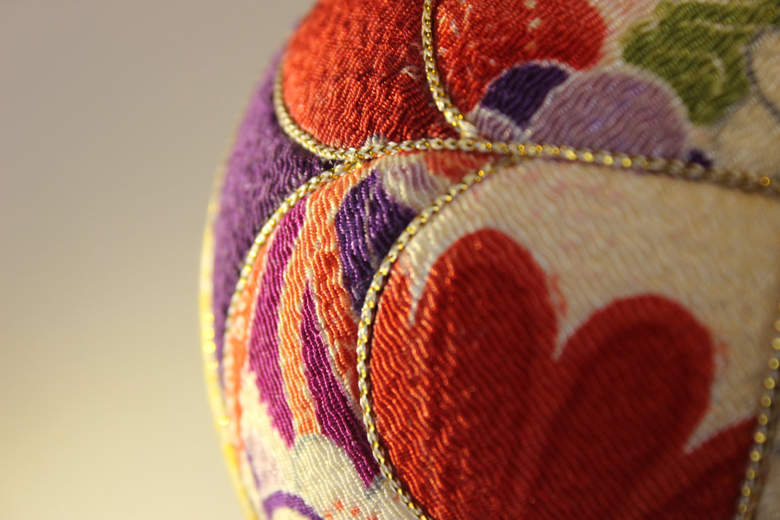
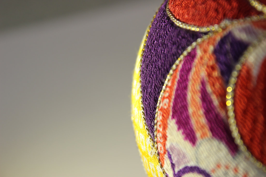
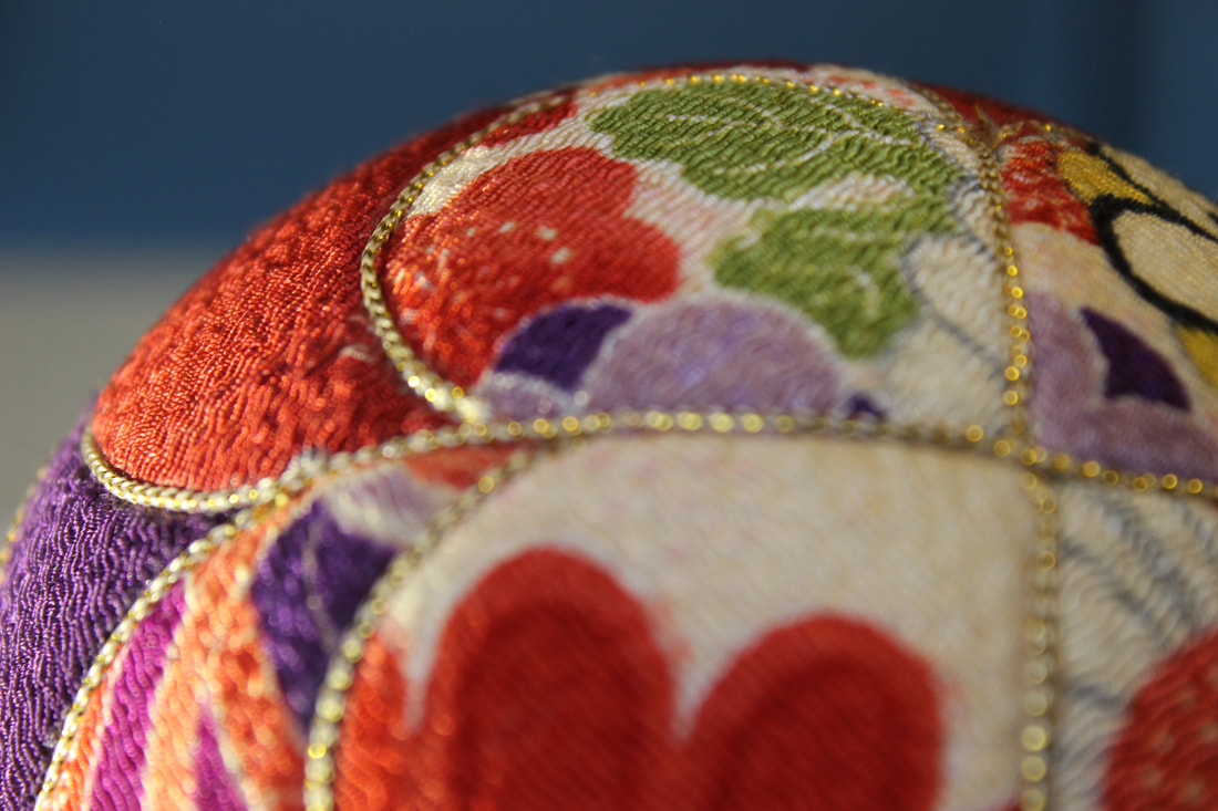
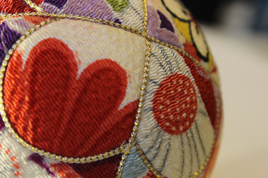
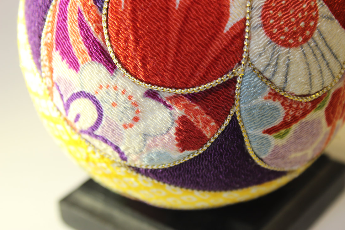
My best and worst images
I believe that this is my best image because the quality is very clear and the background is blurry giving the subject a more sharp and crisp look. The WB is on tungsten light giving the image an eerie look to a certain extent. The reason why there is a blurry background is because the F stop is high.
|
I believe that this is my worst image because the subject is blurry due to the F stop, which was on about F5. The subject isn't clear and crisp, not allowing you to see the intricate design of it.
|
Fan
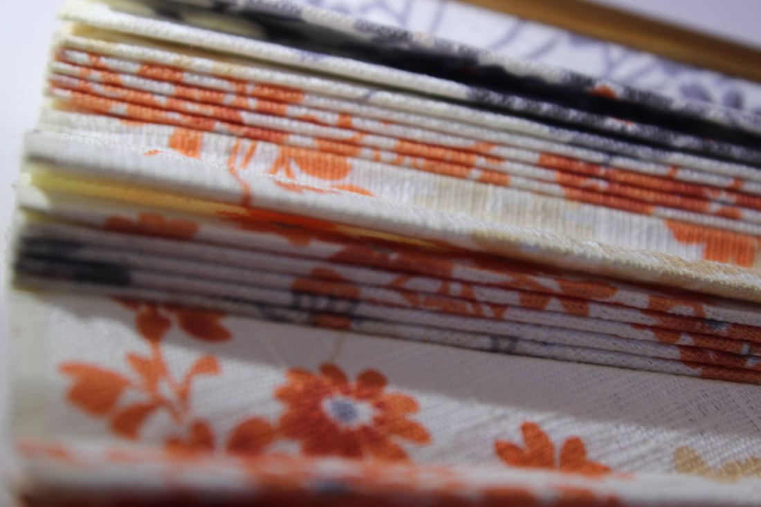
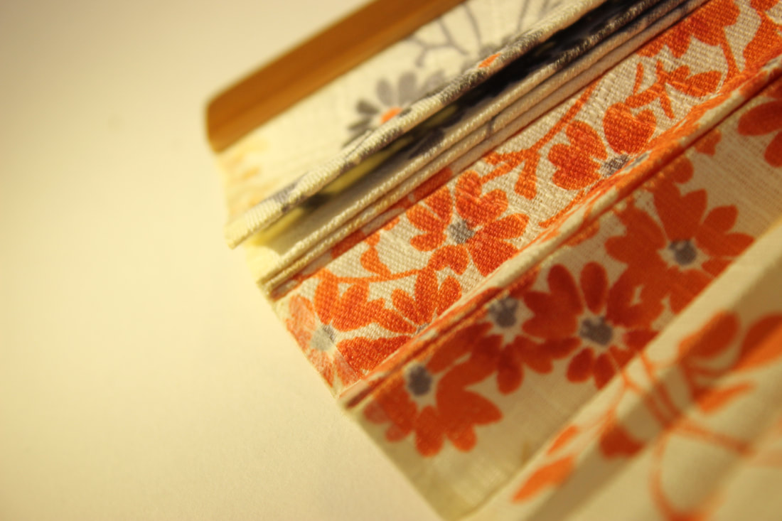
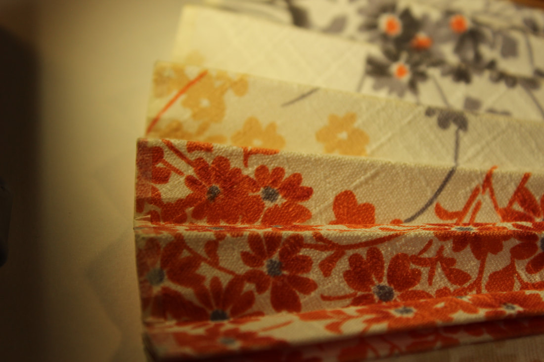
My best and worst images
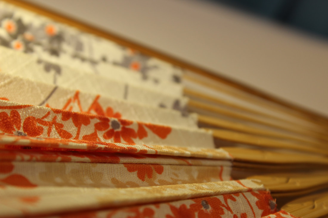
This is my best image because the subject is clear and the background is blurry, since the F stop is high. The lighting also has a more warm and soft look, making the image look presentable.
|
This image is my worst image because the subject isn't exactly crisp and it's a little bit blurry miking the image look unappealing and not presentable. The lighting also isn't suitable for the subject since it's a fan.
|
Pins
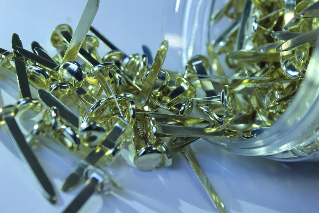
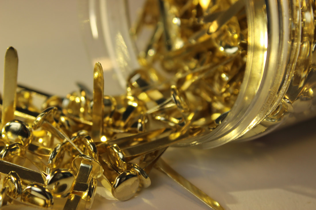
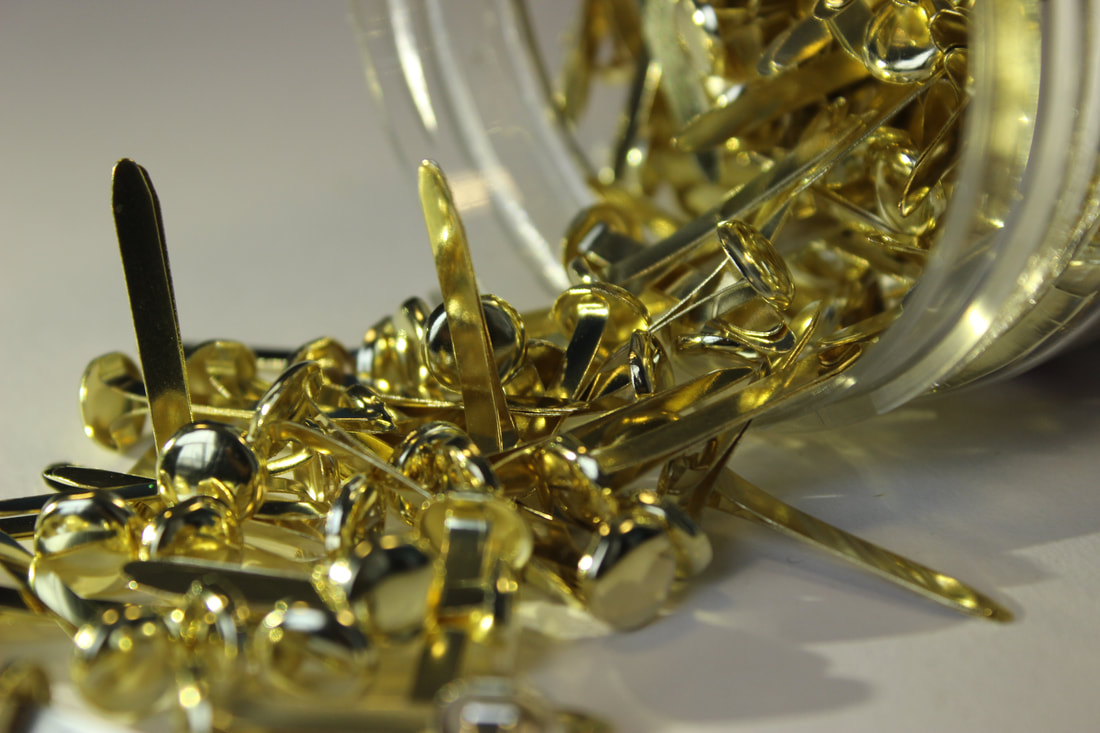
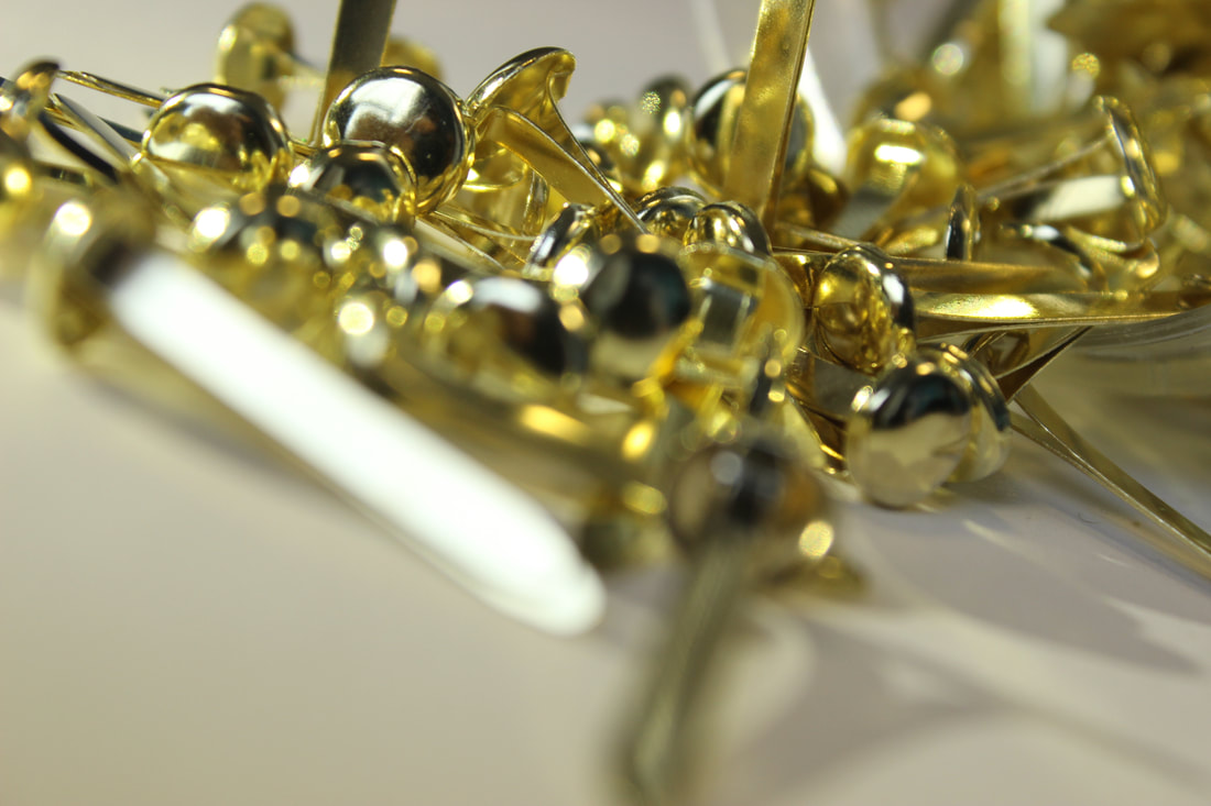
My best and worst images
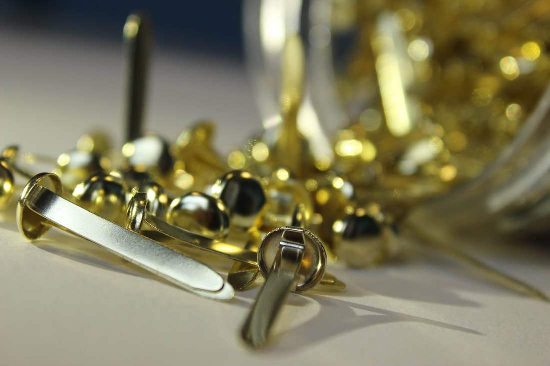
This image is mt best image because of the I used a high f stop which gives the image the blurry background and makes it look intersting and less boring. The lighting on the image also has a warm tone which makes it feel less cold and cruel which is something not eveyone would want to see on a website.
|
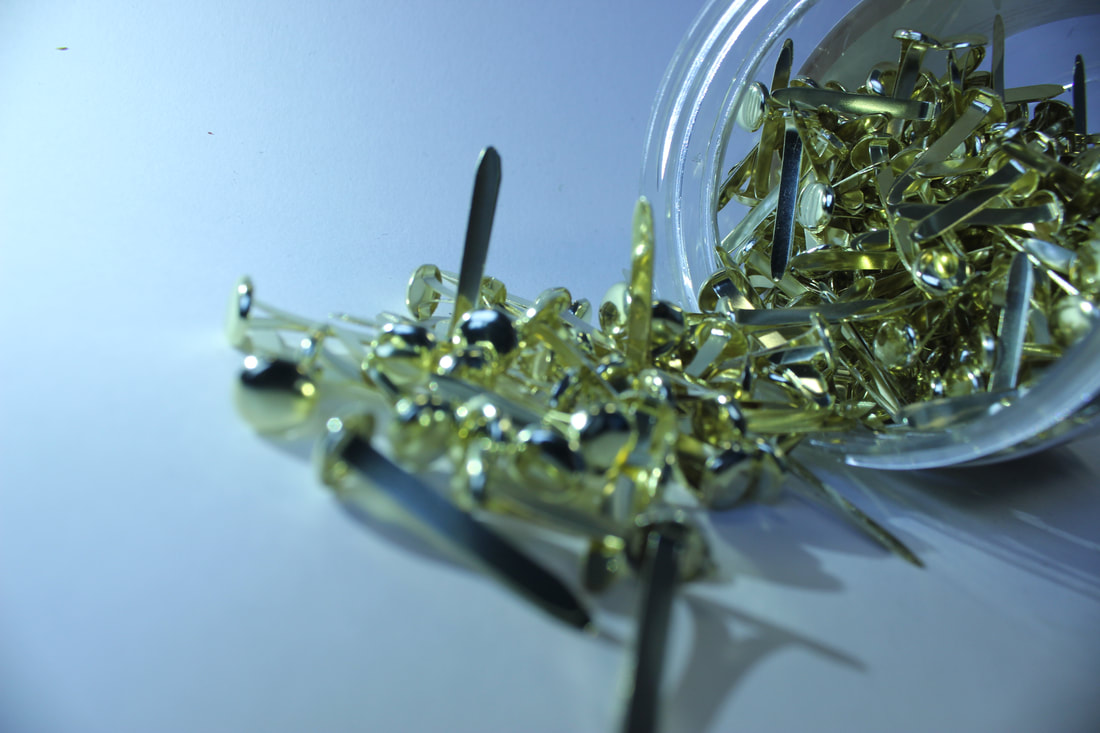
This image is my worst image because the f stop is low which makes the image look clear but the subject blurry, which is something that makes the image look unappealing, the lighting is also cold and cruel which is not presentable for a professional website.
|
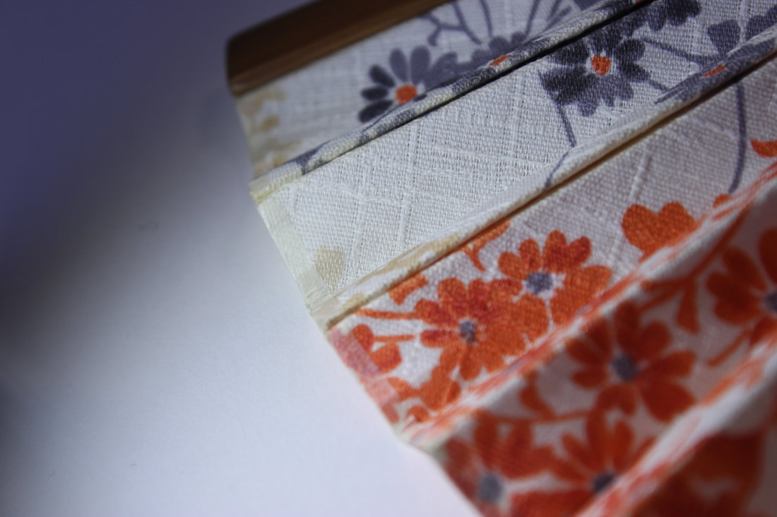
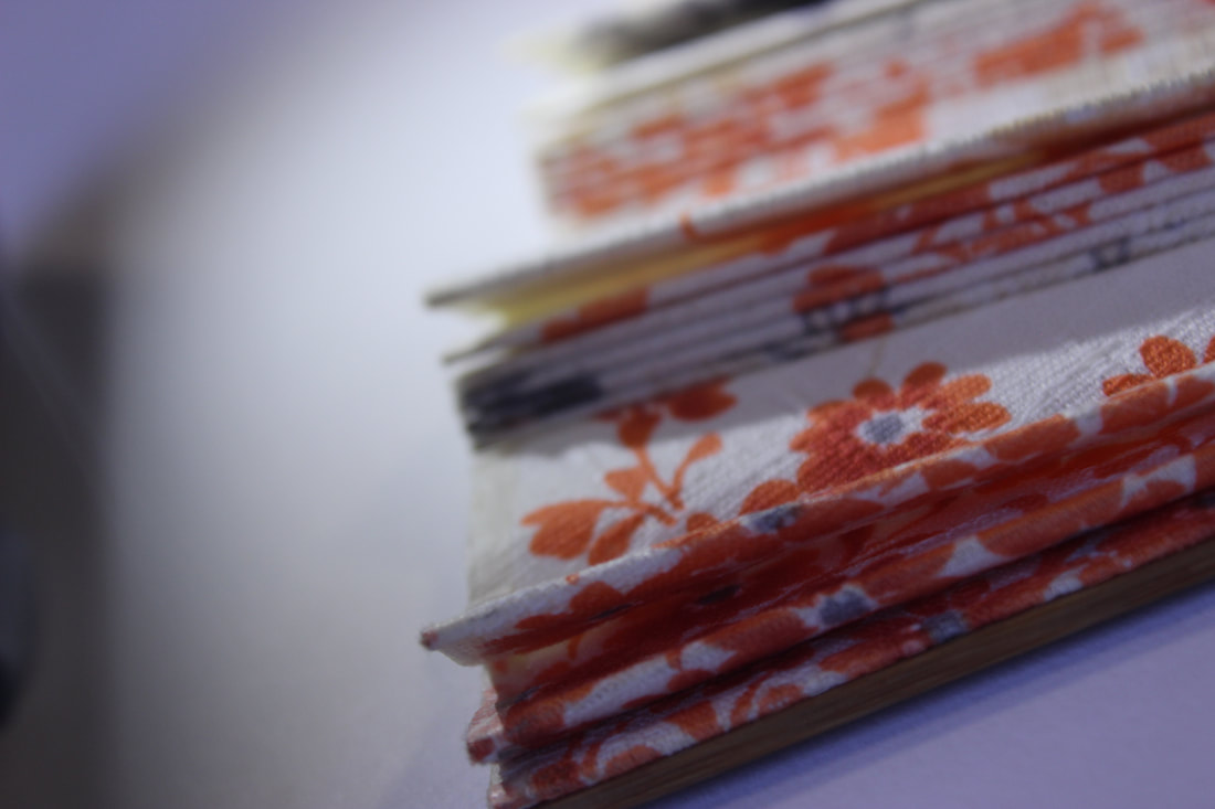
Crumpled newspaper
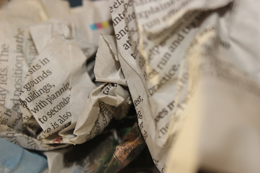
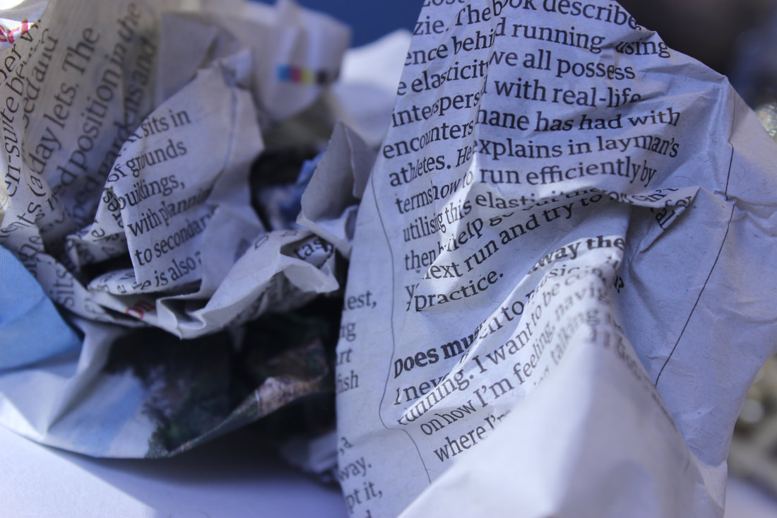
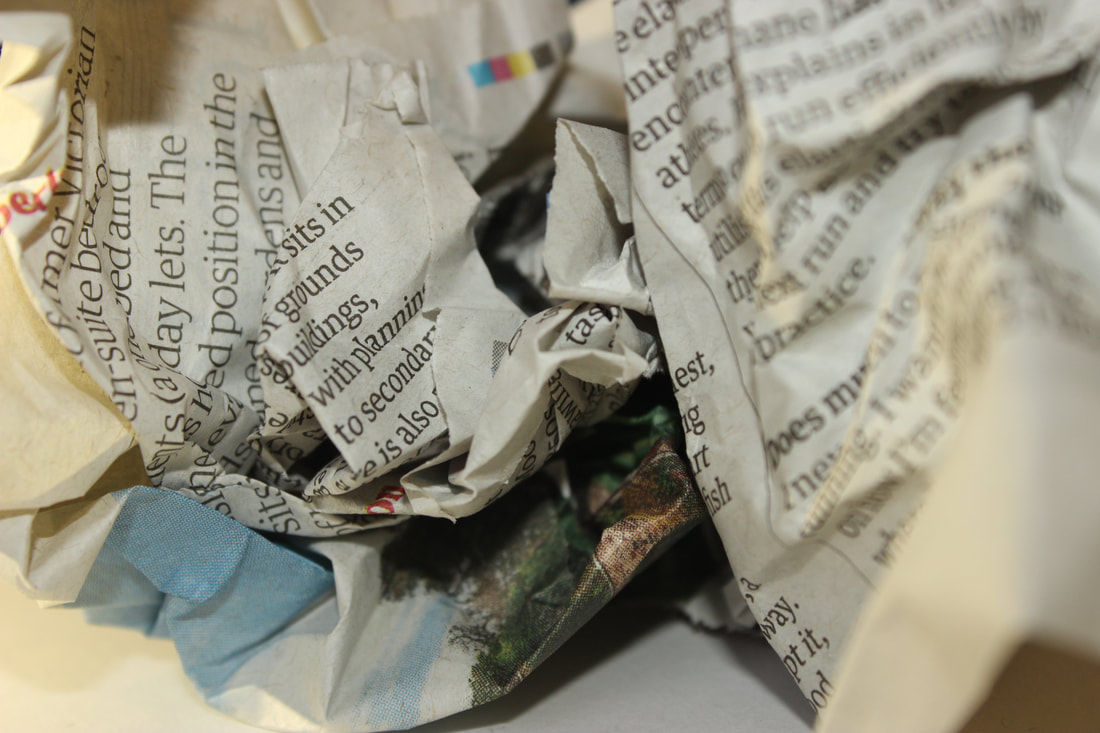
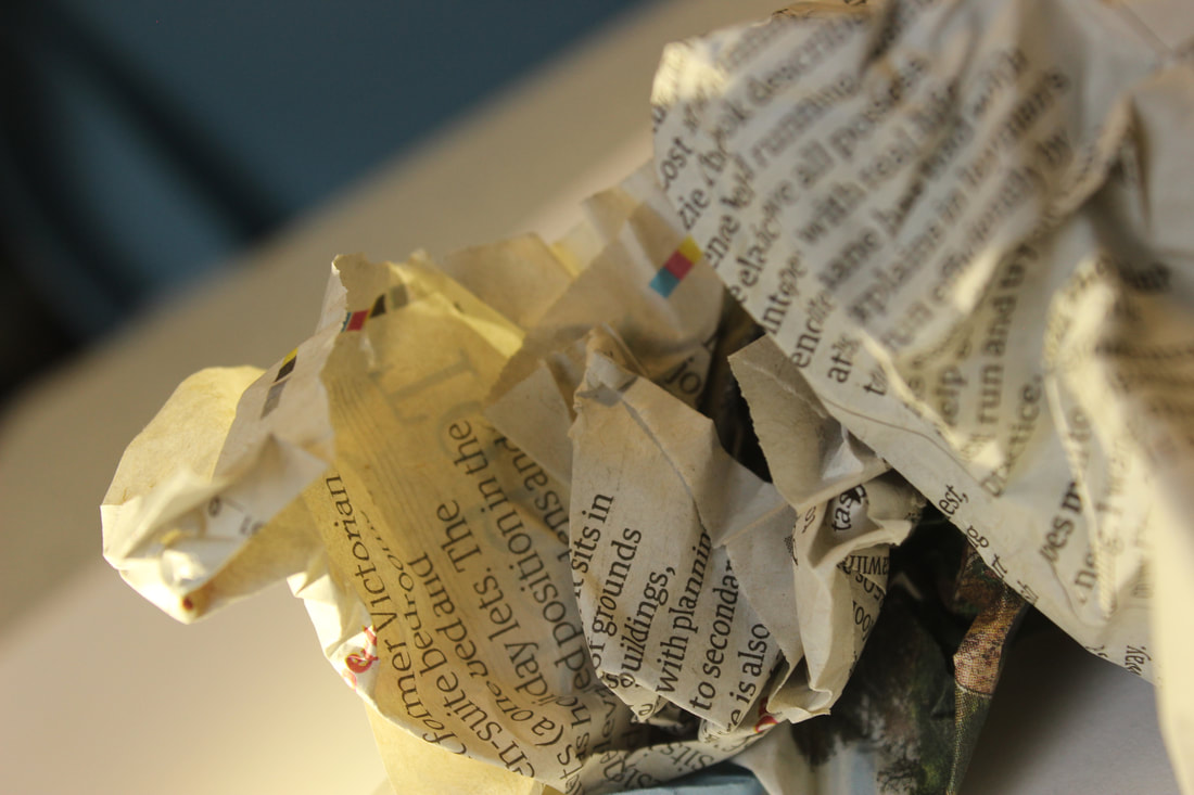
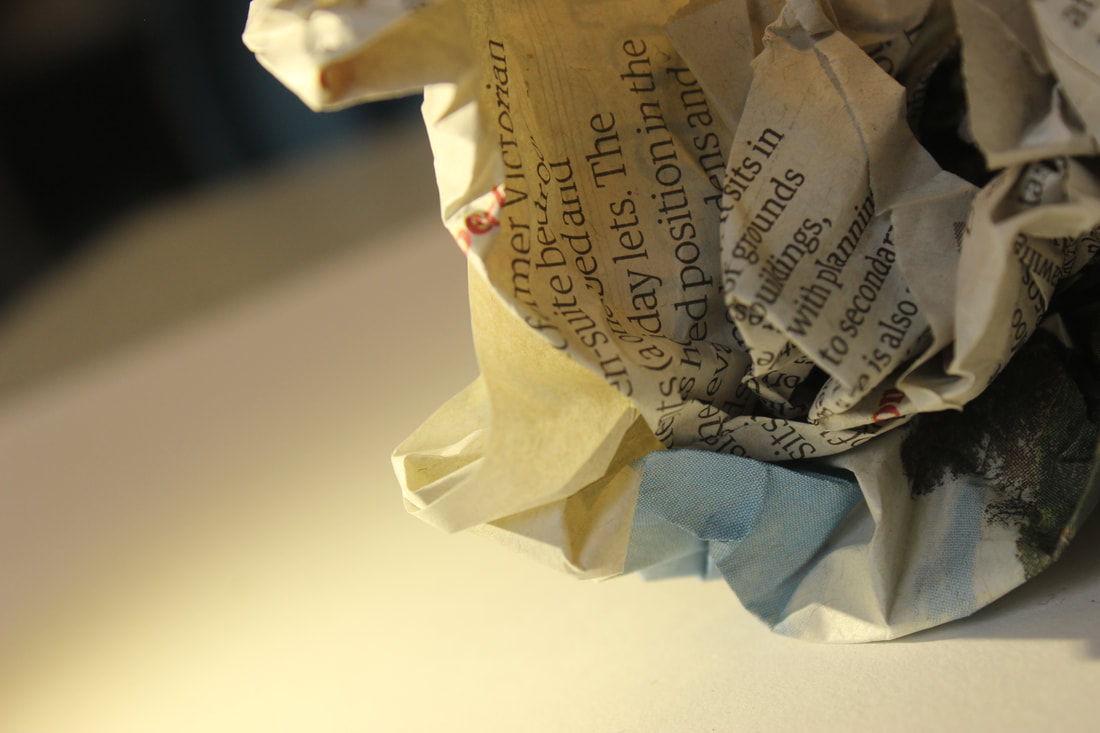
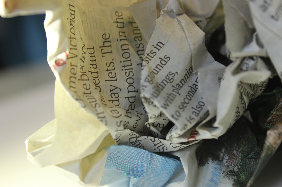
My best and worst images
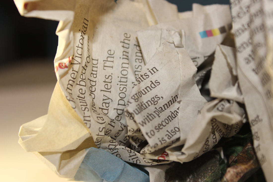
I believe that this image is my best image because it looks very clear, the subject is close up that you can see the newspaper in intricate detail which will look professional on the website. The lighting has a warm tone to it which also makes it look professional.
|
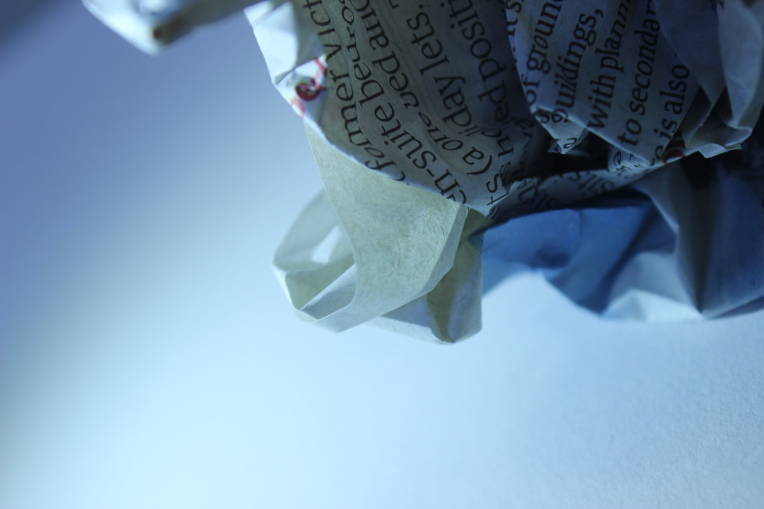
I believe that this image is the worst because the subject is barely in the image so it makes it difficult to critique it, it also looks as if it's intruding the image or the frame. The lighting is cold and cruel which again isn't professional for the website .
|
Shoot 4: Tuesday
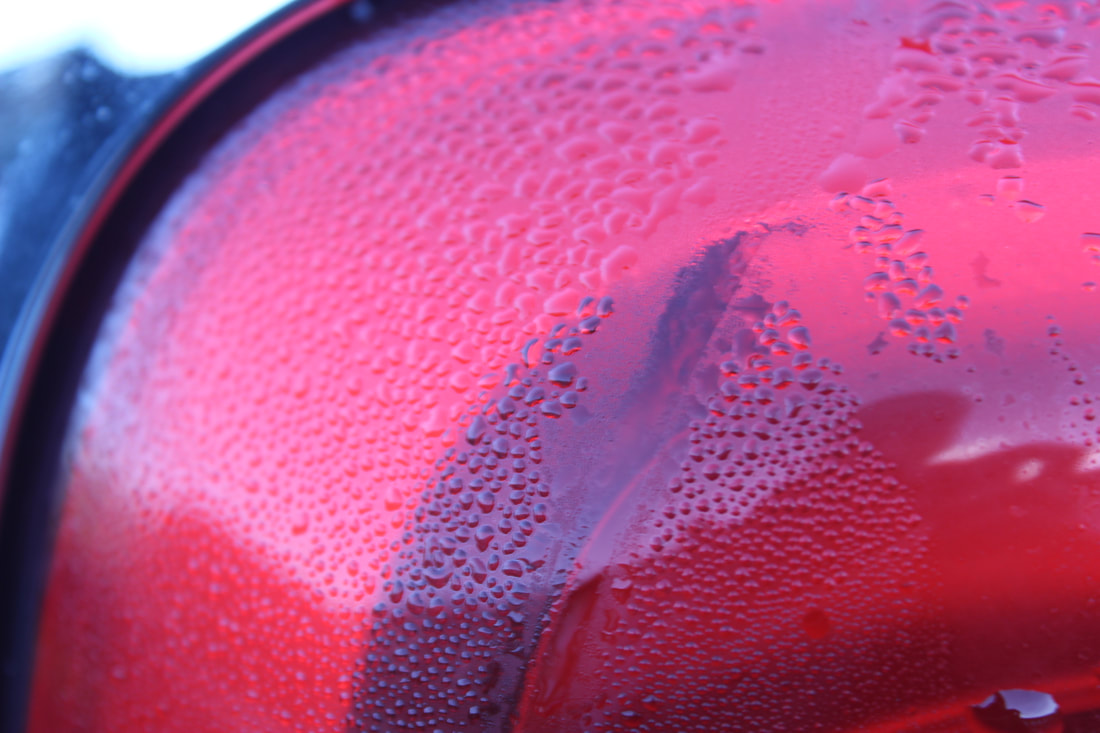
Car lights
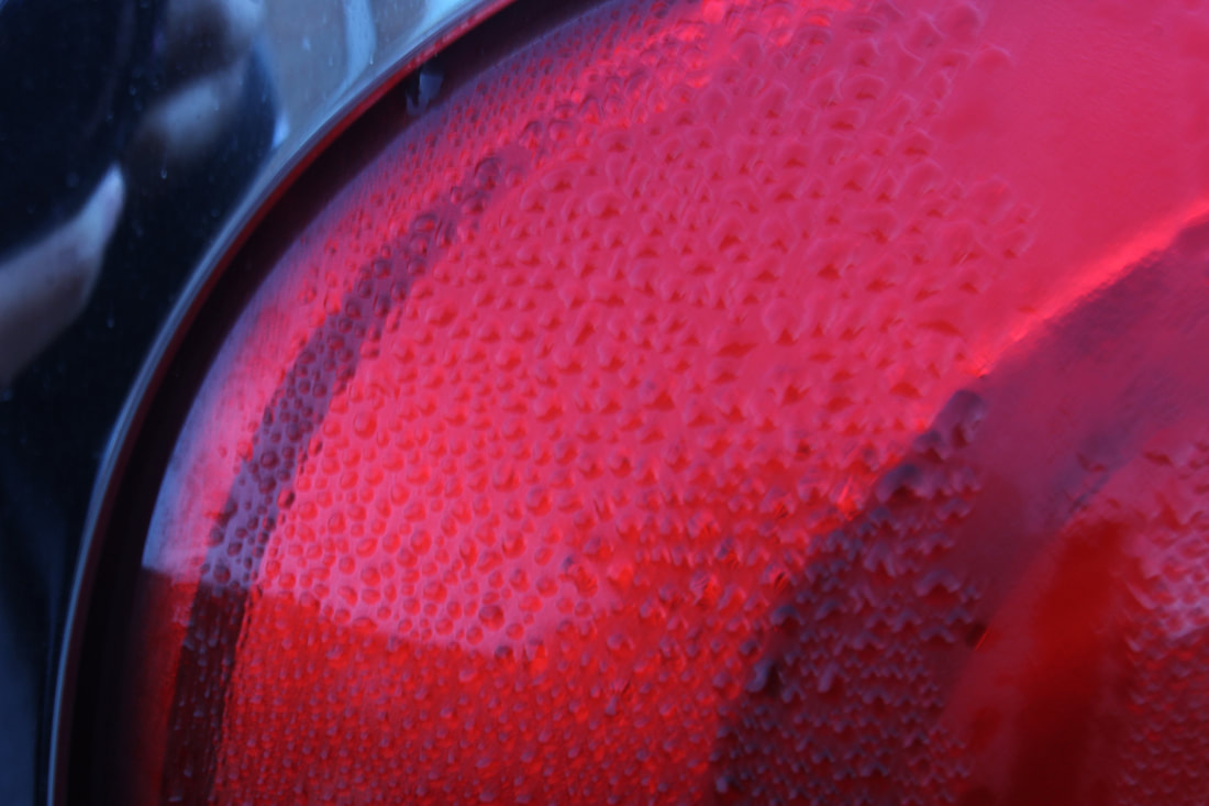
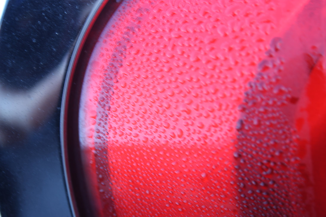
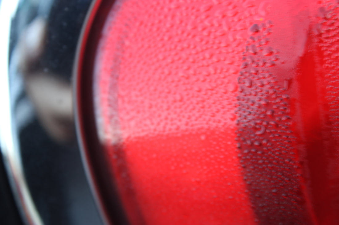
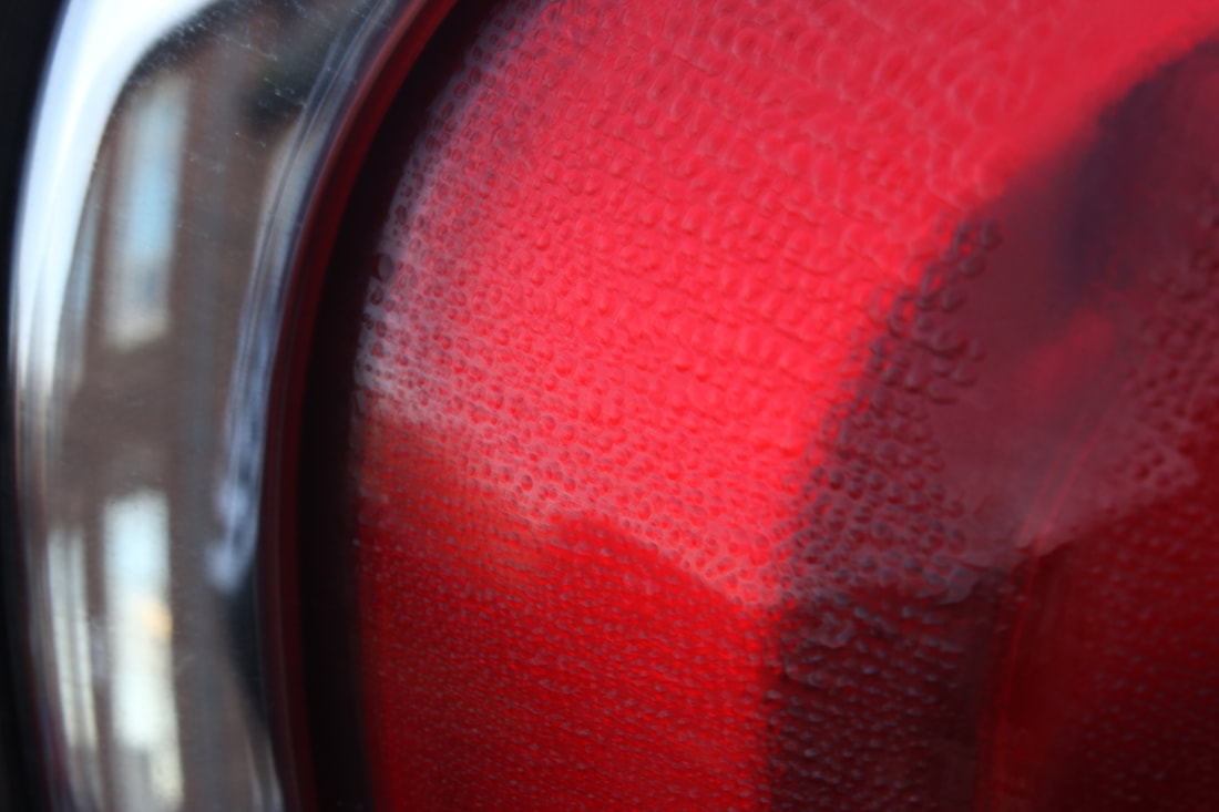
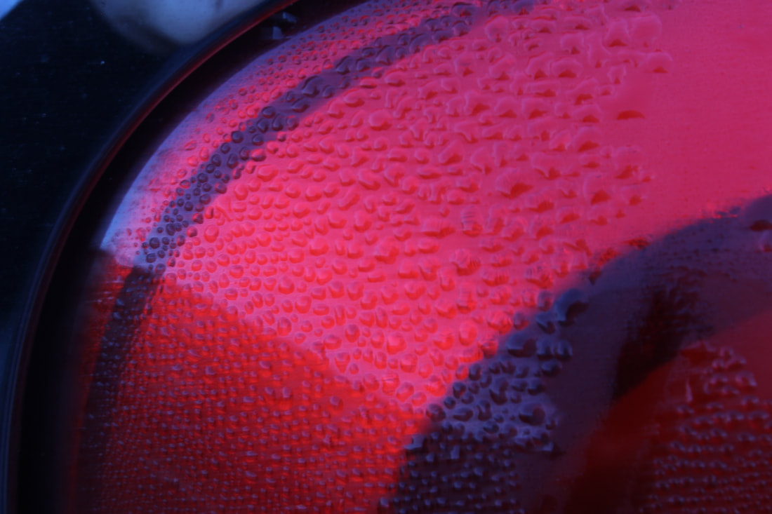
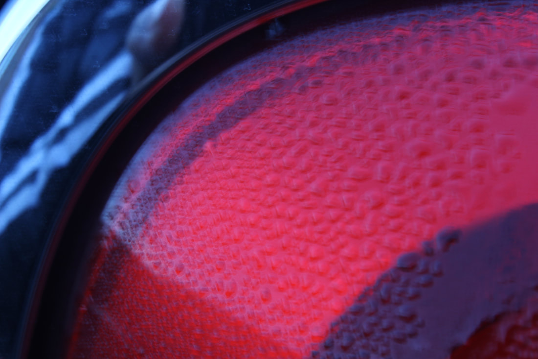
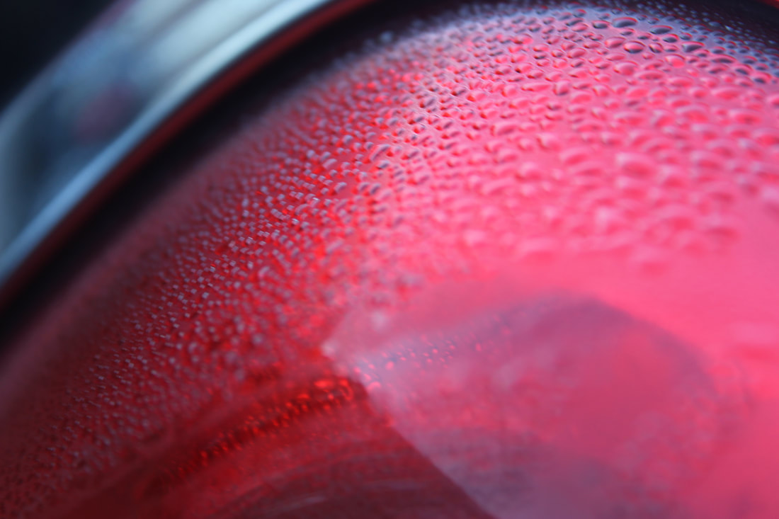
My best and worst images
|
|
Car logos
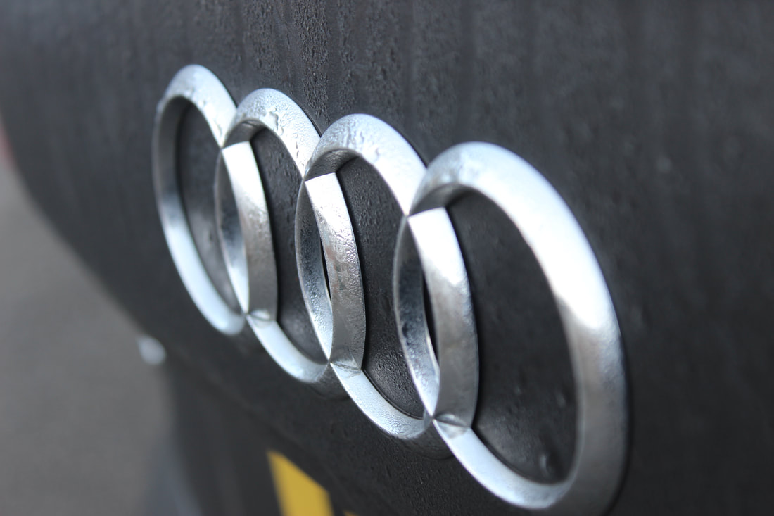
My best and worst images
|
|
|
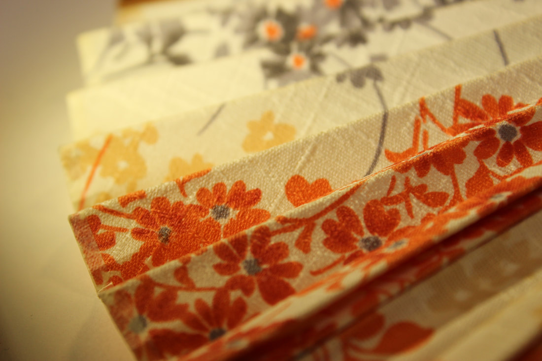
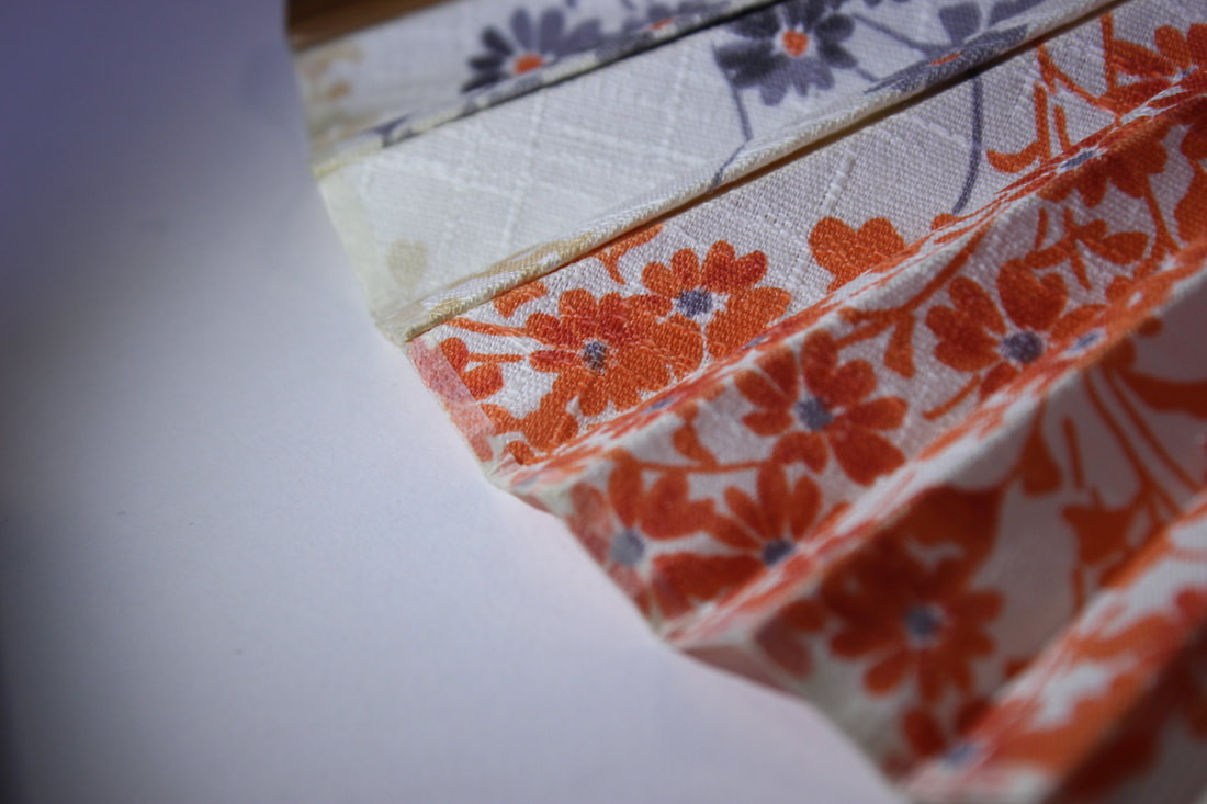
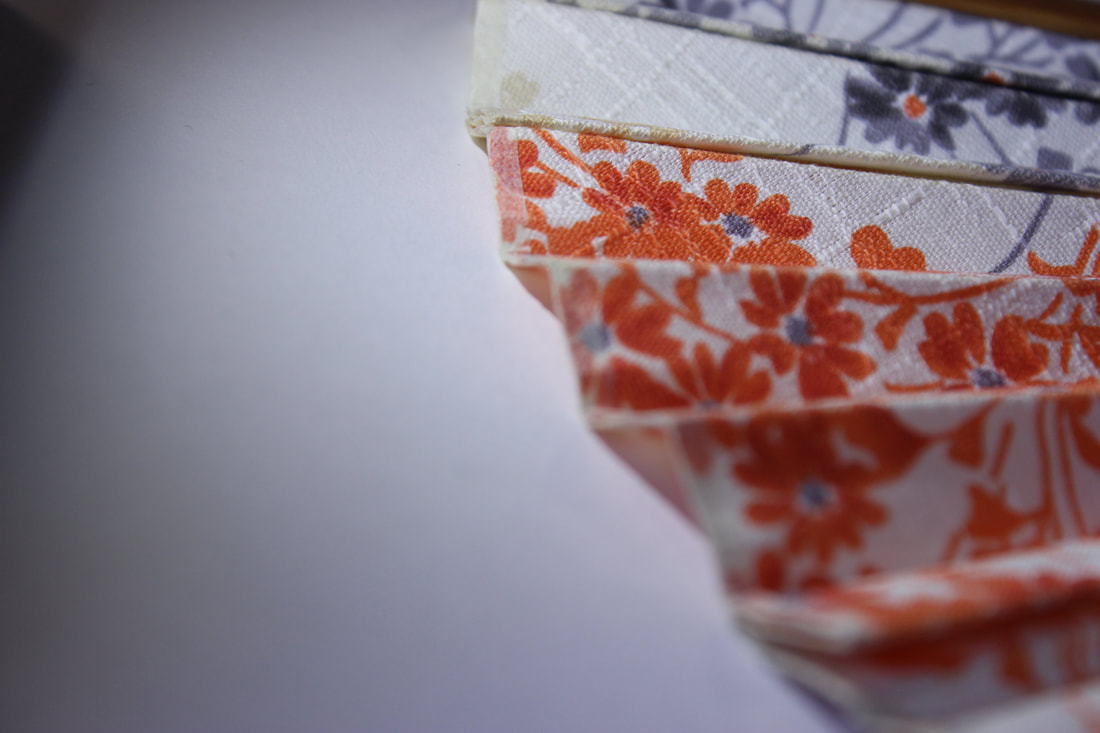
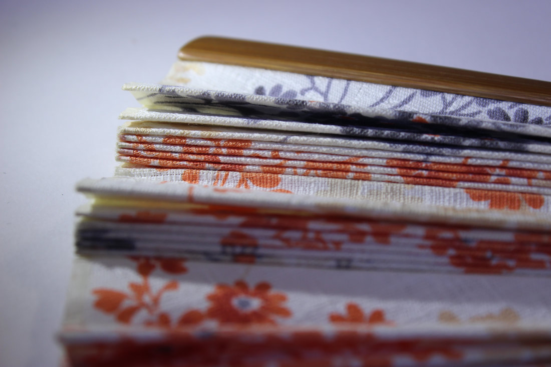
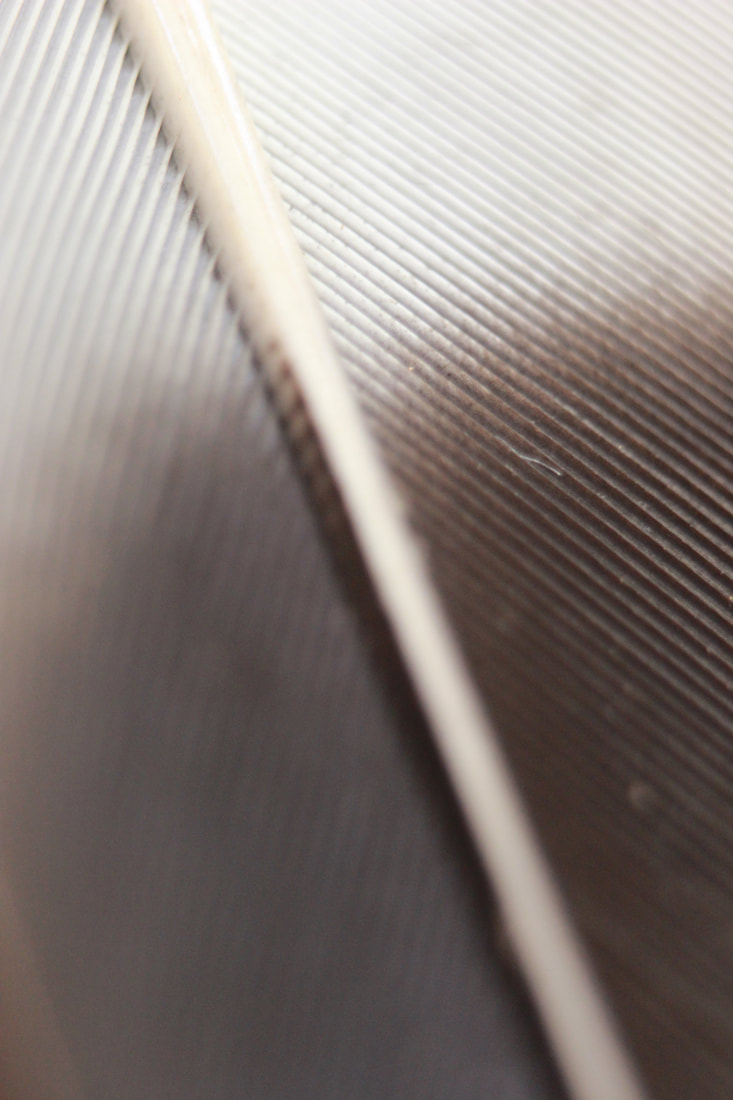
Close ups
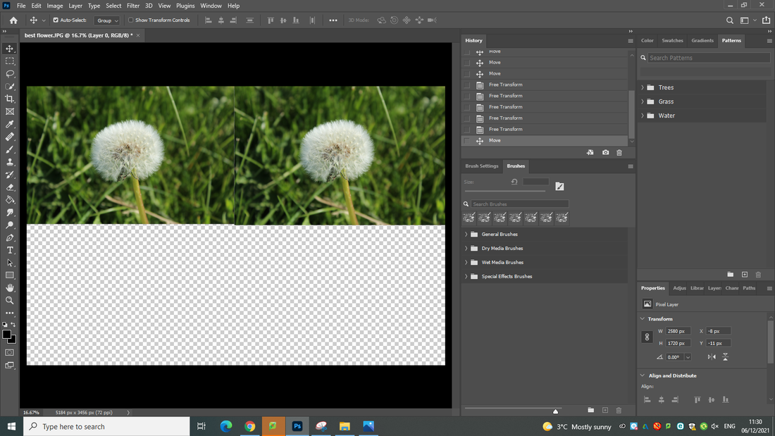
Developing my work using Photoshop
Image before editing
Process
Final outcome
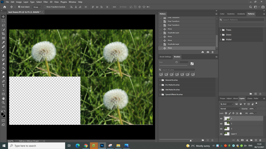
Developing my work using Photoshop
Process
Final outcome
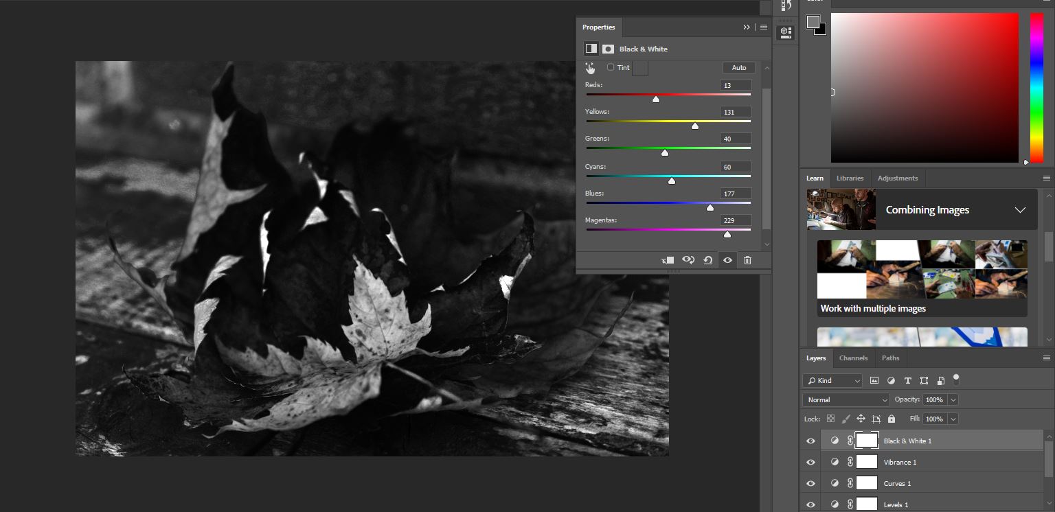
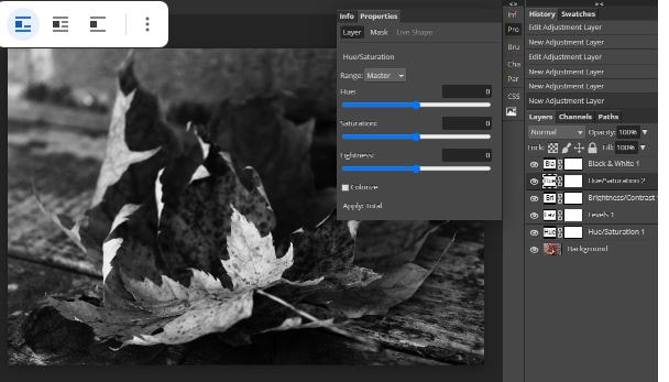
I developed this image using photoshop by adjusting the saturation to make the flower pop and look interesting, I also changed the hue to make the image look more moody and autum like. I then changed it to black and white since I was experimenting with it which also developed my interest in black and white. This was my first photoshop and I think I did pretty well for the first time.
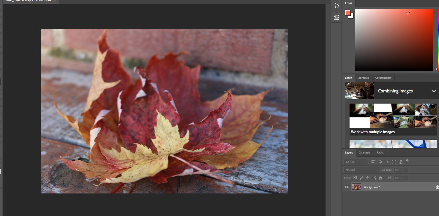
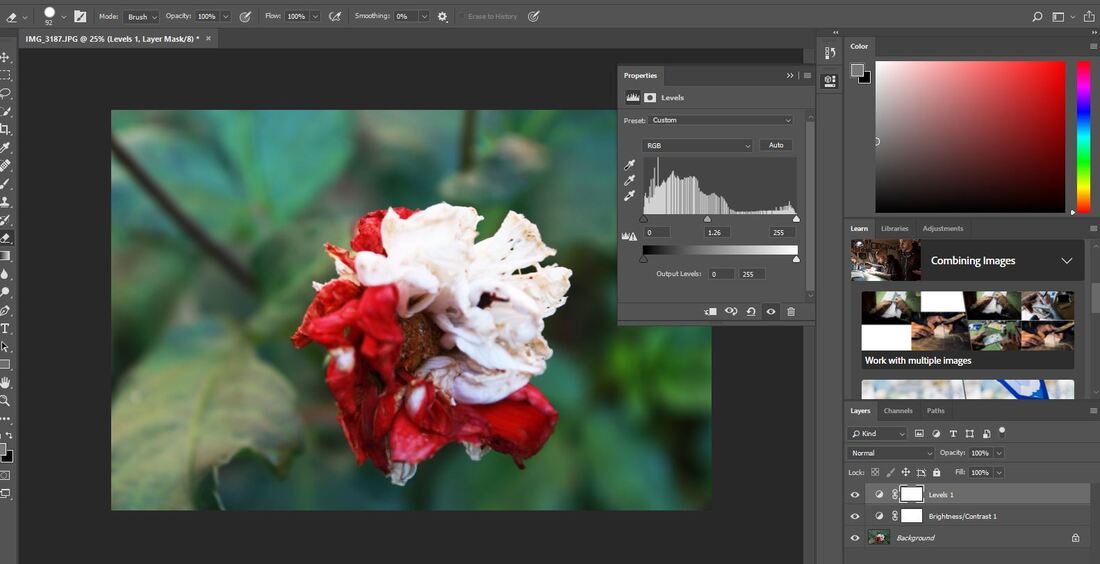
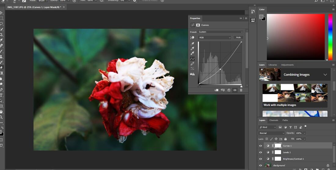
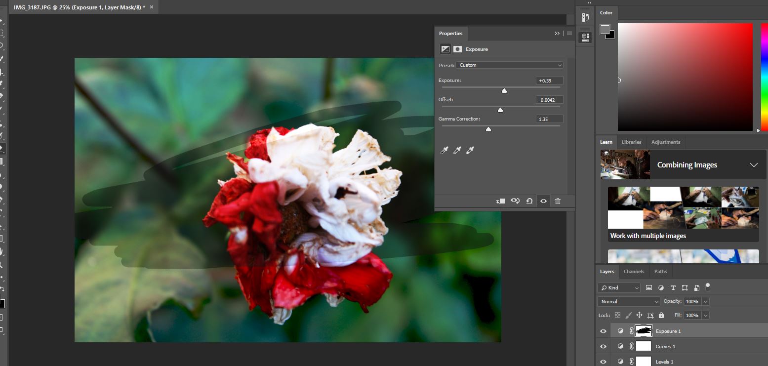
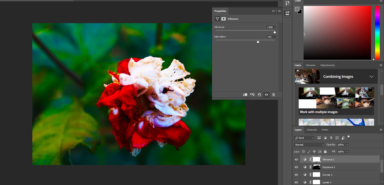
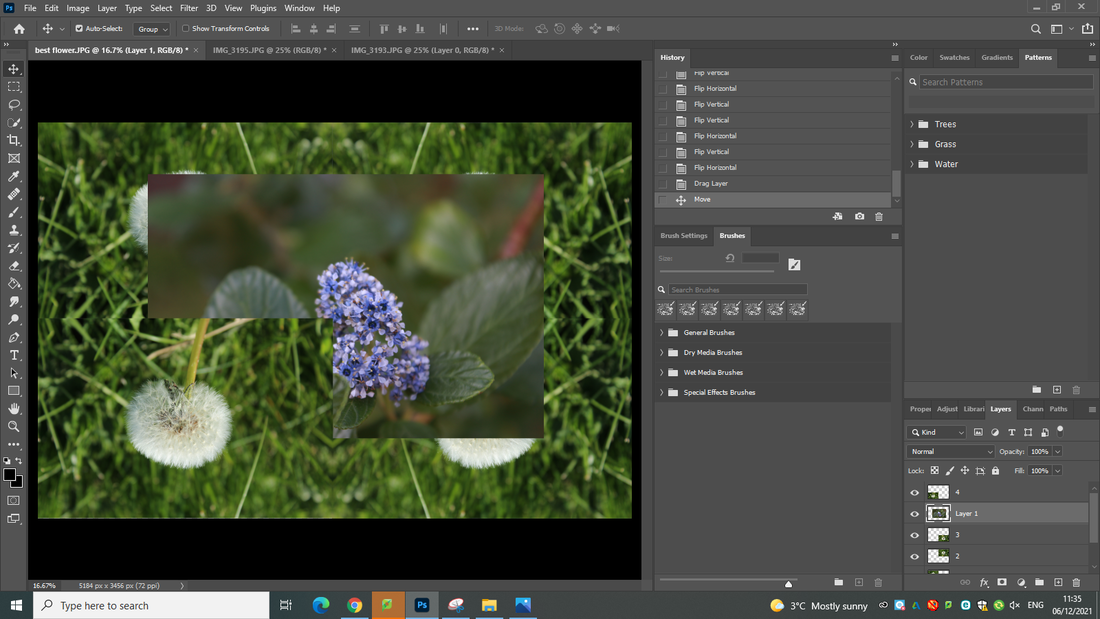
Developing my work using Photoshop
Image before editing
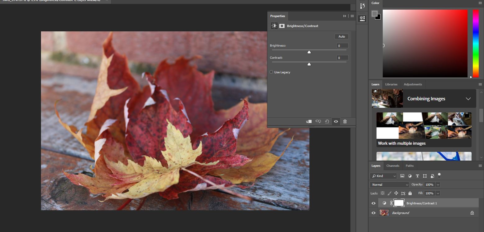
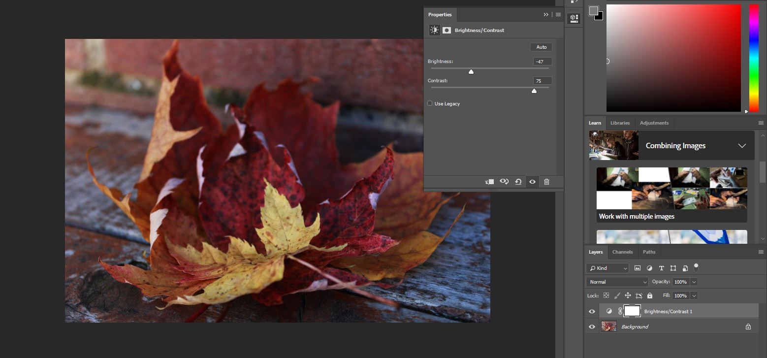
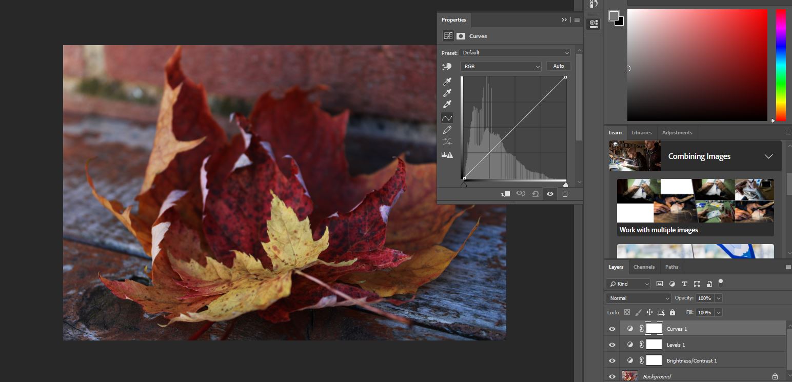
Process
Final outcome
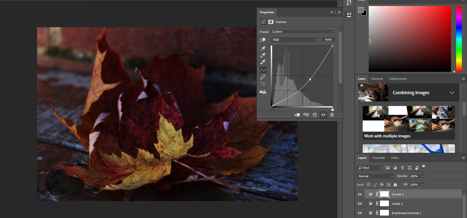
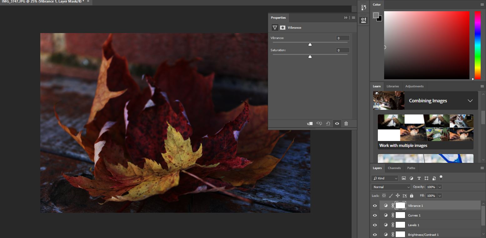
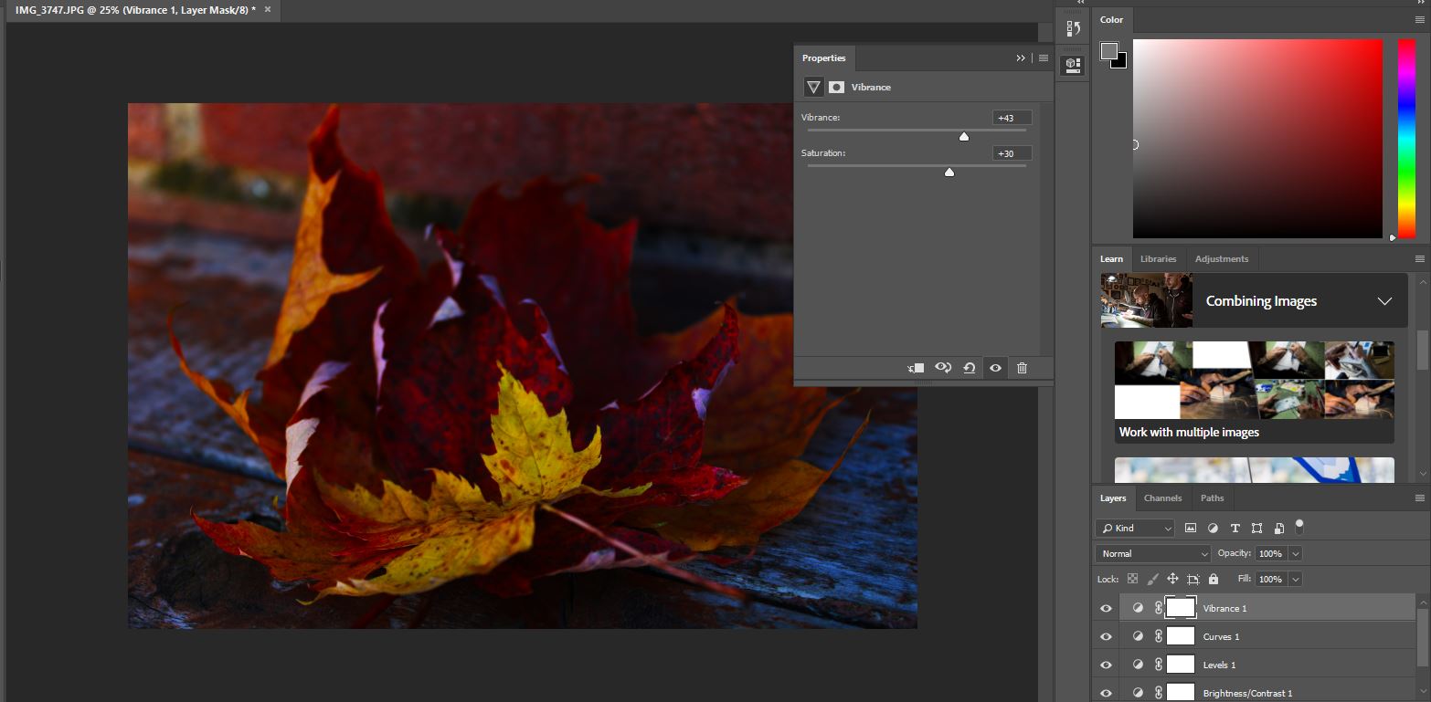
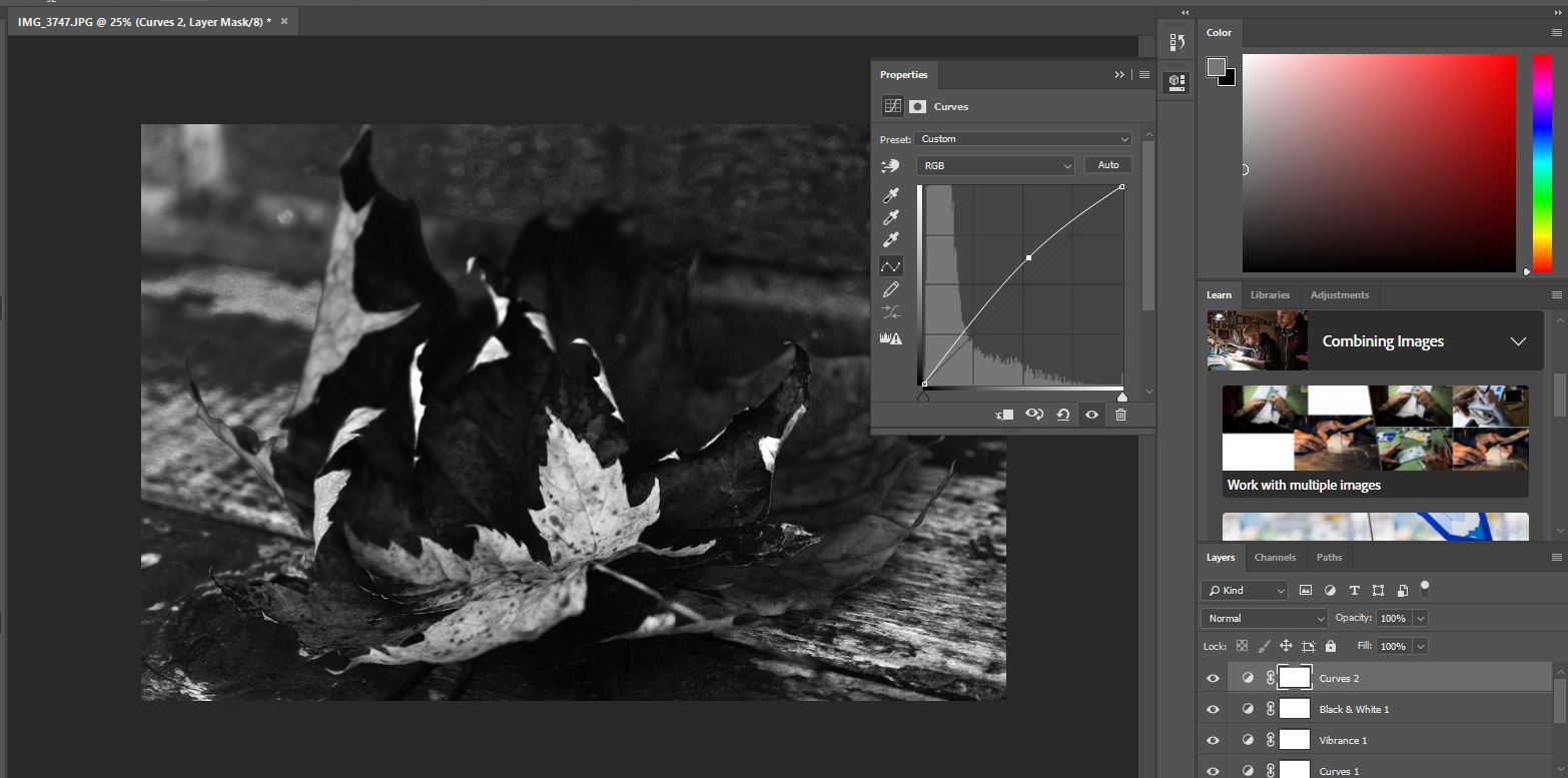
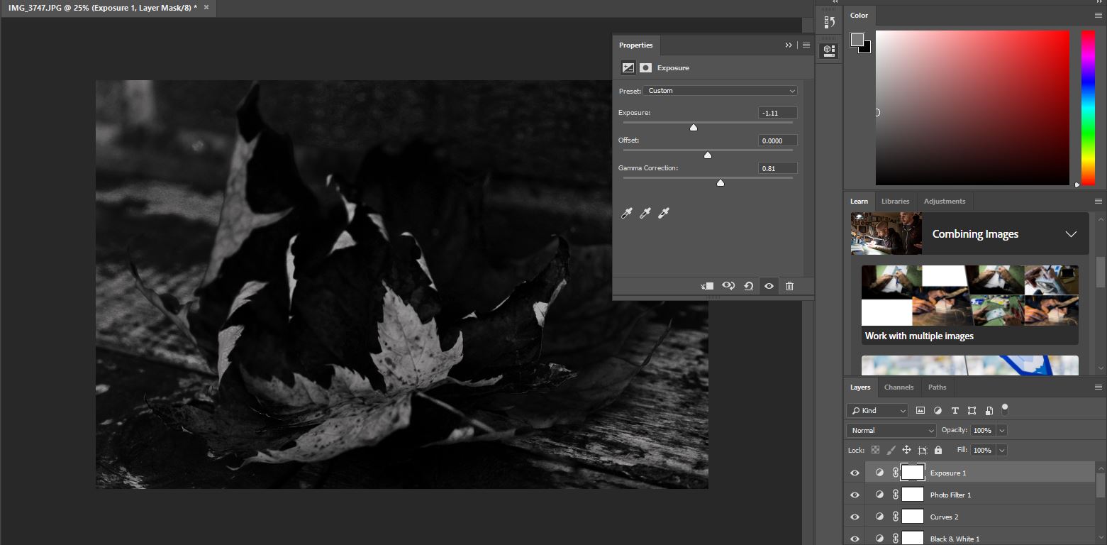
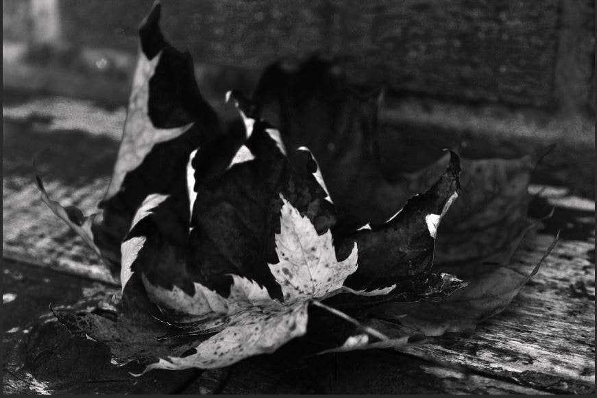
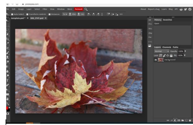
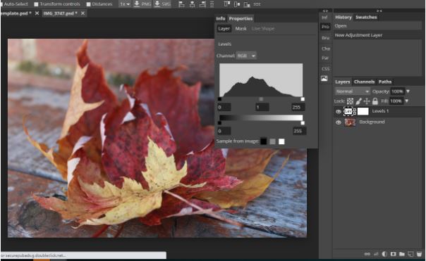
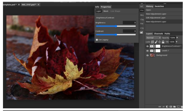
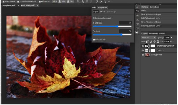
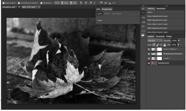
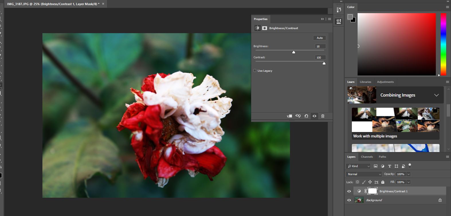
I developed this image using Photoshop by brightening the colors and making them more bright because before the image before looked dull and I needed to liven and brighten it up, I did this by changing the curves of the image and changing the contrasts and saturation, the curves were a learning experience for me because it gave me more ideas in the future and how to use it more wisely and skillfully. I've used/played with the saturation before so I am more skilled at it than using the curves.
Developing my work using Photopea
Image before editing
Process
Final outcome
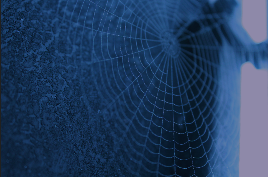
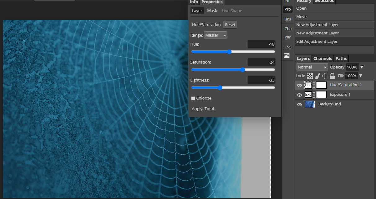
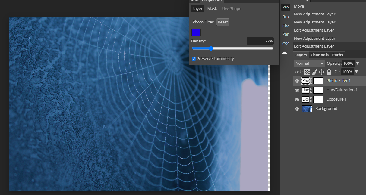
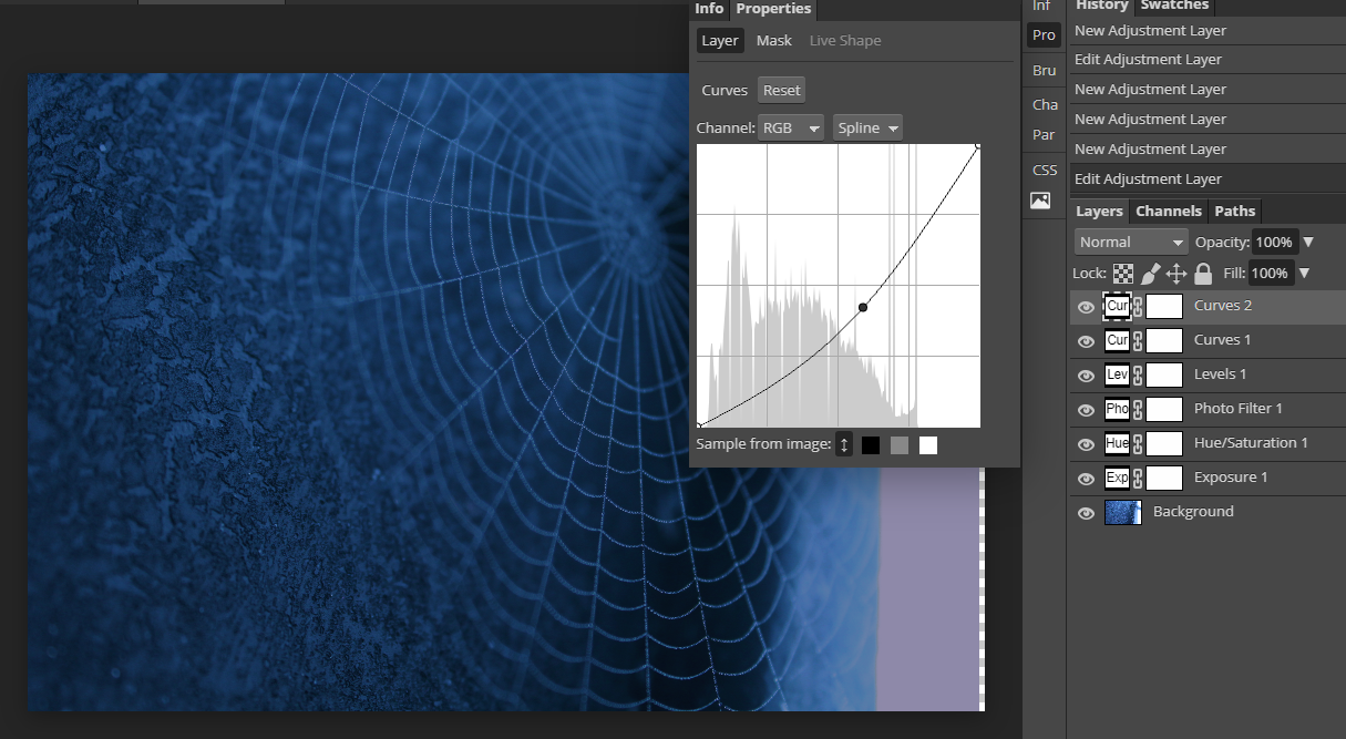
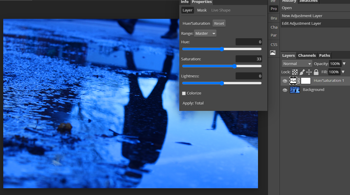
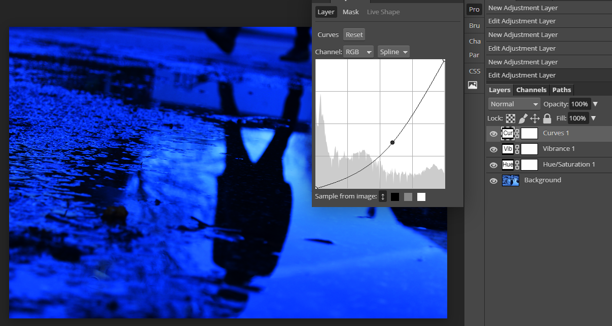
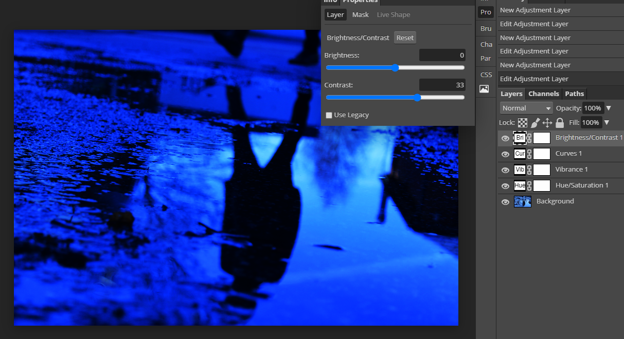
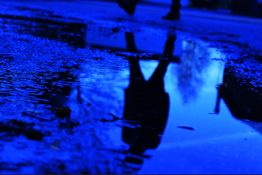
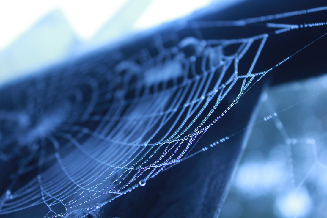
I developed this image using photopea by adding tools to my photo such as I modified the hue and saturation, which gives the photograph the turquoise tone, then I modified the density which darkened the image, magnifying the cobweb, I also wanted to darken the image more so I curved it which leads us to the final image.
Developing my work using Photopea
Image before editing
Process
Final outcome
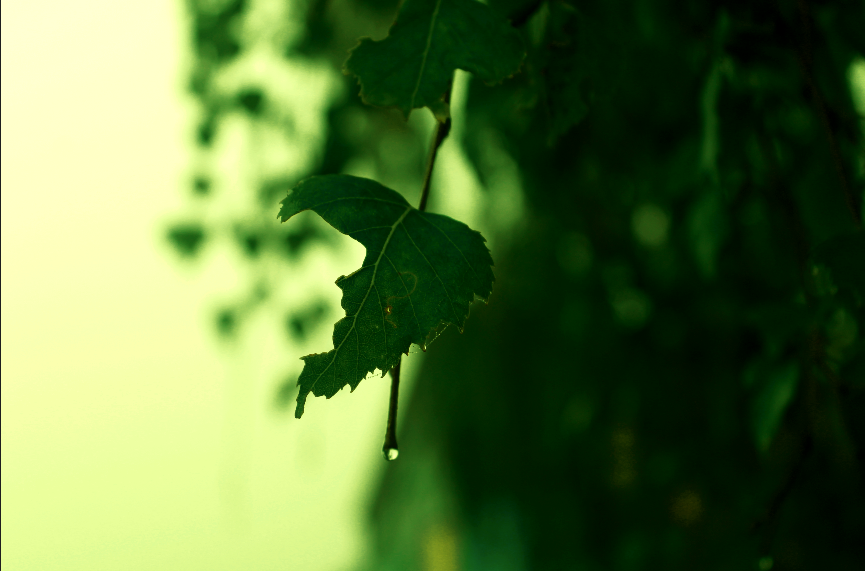
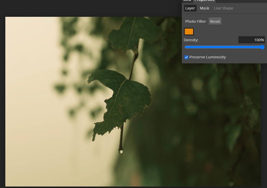
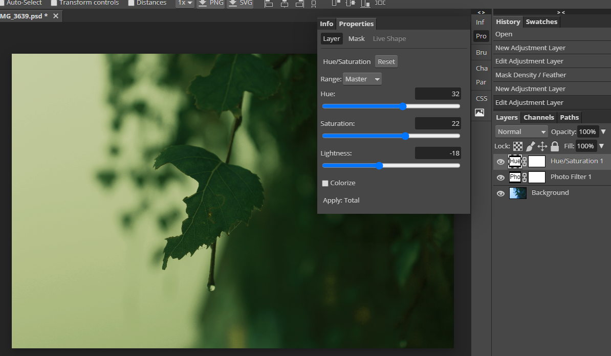
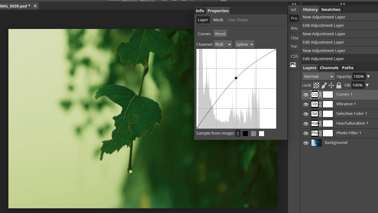
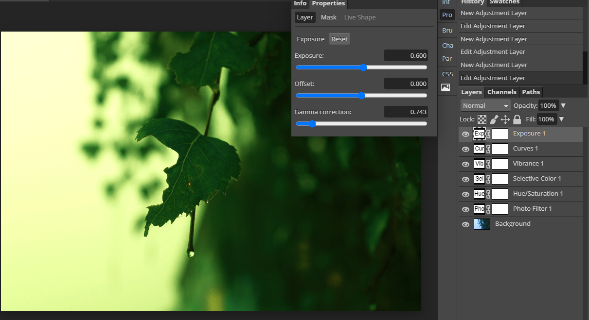
I developed this image using Photopea by changing the density, which softened the photograph, then I modified the hue and saturation which added more green to the photo, after that I curved the image lighter so it looked more alive and green, this leads to me changing the exposure of the image which magnified the droplet on the leaf, which then leads me to the final image.
Developing my work using photopea
Process
Final outcome
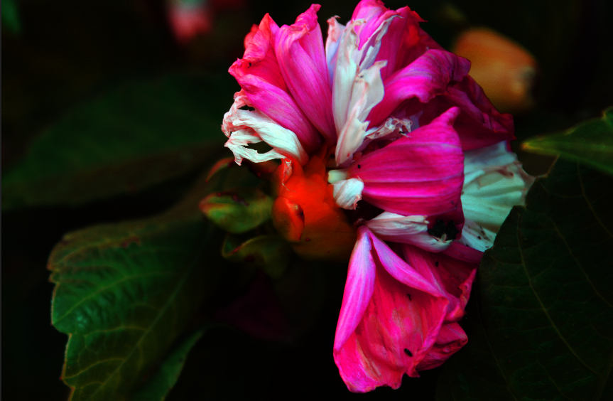
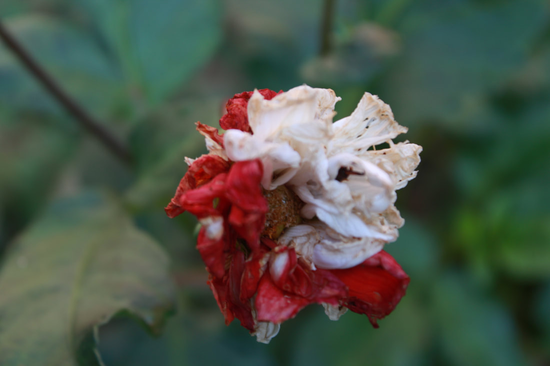
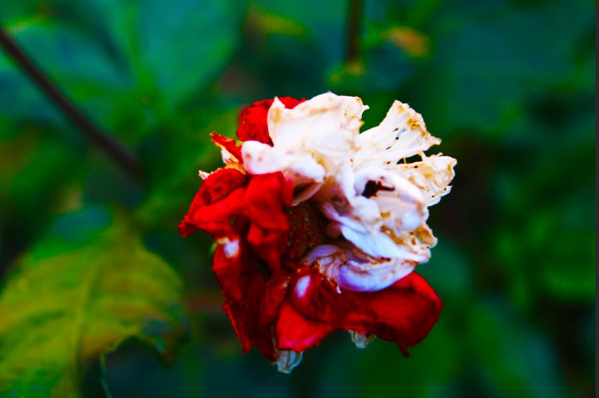
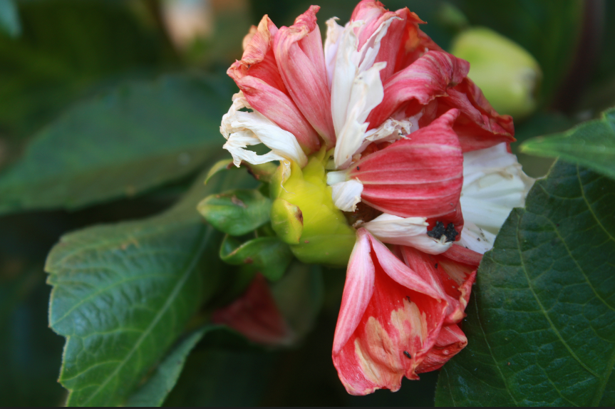
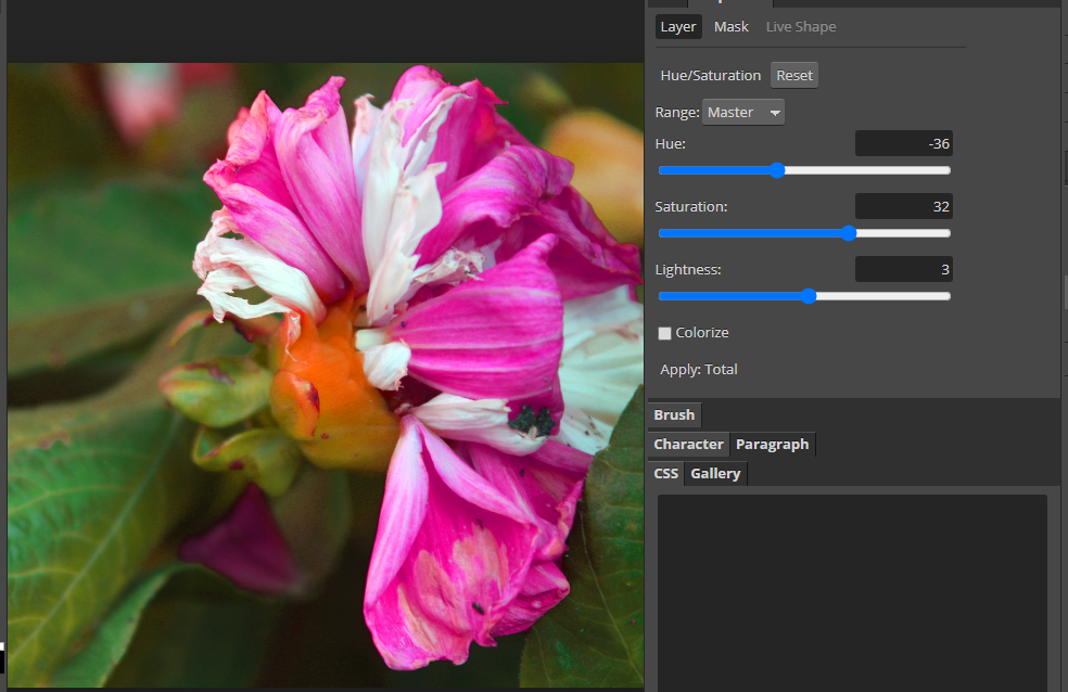
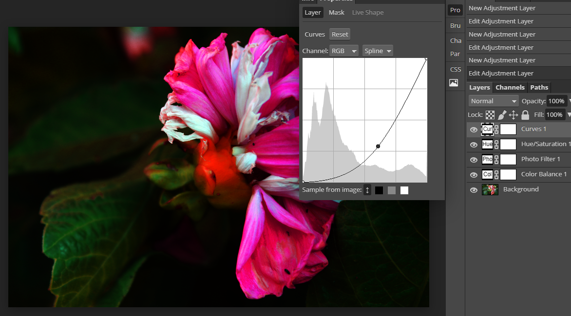
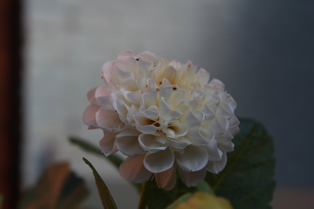
I developed this image using photopea by altering the hue and saturation which changed the color of the petals into a more vibrant color so that it doesn't look dull, I also altered the curves of the image so that we just focus on the flower, which leads us to the final image.
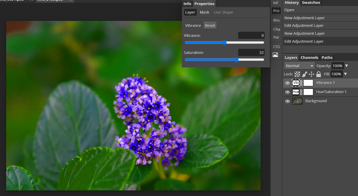
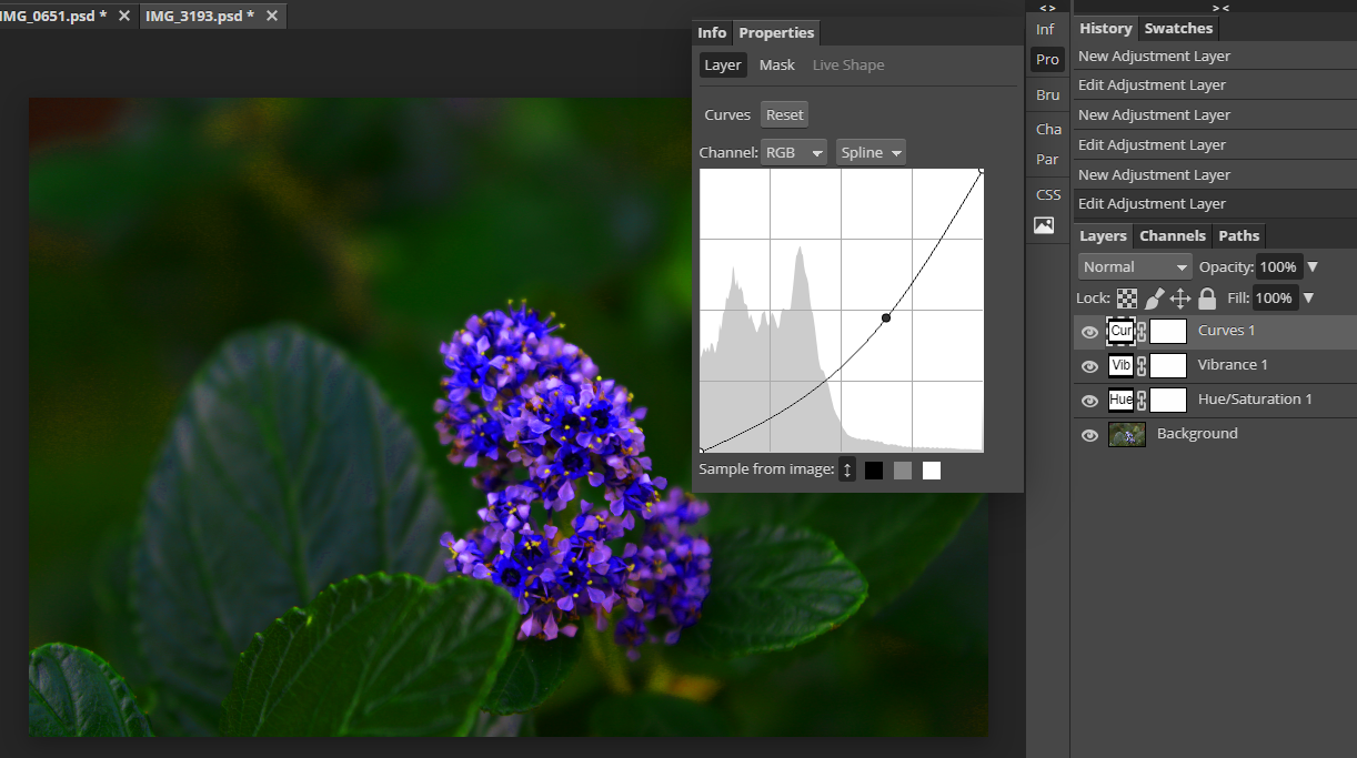
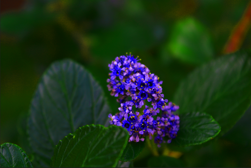
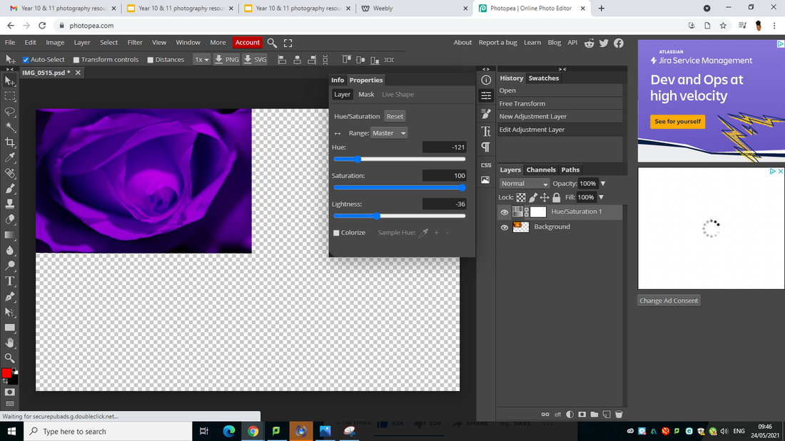
Developing my work using photopea
FINAL IMAGE
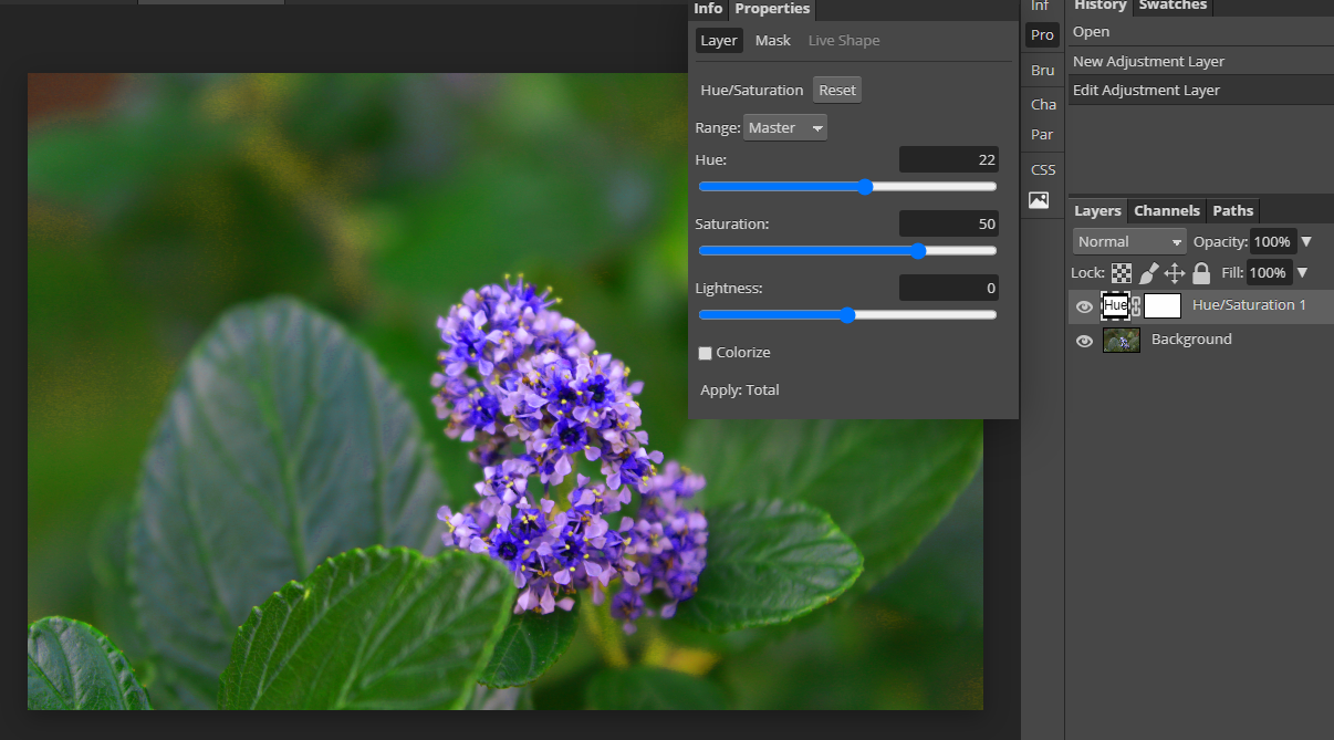
I developed this image using photopea by adapting the hue and saturating to make the purple on the plant more vibrant, i wanted to make the image more vibrant so i added more vibrancy to the image, i also wanted my eyes to focus on the plant so i curved the image so that i wouldn't be distracted with the background, this leads me to the final image.
DEVELOPING MY WORK USING PHOTOPEA
FINAL IMAGE
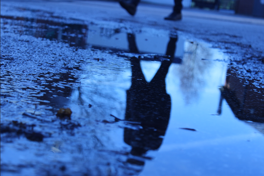
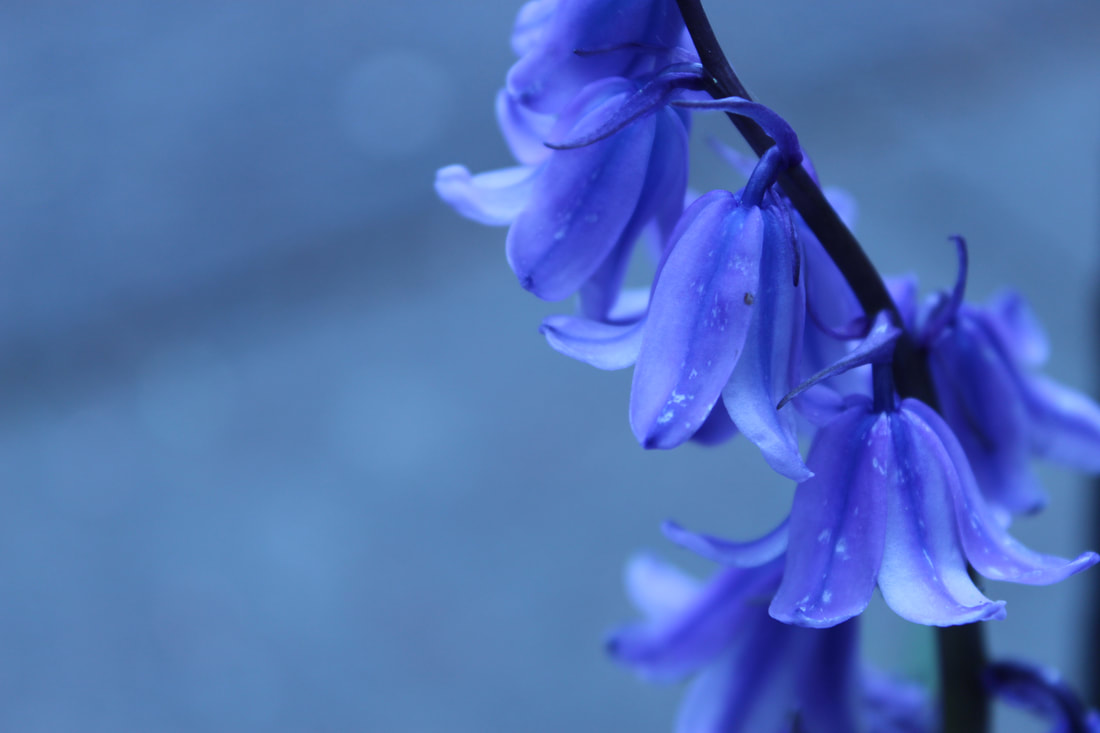
I developed this image using photopea by altering the hue and saturation this makes the image more blue which makes it less dull and more vibrant.
PHOTOGRAPHY IDEAS
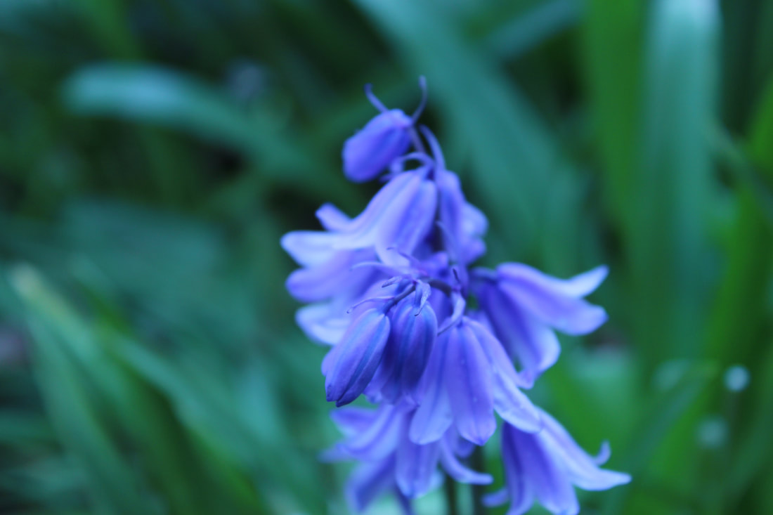
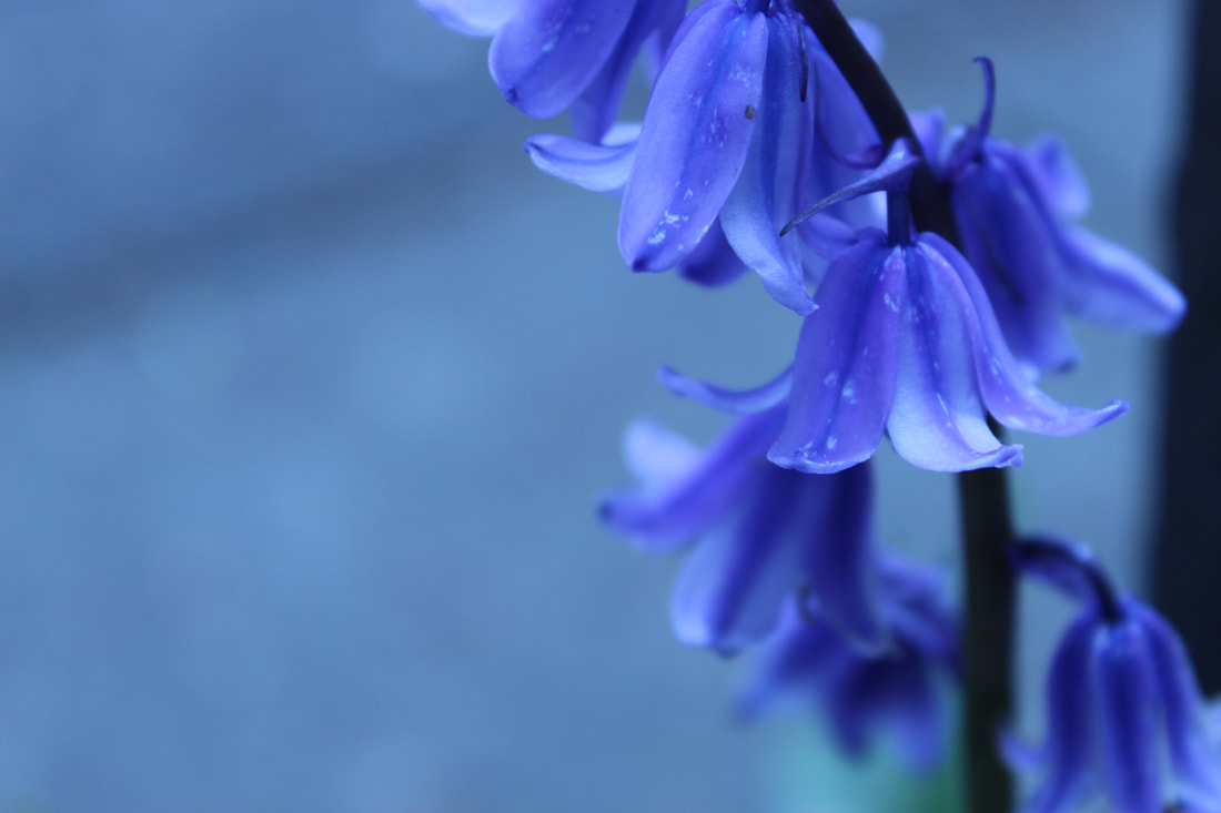
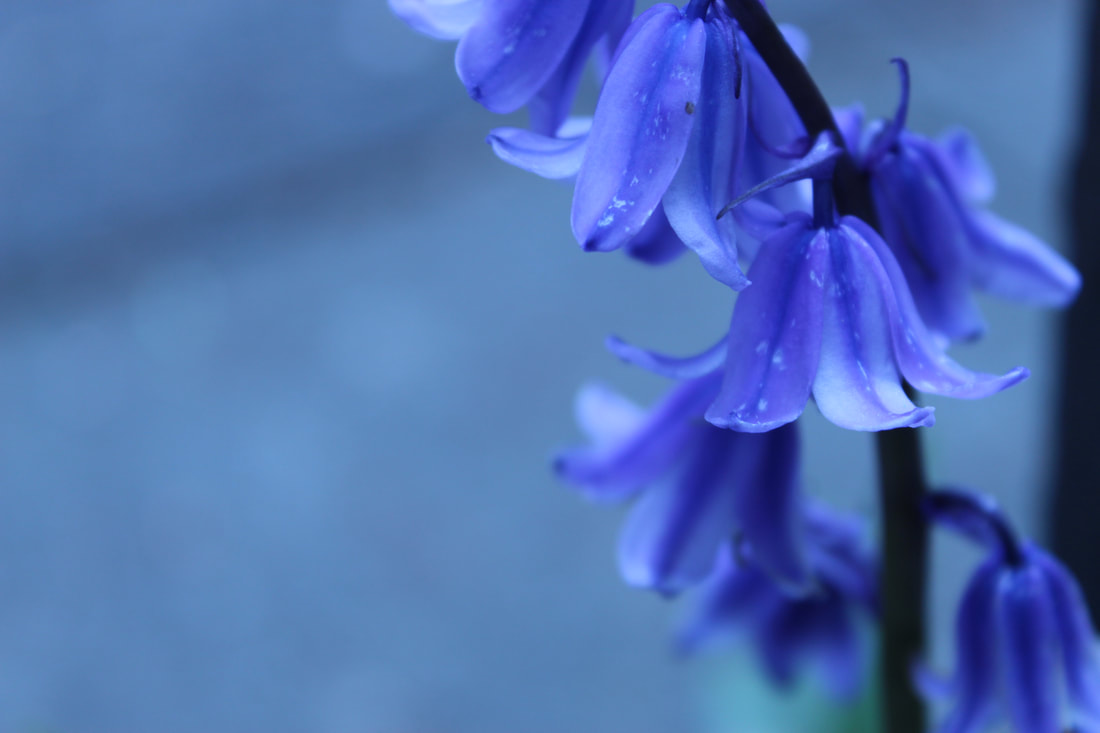
I would like to take photographs of flowers because that's what I work best on, I also don't have many flower photographs so I would like to take more photos of that to make my website look more vibrant and alive.
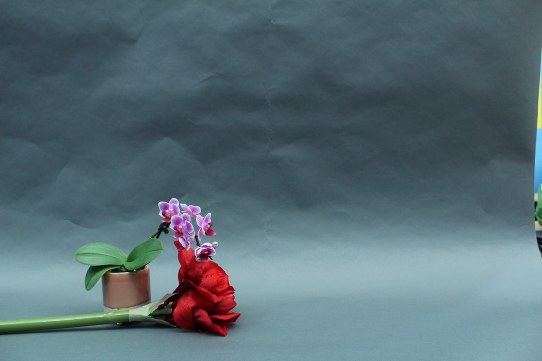
FINAL SHOOT PLAN
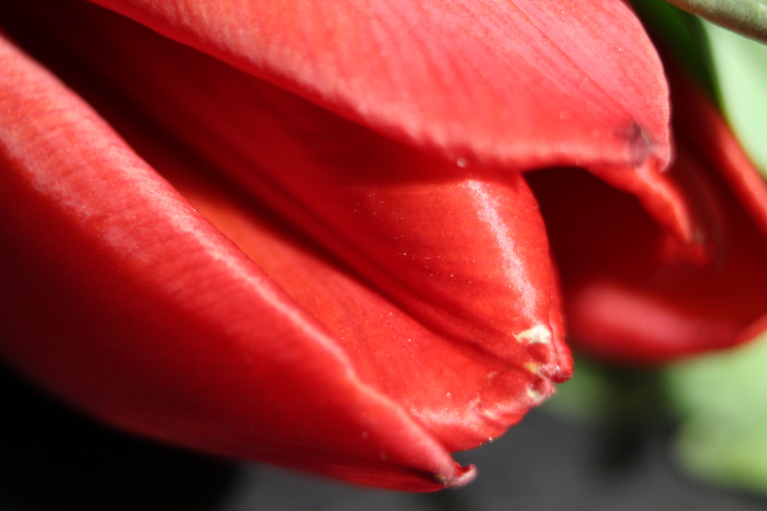
For my final shoot plan I am going to photograph flowers in a studio because it makes the photograph look elegant and beautiful. This links to my research because I was researching Imogen Cunningham who does a lot of studio shots of flowers and she makes it look elegant and magnificent by using studio lights and a black background to make the flower stand out. I will be using a manual camera (canon). This will make the image look more professional because it was taken on a professional camera.
I will use various amounts of light settings because I would like to experiment and see if the image will look better with one or the other light setting. Then I am going to develop them using Photoshop. A lot of pictures that I want to take are more minilmilistic. I also would like to change the tone for this shoot
I will use various amounts of light settings because I would like to experiment and see if the image will look better with one or the other light setting. Then I am going to develop them using Photoshop. A lot of pictures that I want to take are more minilmilistic. I also would like to change the tone for this shoot
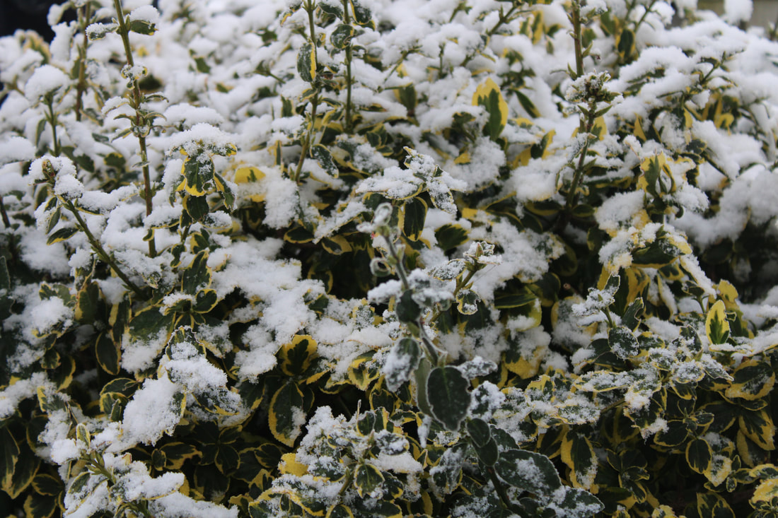
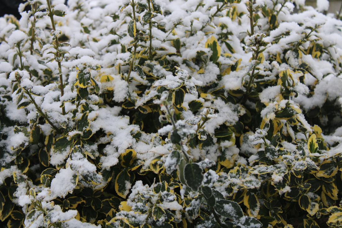
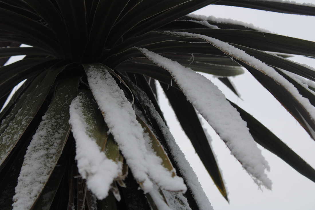
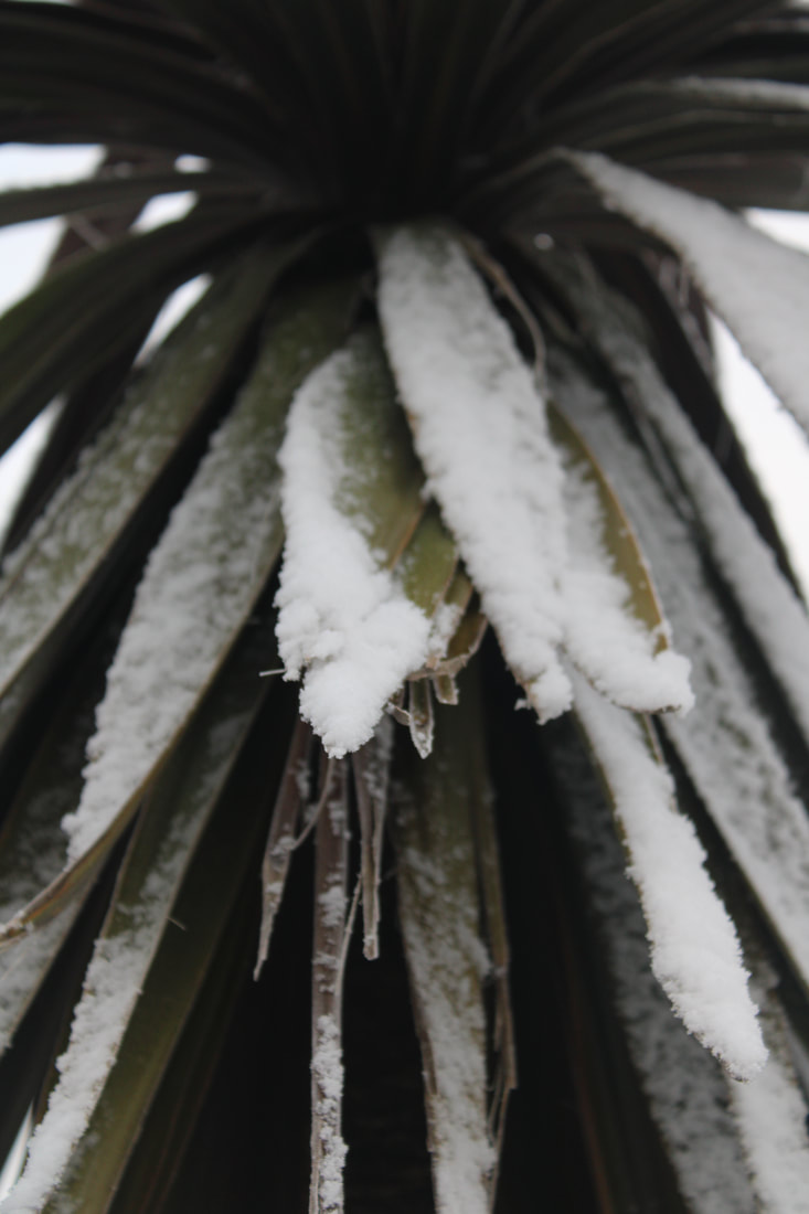
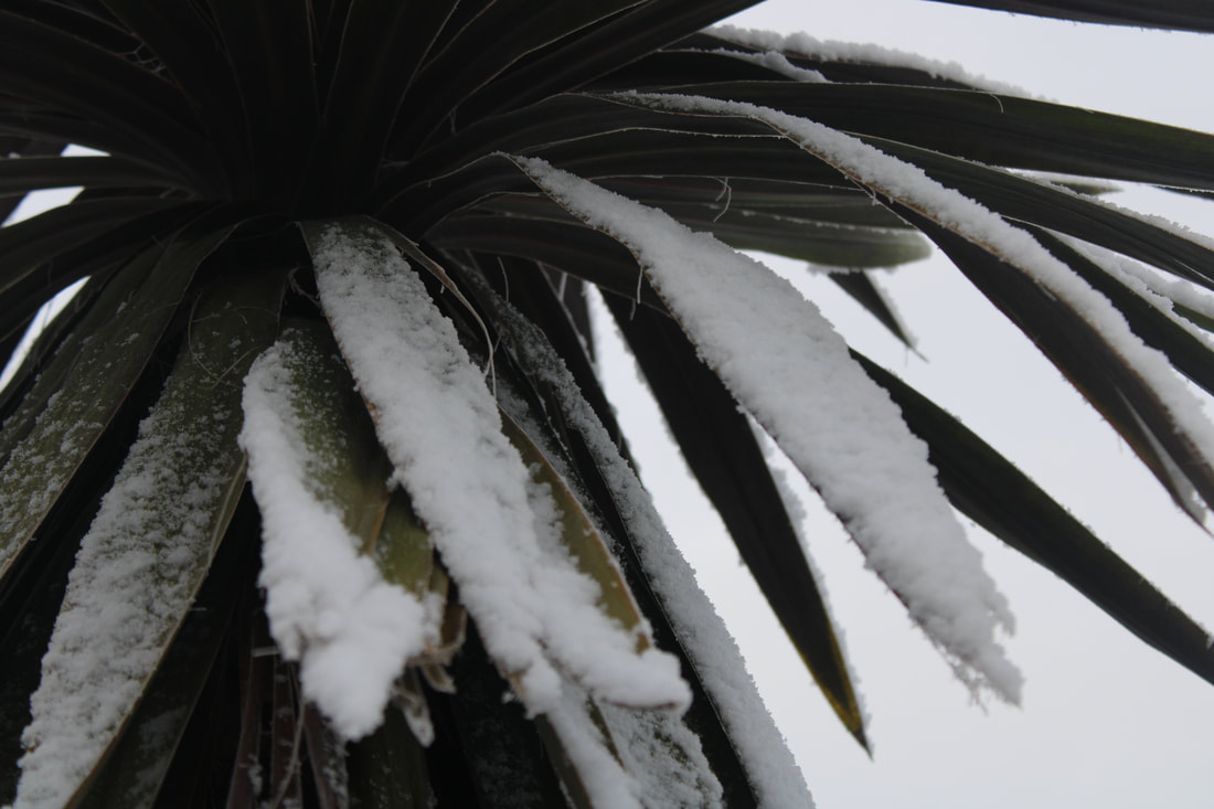
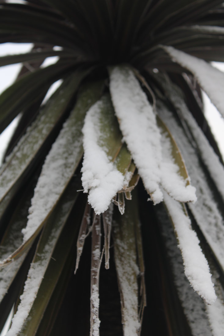
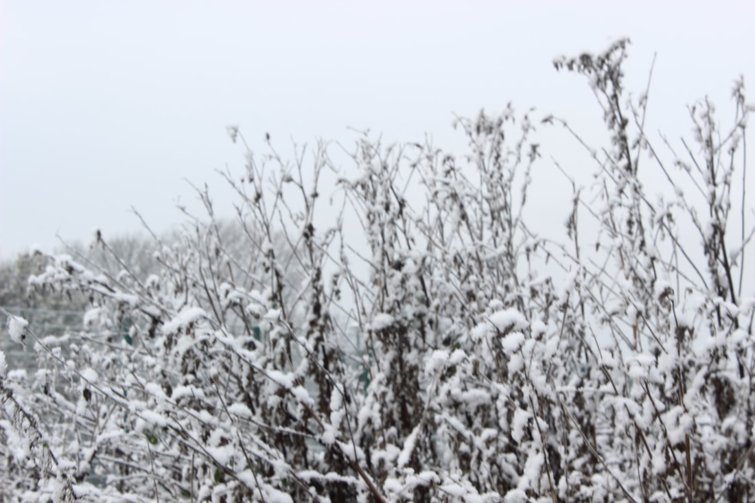
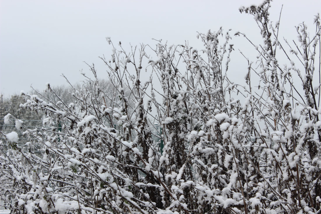
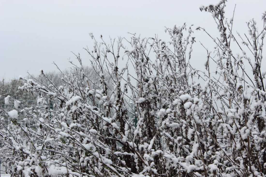
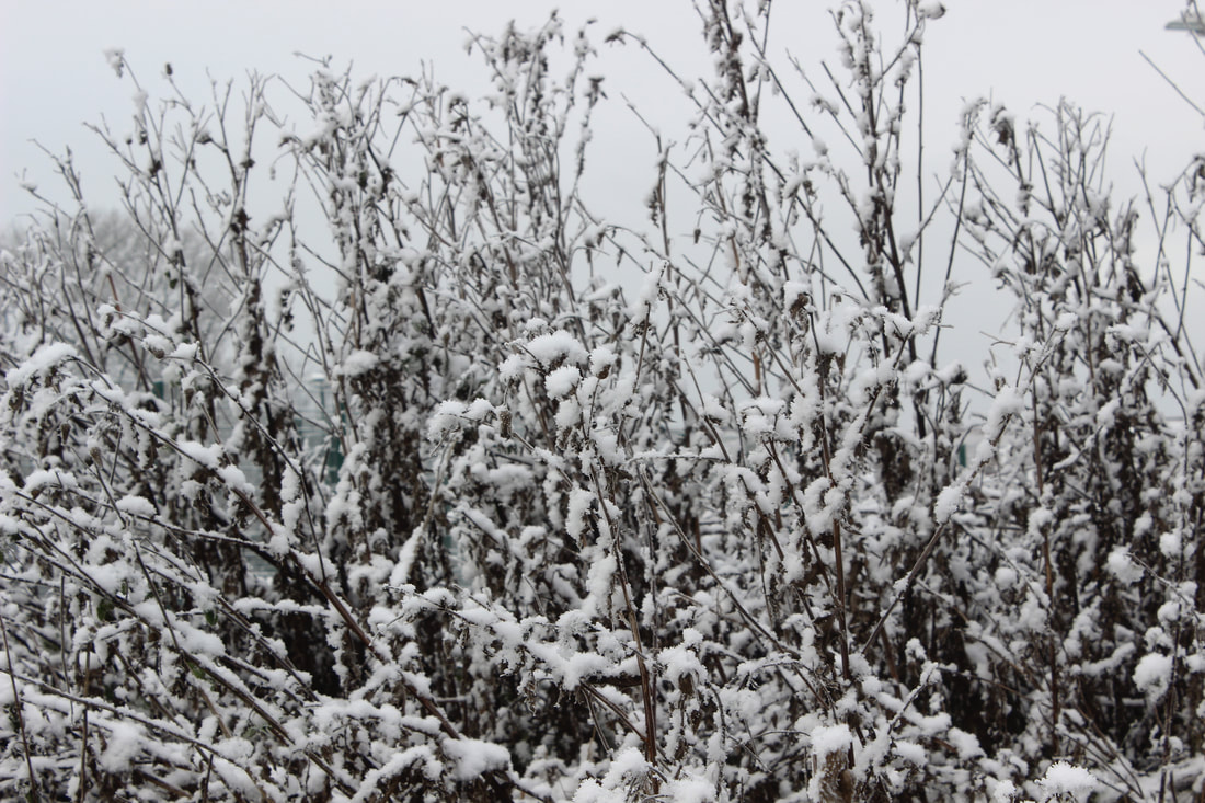
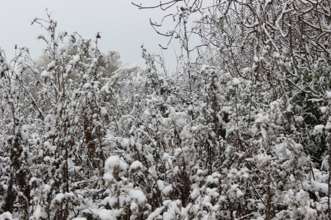
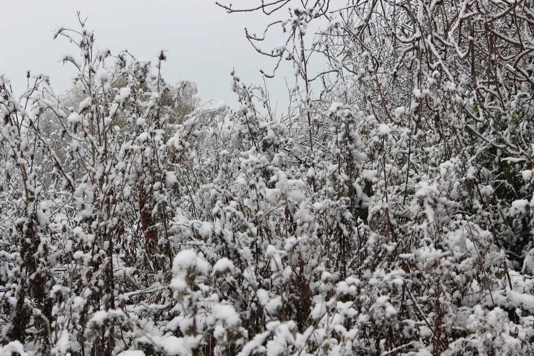
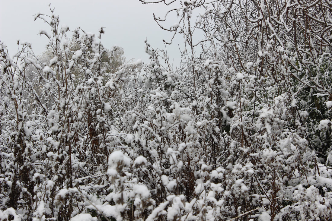
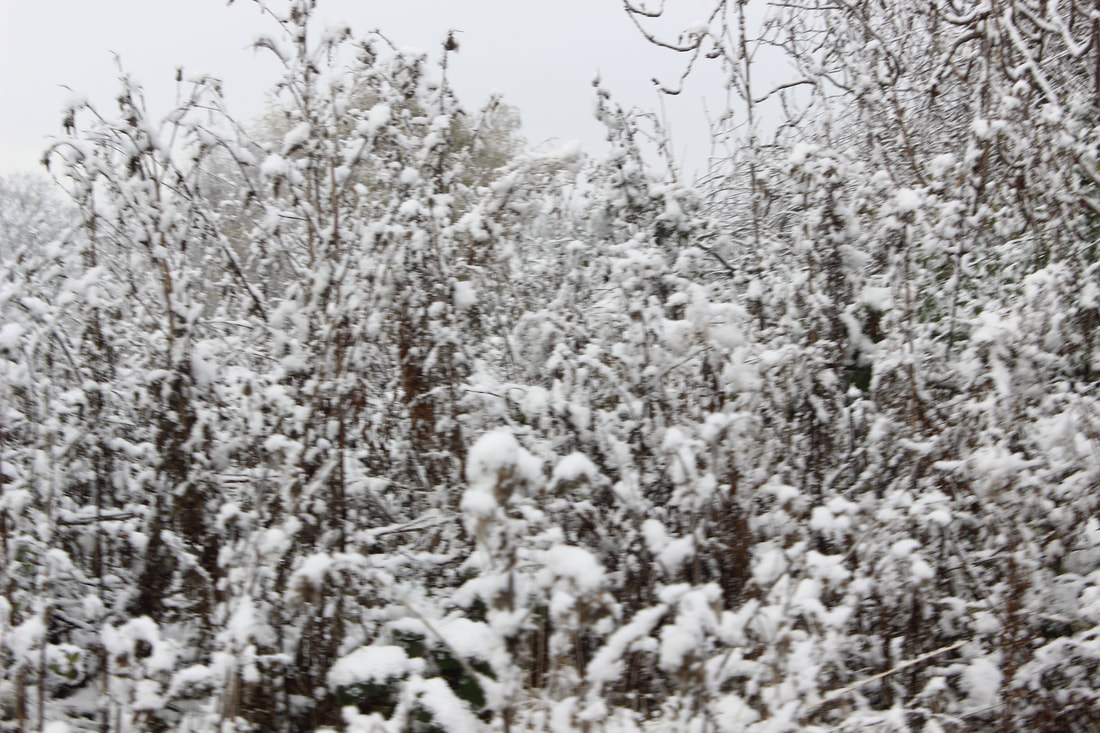
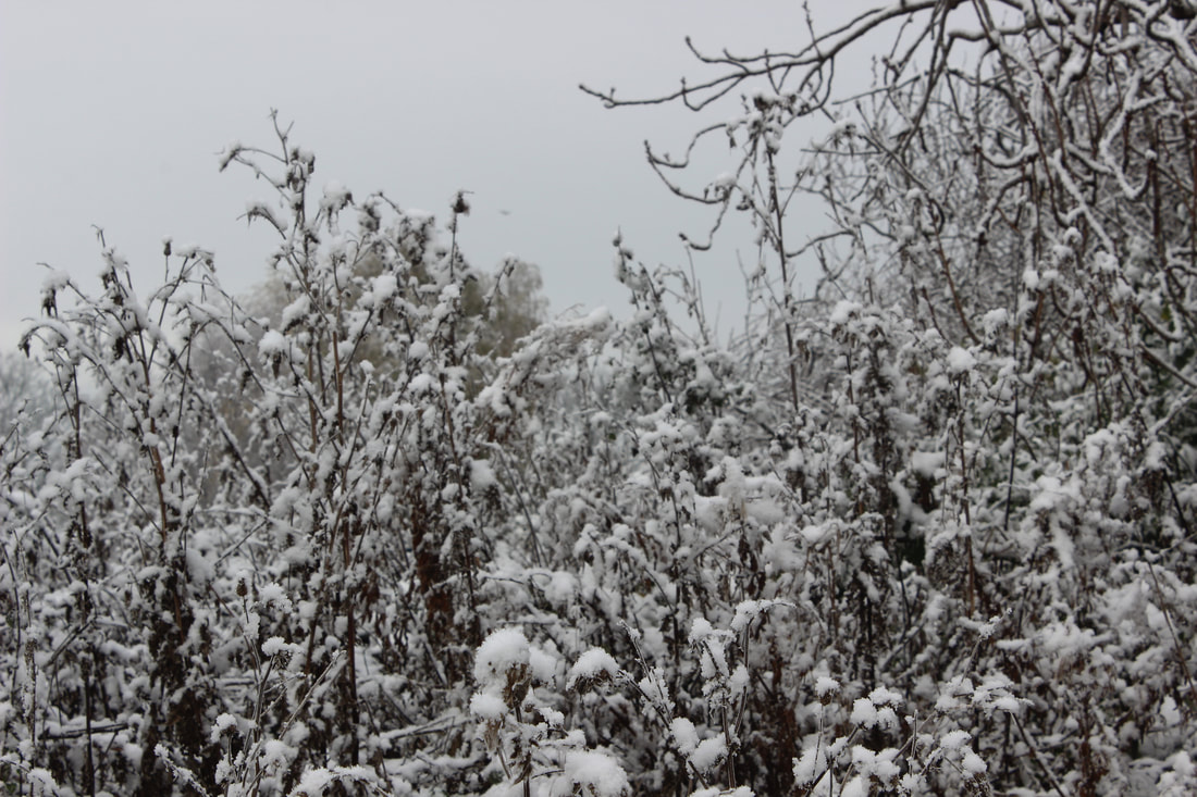
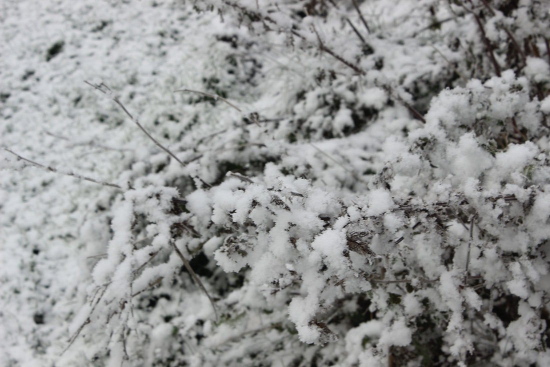
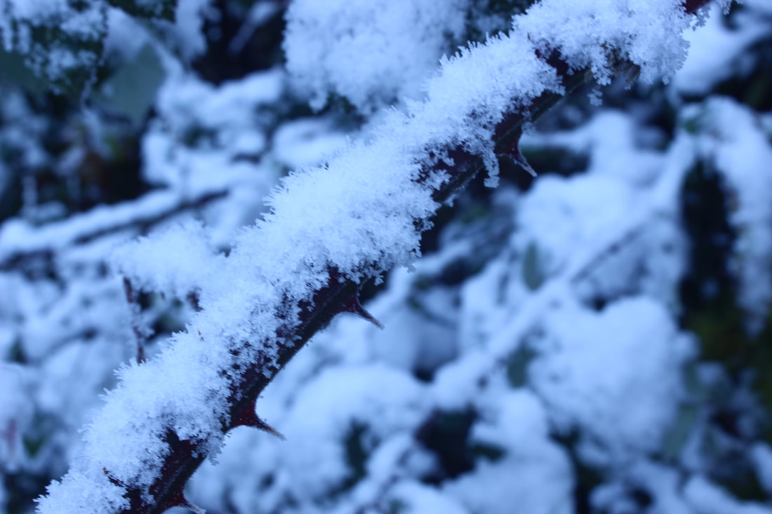
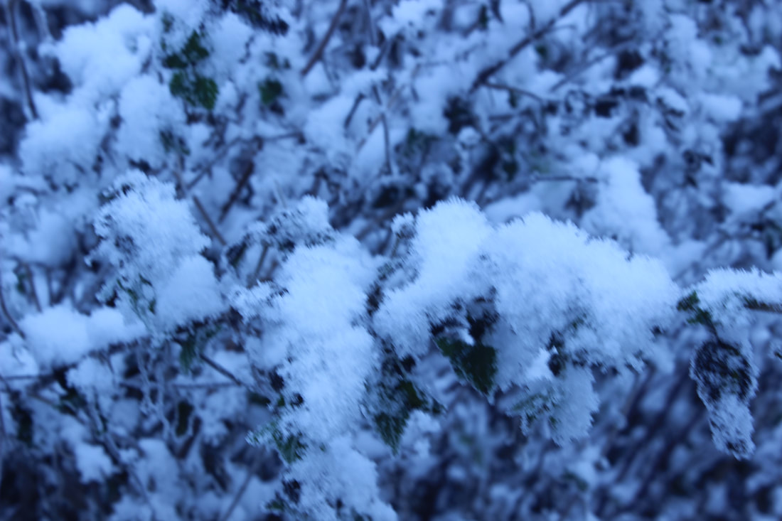
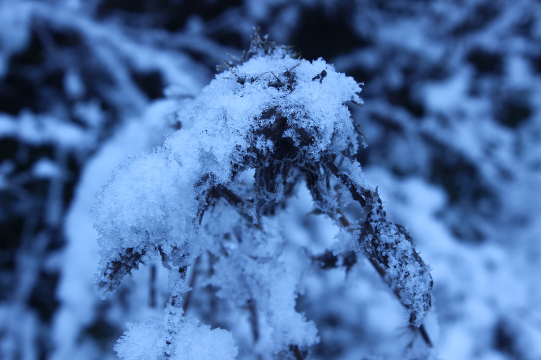
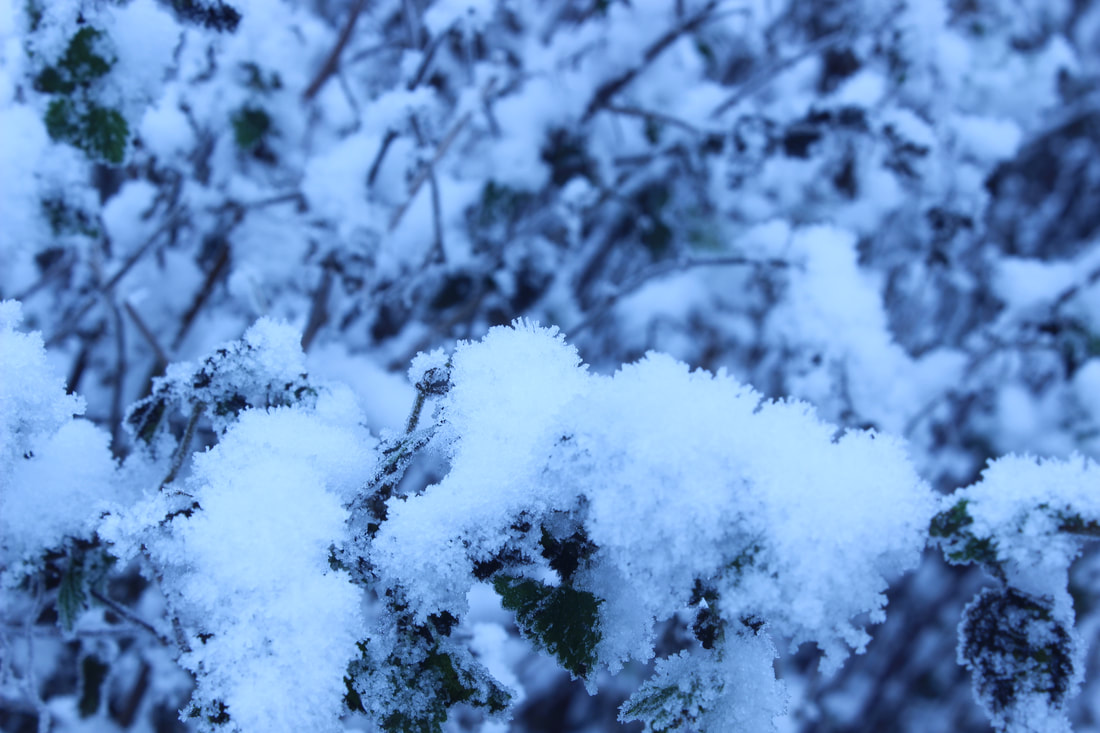
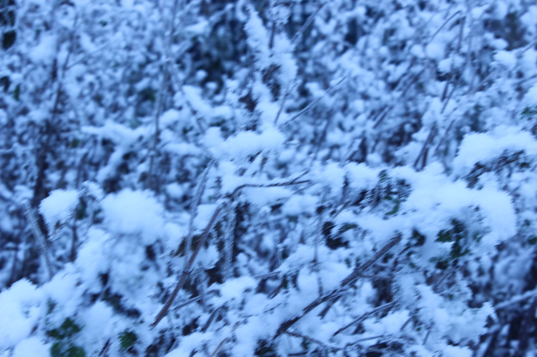
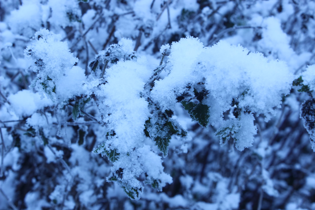
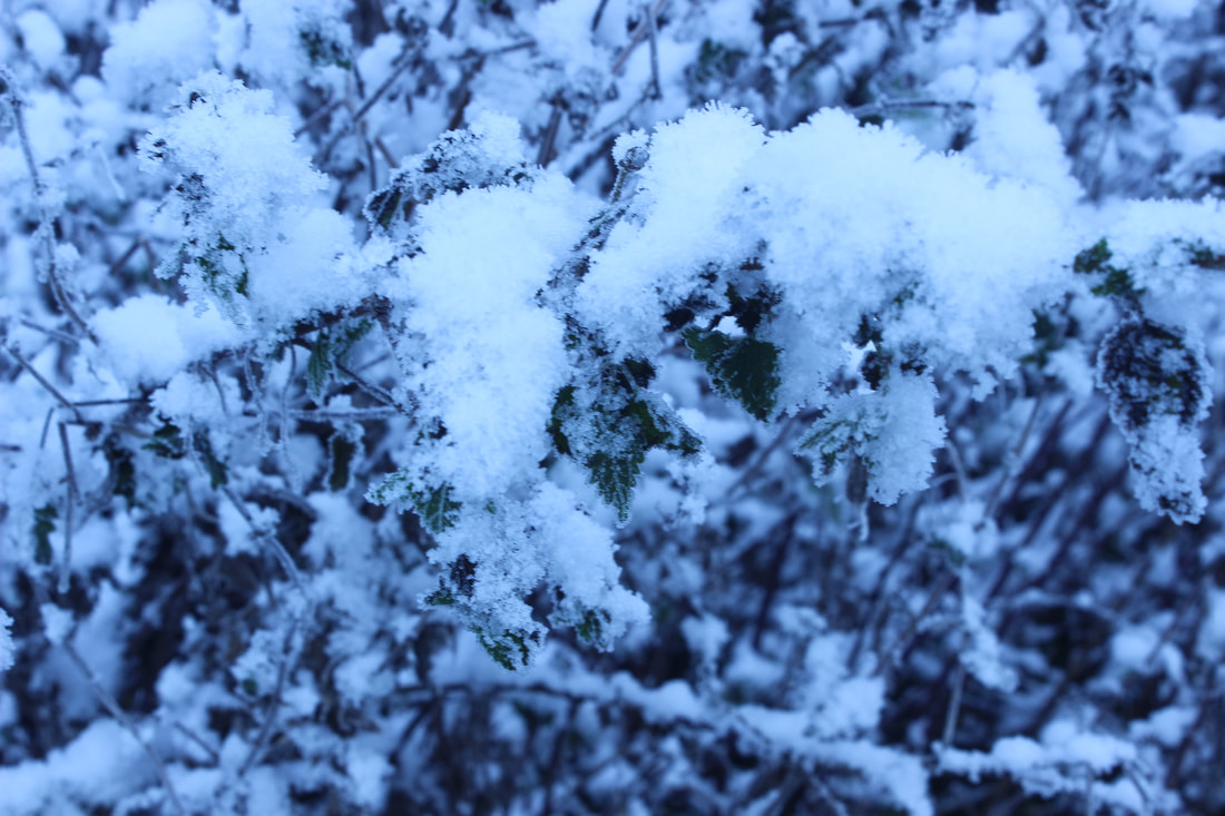
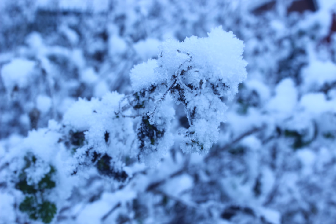
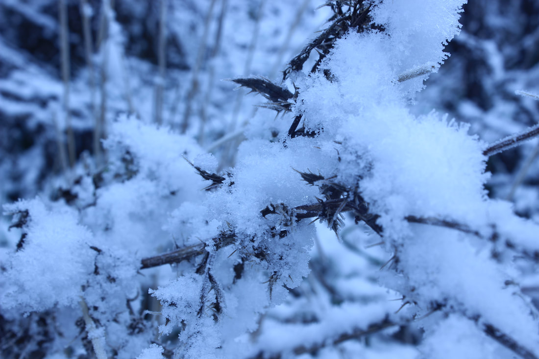
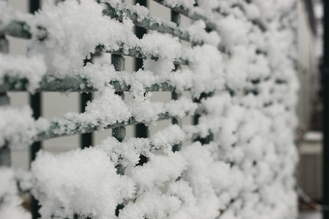
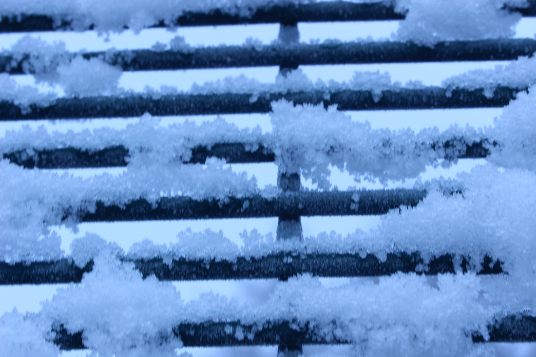
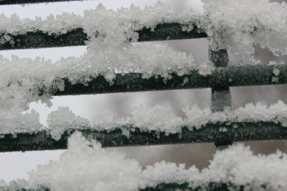
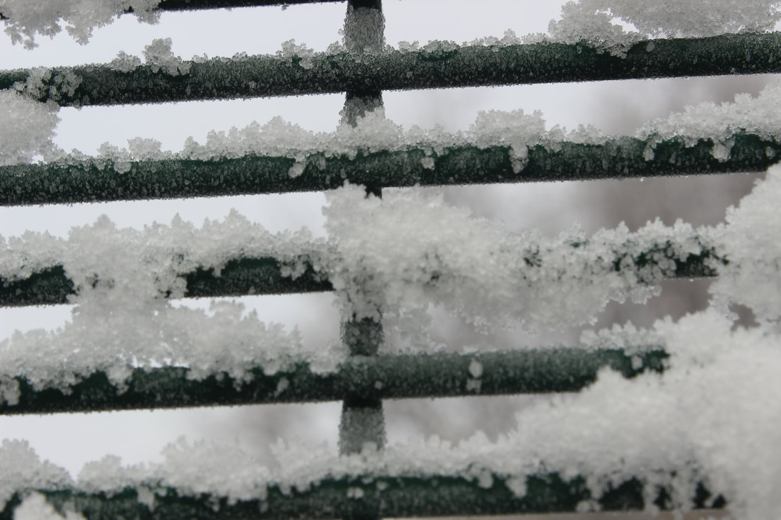
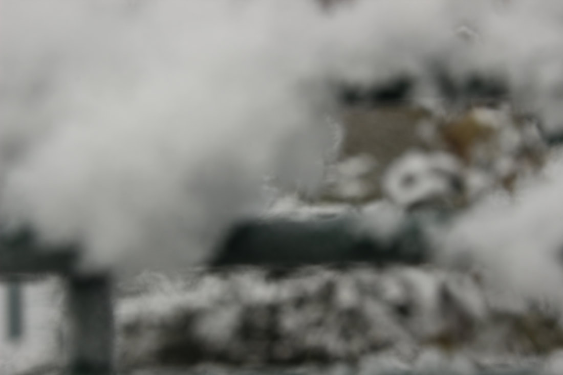
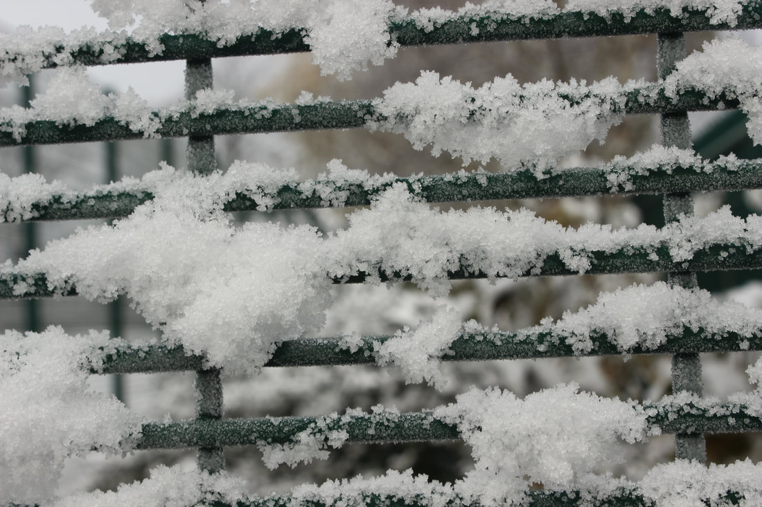
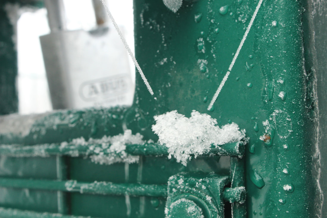
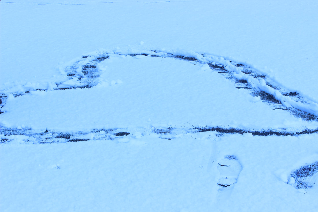
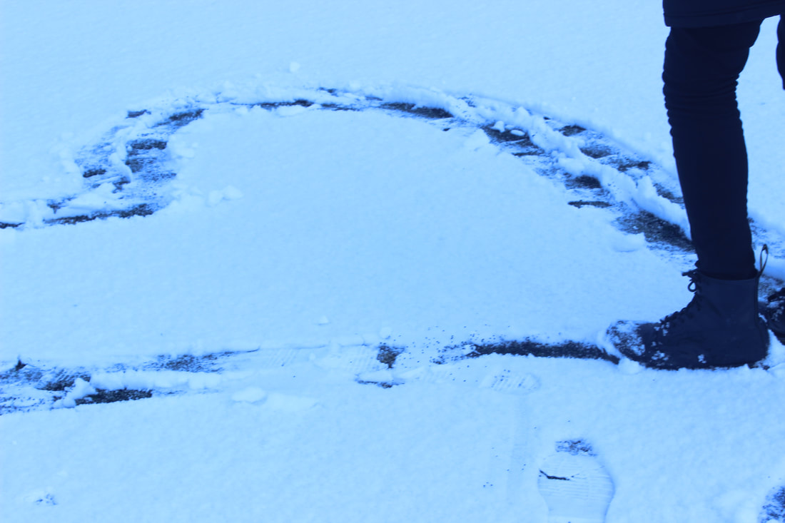
Snow shoot
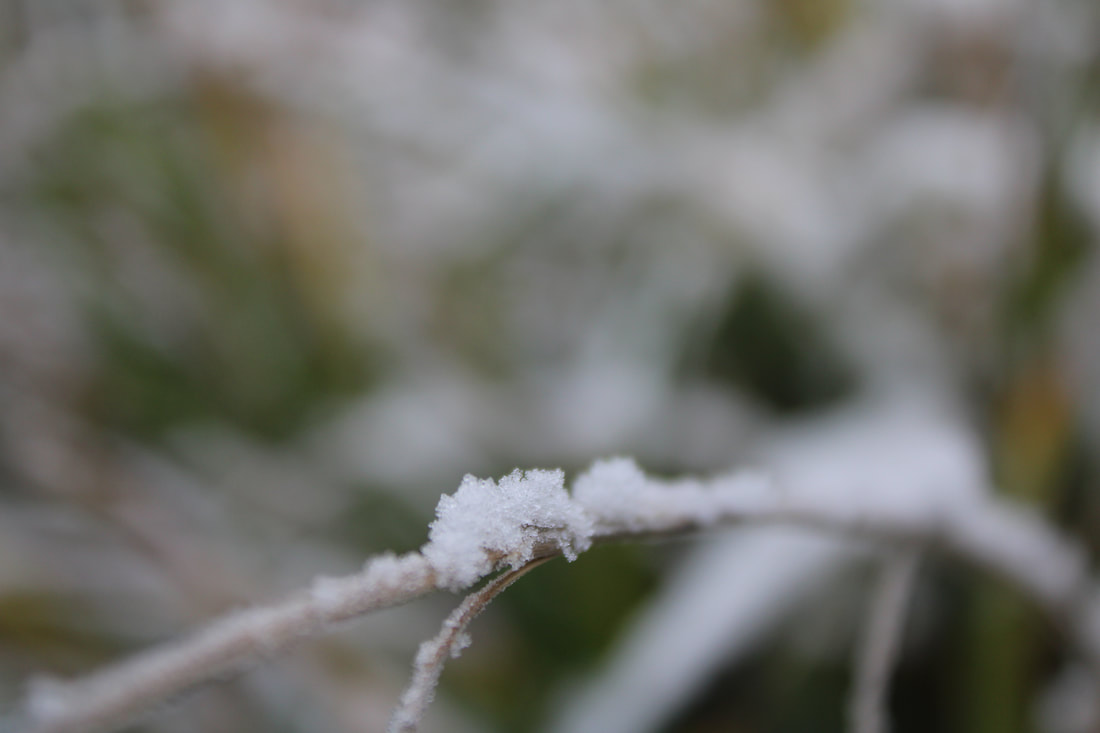
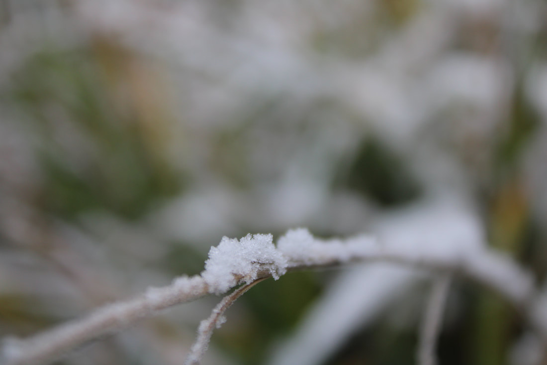
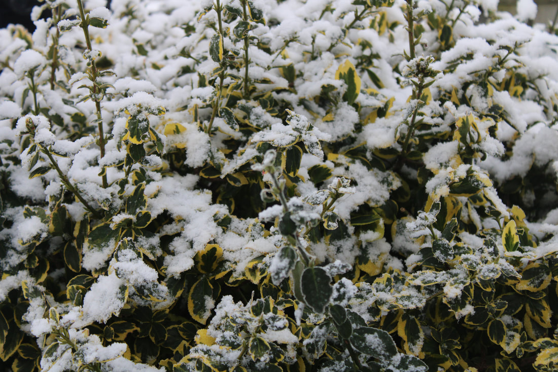
Best and worst
|
|
Best and worst
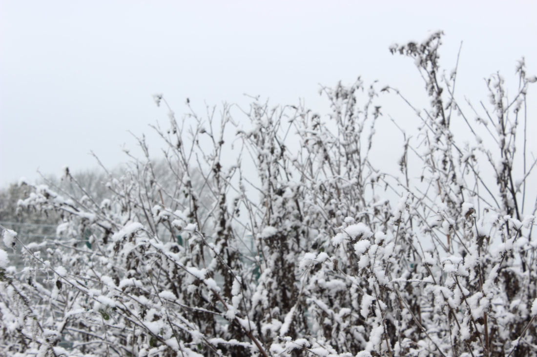
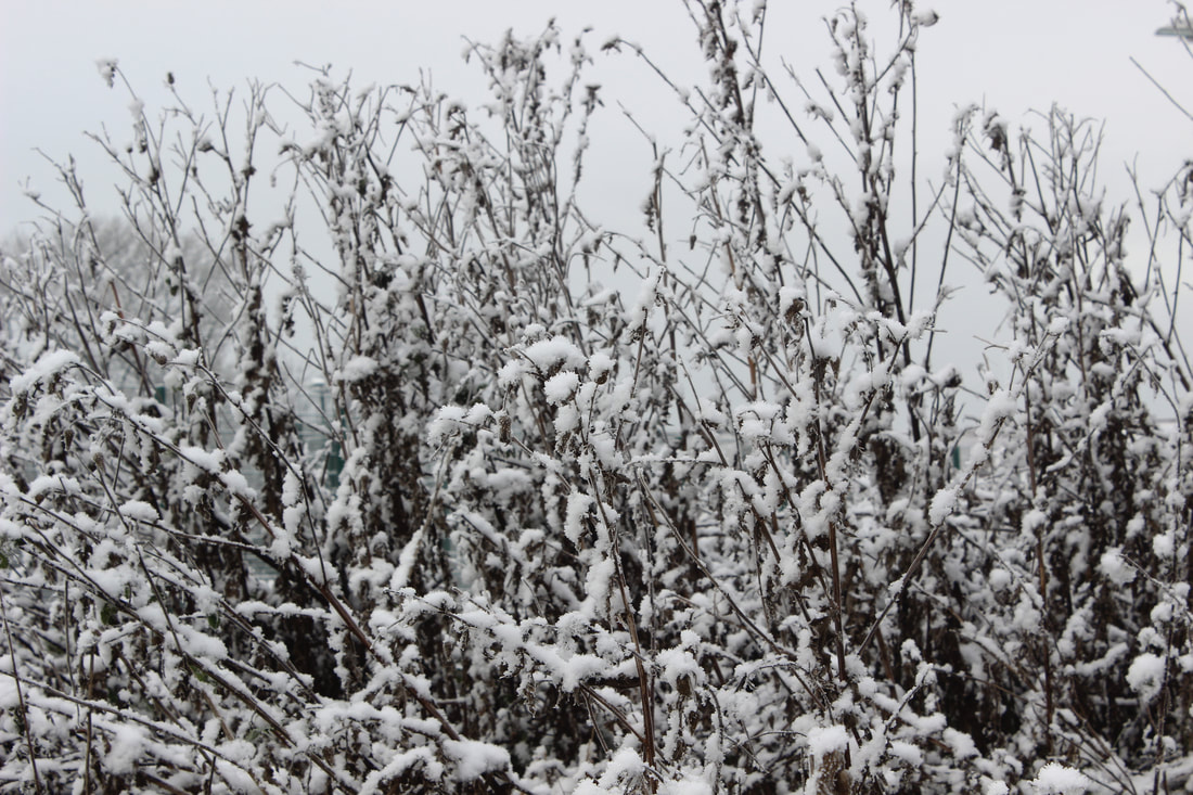
Best and worst
Best and worst


Best and worst


Best and worst


Best and worst
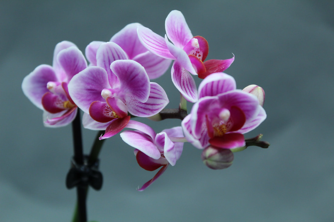
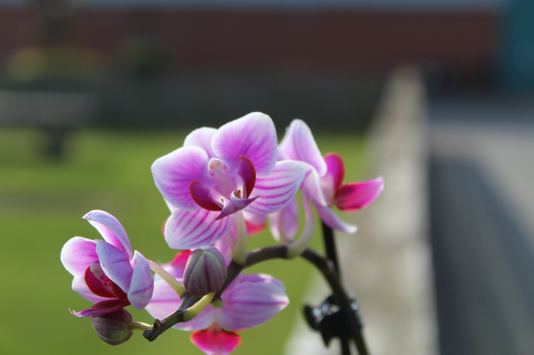
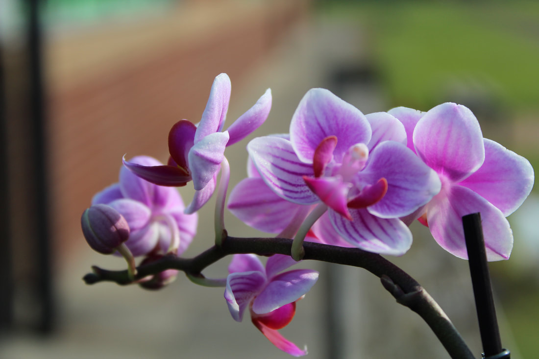
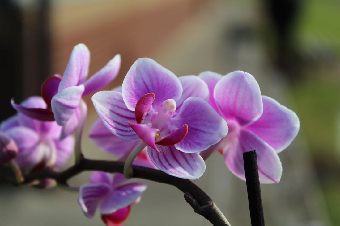
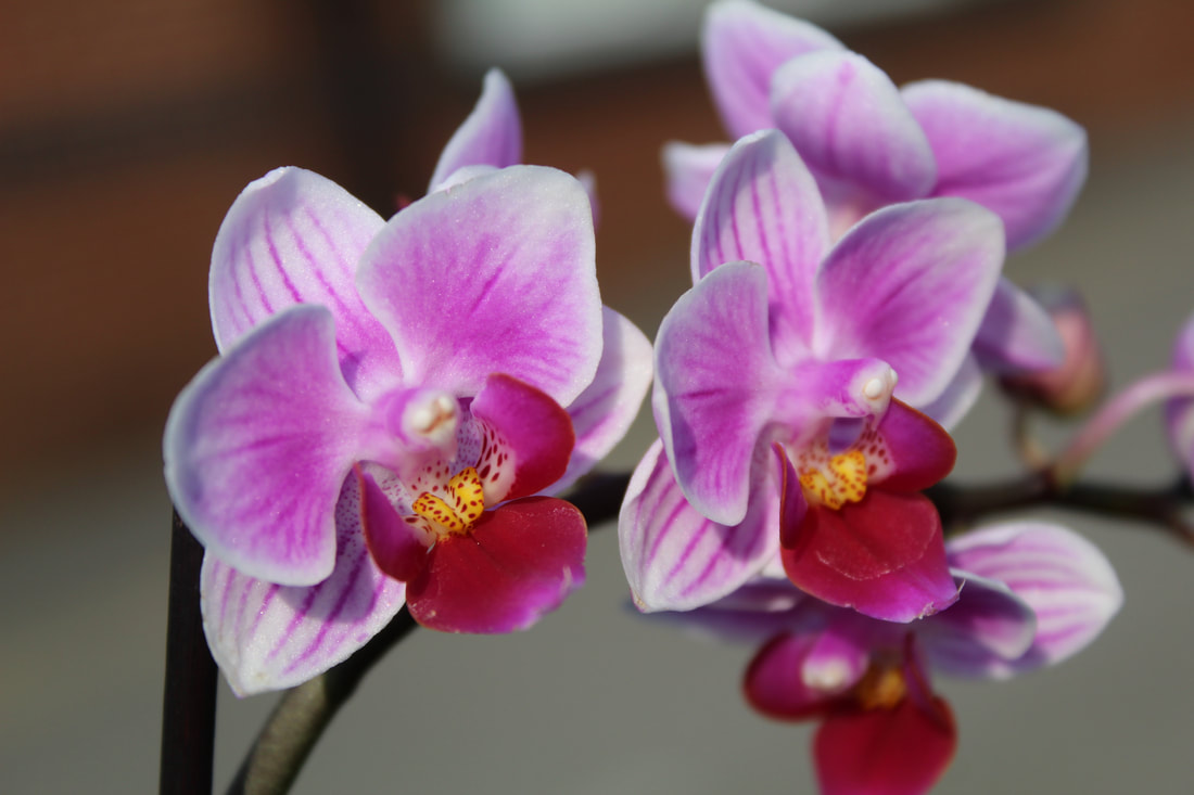
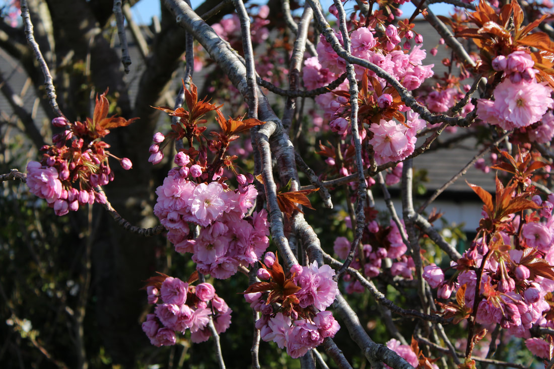
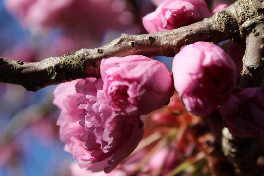
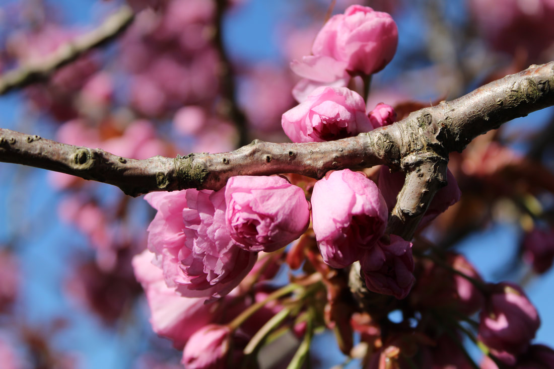
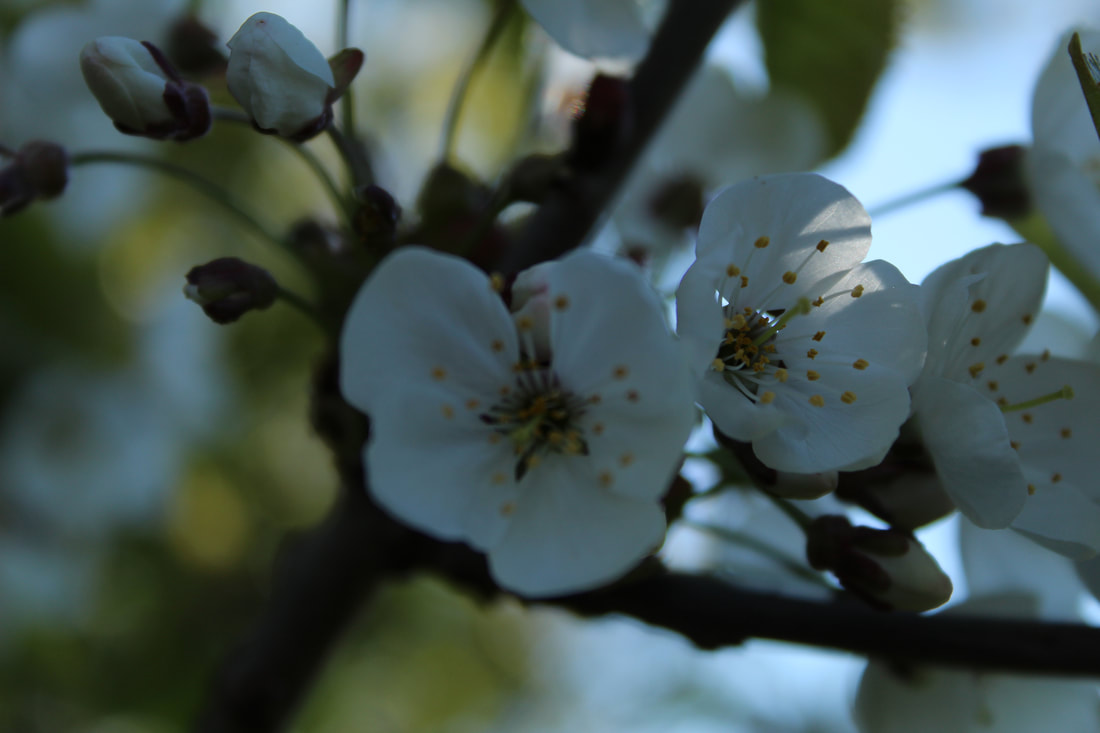
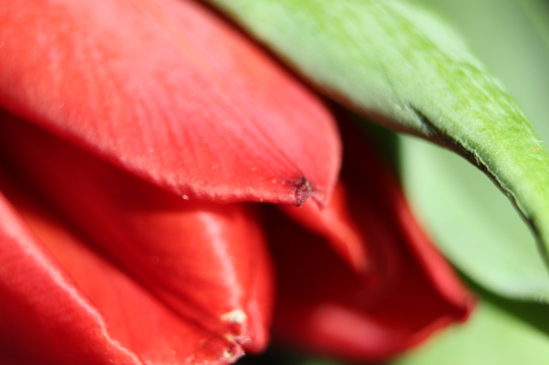
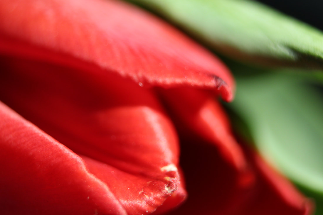
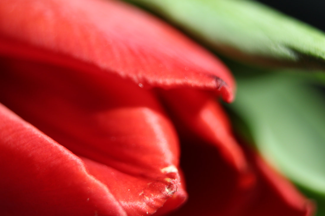
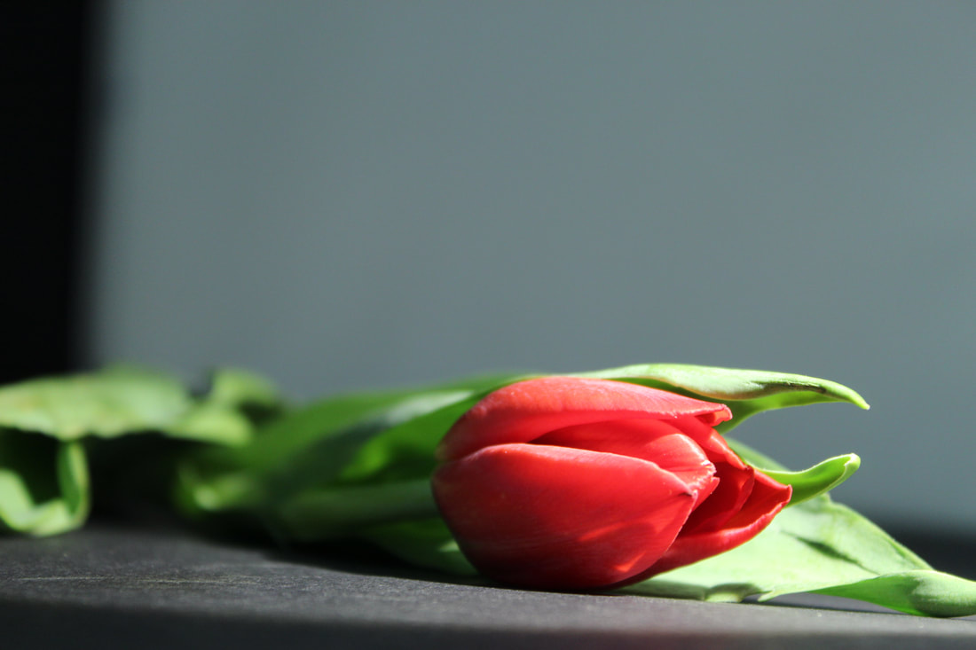
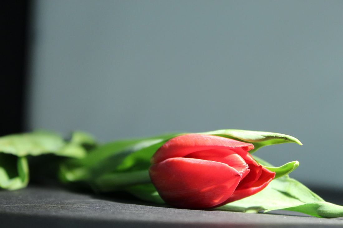
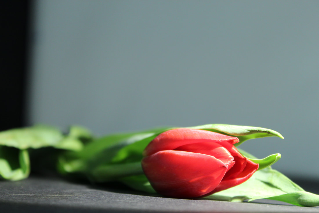
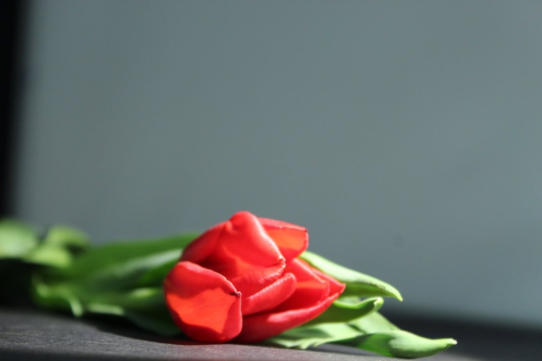
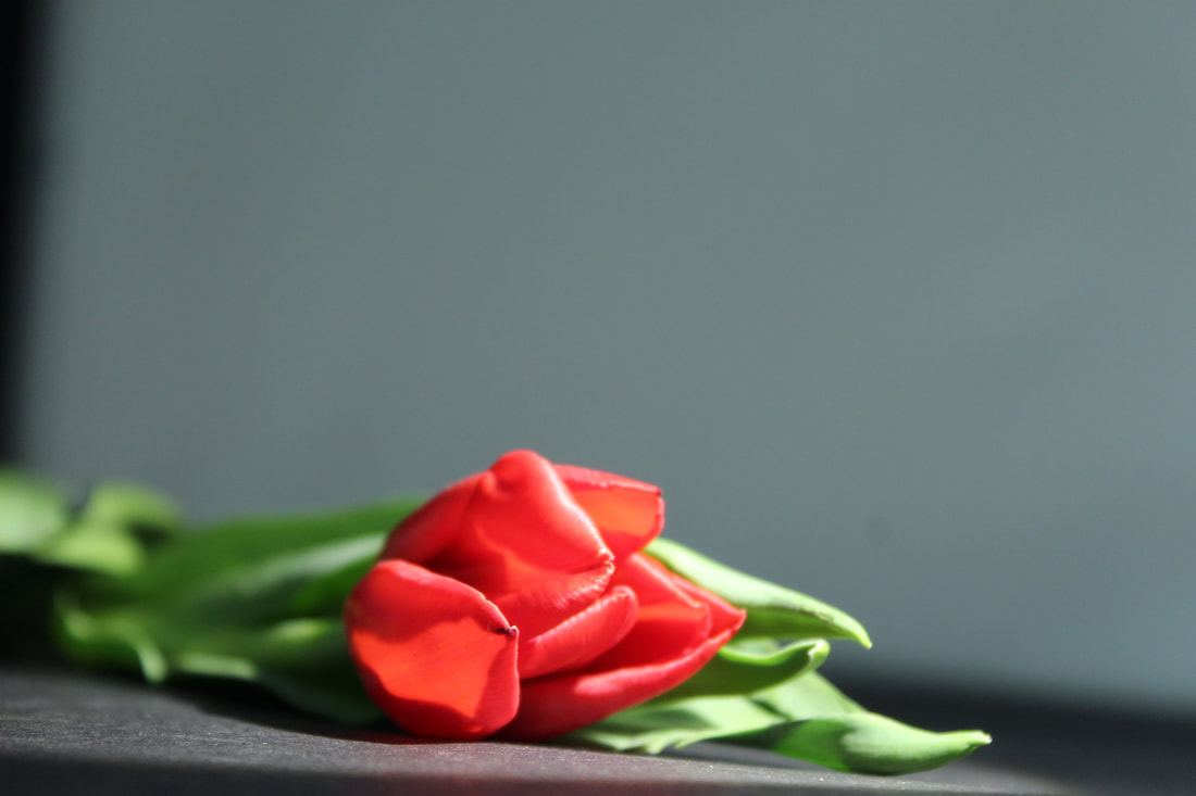
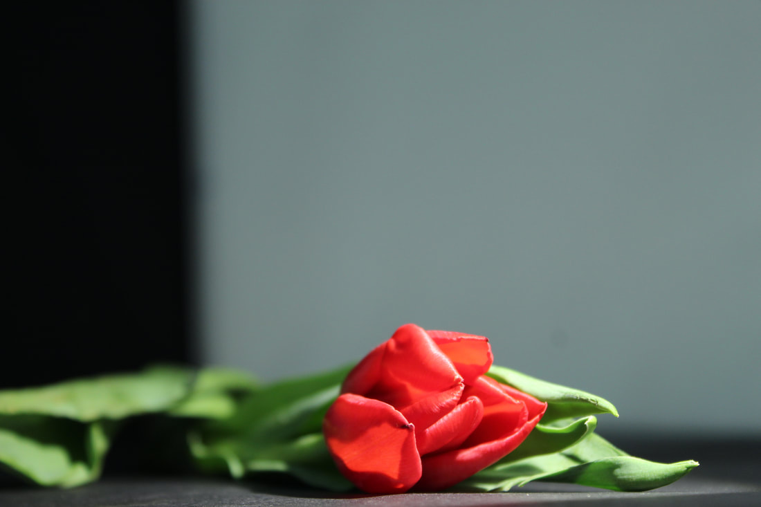
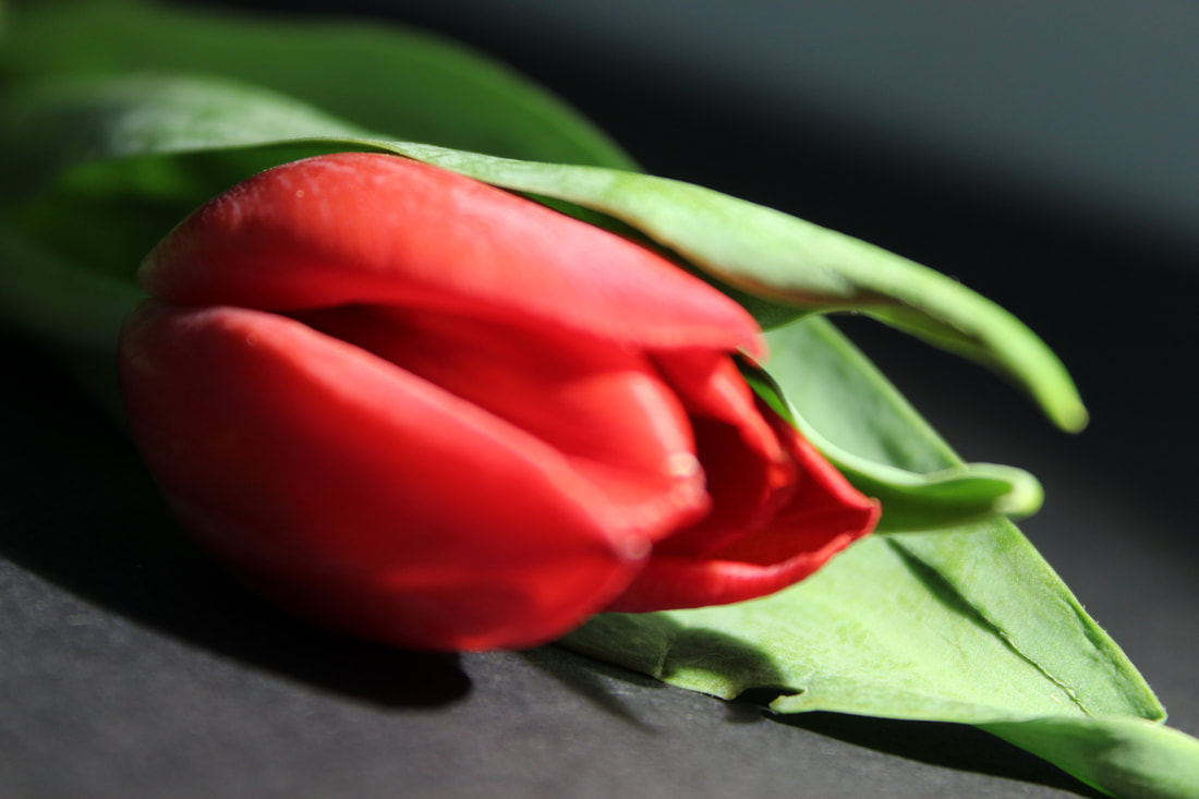
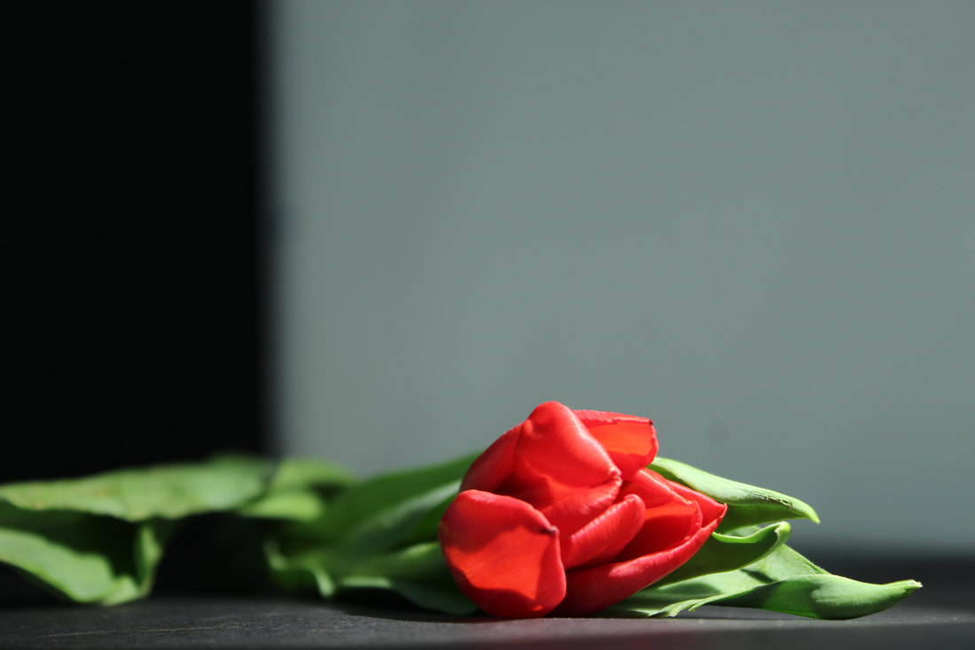
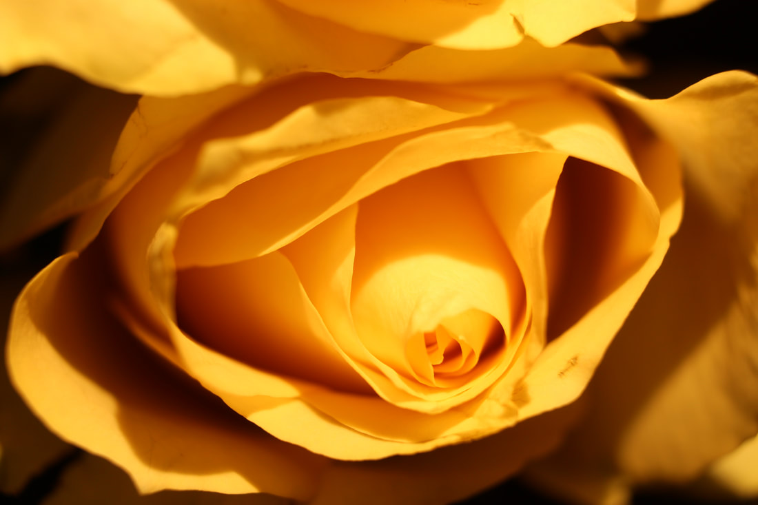
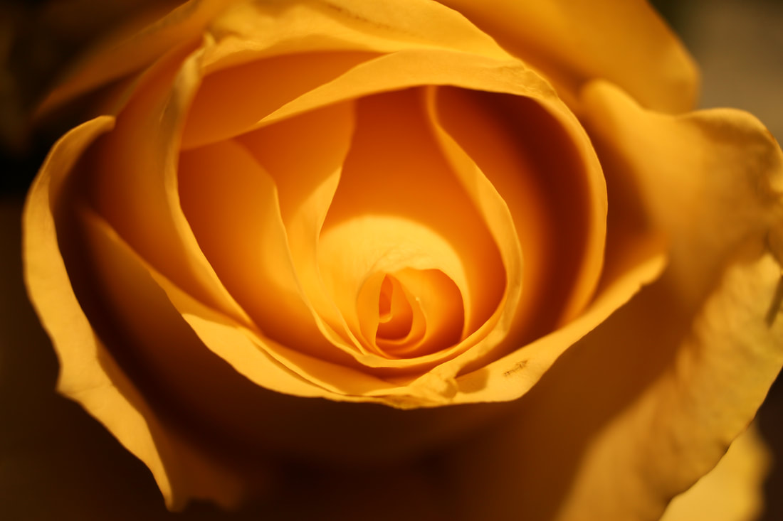
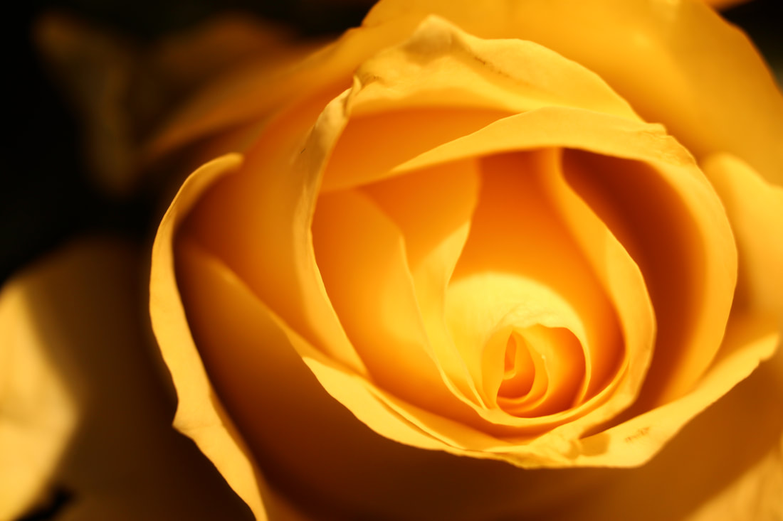
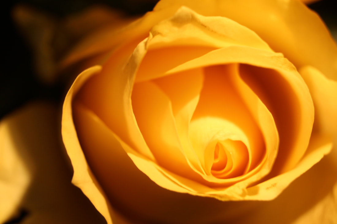
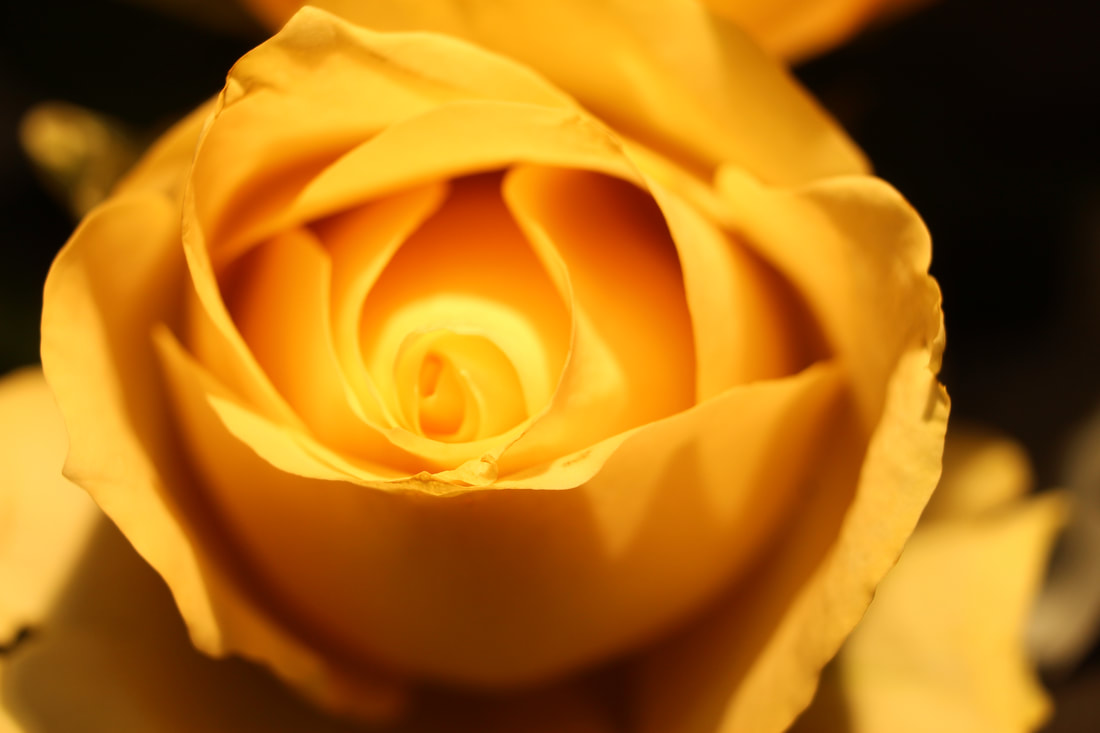
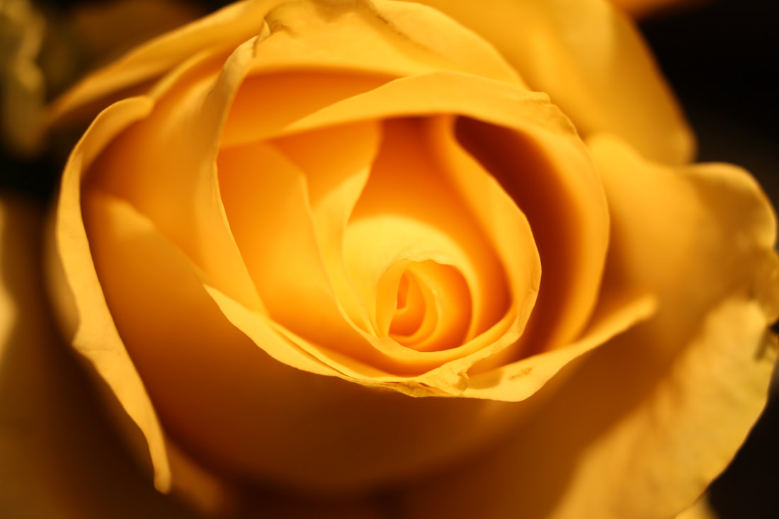
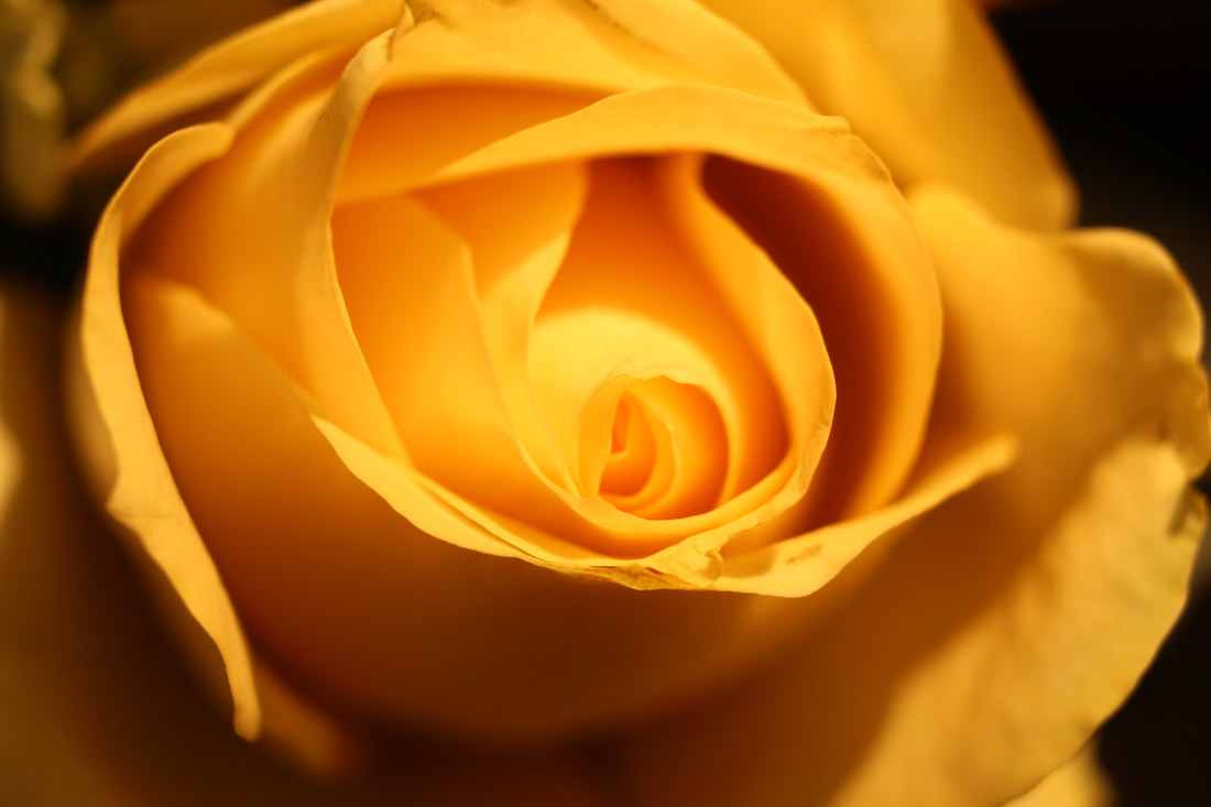
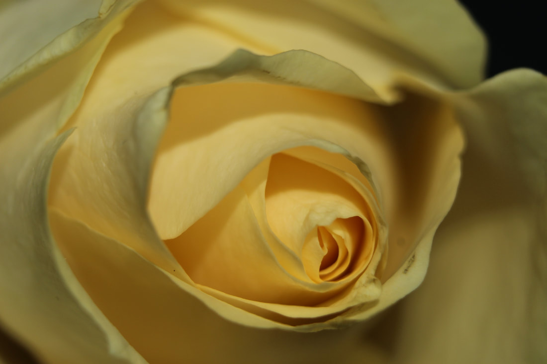
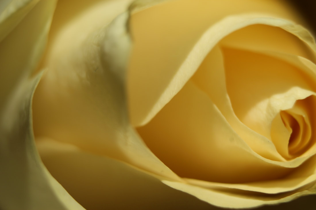
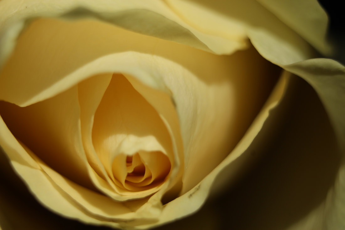
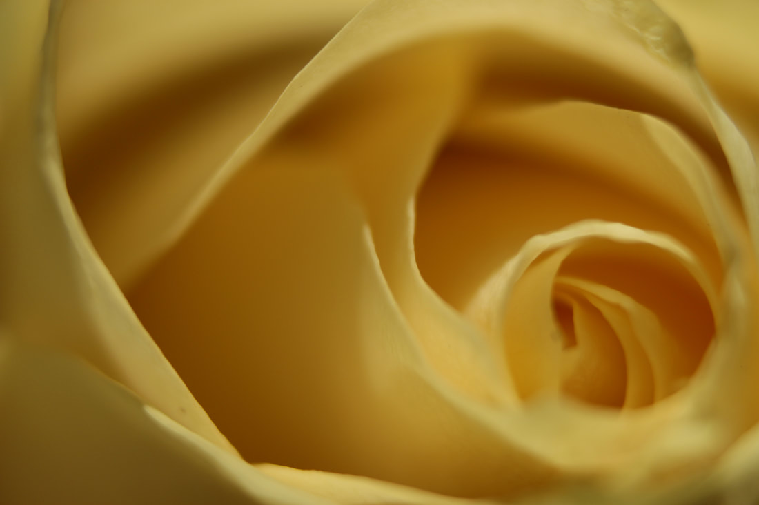
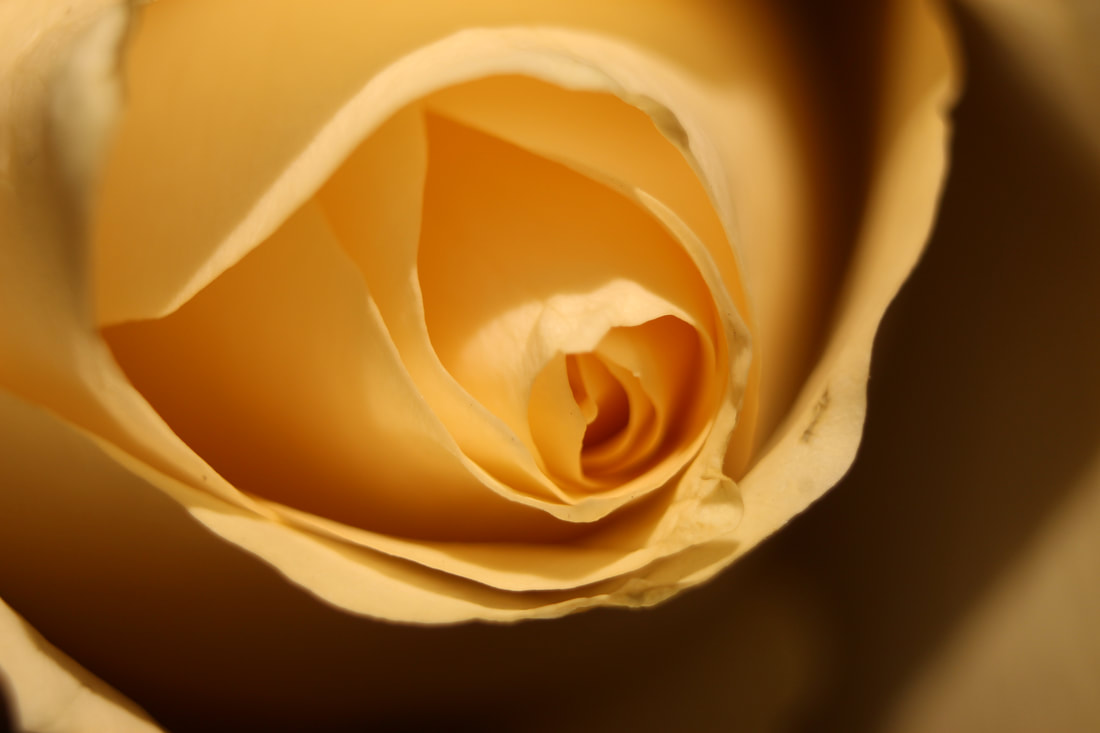
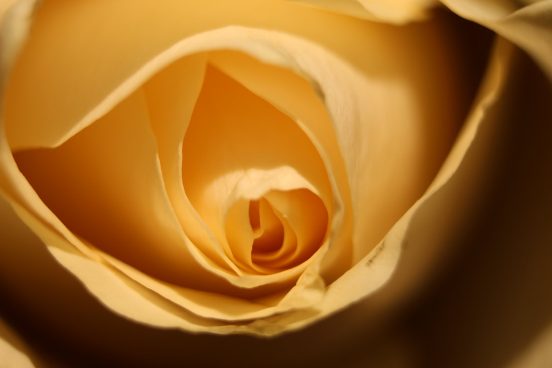
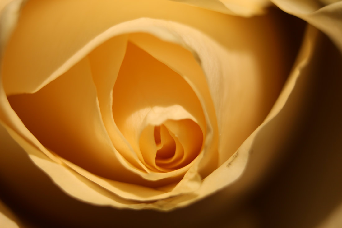
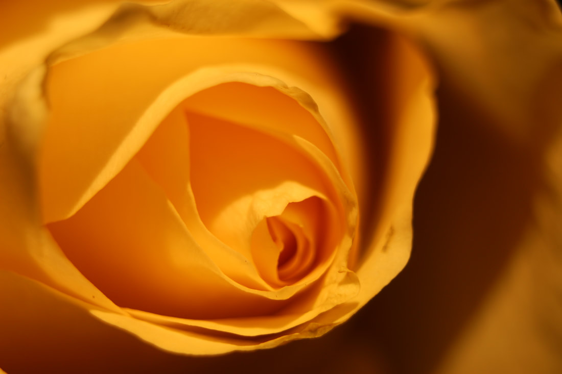
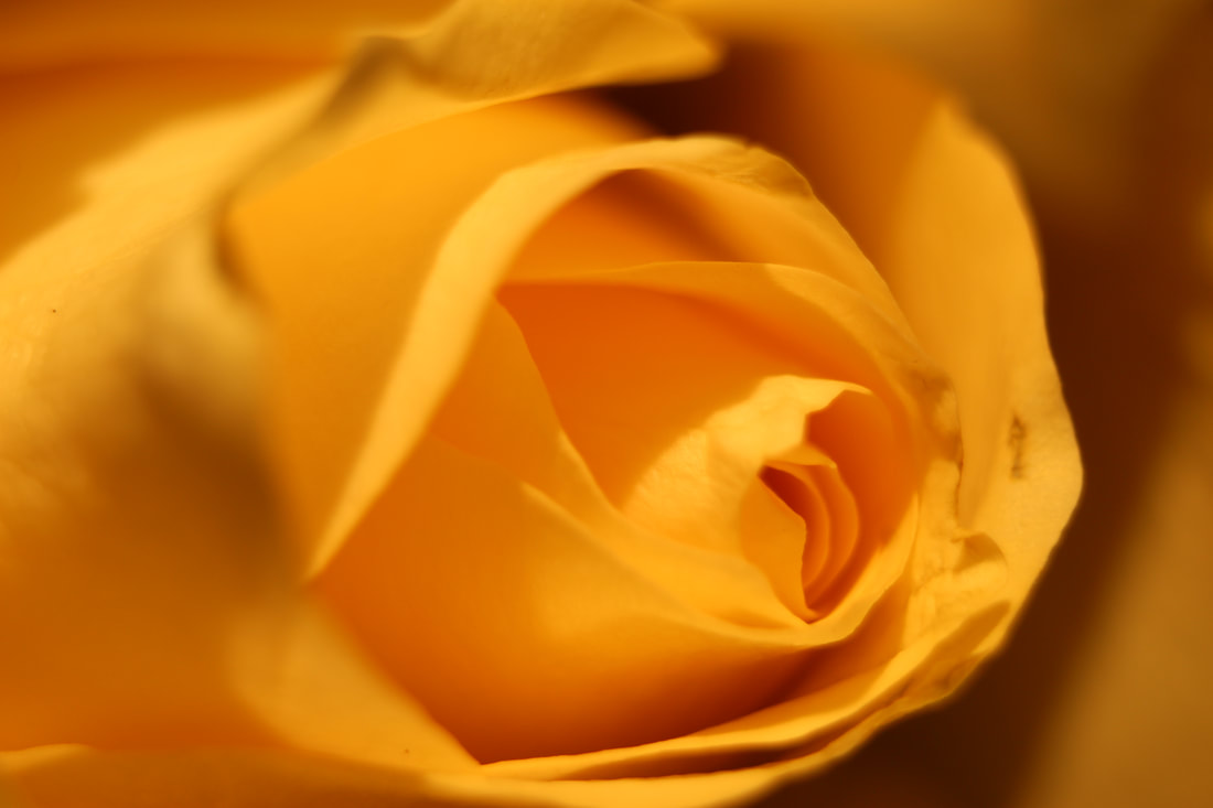
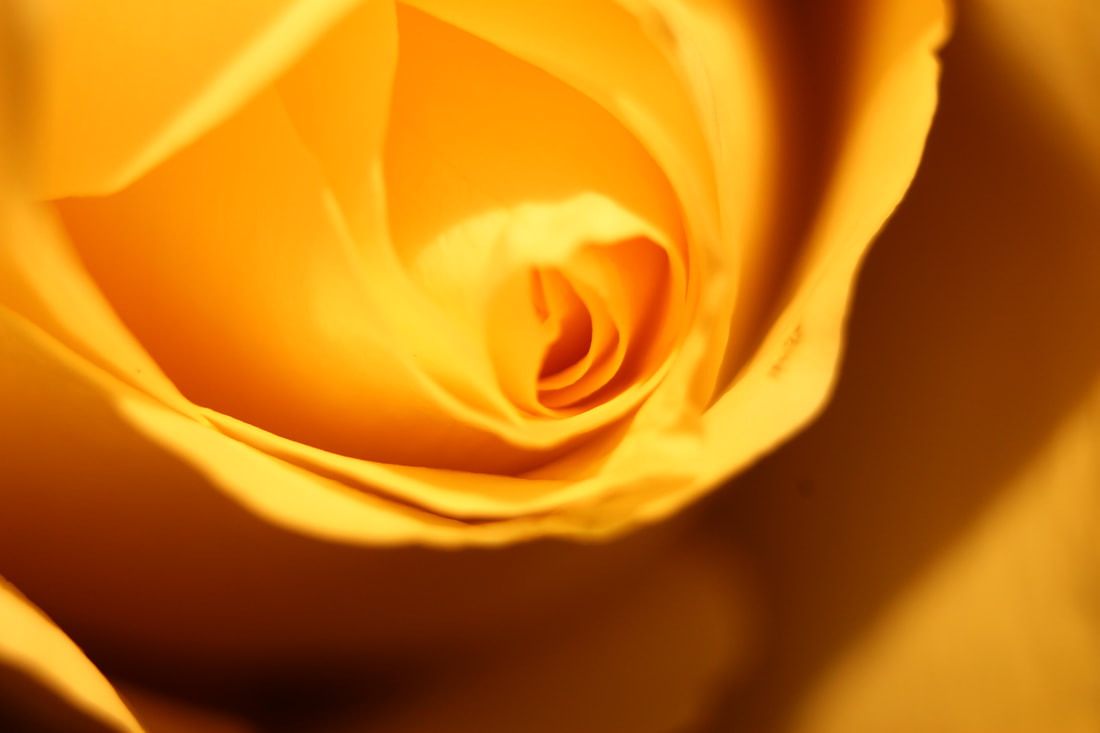
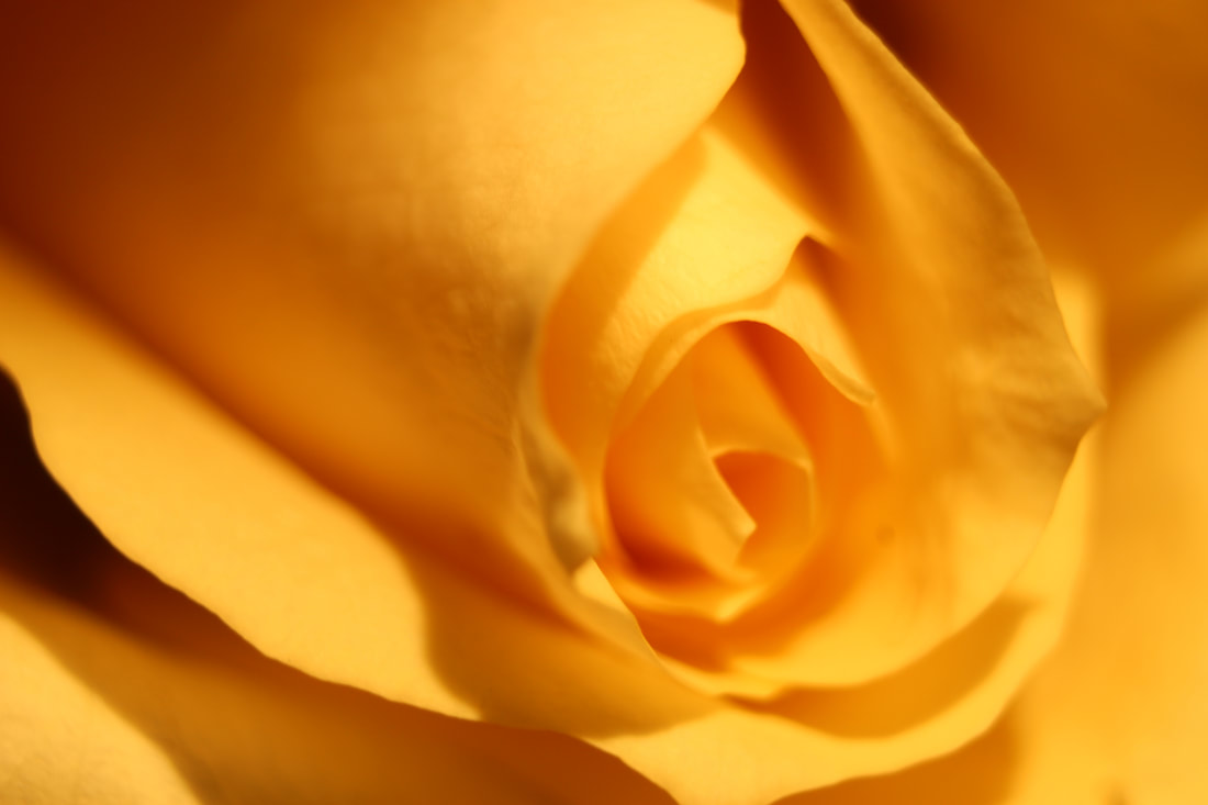
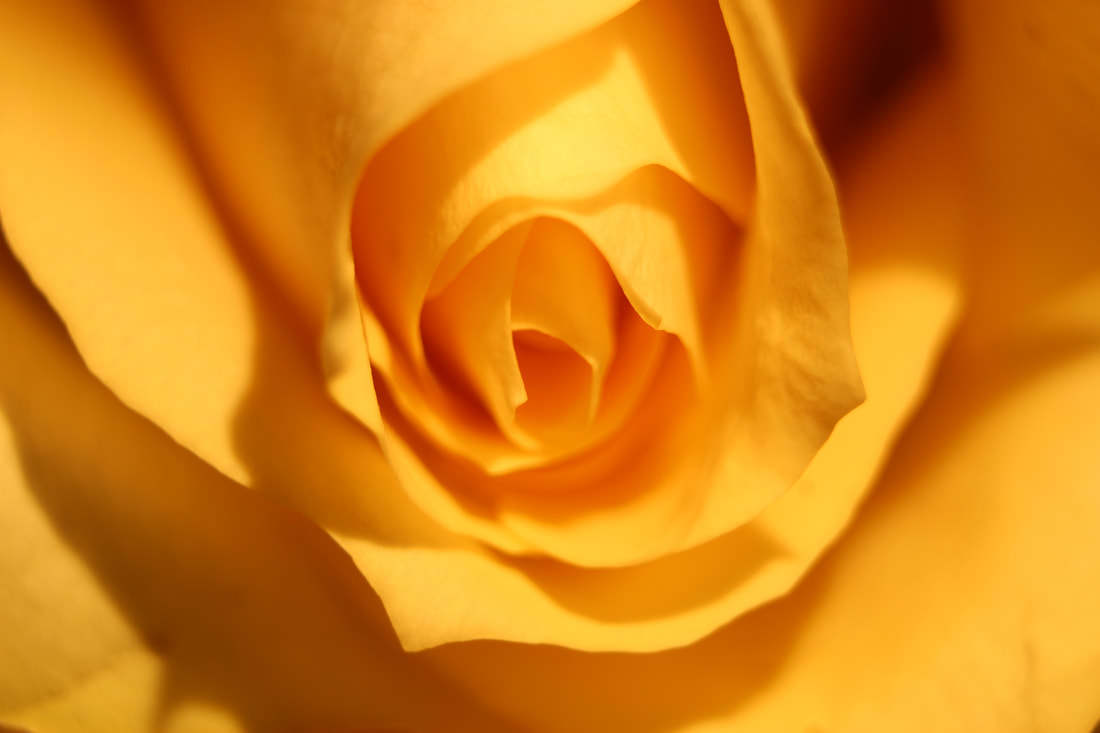
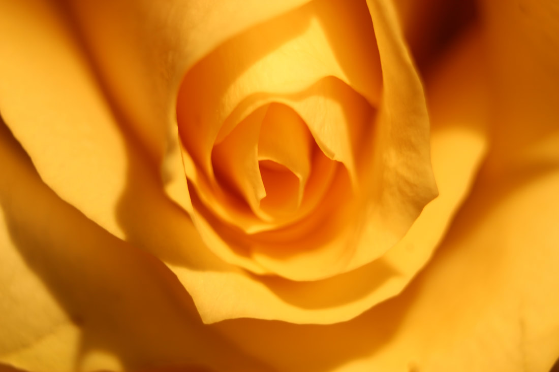
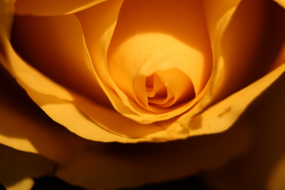
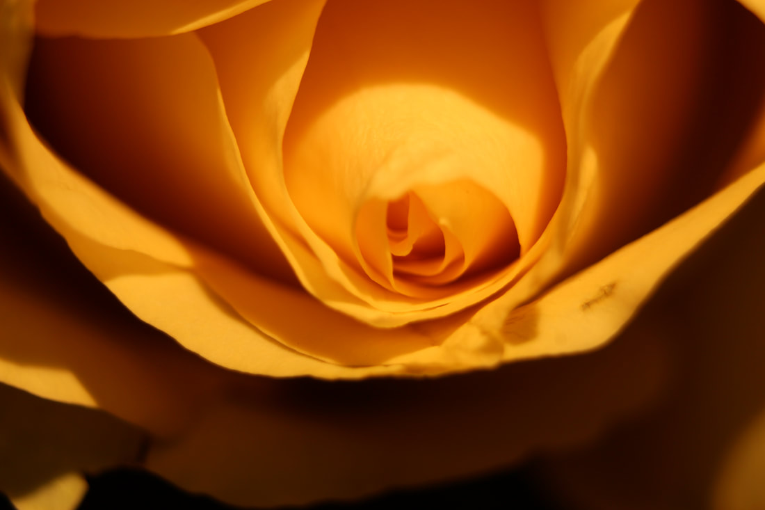
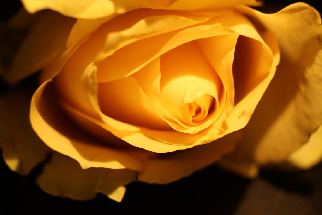
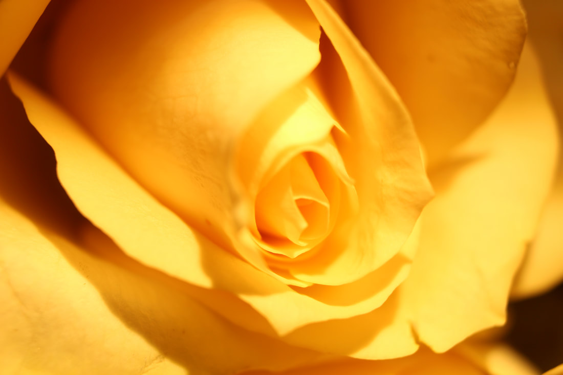
Studio shoot of flowers
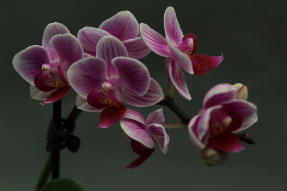
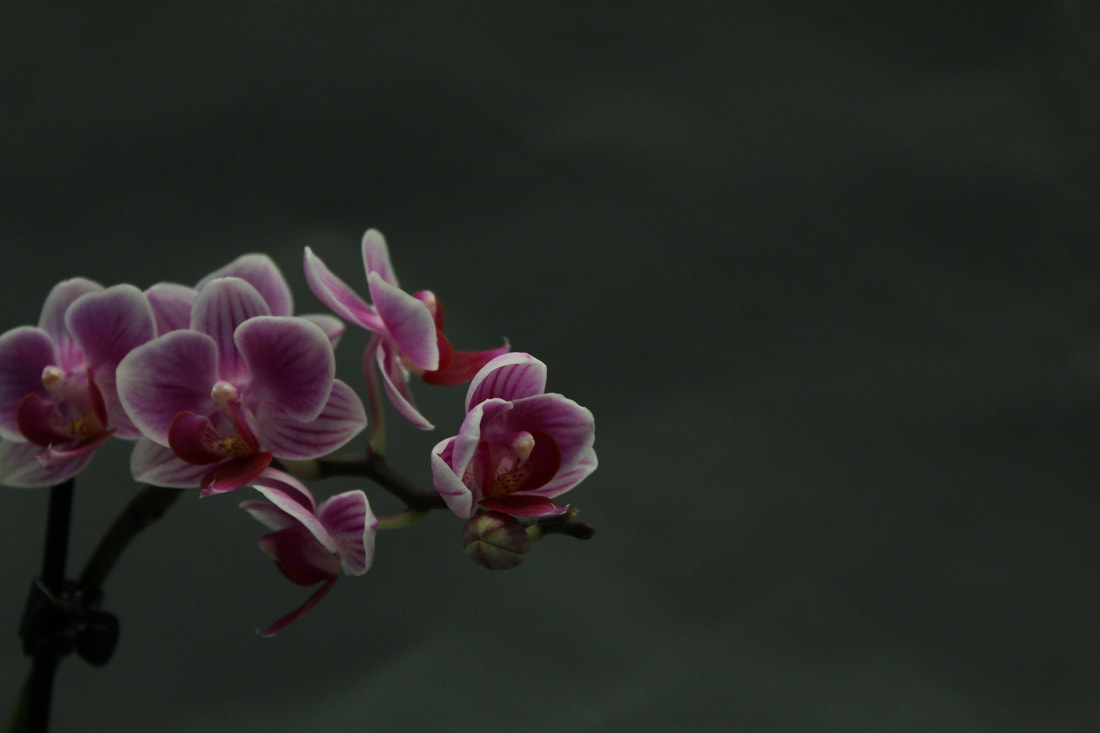
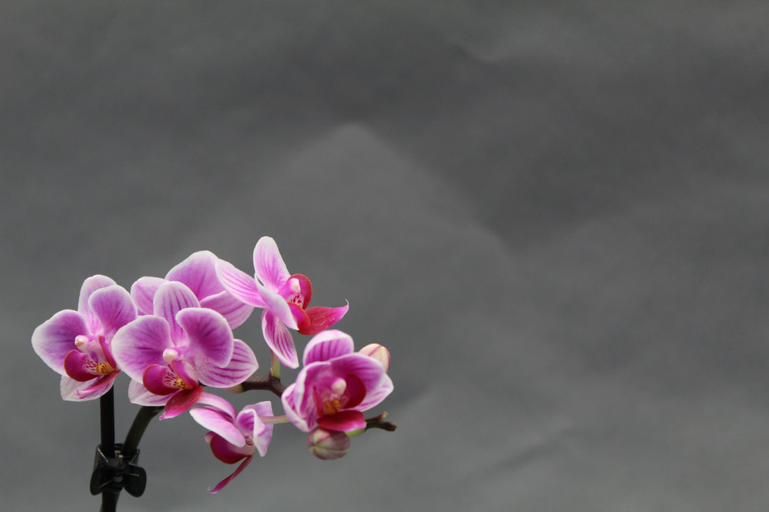
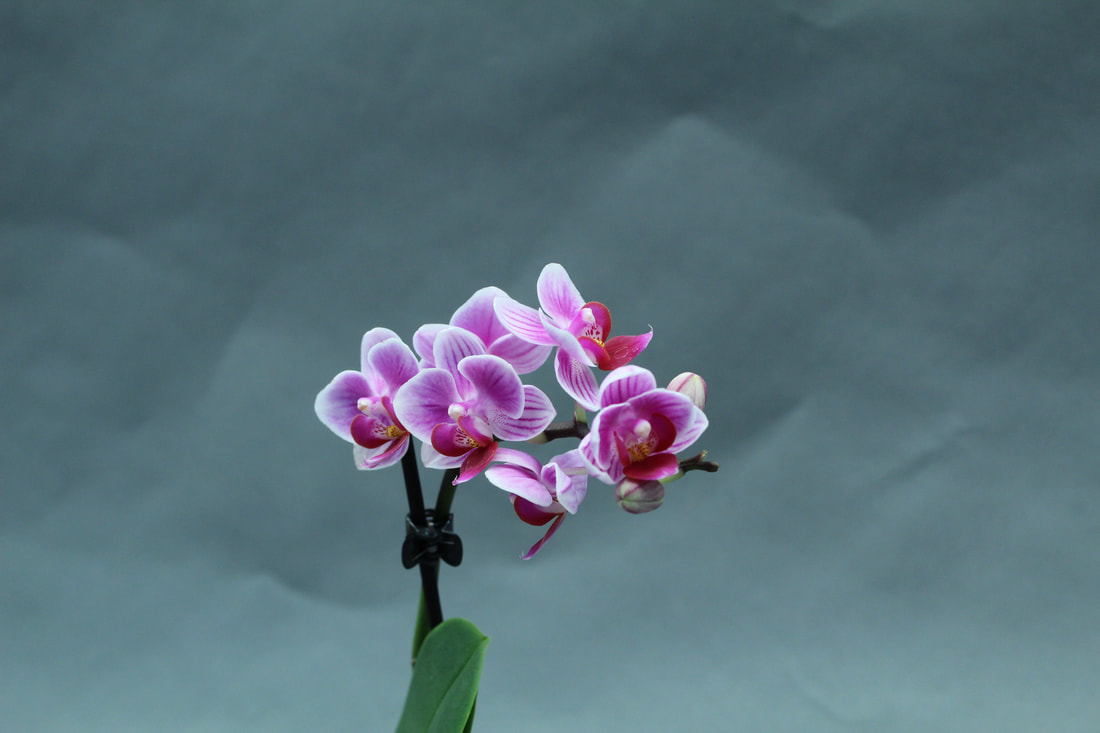
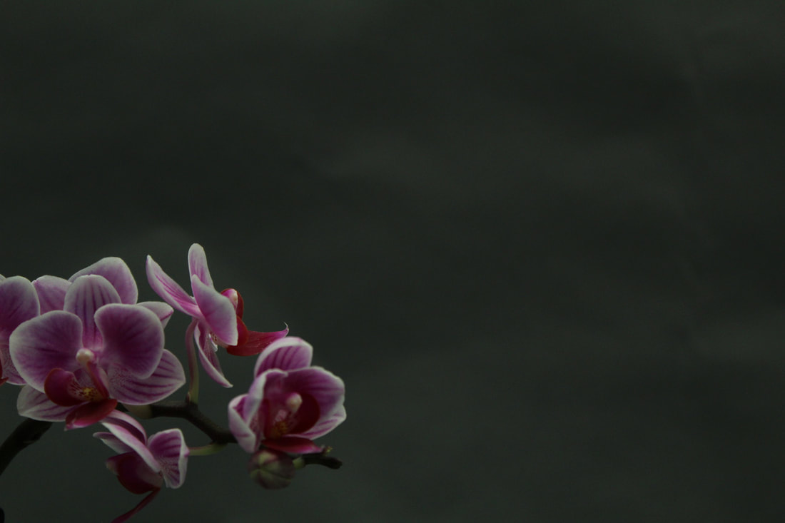
My best and worst images
|
|
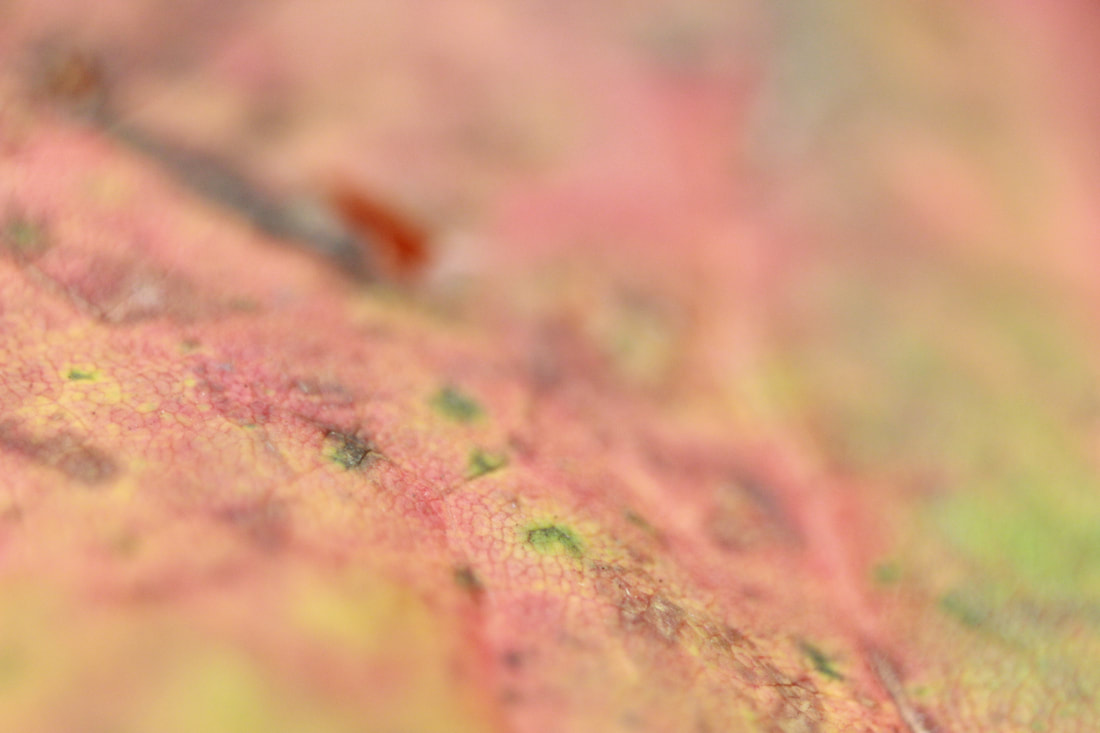
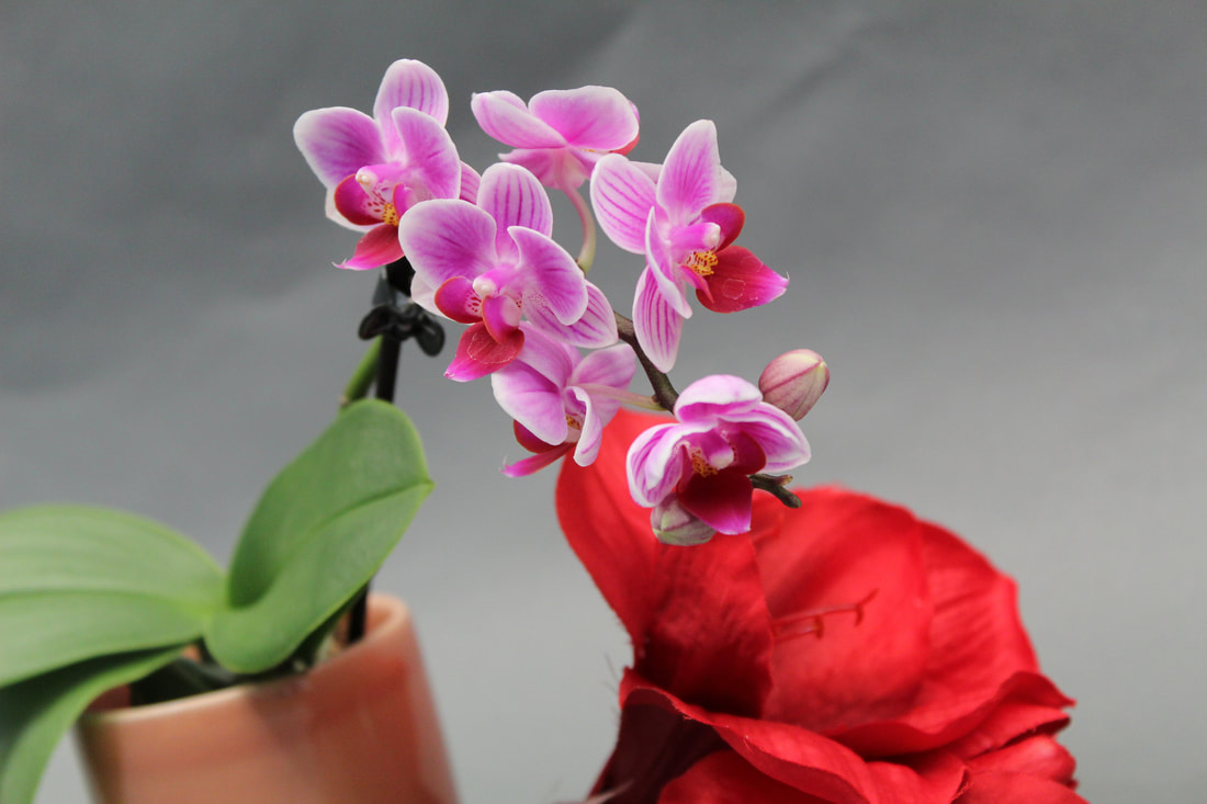
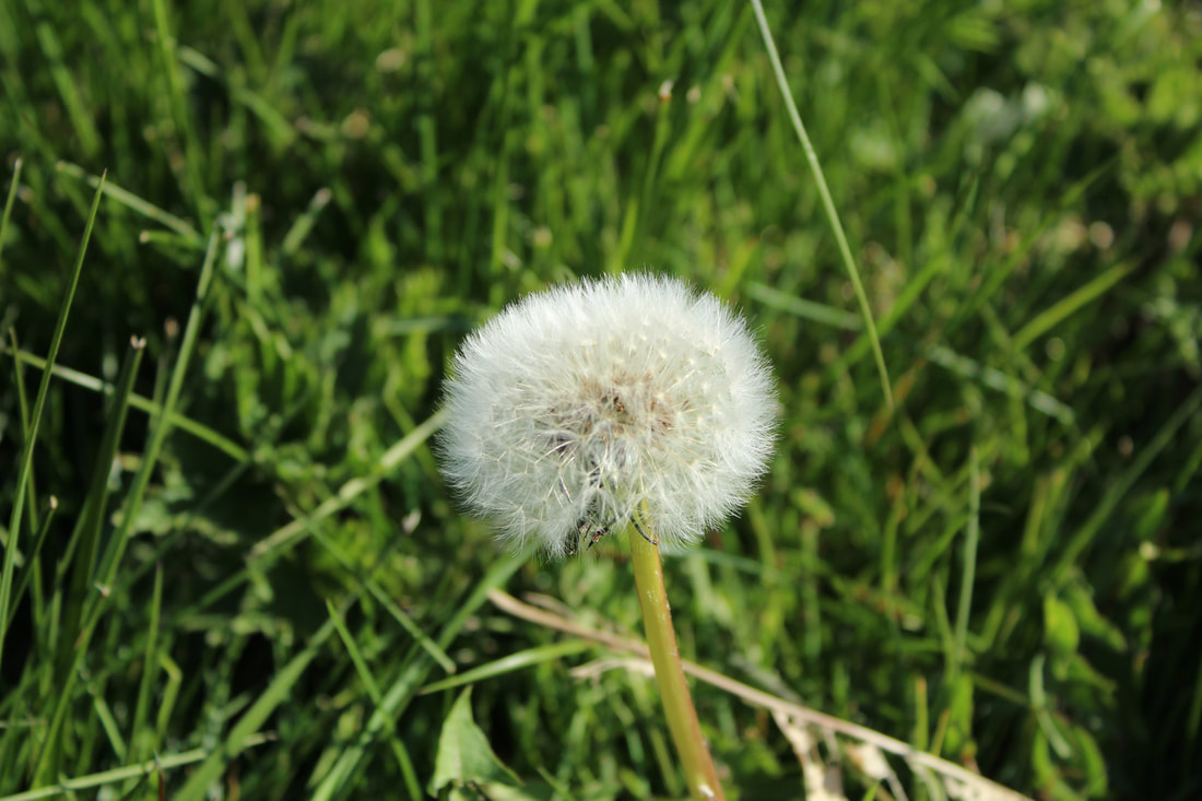
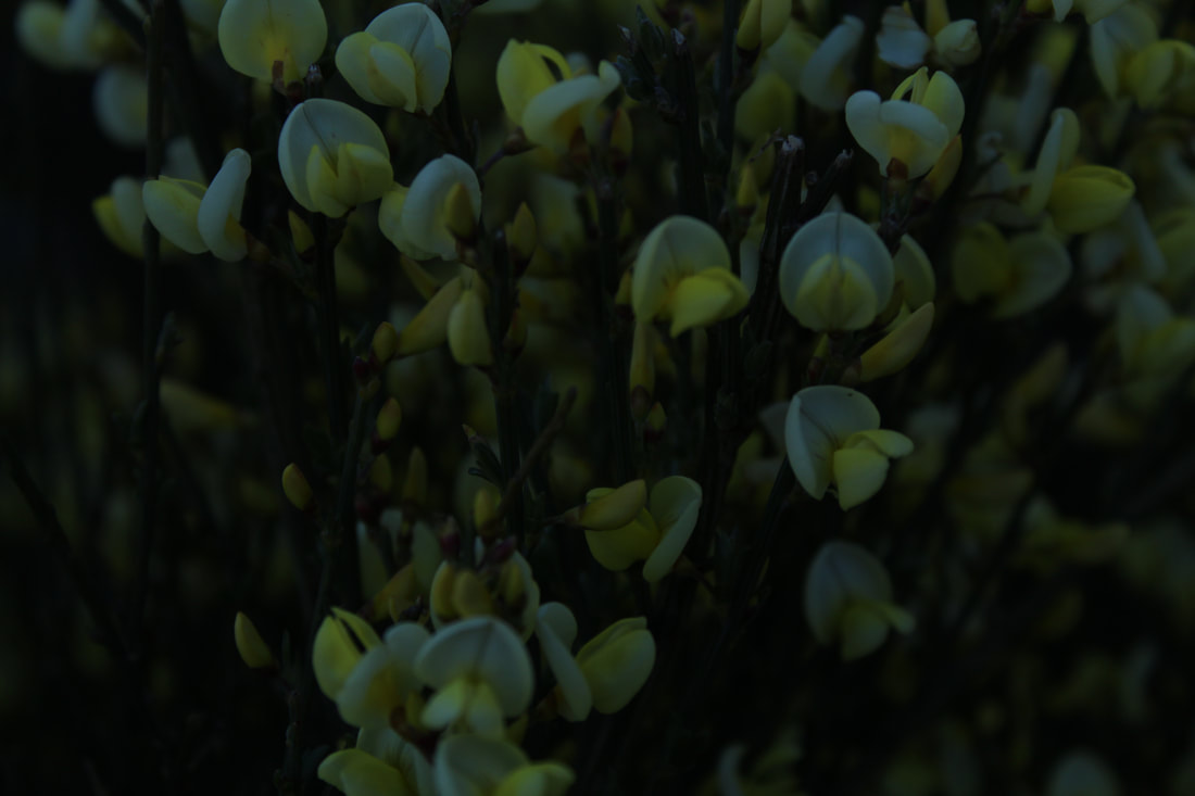
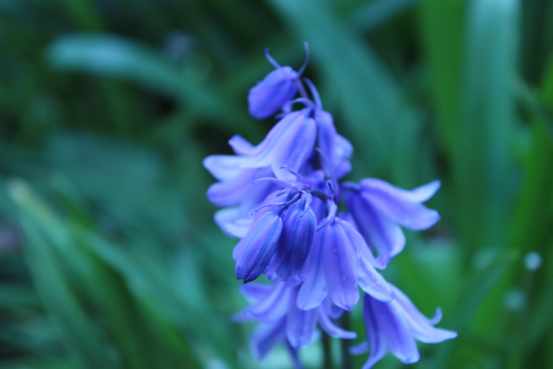
Flowers in a natural setting
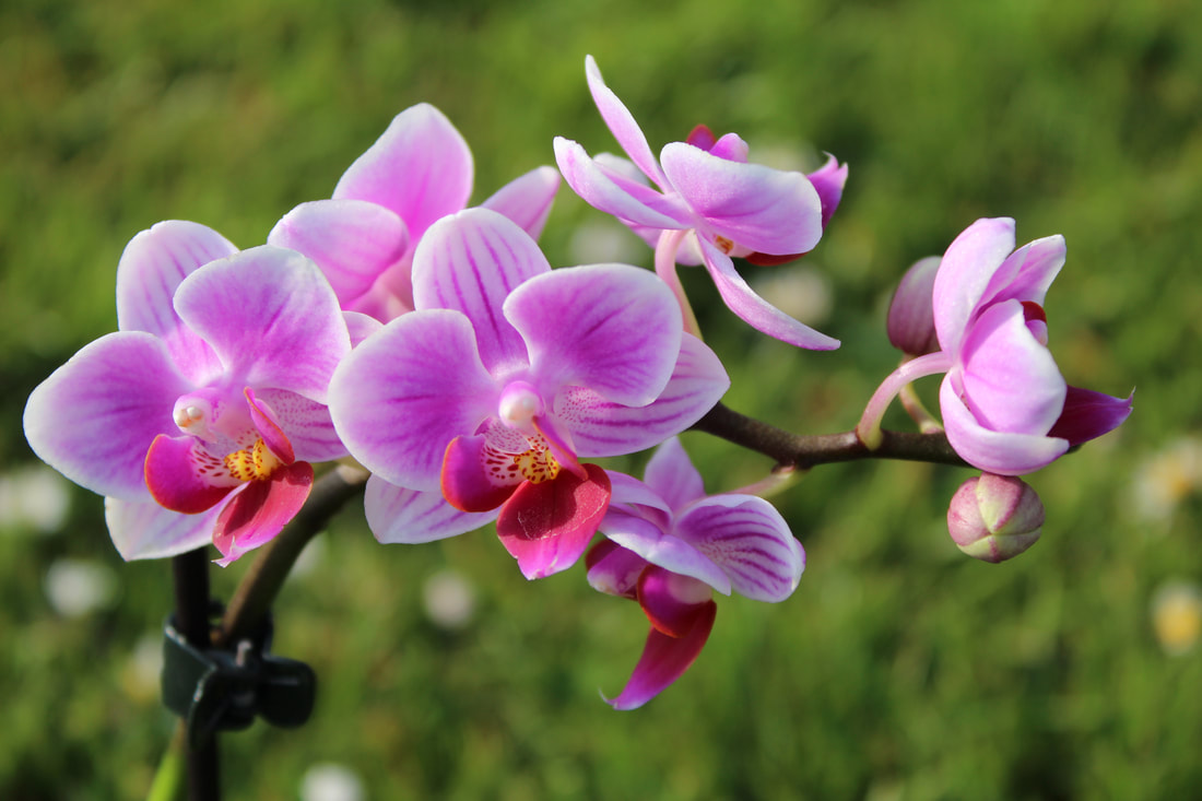
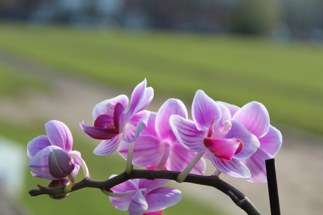
My best and worst images
|
|
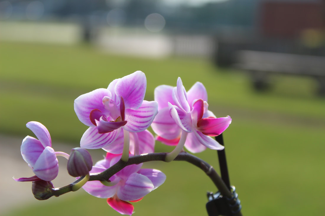
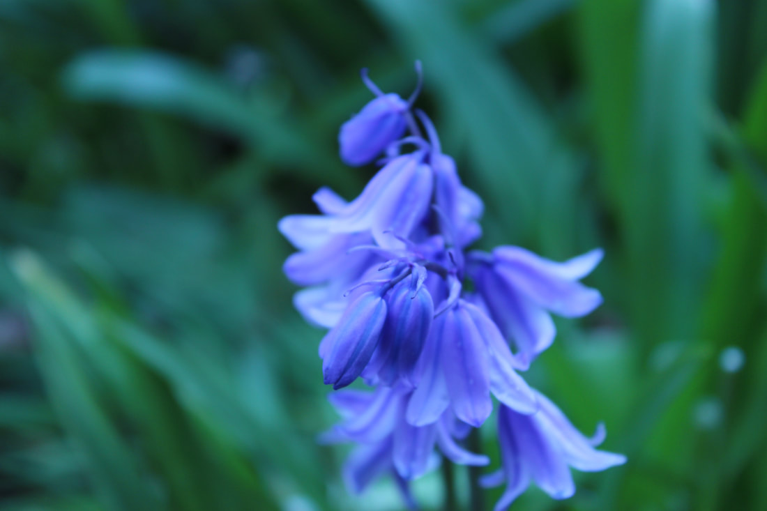
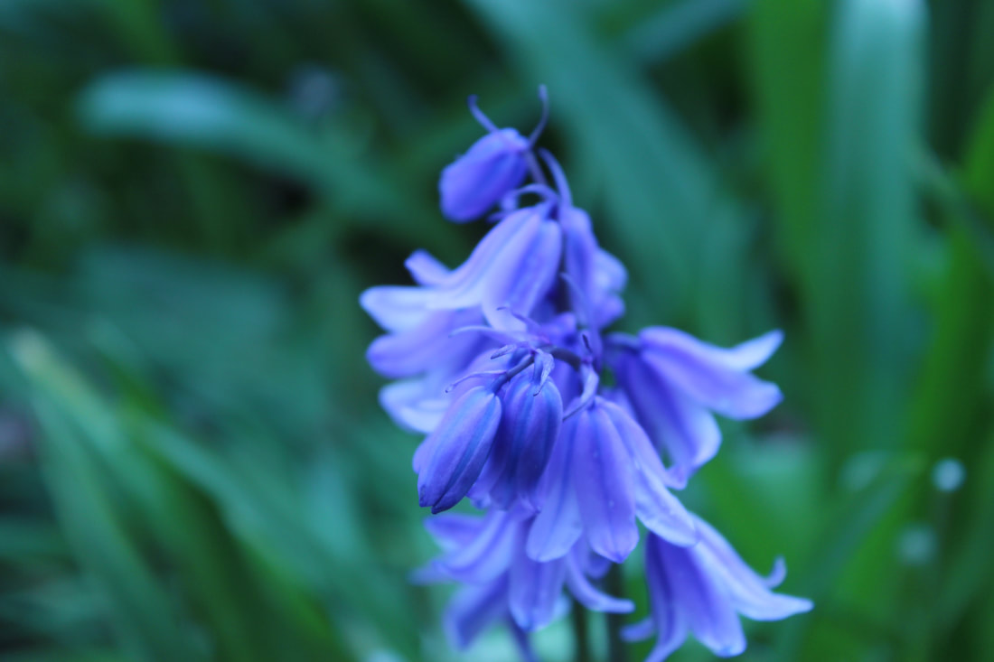
Natural flowers
My best and worst images
|
|
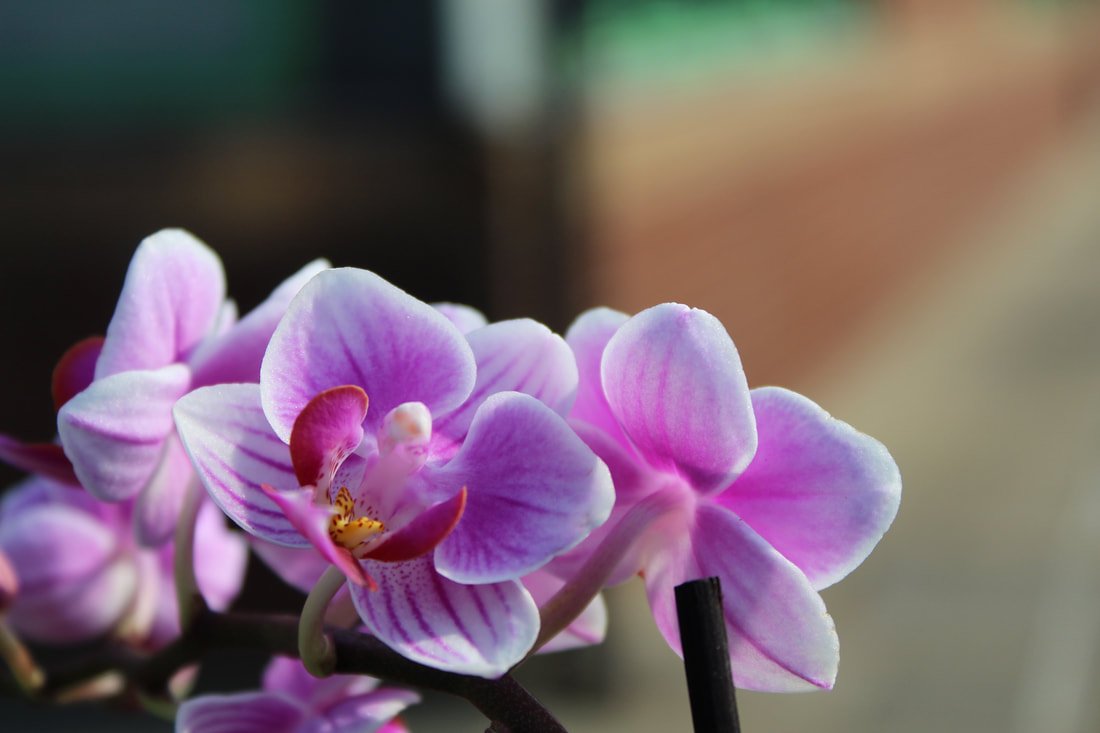
Flowers


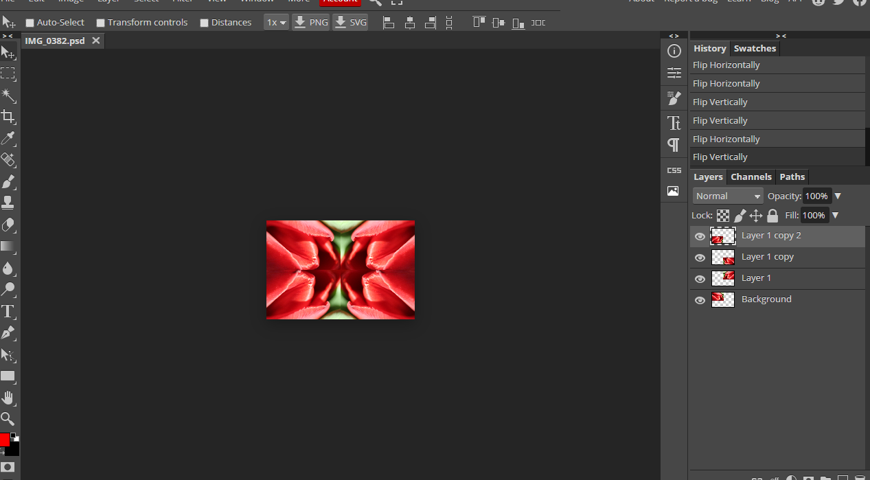
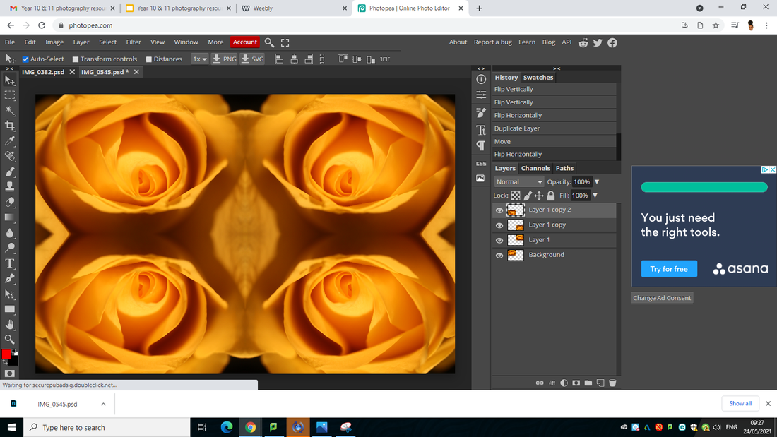
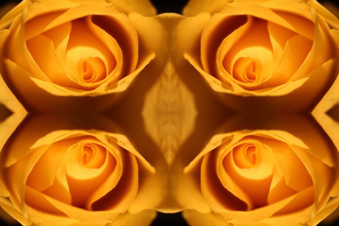
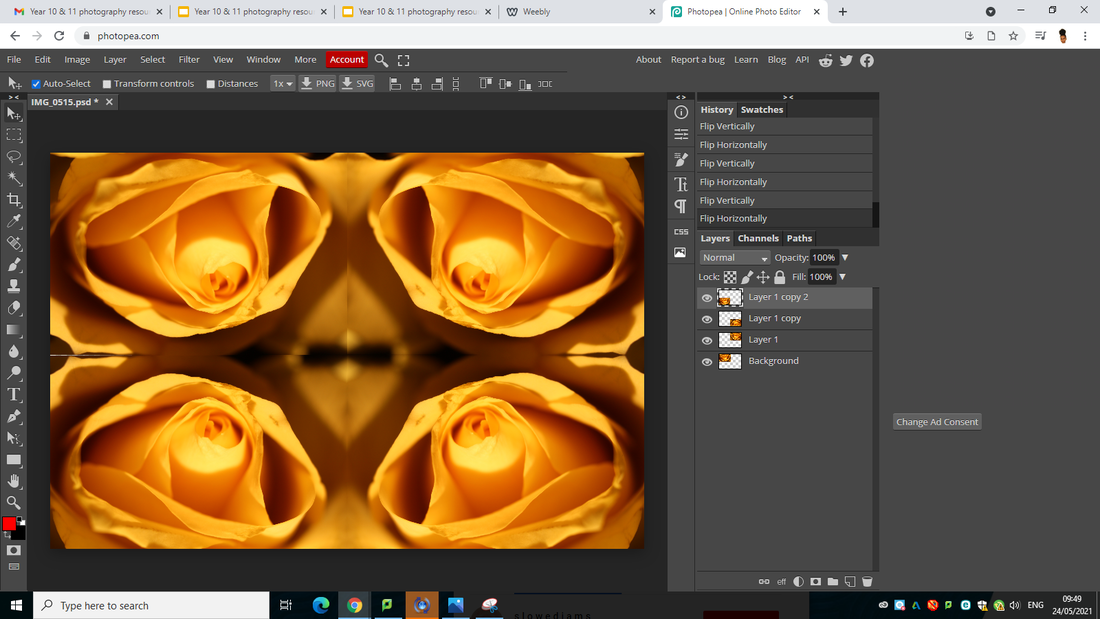
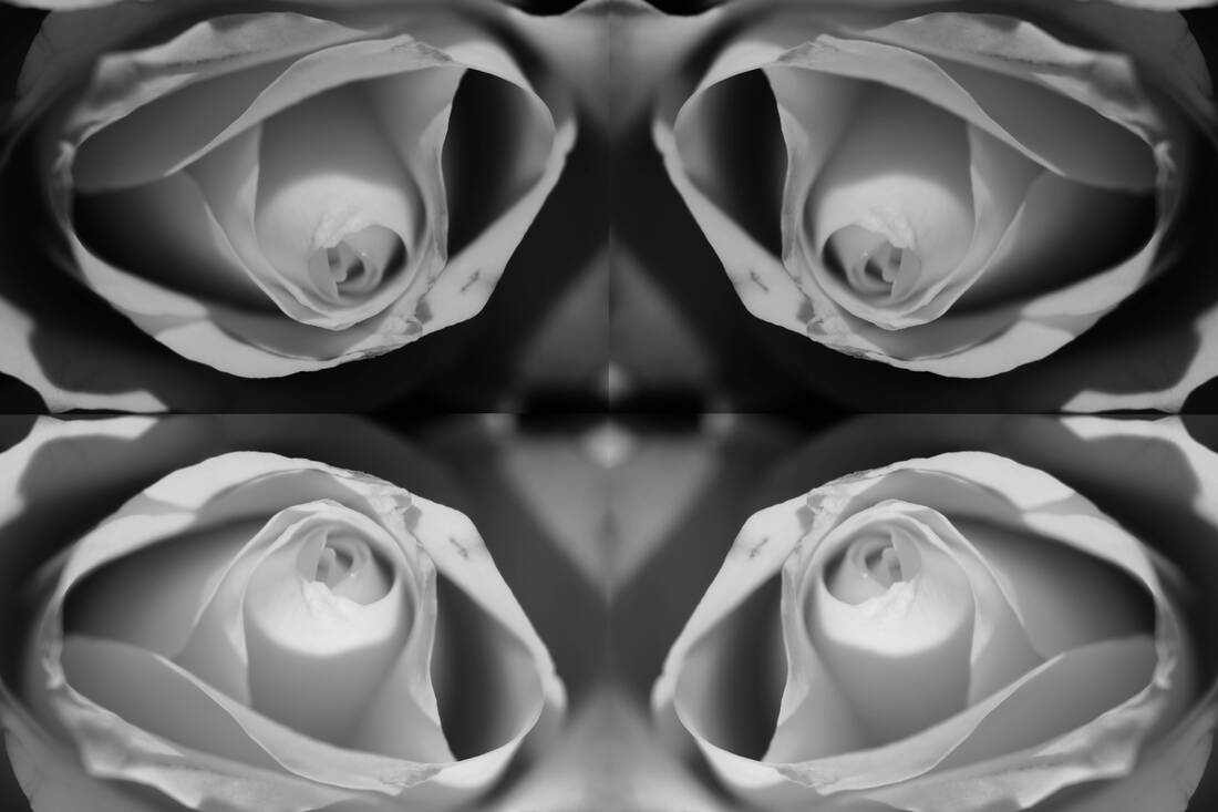
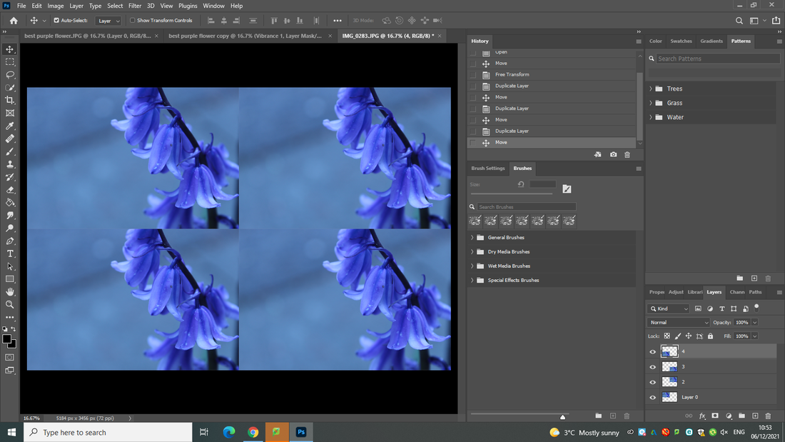
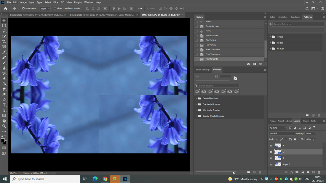
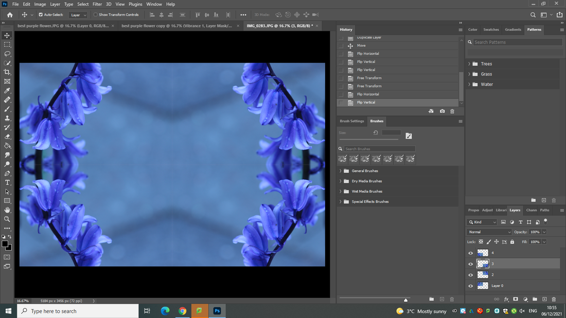
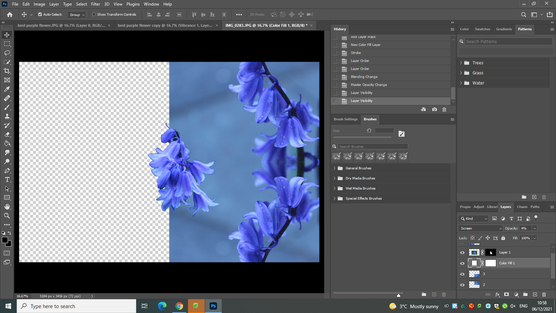
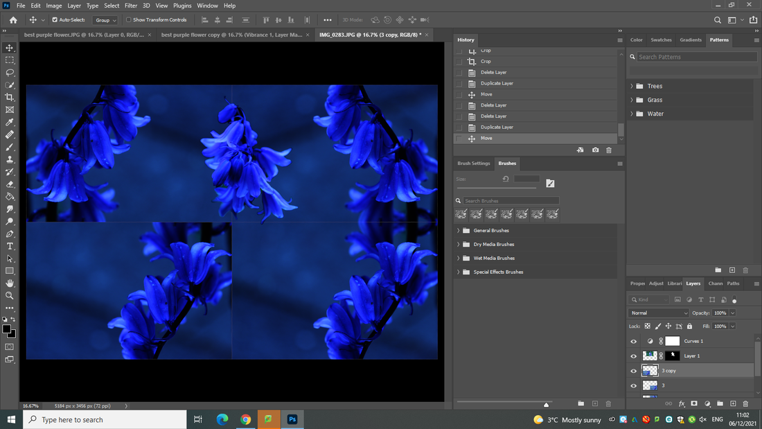
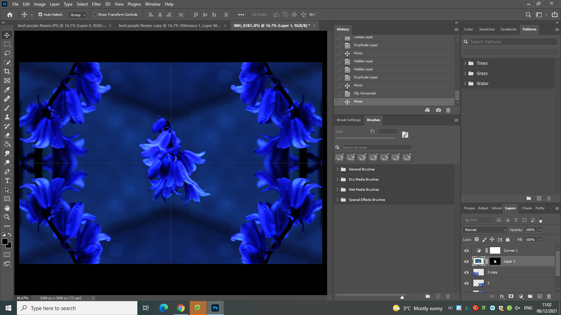
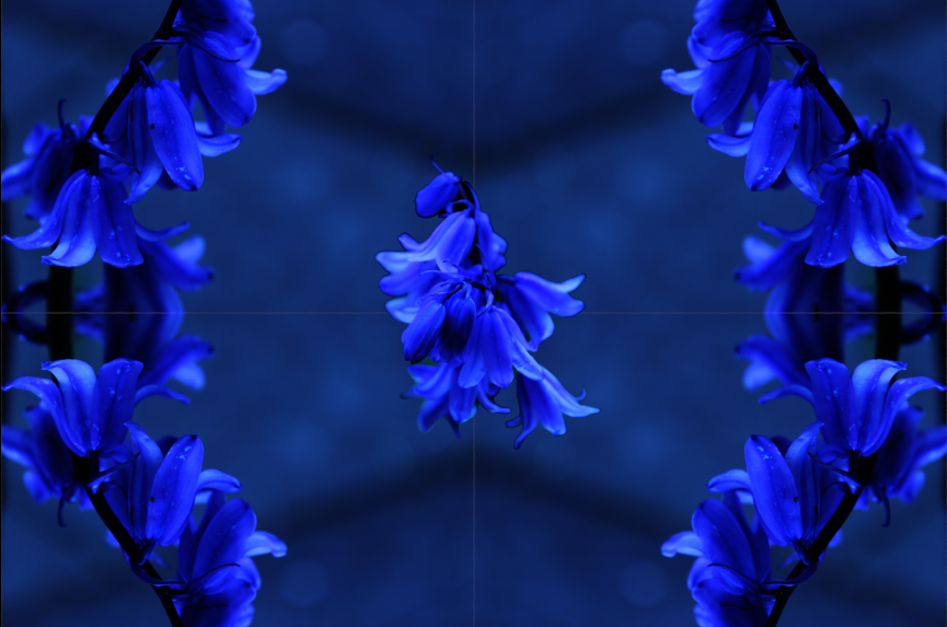
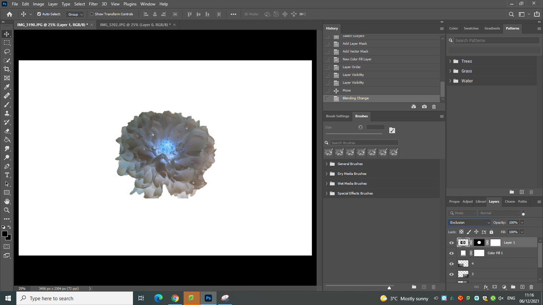
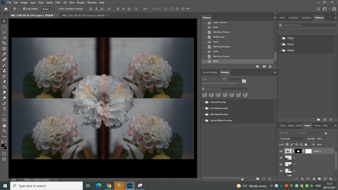
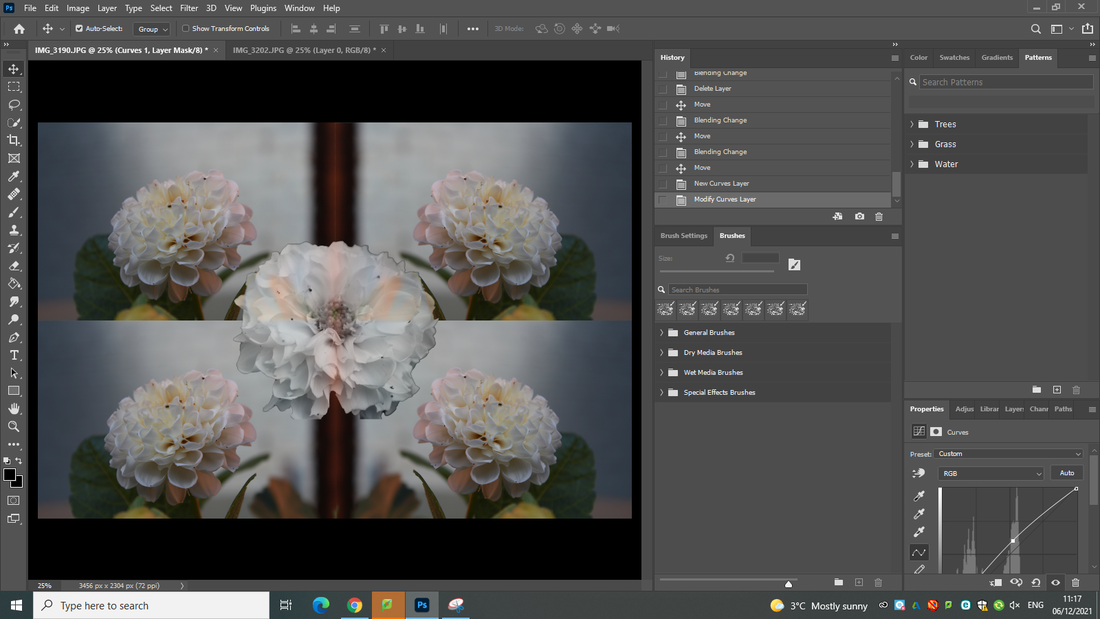
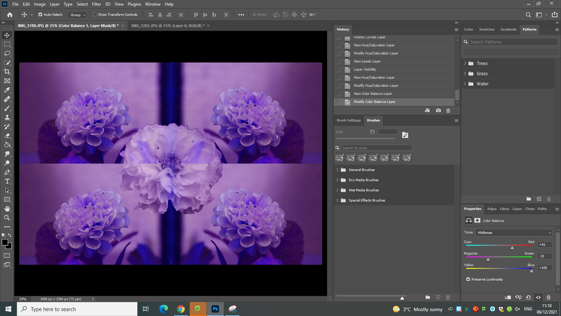
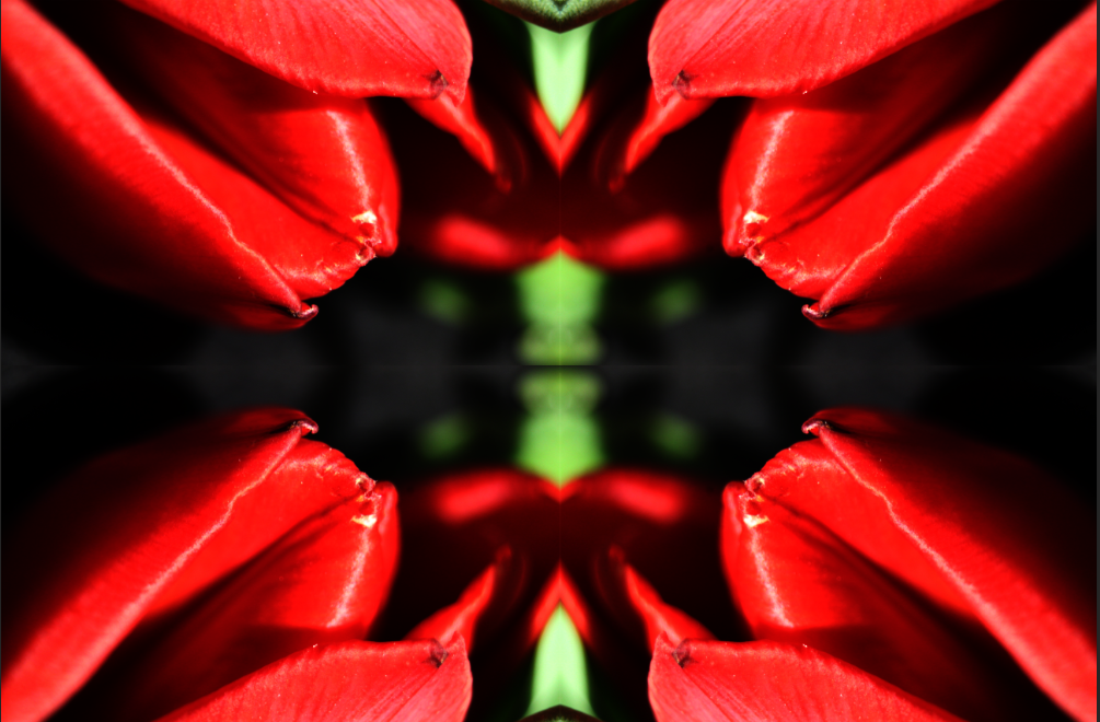
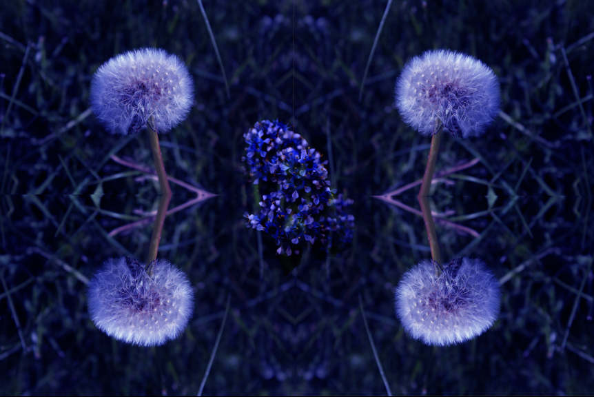
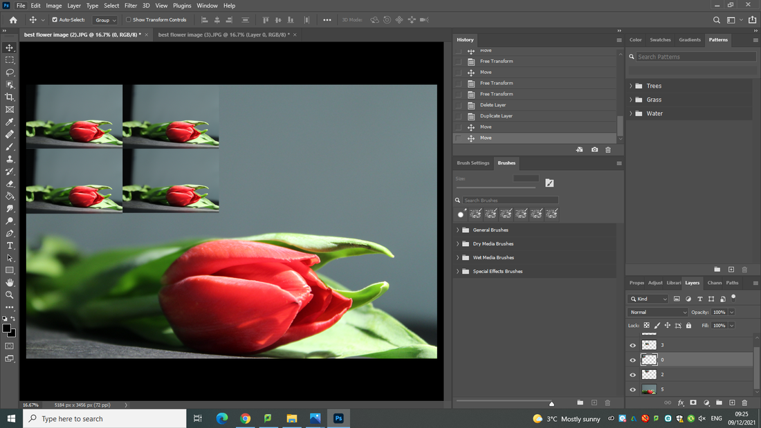
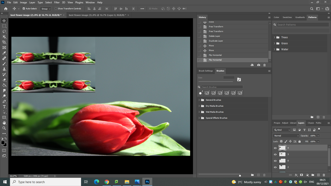
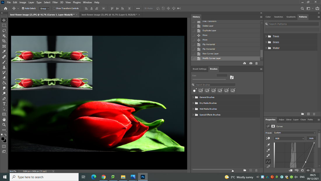
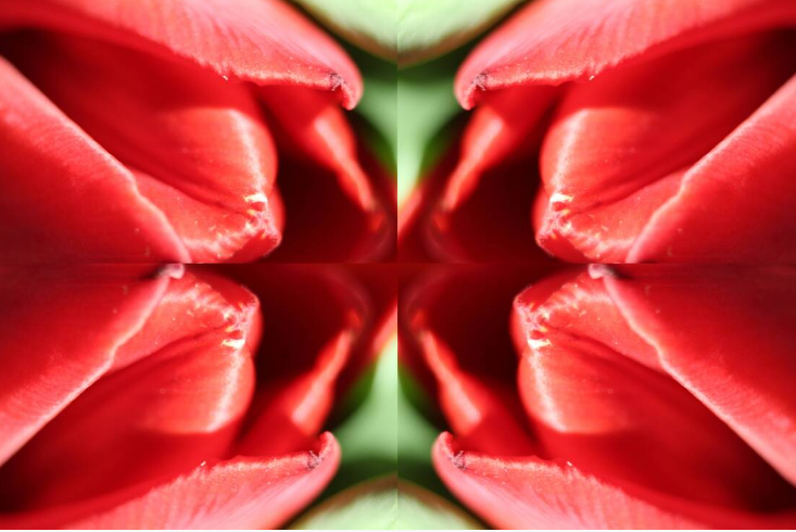
Developing my work using Photopea
FINAL IMAGE
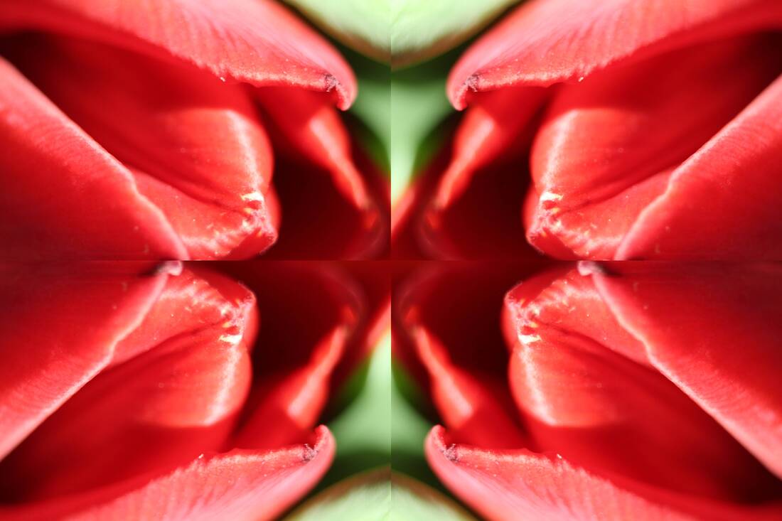
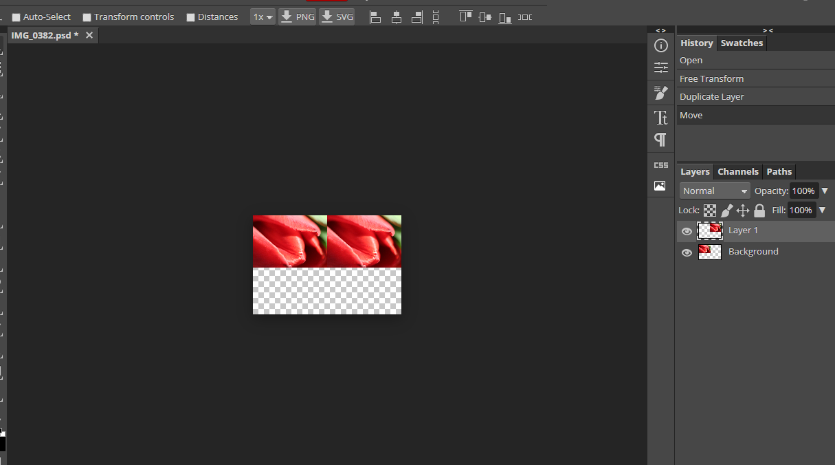
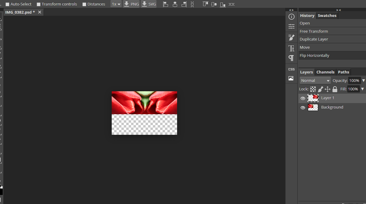
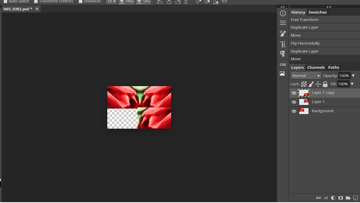
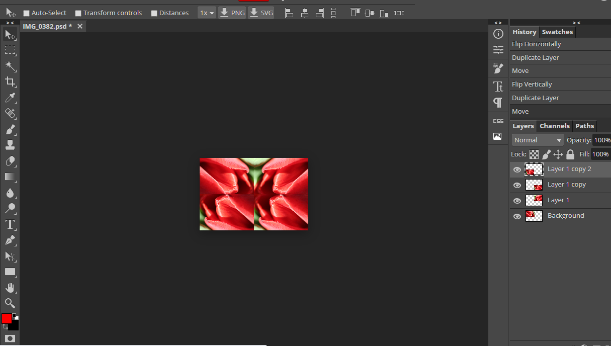
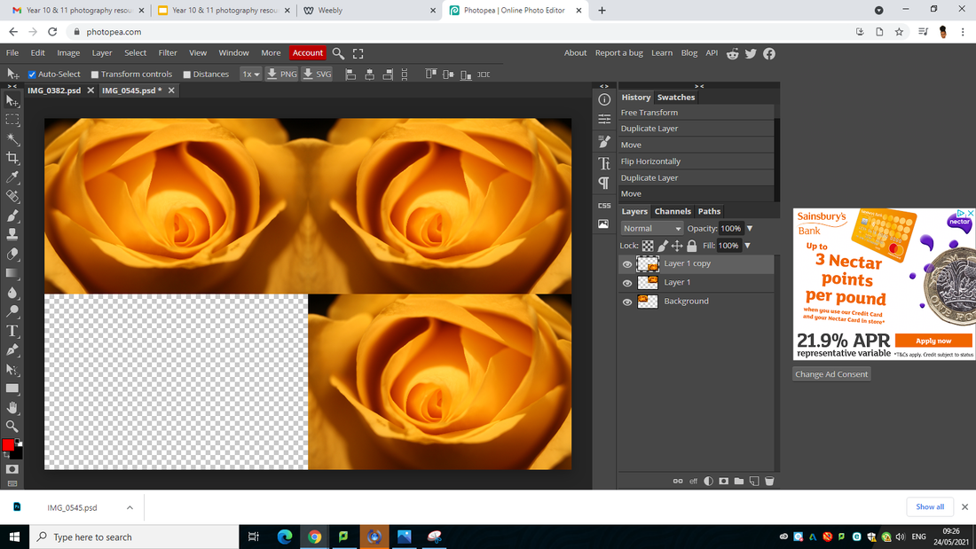
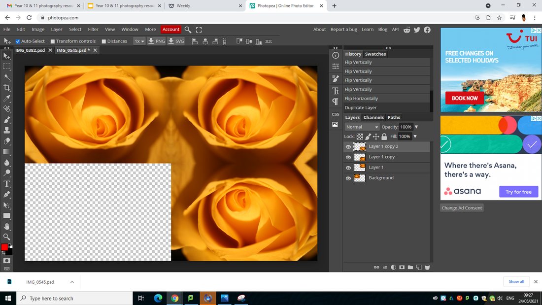
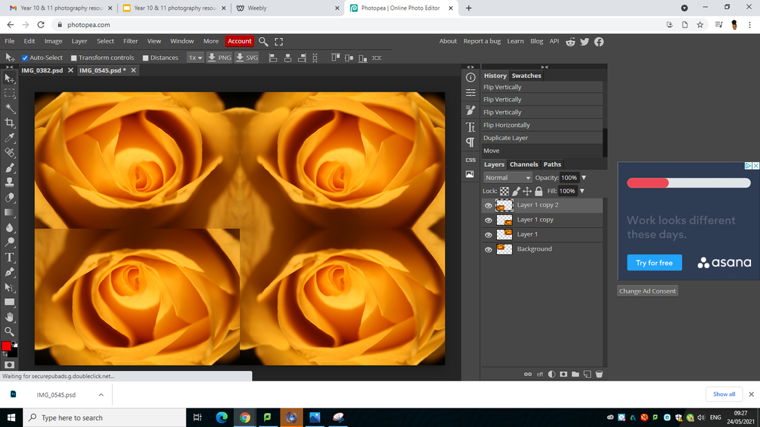
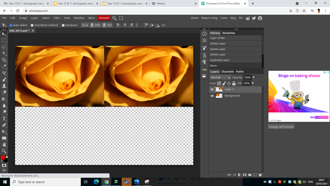
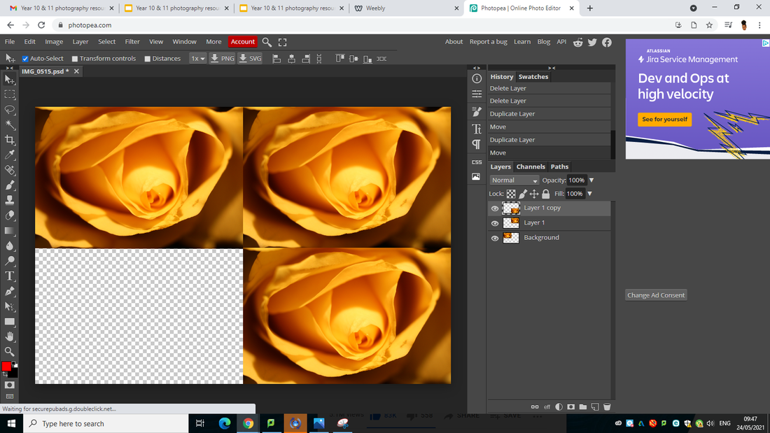
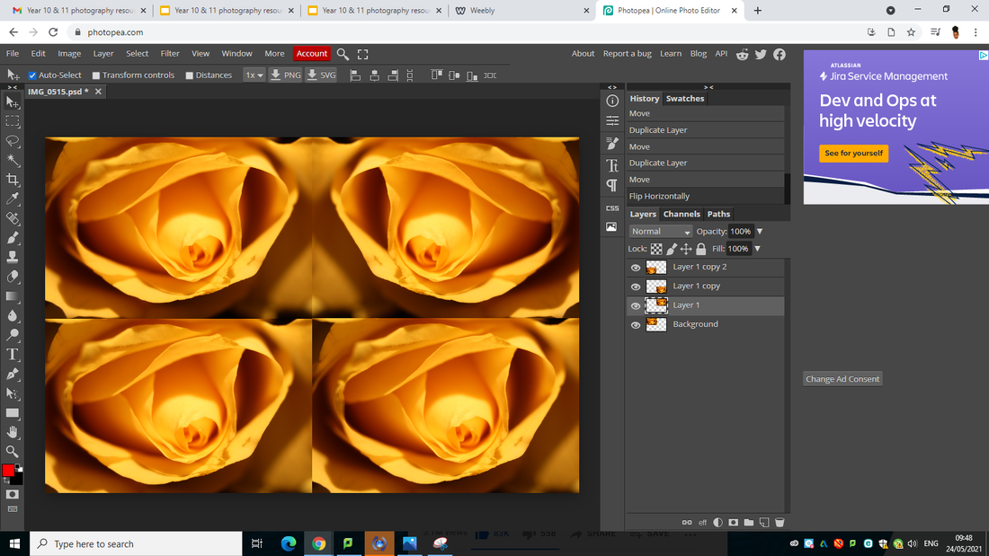
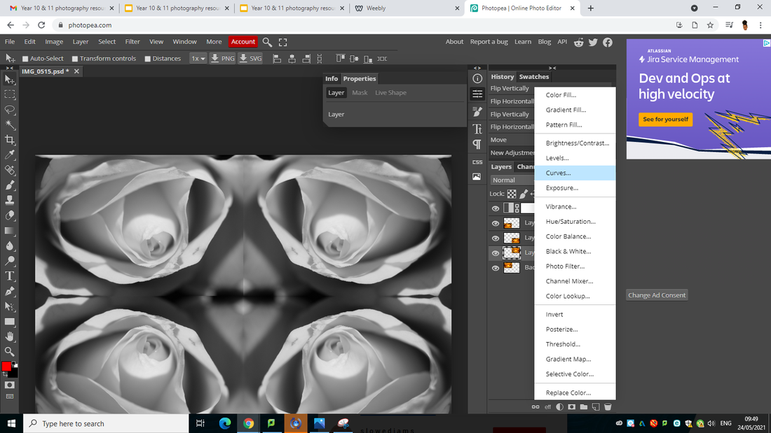
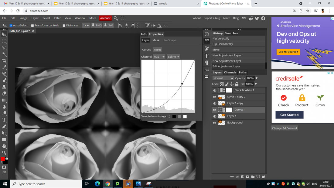
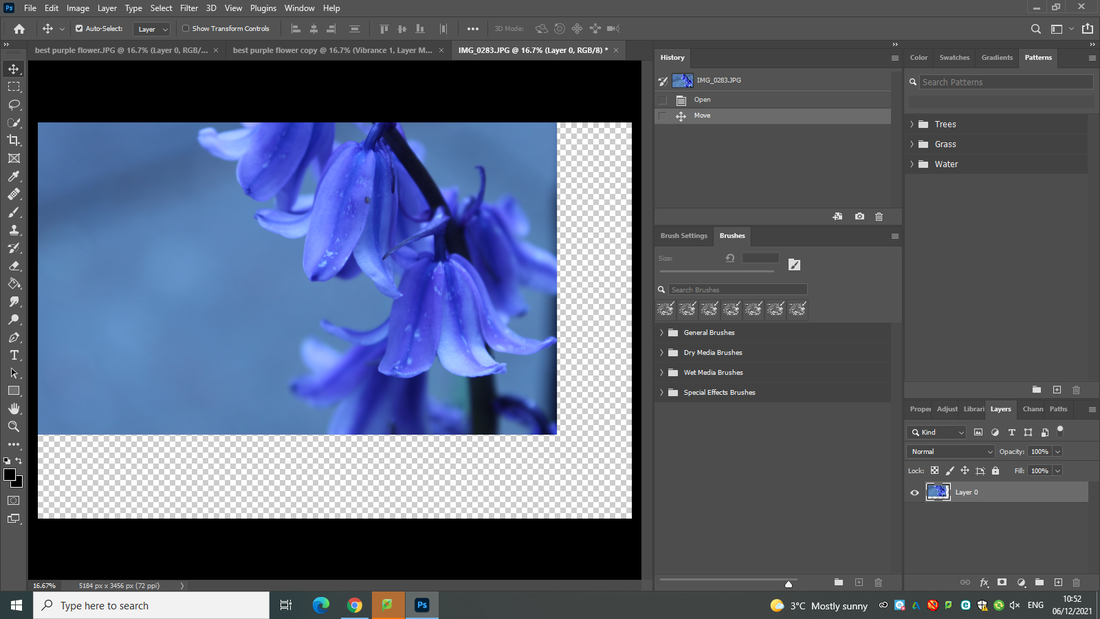
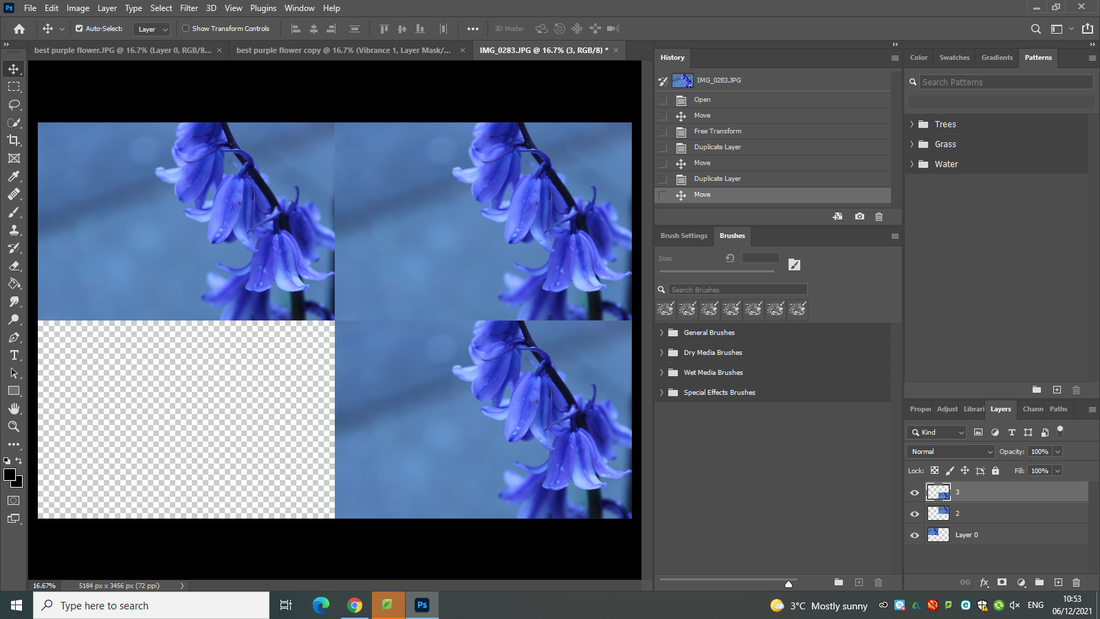
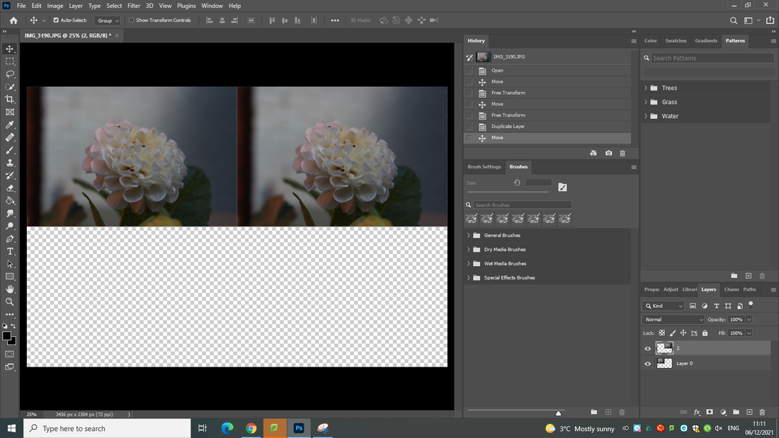
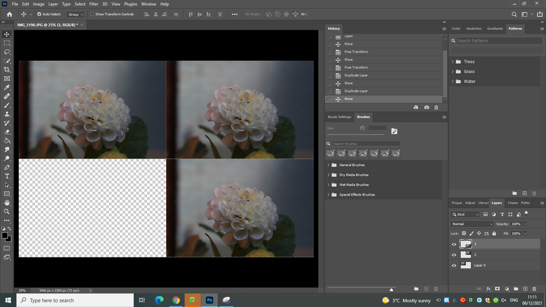
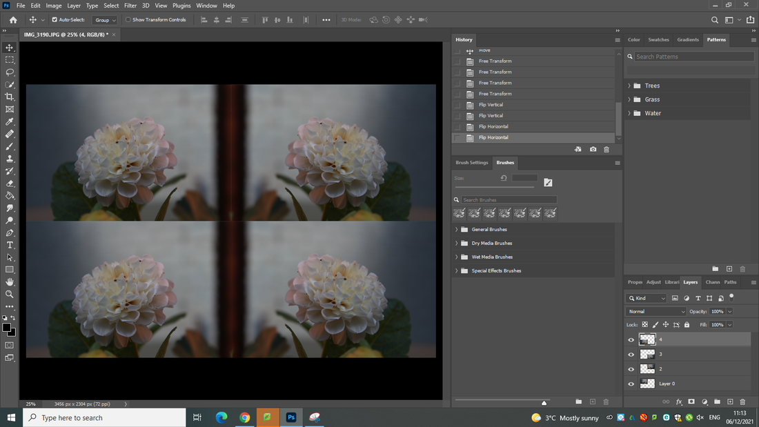
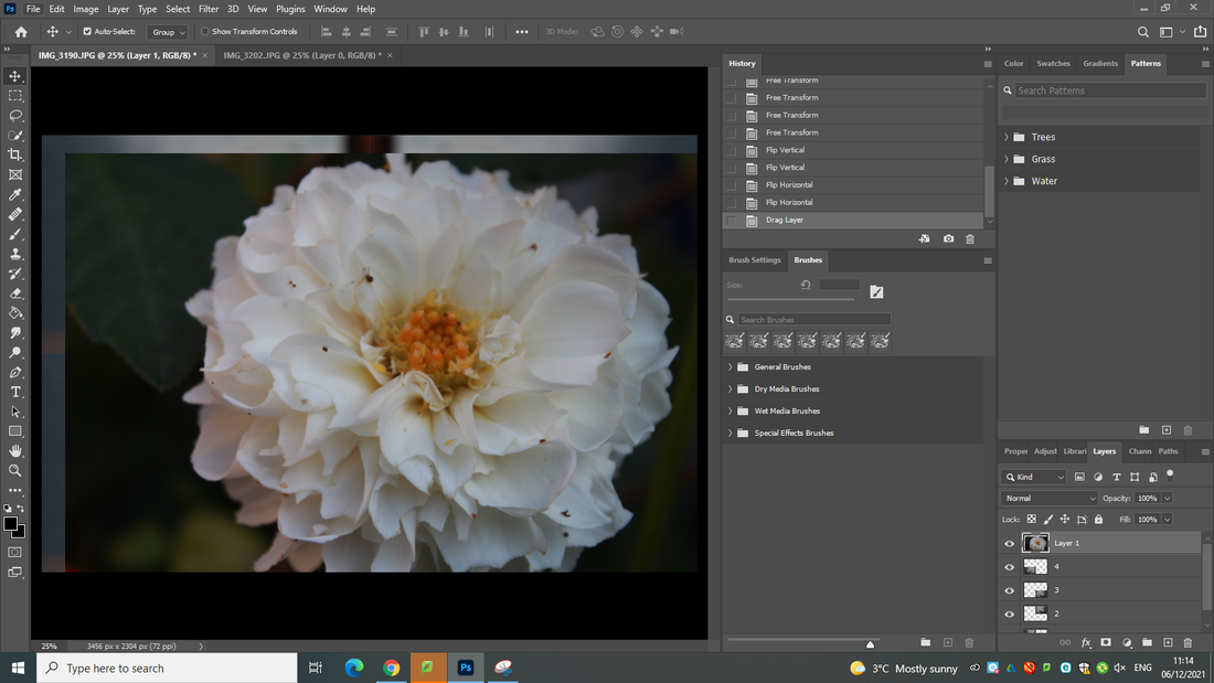
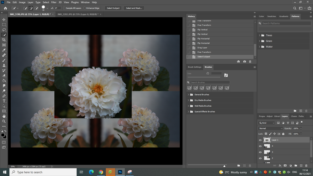
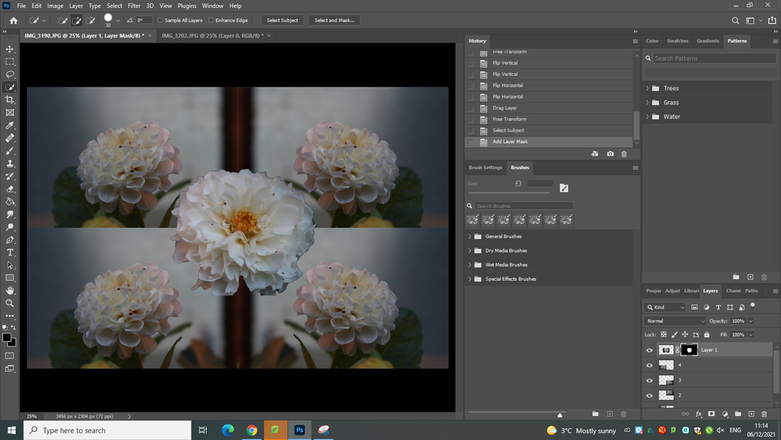
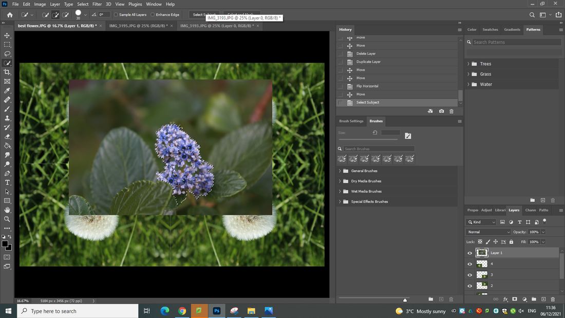
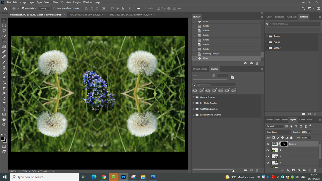
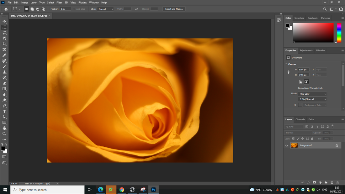
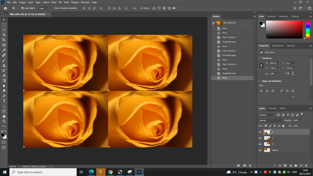
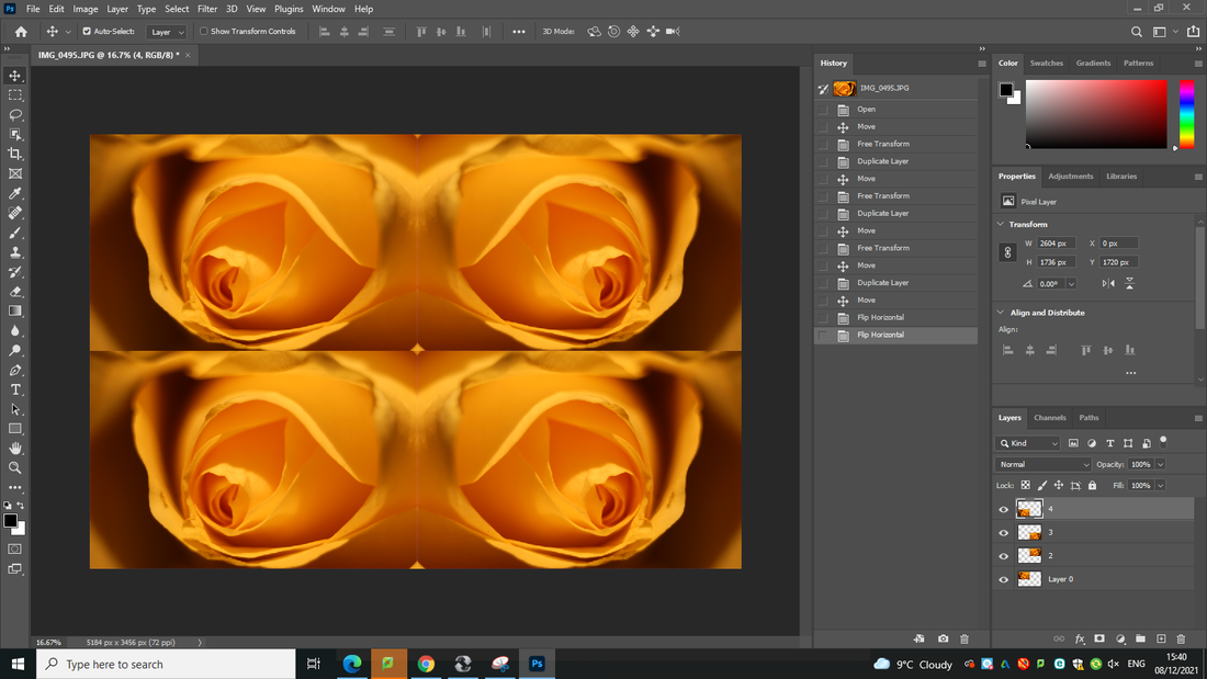
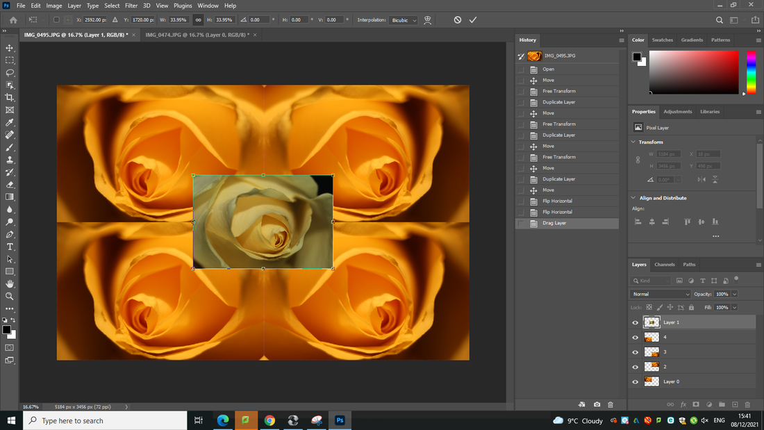
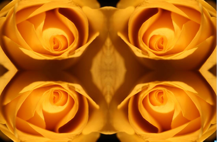
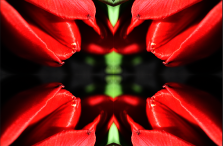
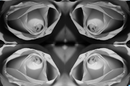
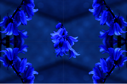
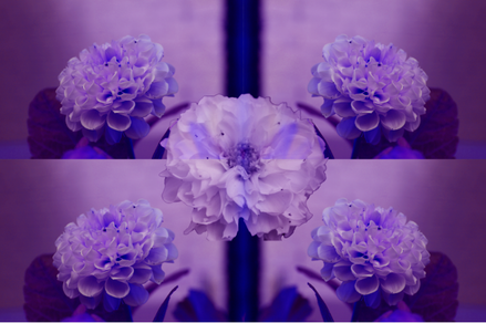
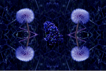
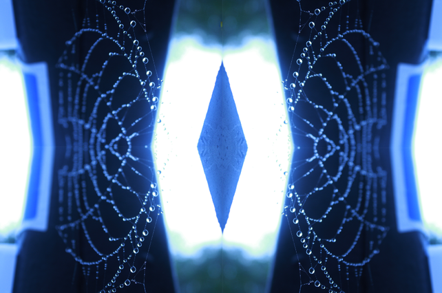
For this edit I decided to use a kaleidoscope pattern because it would look interesting and and different. It would also suit the image since the ends of the flowers are pointy.
Developing my work using Photopea
Final Image
Developing my work using Photopea
Final Image
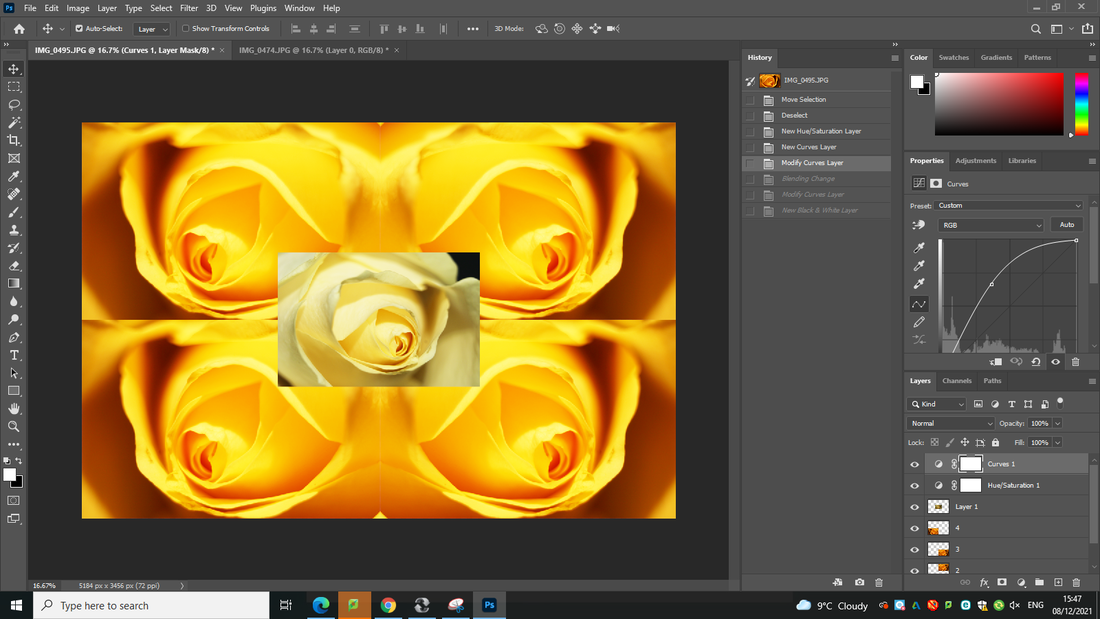
Developing my work using Photoshop
Process
Final image
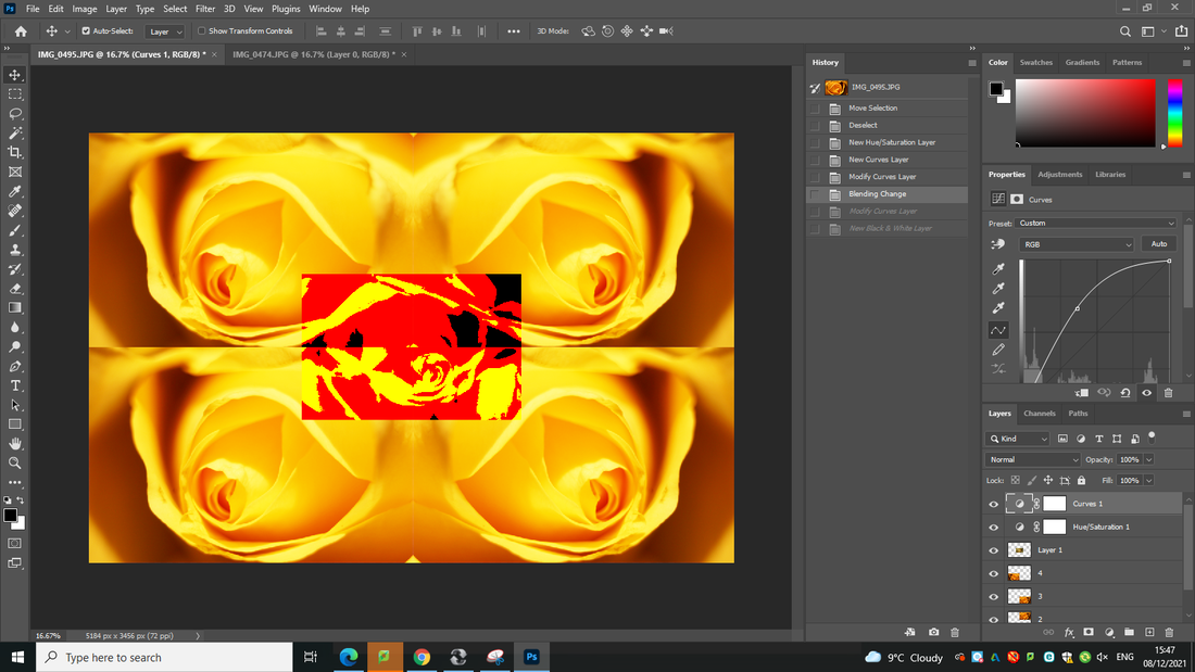
Developing my work using Photoshop
Process
Final Image
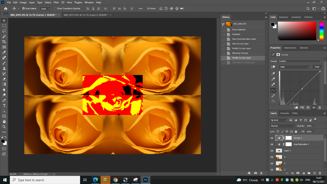
Developing my work using Photoshop
Process

Final image
Developing my work using Photoshop
Image before editing
Process
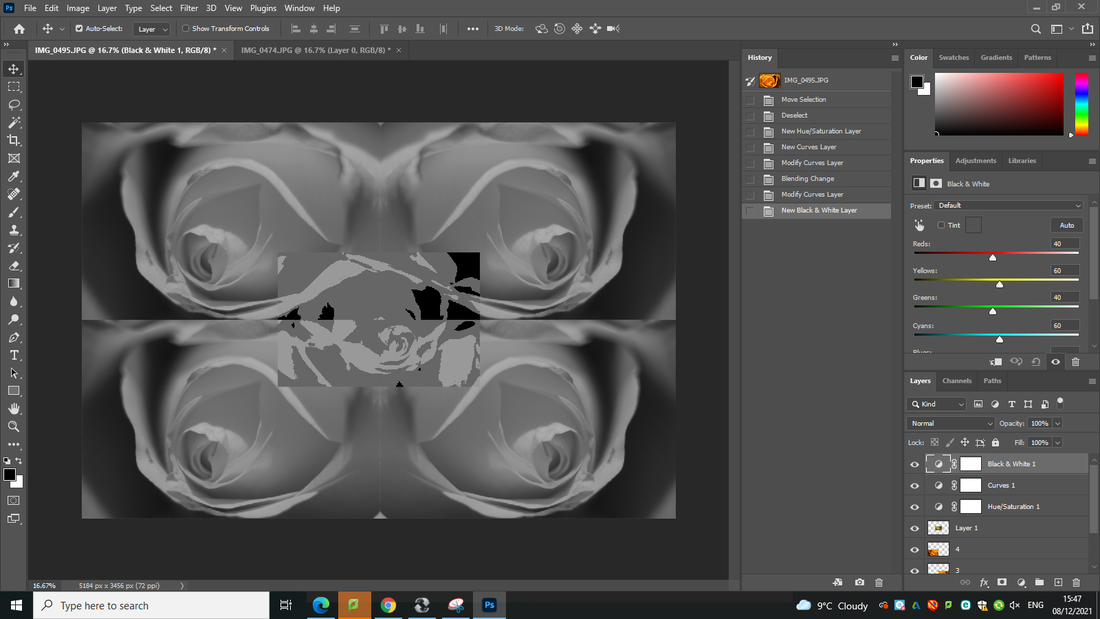
Final Image

Developing my work using Photoshop
Image before editing
Process
Final Image
Final gallery
|
|
|
|
|
|
|
|
Evaluation
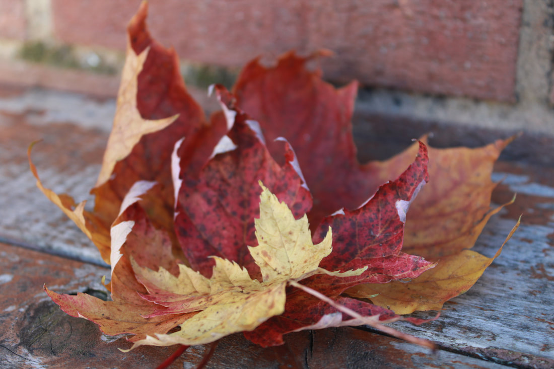
My main theme was textures such as natural objects for example flowers and trees and leaves, I even took photos close up to see the magic in the natural elements of my photographs. I thought the theme was good because I believe that natural objects are more captivating and it will lure more attention to the photograph.
In photography I found the use of Photoshop the most interesting because I enjoyed manipulating my work and improving the images taken. Learning how to use the camera on manual settings is also something that I enjoyed since I can use those skills to take the pictures that I enjoy.
I know how to copy and paste layers and use the blur tool in Photoshop, I have also learned how to turn the photograph into a kaleidoscope since I thought it would make the image look more interesting and alluring. I have also learned how to use camera techniques such as W B, ISO, and manual settings. I am glad that I have learned this since I can now use these skills to take the best photos.
I would like to develop my skills more in Photoshop since there are more ways to make the image look more beautiful and unique, such as layering my images and turning my photographs into something rare and beautiful.
I have taken photographs of flowers and grass, these link to my work because I have researched the photographer Imogen Cunningham and she takes a lot of images of flowers and black and white images and I have managed to succeed to that.
I have taken a lot of images of photographs and turned them to black and white since most of Imogen Cunningham's work is in black and white, I have also take a lot of studio shots of flowers to make them look more delicate and professional.
I really enjoyed my photopea work because I could use a range of tools to make my work look more captivating and alluring since its edited to make it look more awesome.
I learned how to use different websites, such as Weebly to help my work look more professional, i believe that my final shoot is the most professional because it links more to my research and mind maps, I also learned how to edit my photos using Photopea. This is a great advantage for me because it allows me to make my photos look even better than they did before. I also learned how to figure out why my photos are the best and worst and i believe that this skill is important and useful to have.
I didn’t encounter any problems with my problems since I listened to instructions and now my portfolio looks as good as I can make it.
I didn’t make any mistakes therefore I have nothing to learn from, the only mistakes I have ‘made’ is some of my photos but these are still used in my portfolio so I can use these to make my photos look better.
I would pick a more man made texture since most of my work is natural and I believe that if I picked man made it might’ve made my portfolio look more professional. If I had more time I probably would’ve chose a more man made texture but due to lock down I chose a natural texture so I can get more and more things done.
