STATEMENT OF INTENT
My chosen theme for my GCSE level photography portraits. In more context, I will be focusing on capturing black and white portraits that are simple but remarkable. I have decided to do this theme because I believe that the black and white feature makes your photographs look elegant and that is my goal that I would like to achieve, this will also make me explore different ways to capture my desired image such as using different patters, different angles and different angle techniques. For my final gallery I would like to turn my best images into magazine covers because that is also my goal.
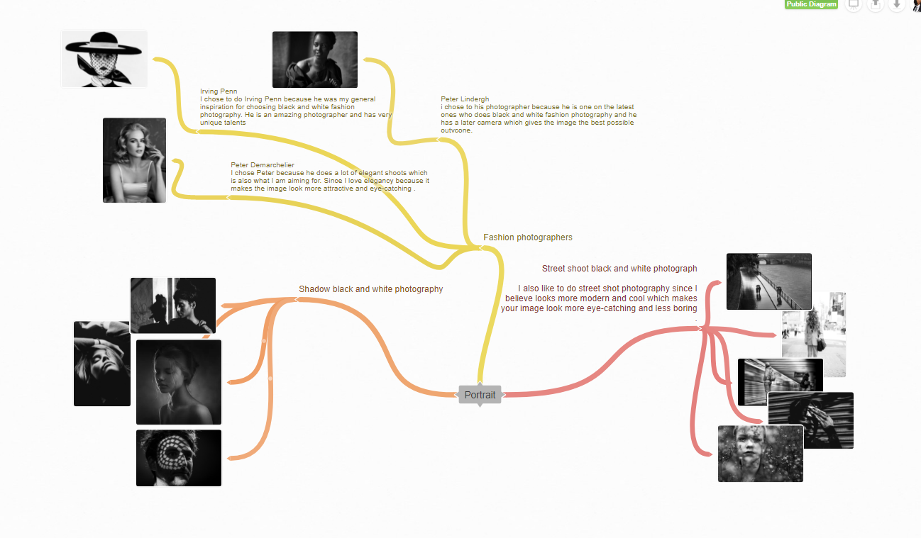
To make my work the best it can be, I will carry out different research methods of my theme Portraits. I will research some of my chosen Photographers that specializes on black and white photography and try my best to recreate some of their images. For example Irving Penn because he takes simple but remarkable images and it would feel great if I can achieve to recreate some of his photographs. This will inspire my own outcomes because I would try my best to top his work and this will bring out some of my best abilities which will makes me and even better photographer which will earn me a high grade.
I was very glad to hear that we will be doing portraits and I was even more glad that I was allowed to do them in black and white. I believe that I will succeed in this theme because I enjoy it so much and this will bring out some of my best abilities. I have expanded my ideas for this theme by choosing different ways to accomplish this theme such as; I will photoshop one of my black and white images and add some colorful edits to them to make this photograph stand out which is what I want to achieve.
To start my progression through my work I will start by photographing my friends at school, then I will edit these images into black and white. I would like to take studio shots since I believe that it would make the photographs look more elegant which will fit my goal. I would capture my photographs in different angles and I would then edit them using photoshop to make the picture stand out more. I would then edit them to make them look like magazine covers which is my number one goal.
I would like to use a wide range of techniques so I know that I haven't wasted my abilities. I have a manual DSLR canon camera which i will take many of my photographs on. In many situations i have had the opportunity to use a telescopic lens which has been a blast to use. I will try to push myself to be a lot more creative on photoshop to better my photos, i will try to learn how to layer images and how to blur the background of some images.
I have three months to construct my work towards my final piece. I aim to complete my initial research within the third week and start photographing by the fourth week in order to give me the time I need to show my progression in my work. I will then develop my work in photoshop and capture some more images when I next go outside. When I have completed the project, I will select my best photography outcomes and display them in my final gallery with my evaluation at the end too.
As my project increases I will use annotations to show my ideas and developments clearly on my webpage. This will help me because I will be able to see any of of the mistakes I made and this will help me improve them. I'll most likely get support from my class peers and my teachers, I will also watch tutorials to help me too. After I've finished my final page, I will write a final evaluation reflecting my project as a whole, reflecting on what went well and all of the mistakes I made, which will help me improve.
Research
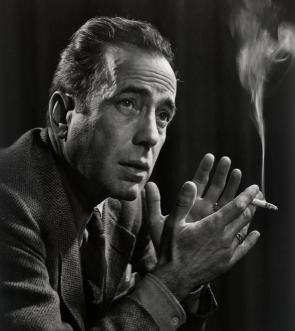
Photography research for Yousuf Karsh
CONTEXT
Yousuf Karsh (Yousuf Karsh, 1908-2002)
"As an Armenian in what is now Turkey, Karsh endured persecution and deprivation. In 1922 he fled on foot with his family to Aleppo, Syria. Two years later his father was able to send him to Canada, where he joined his uncle, a photographer, in Sherbrooke, Quebec. Beginning in 1926, Karsh began working for his uncle and learning the art and science of photography. From 1928 to 1931 he served as an apprentice to John H. Garo, a Boston painter and portrait photographer, and briefly attended evening classes at art school. Garo introduced Karsh to artificial lighting techniques, which formed the basis for Karsh’s use of dramatic lighting in his portraits.
Not everyone in Britain is familiar with the name Yousuf Karsh. Yet just about everyone in Britain has carried his most celebrated image around in their pocket, wallet or purse."
I found this information in an article from the New York Times.
Not everyone in Britain is familiar with the name Yousuf Karsh. Yet just about everyone in Britain has carried his most celebrated image around in their pocket, wallet or purse."
I found this information in an article from the New York Times.
COMPOSTITON
The image has a lot of photography techniques for example Yousuf's professional usage of the rule of thirds which was done brilliantly. The photographer used the rule of thirds to make the model the center of attention which he successfully did since all of my focus is on the model. I would like to achieve something like this because it looks really professional and this is something that can look amazing on the cover of a fashion magazine which is something that I am aiming for, for my project. His use in lighting is fantastic because it shines only on the model which shows the viewer the main point of the image which also doesn't confuse the viewers. The image was taken in a studio since it has a very unnatural background, I can also tell that it was taken in a studio shot since the lighting looks very focused on one spot of the image(the model's face). The framing is eye level which is good because the image looks very classy and elegant. Since the framing is eye level and the model is sitting down, the photographer must've used a tripod but on a very low level. I can also tell that this image has a higher aperture because only a little light is entering the camera and only focusing on the person. Since this photo was taken before Photoshop existed, the photographer didn't use any Photoshop techniques, but the black and white makes up for that.
CONNECTIONS
I have decided to use Yousuf Karsh because he fits the criteria that I would like to achieve. Black and white. He is brilliant at how he takes his pictures and this is something that I am going to try and recreate. Since he is a much older photographer, he takes a lot of pictures that are decades years before my time and I quite like how they look and I've decided that old-fashioned magazine photography is my goal since it looks more elegant. He takes a lot of pictures of people who aren't posing for the camera which is also what I am trying to attain since they look more natural.
COMMENT
In my opinion I really like Yousuf's work because he takes really elegant shots which, to me, is the most admirable to look at. Another thing I like about his work is that they are all in black and white and I never seem to become bored looking at them. He also maintains a skillful eye in this kind of photography since all of his photos are mainly in the moment and natural.
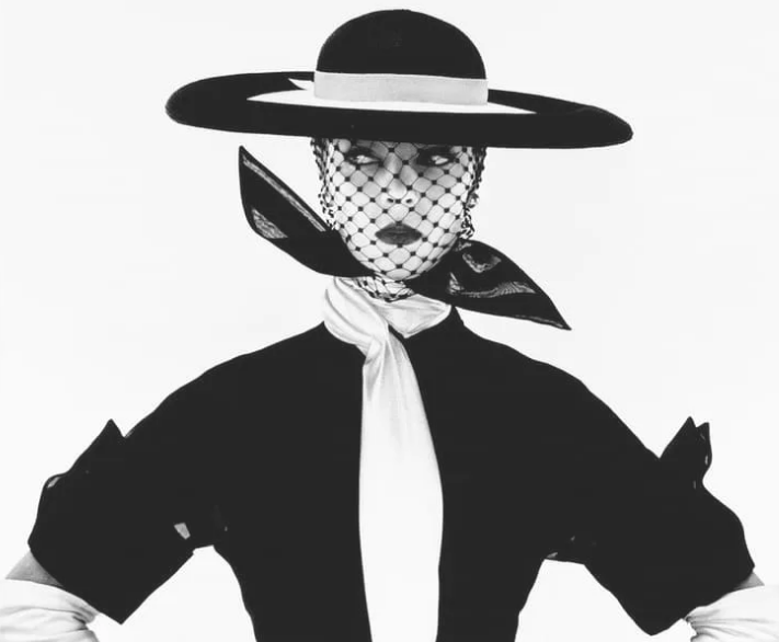
Photography research for Irving Penn
CONTEXT
Irving Penn
"Irving Penn was one of the twentieth century's great photographers, known for his arresting images and masterful printmaking. Although he was celebrated as one of Vogue magazine's top photographers for more than sixty years, Penn was an intensely private man who avoided the limelight and pursued his work with quiet and relentless dedication. At a time when photography was primarily understood as a means of communication, he approached it with an artist's eye and expanded the creative potential of the medium, both in his professional and personal work.
Born in 1917 in Plainfield, New Jersey to immigrant parents, Penn attended the Philadelphia Museum School of Industrial Arts from 1934–38 and studied with Alexey Brodovitch in his Design Laboratory. A formidable Russian émigré who worked in Paris in the 1920s, Brodovitch taught the application of principles of modern art and design through exposure to magazines, exhibitions, architecture, and photography."
https://photogpedia.com/irving-penn/
COMPOSITION
I wanted to choose Irving Penn because he was the blueprint in black and white fashion photography and he does it so well. Not only does he take amazing photos, he does them so uniquely that it, without a doubt, draw attention to it. Now normally photographers that do black and white photography stick to one tone of black and white, but Irving Penn varies through different and as expected does amazingly at them. He also takes a lot of pictures in rule of third, since he likes to draw attention the model which he as done successfully. His lighting technique is also interesting since they all tend to be quite bright whereas the model is wearing very dark colours to contrast against the white, which makes the image even more interesting. The model is also wearing a lace material over her face which also makes the image more unique and interesting. The lace also has a beautiful pattern which shows contrast in the image. There isn't anything in the background since the photo has an infinity curve and there isn't anything in the foreground but the middle ground is the model, who is posed to fit the camera. There isn't any Photoshop techniques that I am aware of but the black really stands against the white which makes the image look classy and significant.
CONNECTIONS
I have decided to use Irving Penn as my inspiration since all of his pictures are unique and never boring which is something I would like to achieve. I also aspire to take pictures in different black and white tones just so they aren't the same and make my website look more interesting and not boring which is something that is difficult since the pictures are in black and white. I will also dress the models up in extreme outfits like Irving Penn did since that seemed to draw attention to a lot of people.
COMMENT
In my opinion Irving Penn is one of the best black and white fashion photographers out there since what he does interests me so much. It would be an honour to recreate some of the things that he has beautifully created.
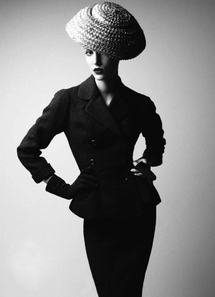
Photography research for Peter Demarchelier
CONTEXT
"Patrick Demarchelier, born in 1943 and raised in a small town near Paris, is one of the world’s leading fashion photographers. He has photographed the campaigns and covers for many high-ranking fashion house and publications. From the age of seventeen, he developed a fondness for photography when his step father gifted him a camera, thus he started taking pictures of weddings and friends. During this time he learned the way to retouch negatives and develop film. When he was twenty years old, he left for Paris and started to work for a photography laboratory. His job was to print photographs for newspapers.
He first worked with a photographer who made covers for a film magazine; later he became an assistant to a photographer, Hans Feurer, who worked for Vogue. He has learned from experience and according to him, from his mistakes, hence he keeps practicing like an athlete and keeps taking pictures. He has no formal qualifications. He also worked with Grace Coddington and during her term at the British Vogue, Demarchelier attributed her in helping him to commence his career.
Having won the reputation of an esteemed fashion photographer, in 1975, Patrick Dermarchelier worked Terry King, Jacques Guilbert and Henri Cartier-Bresson, as a freelance photographer. Seeing his work, 20 Ans Magazine, Marie Claire and Elle also began noticing him.
Patrick Demarchelier became Princess of Wales, Diana’s personal photographer. He was the first non-British photographer hired by the Royal family. Diana had contacted him after witnessing his photographs on Vogue’s cover."
https://www.famousphotographers.net/patrick-demarchelier
COMPOSITION
There isn't a foreground in the image and there isn't any background in the image, but there is a foreground which is the model who is posing uniquely to show what she is wearing which is the purpose of a fashion magazine. The photographer made the model stand in the middle of the camera which is good because she stands out which is what the photographer wanted. There also isn't any illusion of depth since the model is standing in front of an infinity curve but this is a good thing because then the model would't have stood out. The photographers use of rule of thirds is amazing because the focus is mainly on the model and there isn't really anything else to focus on. Now because this is a fashion magazine, the photographer wouldn't use any Photoshop techniques but like other black and white fashion photographers, the black really stands out against the greyish background that has a shadowy effect which is also helpful in making the image look more unique and different. There isn't any patterns/shapes in the image but the background is nice to look at since it's shadowy and looks more mystical. The lighting is also darker than some other photos and this makes the image look more moody, quiet and romantic which is not used often. The image was also taken in a studio since the background is not a natural setting and the image would look odd.
CONNECTIONS
I have decided to use Peter Demarchlier as my inspiration since all of his pictures are unique and never boring which is something I would like to achieve. I also aspire to take pictures in different black and white tones just so they aren't the same and make my website look more interesting and not boring which is something that is difficult since the pictures are in black and white. I will also dress the models up in extreme outfits like Peter did since that seemed to draw attention to a lot of people.
COMMENT
In my opinion Peter D is one of the best black and white fashion photographers out there since what he does interests me so much. It would be an honour to recreate some of the things that he has beautifully created. He also only takes magazine covers for Vogue which is what I am trying to do
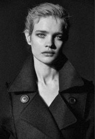
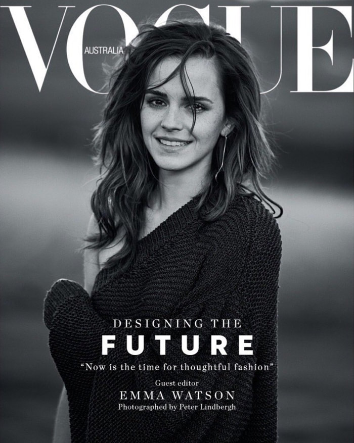
Photography research for Peter Lindbergh
CONTEXT
"Peter Lindbergh’s now-iconic photographs of women derive inspiration from early narrative cinema and street photography in their fleeting observations and compositional elegance. His Eastern European heritage can be traced in the stark and guileless realism that frames the feminine beauty of his subjects. In his editorial work for Vogue, Harper’s Bazaar, Interview, and many other international magazines, Lindbergh replaces staged, calculated glamour with a vérité approach, enhanced by his use of high-contrast black-and-white photography. He uses body movement—in particular modern dance—to celebrate the human form in a way that carries elements of both antiquity and modernity. In the 1990s Lindbergh garnered international acclaim for launching the careers of the “Supermodels”—Cindy Crawford, Kate Moss, Stephanie Seymour, Naomi Campbell, and Linda Evangelista. His images became homage to the new modern women.
Lindbergh was born in 1944 in Leszno, Poland. His work has been exhibited in solo and group exhibitions worldwide, including Images of Women, Bunkamura Museum of Art, Tokyo (1996, traveled to Hamburger Bahnhof, Berlin; Kunsthaus Wien, Vienna; Palazzo delle Esposizioni, Rome; and Pushkin State Museum of Fine Arts, Moscow, among others); Stories Supermodels, Ludwiggalerie Schloss Oberhausen, Germany (2003); Visioni, FORMA Centro Internazionale di Fotografia, Milan, Italy (2006); Beauduc, Les Rencontres d’Arles, France (2008); The Unknown, Ullens Center for Contemporary Art, Beijing (2011); Fotomuseum, Antwerp (2011–12); Berlin, Maison de la Photographie, Lille, France (2013); The Unknown and Images of Women, HDLU Museum, Zagreb, Croatia (2014); and Peter Lindbergh/Garry Winogrand: Women on Street, NRW-Forum Düsseldorf (2017).
Lindbergh lives and works in Paris, New York, and Arles, France."
https://gagosian.com/artists/peter-lindbergh/
COMPOSITION
There is no background or foreground but there is a middle ground which is the model posing to fit the mood of the camera and setting, and since the image is a cover for a classic magazine the image would've been set in a unnatural setting so there is no vanishing points/leading lines,but the background is not your usual plain white/infinity curve setting, it's a greyish black colour which makes the image look more moody which is something I am trying to achieve when I take my own photos. The camera is only focused on the model and a little of her face and hair. I am unsure of what time of day it is since the image was taken in studio but the image looks dark so it could present night time. The photographer could've used some Photoshop techniques to change the light setting into a more moody one. There are also no patterns and shapes but the model has made the image look shadowy and mysterious which makes up for the no patterns and shapes. This image was also shot on a tripod in a studio since the model is directly in the middle of the camera and the model is in front of a greyish black backdrop. I also think that the ISO and W/B is auto since it was shot in a studio and the image is in black and white. The image also looks very still so the shutter speed would've been high to make it look as clear as possible, and finally the camera is eye level because the model is looking directly into the camera and the camera is
CONNECTIONS
I have decided to use Peter as my inspiration since all of his pictures are unique and never boring which is something I would like to achieve. I also aspire to take pictures in different black and white tones just so they aren't the same and make my website look more interesting and not boring which is something that is difficult since the pictures are in black and white. I will also dress the models up in extreme outfits like Peter did since that seemed to draw attention to a lot of people.
COMMENT
In my opinion Peter L is one of the best black and white fashion photographers out there since what he does interests me so much. It would be an honour to recreate some of the things that he has beautifully created.
Magazine Cover Mood Board


|
|


Black & White Fashion Photography Mood Board


COGGLE
Plan for my first shoot


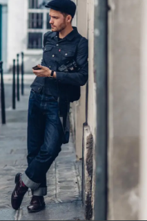
I am starting my projects by taking inspiration from these four images. I would like take inspiration from them because I believe that these images have texture which is what I would to achieve since I believe that they look the most simple but most interesting to look at which is my goal. I am going to take pictures of people like this in the studio to get the best result. Then I would like to take the photos I've taken and edit them in Photoshop to enhance them for the best outcome.
The equipment I will be using will be a DSLR Canon camera which will be put onto a tripod to get the best professional image. I will also try to use studio lights to make the image more brilliant, unique and professional. I will use a background of either black or white because it will give me a more moody and more serious look which is my goal in this shoot. My camera setting will be changed throughout so I don't miss out on the opportunity to get the best image. The white balance will be on auto or it might change due to the circumstance. My ISO would be on auto and wouldn't change since it's taken in a studio setting. I am aiming to take 15-20 photos of each person in different poses because i believe that any less than that would be unprofessional and any more than that would be too untidy. I will take photos of my friends and maybe more who would want to. The people that I will be taking photos of wouldn't wear something too extreme, i am trying to make them wear something basic and I would like them to have nothing on there face just their natural self.
My models will be Maya and Josh from my class and they will be wearing neutral clothing and have a black background for my black and white shoot and really colorful clothing and a really colorful backdrop for my color shoot.
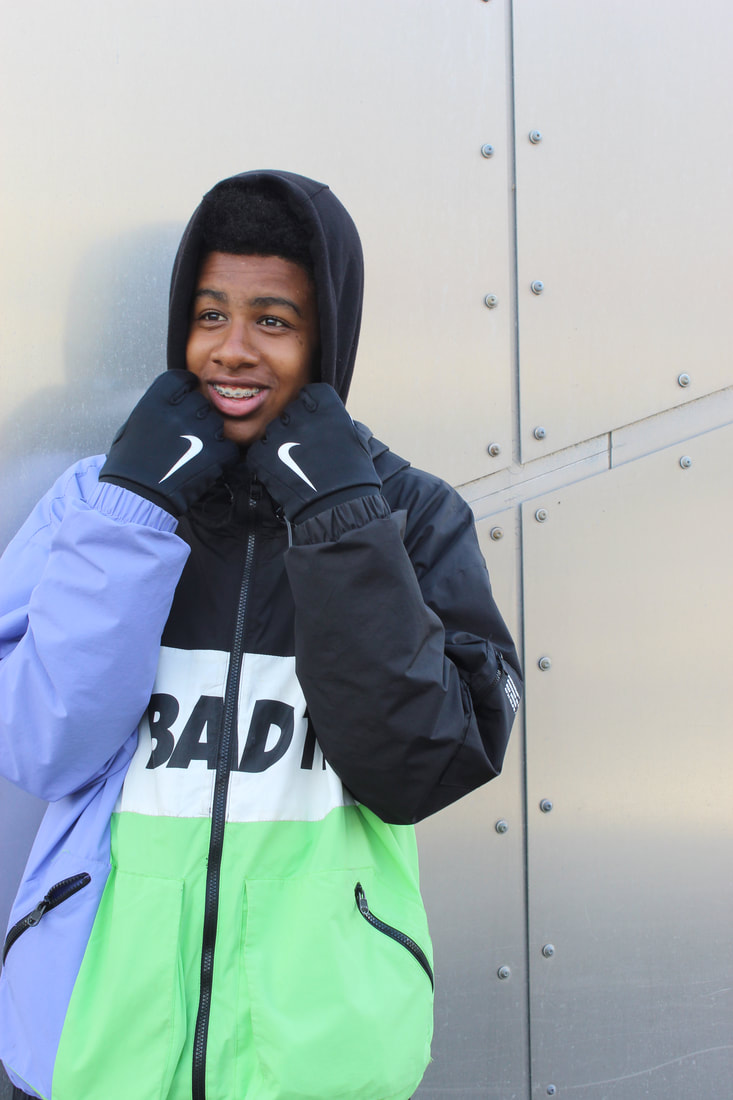
Black&White (Maya)


Best&Worst
I think that this images is the best one from the gallery because of how dramatic it is. The lighting and the texture of the models face make a good match since the image is now dramatic which will look well on a magazine cover.
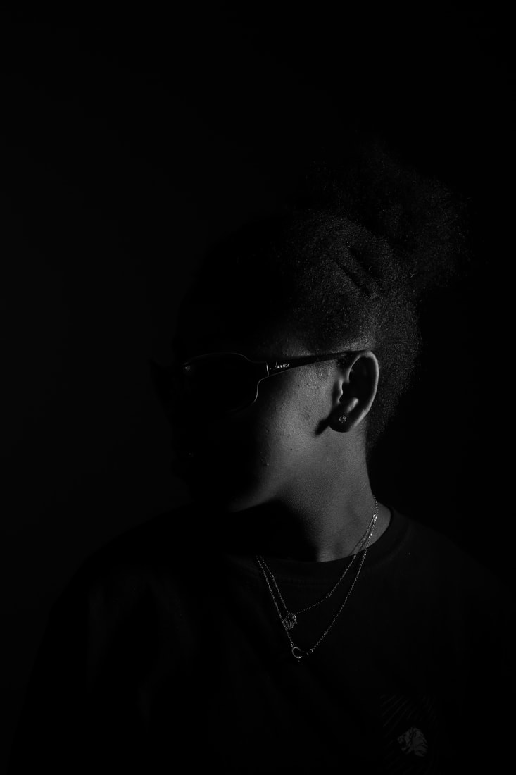
I think that this image is the worst one in the gallery because of where the models face is placed. The lighting only went on one side of the models face so you cant actually see the other side.
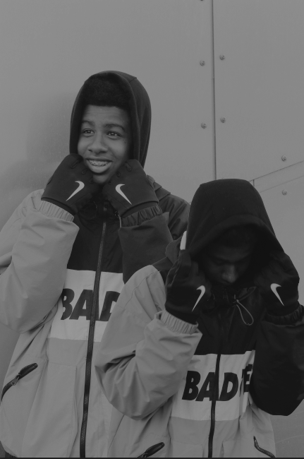
Black&White(Justin)


Best&Worst

I think that this is the best image in the gallery because of how the light captures the models face and how the model doesn't look directly to the camera which makes the models face more dramatic which is my aim.
|

This image is the worse one because the way the model placed his head is unappealing. There is nothing wrong with the light but the the position is distasteful.
|
Colour (Maya)


Best&Worst

This is my best image because it looks natural and something suitable for a magazine cover since you can clearly see what she is wearing which makes the image more appealing.
|
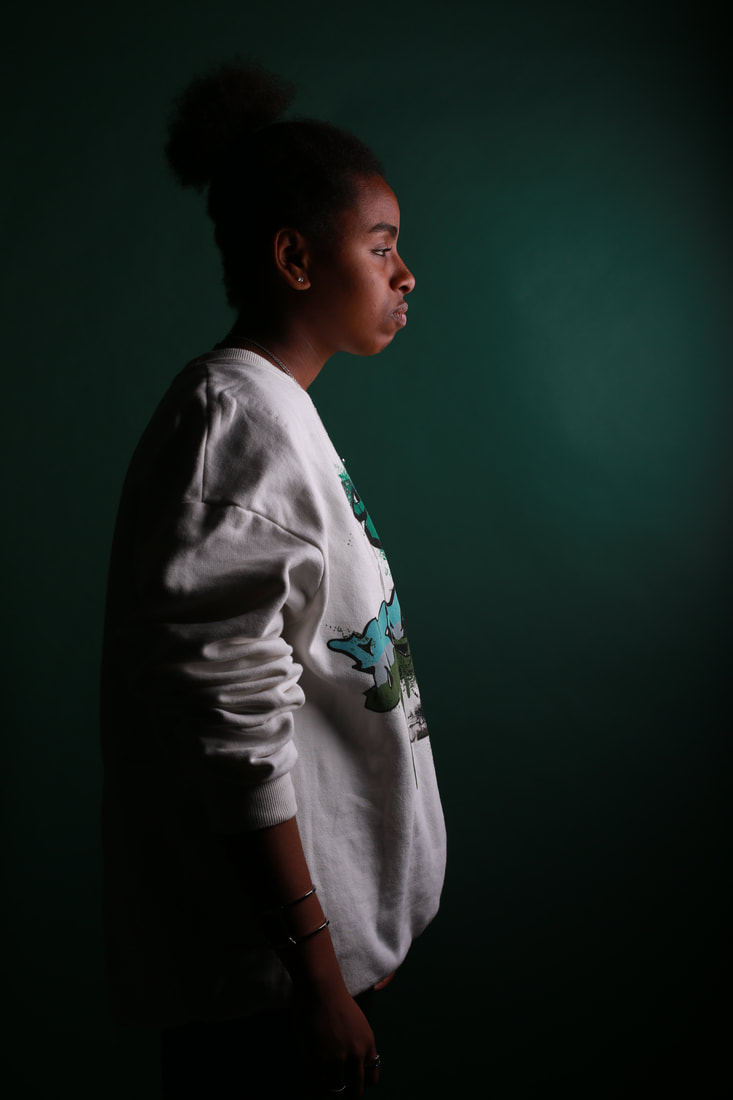
I believe that this is the worst image in this specific gallery because the models eyes are half closed making her look sleepy and less appealing which someone wouldn't want to look at on a magazine cover. The lighting is perfect because its set to mainly cast on the model.
|
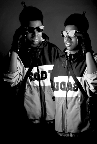
Colour(Josh&Maya)


Best&Worst
|
I believe that this is the best image in the gallery because of the position that they are in. I also think that the colors on their clothes really pop out which makes the image stand out, the colors also work very well together which also makes the image stand out
|
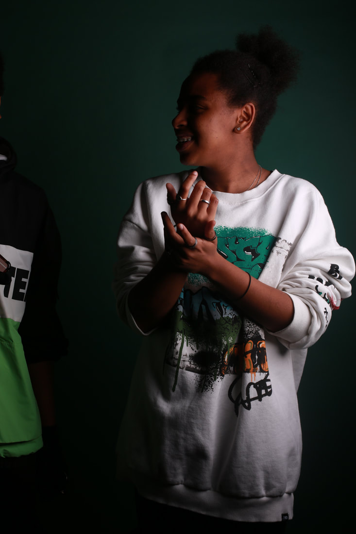
I think that this is the worst image because it was taken when the models weren't ready so it looks really unprofessional which is not appropriate for a magazine cover. The lighting is ok but its not really focused on the models which is also unattractive.
|
Colour(Josh)


Best&Worst
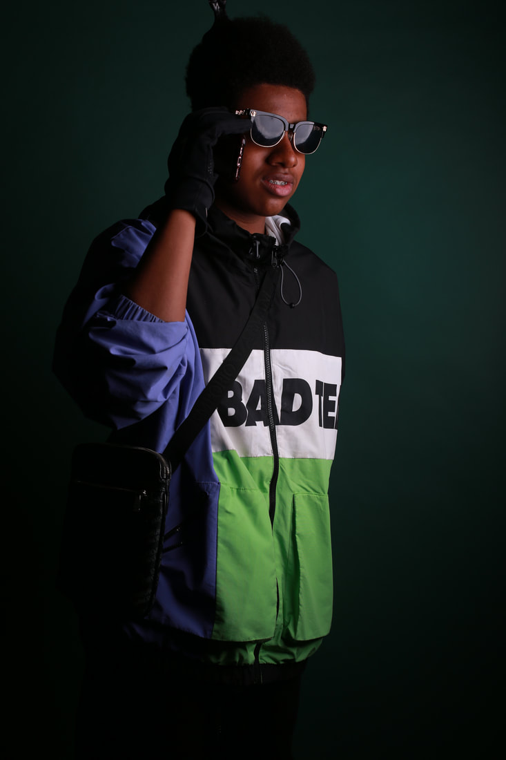
This is the best image because it's the one that looks the most professional, this also looks like a real picture for a magazine cover which is my goal.
I believe that this is the worst image in the gallery cause it’s very natural and not suitable for a magazine cover. Other than that the qualities of the image is amazing and has nothing wrong with it, it’s just that it’s not exactly in the frame and I prefer If he was in the centre.


Shoot plan for Salford
I am starting my projects by taking inspiration from this image and developing it into something of my own. I would like take inspiration from them because I believe that these images have the qualities of which i desire which is what I would to achieve since I believe that they look the most simple but most interesting to look at which is my goal. I am going to take pictures of people like this in the studio to get the best result. Then I would like to take the photos I've taken and edit them in Photoshop to enhance them for the best outcome.I will be taking pictures outside which will make the photos look more natural and acceptable for a magazine cover. Then I will take these photos to Photoshop and turn them into black and white.
The equipment I will be using is a Canon DSLR camera and I will not be using a tripod since I will be outside and will need to take multiple pictures in a lot of different areas in little time. I will use a fast shutter speed so I can capture the clothing and surroundings better. The background will be natural since its street shots but I will use an ISO of 100 to make the background look more professional with lighting. The camera setting might change throughout the shoot to make the images look more different and unique. I will also keep my white balance the same since I am staying outside.
My models will be Maya Douglas and Joshua Douglas and they will be wearing street style clothing and no makeup since the outcome is meant to be street.
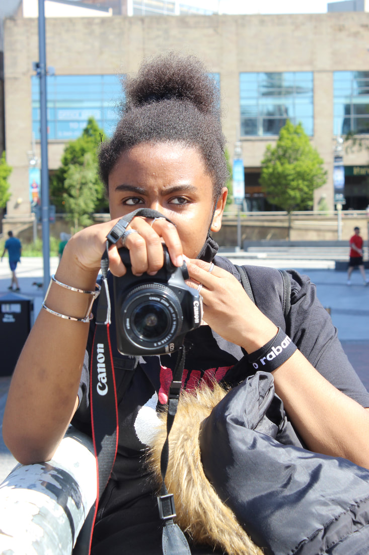
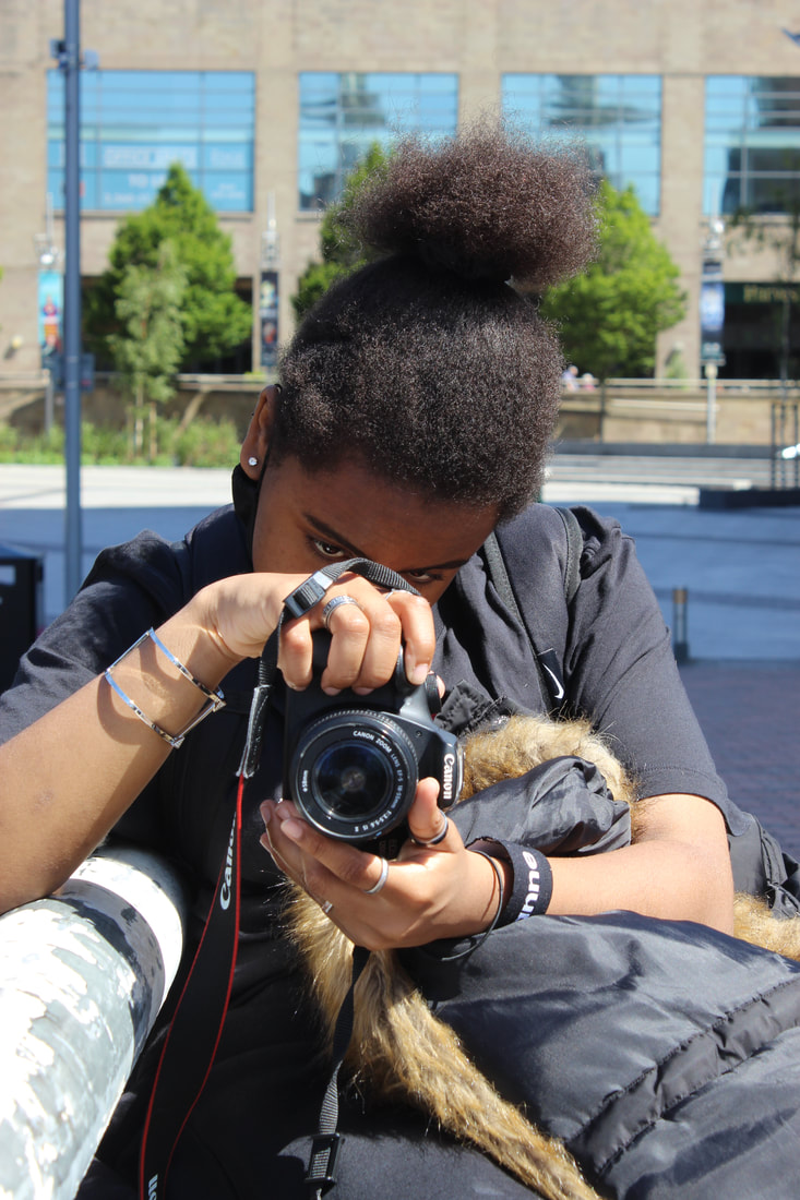
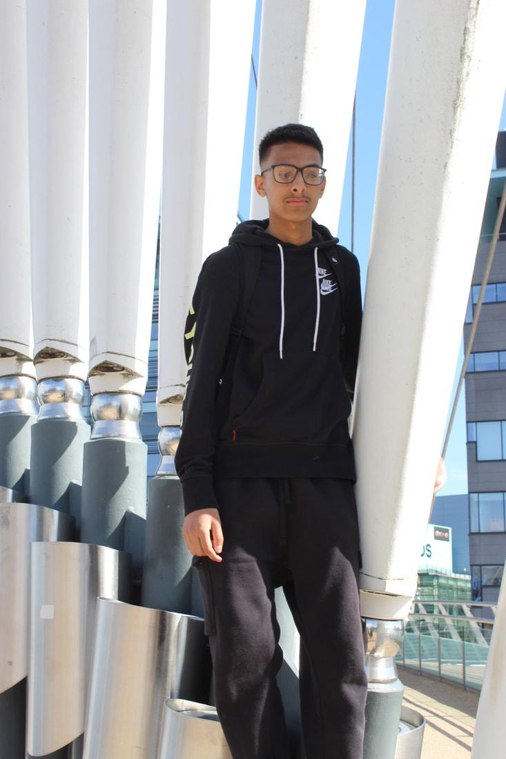
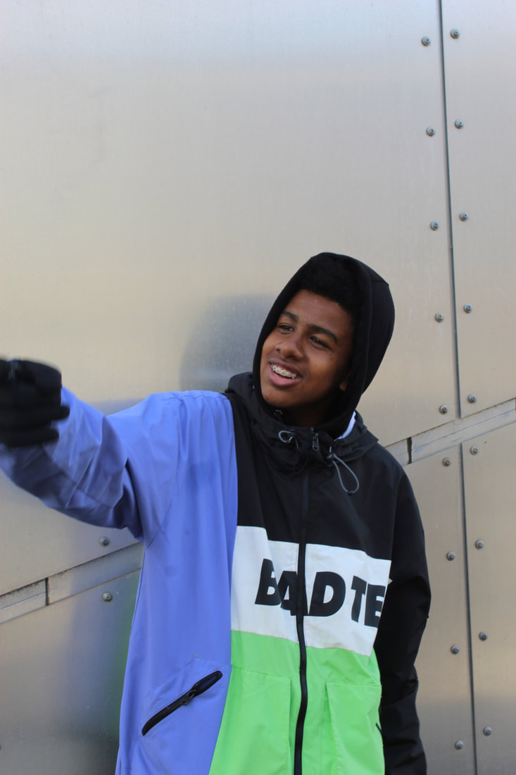
Street shot portraits from Salford Quays
(Josh)


Best and Worst
|
I believe that this is the best image because of how clear the subject is, the white-balance was set to daylight and this comlimented the Joshes skin very well. The f-stop was low because the background was blurry and the subject was in focus.
|
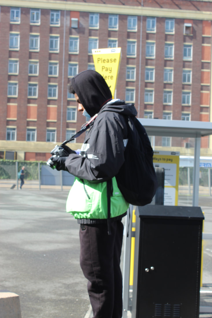
I believe that this is the worst image because of how blurry it is, the lighting didn't compliment anything and it made the image unappealing. There was also a dull light shimmering the coat and it made the image look unsatisfactory.
|
Street shot portraits from Salford Quays
(Maya)


|
|

|

|
|
|
Best and Worst
I believe that this is the best image because the exposure wasn't too high and the white balance was set to daylight creating a nice warmth to Maya. The f stop wasn't high either also creating a clear but simple image.
|
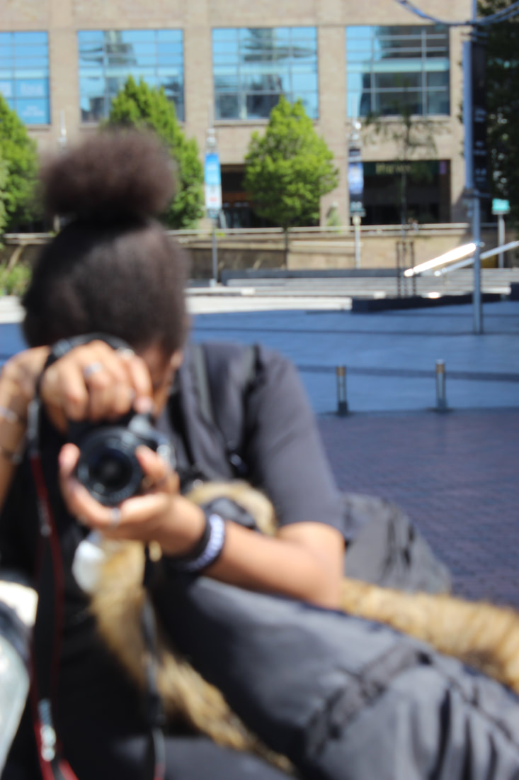
I believe that this image is the worst image because it's blurry and the white balance wasn't set right, the f-stop or shutter speed must've been set incorrectly to gain this image.
|
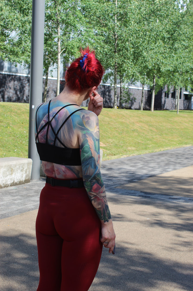
Street shoot portraits from Salford Quays
(Lady with tattoos)

|
|

|
Best and worst
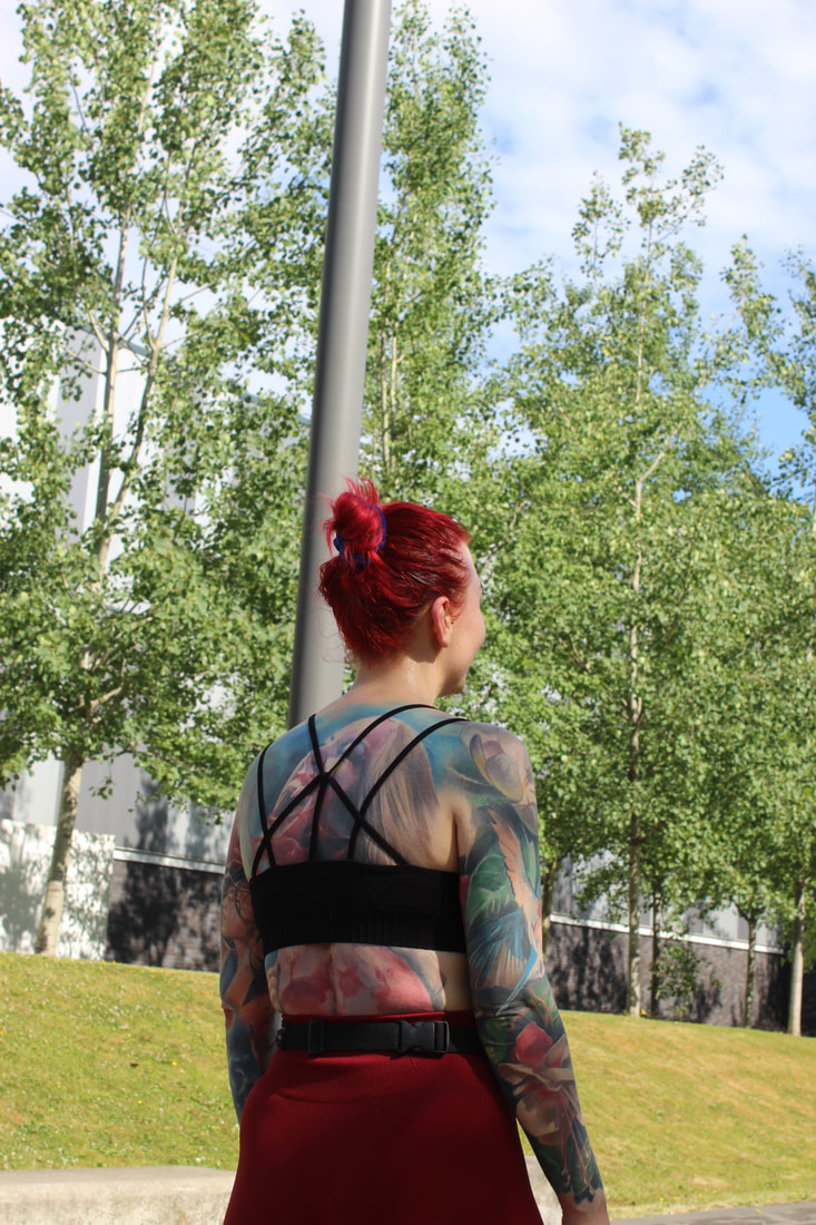
I believe that this is the best image because the lighting really suited the area and really complimented the models skin, tattoos and hair making the image look more elegant and aesthetically pleasing. The f-stop was in the middle because the background is not blurry and the image is still clear and in focus.
|
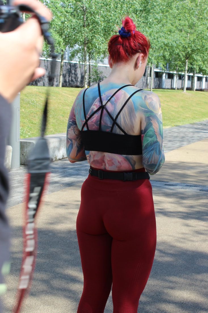
I believe that this is the worst image because you can see another photographers camera and the shadow is affecting the lighting. The f-stop was high because the background was very clear but this impacted how blurry the thing closer to the camera was.
|
Street shoot portraits from Salford Quays
(Danyal)
|
|
|

Best and worst
|
I believe that this image is the best one because of the background, the background was clear and so was the subject and it really developed the image. The white balance was set to daylight which really advanced the look of the building behind Danyal.
|
I believe that this image is the worst one because of how unfocused it, the subject also wasn't looking at the camera and the background to my belief was unsatisfactory. The white balance was set to daylight but this didn't help with the shadowy effect the image had.
|
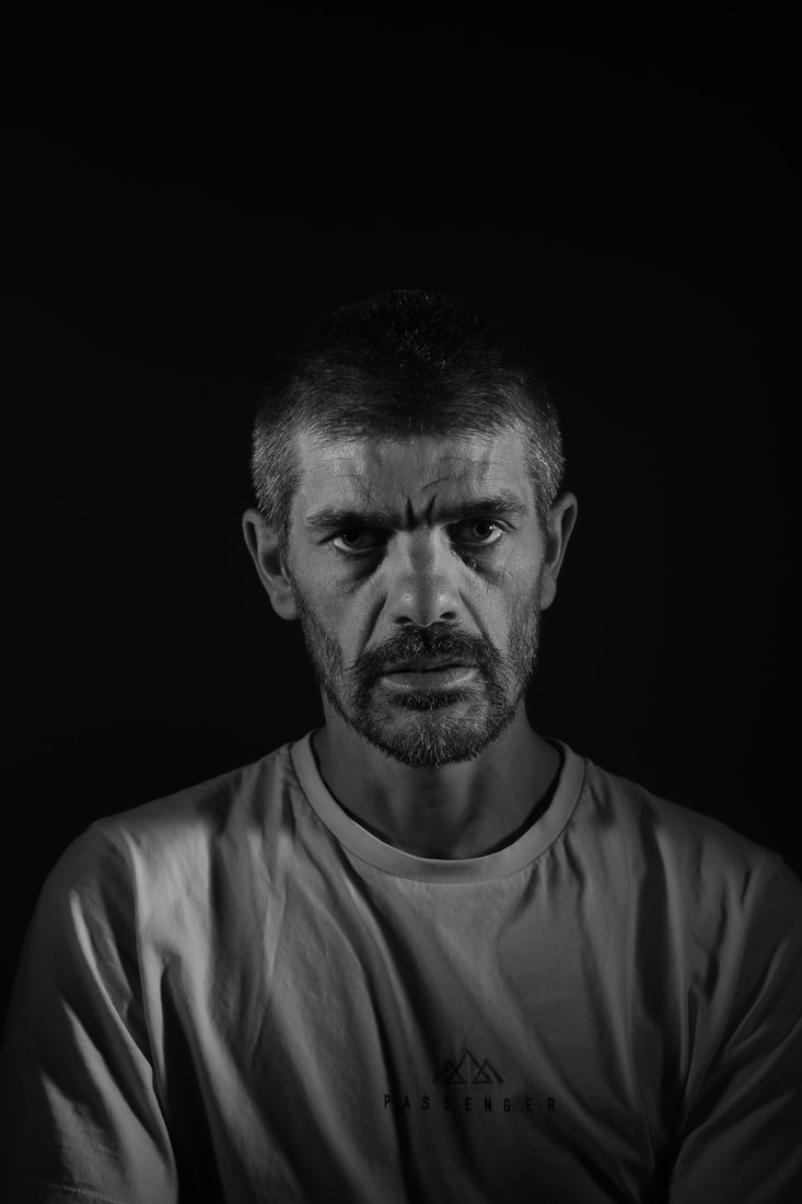
Experimenting with Photoshop
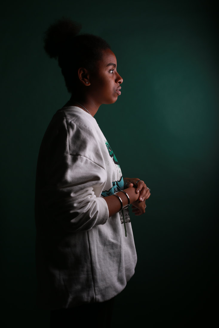
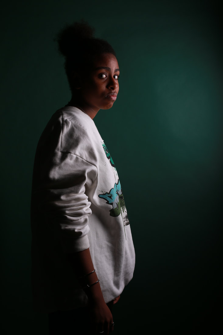
Image before editing
Photoshop edit 1
Tutorial

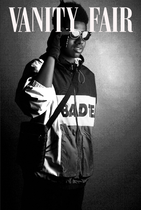
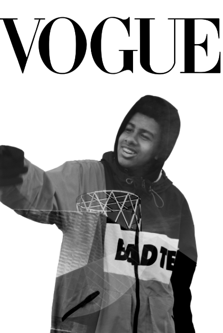
I have chosen this tutorial to edit my photo because it can show me how to apply the VOGUE logo onto the photo to make it look like a magazine cover. Which is my goal. This website/tutorial is easy to use because it's a PNG, which means a portable graphic format.
Process


Final image
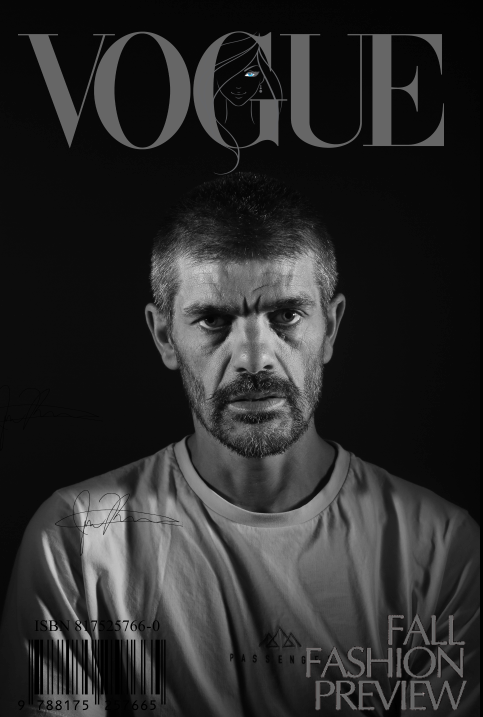
This Photoshop piece was my first ever go at the vogue cover edit and I believe that it went successfully. First I had to find a PNG for a vogue, which was simple, then I had to transfer that onto Photoshop, because I was doing black and white I had to change the color of the wording to black which wasn't that easy but it was doable. Then I has to transfer that onto the image which then got it that magazine cover effect. I felt like if I left it like that it would be too bland so I added some more PNGs to the image to make it more realistic, and then I was finished and pleased with my outcome.
Experimenting with photoshop
Image before editing
Photoshop edit 2
Tutorial
I have chosen this tutorial to edit my photo because it can show me how to apply the Vanity fair logo onto the photo to make it look like a magazine cover. Which is my goal. This website/tutorial is easy to use because it's a PNG, which means a portable graphic format. I also used this tutorial because i believe that it looks nice for the image that I am going to use.
Process


Final image
This Photoshop piece was one of the easiest yet one of the ones I like more. First I had to find a PNG for a vogue, which was simple, then I had to transfer that onto Photoshop, because I was doing black and white I had to change the color of the wording to black which wasn't that easy but it was doable. Then I has to transfer that onto the image which then got it that magazine cover effect. I felt like it was too bland but instead of copying my last outcome I changed the saturation of the image to make the image look more presentable and old-fashioned which also complimented the black and white of the photograph.
Experimenting with Photoshop
Image before editing
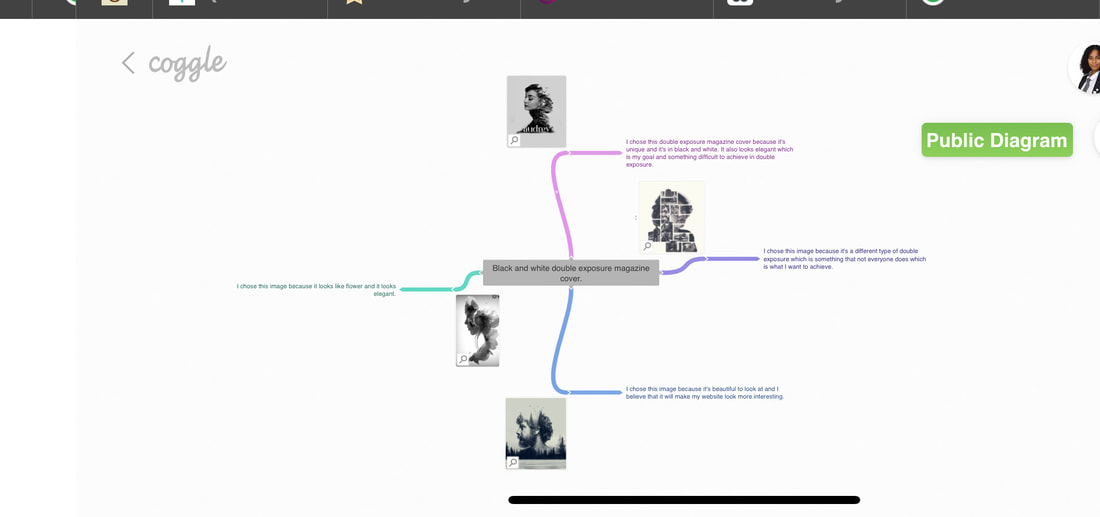
Photoshop edit 3
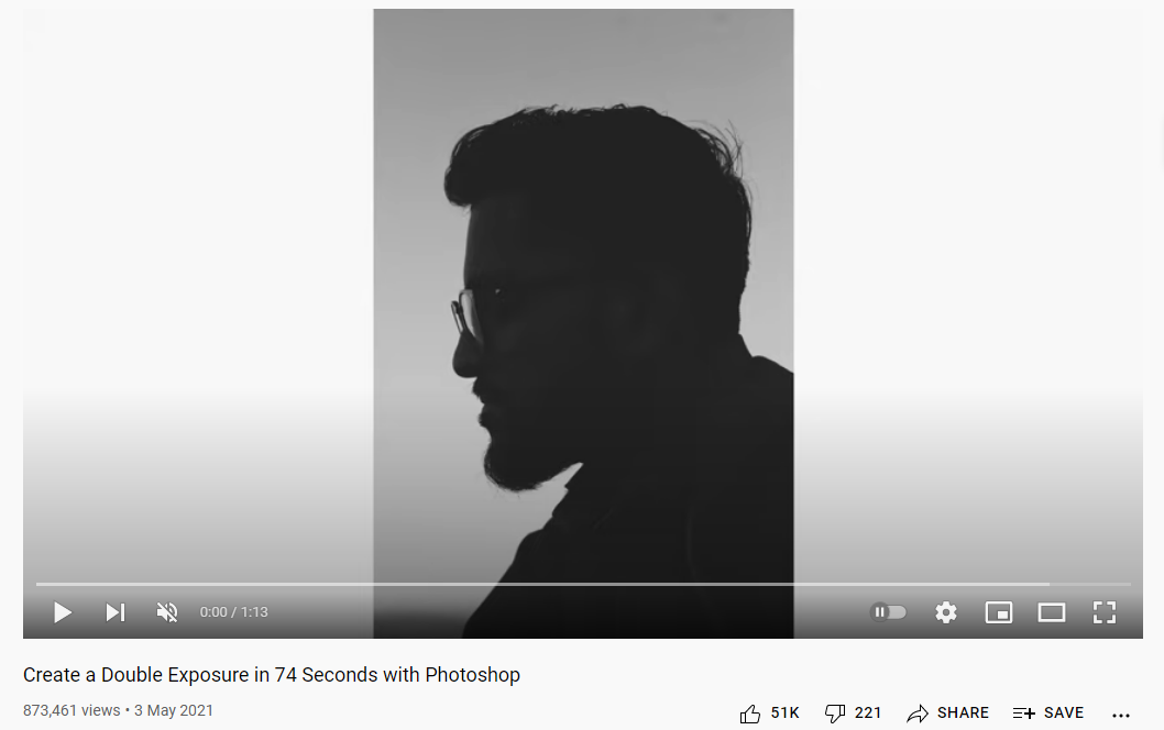
Tutorial
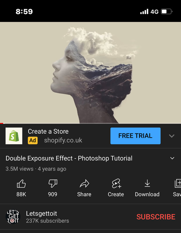
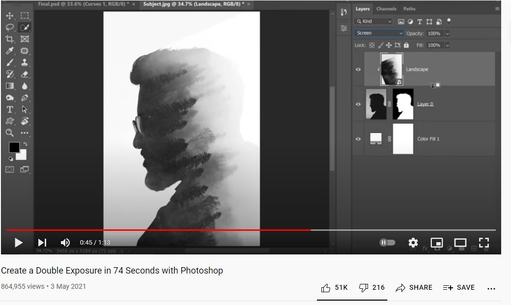
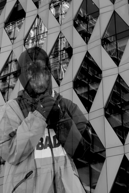
I am using this tutorial because it tells and shows me how to do the double exposure effect, which will help me improve my website into something of a high standard. Double exposure is also hard to do so this tutorial will help me achieve that.
Process


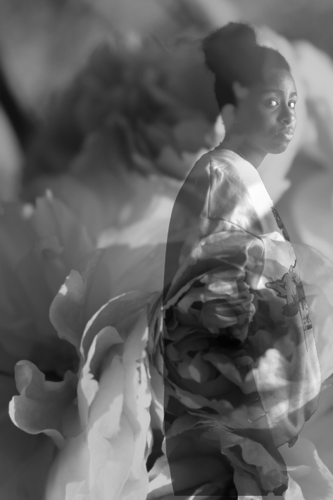
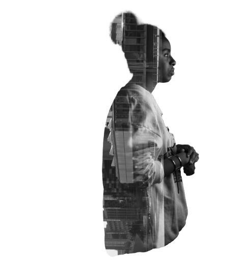
Final image

Experimenting with Photoshop
Image before editing
Photoshop 4
Tutorial
This is the tutorial that I have decided to use because it is easier to understand than the other one, the outcome is even better than the previous one. It also doesn't use up time like the other one, giving me more time to create more outcomes with a higher quality, which will get me better grades and a more professional website.
Process


Final image

Experimenting with photoshop
Image before editing
Photoshop edit 5
Tutorial
This is the tutorial that I have decided to use because it is easier to understand than the other one, the outcome is even better than the previous one. It also doesn't use up time like the other one, giving me more time to create more outcomes with a higher quality, which will get me better grades and a more professional website.
Process


Final image
The outcome isn't to my expectations but I like how it's different compared to other double exposure images
Experimenting with photoshop
Image before editing
Photoshop edit 6
Tutorial
This is the tutorial that I have decided to use because it is easier to understand than the other one, the outcome is even better than the previous one. It also doesn't use up time like the other one, giving me more time to create more outcomes with a higher quality, which will get me better grades and a more professional website.
Process


Final image
Experimenting with photoshop
Image before editing
Photoshop edit 7

Process


Final image
Experimenting with photoshop
Image before editing
Photoshop 8
Process


Final image
Experimenting with Photoshop
Image before editing
Photoshop edit 9
Process


Final image
Experimenting with Photoshop
Image before editing
Process


Final image
Final gallery


|


|
|

|

|


|
Evaluation
My main theme was black and white portrait and I did this because I wanted to have a classy and professional page, I enjoyed experimenting with the black and white theme because not everyone had done it and it really challenged me to become a better photographer since the black and white theme was not exactly creative, so I had to really excel in my photography skills to make my images stand out. I also experimented with different black and white photography techniques such as the use of shadows, patterns and also magazine covers which improved my knowledge and skills in photography.
In photography I found the use of Photoshop the most interesting because I enjoyed manipulating my work and improving my images I had taken. I specifically enjoyed trying out different Photoshop techniques such as double exposure and applying a PNG. Although I enjoyed editing my images with Photoshop, I really liked taking the images because it's fascinating to look back at them in a visual and artistic way. I also really enjoyed going to Salford and taking pictures because there were a lot of skylines that looked really beautiful to take pictures of, it also improved my black and white because it looked creative and impressive. I also enjoyed taking pictures of models because the background was extraordinary to look at which also made my images look more professional and high-toned. I also learned a lot on the trip to Salford because we were in a more sunny setting so I learned how to change the light setting on a manual camera.
I have learnt how to mold two images together on Photoshop and I have really enjoyed using that to make my images look ten times better. I also enjoy experimenting with Photoshop for example I enjoy working with the contrast and saturation because it gives the image more elemental features which is always something nice and interesting to look at. For the tutorials I just went on YouTube and looked at mainly the double exposure tutorial, since it's more harder to use. The tutorials were extremely beneficial because it taught me how to use the effects in completely different ways than how I would normally use them. From those tutorials I can now know how to use the magic wand tool without watching the tutorials, which is useful for the double exposure effect, which is something that I am using more frequently now. For the camera techniques, I learned how to use them with more practice and how to use them at the right time which is also useful to make the images come out more professional. With taking pictures I want everything very precise and clear so the F-stop comes in handy when i'm trying to get nice and clear images. For the lighting I normally like the camera to be on auto for the ISO because I am never sure what kind of lighting I am under so I just let the camera decide for me just to be more precise. If the auto isn't properly working, I will adjust the ISO which has become easier to use due to how long I've been working on with the camera.
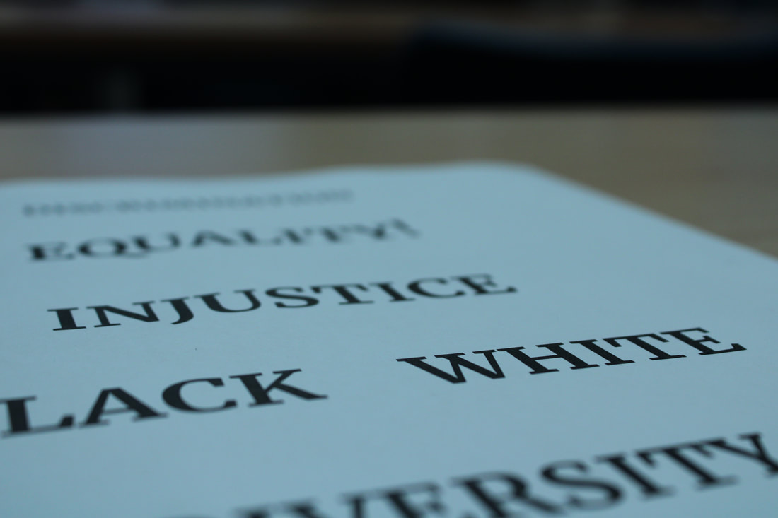
I would like to develop my skills in Photoshop because I've just started working with the more difficult effects and I would like to build my knowledge on this further to get something extremely professional and extraordinary. For my next project I would like to do something with more meaning for example discrimination because I believe that using photography can really help the issue, because it can be so powerful. I can also manipulate the lighting more because the lighting can change the issue so quickly and it's so commanding which is everything in photography. If I wanted to do more studio shots myself I would make it very professional and use things like backdrops and costumes. I would also use the camera like a professional cameraman would.
I looked at many different photographers but the ones that stuck with me were Yousuf Karsch, Peter Demarchelier, Irving Penn and Peter Lindbergh because they take pictures so classy. When I look at most of their pictures I feel at peace because the lighting tones are so calm but yet still so talented. Most of these photographers took pictures for Vogue which to me is so inspirational. I used some of their ideas but I wanted to make some of the images that I took personal because then I would be able to call them my work and not a copy of someone else's.
Most of the photographers nowadays are taking everything in color which is great because color is so interesting but they've almost forgotten about the classical black and white. Which personally I love so much because it looks so stylish and almost 'expensive' which to me is so divine because then it looks appealing. I linked my images to theirs by shadowing their black and white techniques such as patterns and shadows.
I really enjoyed using Photopea because it's easier to use and more reliable if i was to ever work at home. The best tool on Photopea is the color adjustments/filters because it has a higher range of vibrancy which to is what I prefer. The work that I produced on Photopea had a lot of great outcomes which is why I enjoy it so much since it's easy to use and comes out with great quality images.
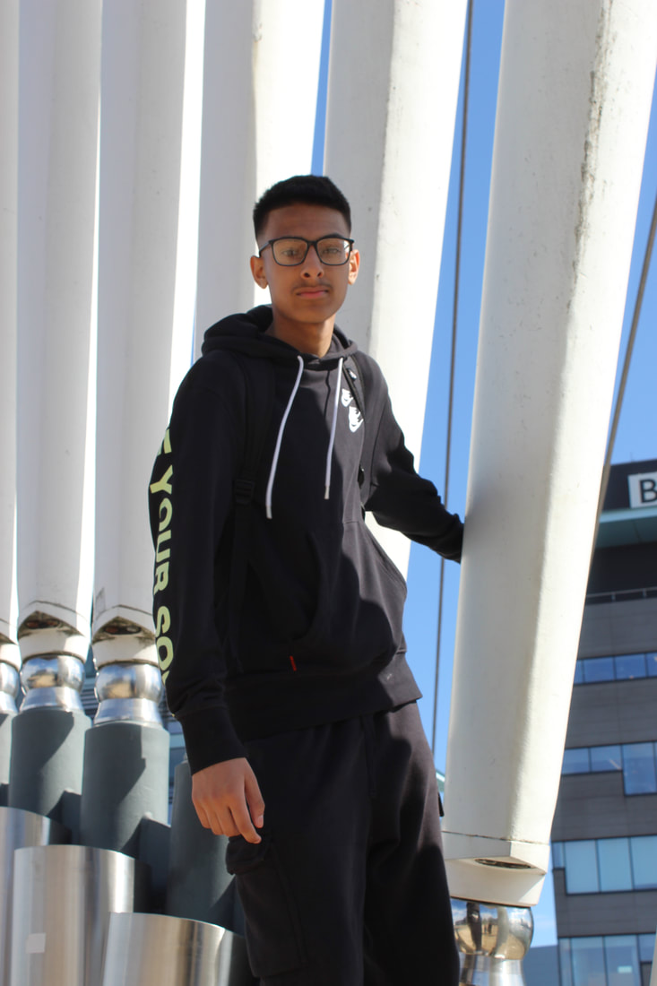
My most successful part of the project was the images I took with Justin because it was very professional and the images that I took with him came out great and had amazing quality which makes my website look more professional than it did. It was also a great experience because I learned how to instruct the model that I was using and now the next time I take pictures I know how to direct them. I also think that my final shoot with Photoshop was successful because a lot of great outcomes came out that and I am pretty proud of it because most of the images were successful. I also used more websites such as Coggle to plan a shoot which was extremely helpful.
The pandemic has caused some delays but I've still been able to complete the shoot although it was meant to be done month ago. We did have some trouble finding the lighting but we worked on it by using natural lighting outside and a studio light which we had in our facilities.
I learnt from watching the tutorials and from my peers which was extremely helpful because some of the techniques are hard to follow. I also learned by myself to become more independent which was a great experience because I am now able to do a lot of things by myself which makes it professional. At first it was difficult but as I went along the path it motivated me to try harder which helped a lot and has really shown up in this project. The researching part of the project had also helped me because I saw a lot of inspiration behind them and the photographers that I researched.
If I was given the chance to start the project again I would take more different pictures of a different pattern variety because most of my image don't have a lot of elemental features which is disappointing. I would also bring in a lot more props to add more context to the images. Due to the pandemic we had a very selective time scale so everything was either rushed or delayed which didn't exactly help, but I managed with it. With this project we didn't have that many lockdowns so we didn't do that many independent learning although if we were to have another lockdown I would be prepared for it and would be able to learn online. Away from school I am quite alright with taking pictures of the nature and outside whenever I get the chance to. I am quite prepared with doing any shoots from home independently.
In photography I found the use of Photoshop the most interesting because I enjoyed manipulating my work and improving my images I had taken. I specifically enjoyed trying out different Photoshop techniques such as double exposure and applying a PNG. Although I enjoyed editing my images with Photoshop, I really liked taking the images because it's fascinating to look back at them in a visual and artistic way. I also really enjoyed going to Salford and taking pictures because there were a lot of skylines that looked really beautiful to take pictures of, it also improved my black and white because it looked creative and impressive. I also enjoyed taking pictures of models because the background was extraordinary to look at which also made my images look more professional and high-toned. I also learned a lot on the trip to Salford because we were in a more sunny setting so I learned how to change the light setting on a manual camera.
I have learnt how to mold two images together on Photoshop and I have really enjoyed using that to make my images look ten times better. I also enjoy experimenting with Photoshop for example I enjoy working with the contrast and saturation because it gives the image more elemental features which is always something nice and interesting to look at. For the tutorials I just went on YouTube and looked at mainly the double exposure tutorial, since it's more harder to use. The tutorials were extremely beneficial because it taught me how to use the effects in completely different ways than how I would normally use them. From those tutorials I can now know how to use the magic wand tool without watching the tutorials, which is useful for the double exposure effect, which is something that I am using more frequently now. For the camera techniques, I learned how to use them with more practice and how to use them at the right time which is also useful to make the images come out more professional. With taking pictures I want everything very precise and clear so the F-stop comes in handy when i'm trying to get nice and clear images. For the lighting I normally like the camera to be on auto for the ISO because I am never sure what kind of lighting I am under so I just let the camera decide for me just to be more precise. If the auto isn't properly working, I will adjust the ISO which has become easier to use due to how long I've been working on with the camera.
I would like to develop my skills in Photoshop because I've just started working with the more difficult effects and I would like to build my knowledge on this further to get something extremely professional and extraordinary. For my next project I would like to do something with more meaning for example discrimination because I believe that using photography can really help the issue, because it can be so powerful. I can also manipulate the lighting more because the lighting can change the issue so quickly and it's so commanding which is everything in photography. If I wanted to do more studio shots myself I would make it very professional and use things like backdrops and costumes. I would also use the camera like a professional cameraman would.
I looked at many different photographers but the ones that stuck with me were Yousuf Karsch, Peter Demarchelier, Irving Penn and Peter Lindbergh because they take pictures so classy. When I look at most of their pictures I feel at peace because the lighting tones are so calm but yet still so talented. Most of these photographers took pictures for Vogue which to me is so inspirational. I used some of their ideas but I wanted to make some of the images that I took personal because then I would be able to call them my work and not a copy of someone else's.
Most of the photographers nowadays are taking everything in color which is great because color is so interesting but they've almost forgotten about the classical black and white. Which personally I love so much because it looks so stylish and almost 'expensive' which to me is so divine because then it looks appealing. I linked my images to theirs by shadowing their black and white techniques such as patterns and shadows.
I really enjoyed using Photopea because it's easier to use and more reliable if i was to ever work at home. The best tool on Photopea is the color adjustments/filters because it has a higher range of vibrancy which to is what I prefer. The work that I produced on Photopea had a lot of great outcomes which is why I enjoy it so much since it's easy to use and comes out with great quality images.
My most successful part of the project was the images I took with Justin because it was very professional and the images that I took with him came out great and had amazing quality which makes my website look more professional than it did. It was also a great experience because I learned how to instruct the model that I was using and now the next time I take pictures I know how to direct them. I also think that my final shoot with Photoshop was successful because a lot of great outcomes came out that and I am pretty proud of it because most of the images were successful. I also used more websites such as Coggle to plan a shoot which was extremely helpful.
The pandemic has caused some delays but I've still been able to complete the shoot although it was meant to be done month ago. We did have some trouble finding the lighting but we worked on it by using natural lighting outside and a studio light which we had in our facilities.
I learnt from watching the tutorials and from my peers which was extremely helpful because some of the techniques are hard to follow. I also learned by myself to become more independent which was a great experience because I am now able to do a lot of things by myself which makes it professional. At first it was difficult but as I went along the path it motivated me to try harder which helped a lot and has really shown up in this project. The researching part of the project had also helped me because I saw a lot of inspiration behind them and the photographers that I researched.
If I was given the chance to start the project again I would take more different pictures of a different pattern variety because most of my image don't have a lot of elemental features which is disappointing. I would also bring in a lot more props to add more context to the images. Due to the pandemic we had a very selective time scale so everything was either rushed or delayed which didn't exactly help, but I managed with it. With this project we didn't have that many lockdowns so we didn't do that many independent learning although if we were to have another lockdown I would be prepared for it and would be able to learn online. Away from school I am quite alright with taking pictures of the nature and outside whenever I get the chance to. I am quite prepared with doing any shoots from home independently.
